When you’re creating an ad or other graphic, no doubt you’re focused on the message you want to convey. The photos, language, font, color – all of these elements should combine seamlessly to support what you want to say, whether that’s promoting an upcoming event or just looking for more social media engagement.
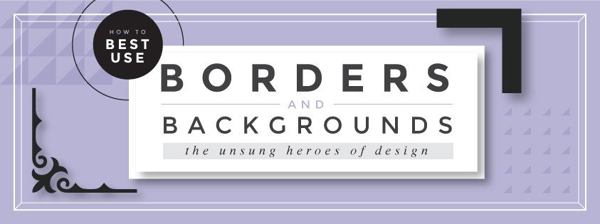
Borders and backgrounds are sometimes ignored or knocked down to a lower place of prominence, but the truth is that these seemingly humble little ingredients are significant contributors to your overall design aesthetic. Here we’ll point out just how pivotal borders and backgrounds are to your end product, and we’ll even give you a few tips on how to use them with maximum effectiveness.
In the Background
Backgrounds are, by their very definition, a supportive role in your design. They lay behind your text and graphics to help amplify – never detract from – the message at hand. But how do you know which purpose your background is serving? There are a few design guidelines to follow to ensure that your background will not overwhelm the other elements and create distraction.
- Be smart about your color choices. First and foremost, you have to think carefully about colors when it comes to choosing a background. You can use a bold, bright color, but pair it with simple fonts and graphics so that you don’t create a visual overload. Don’t forget to keep in mind the color of your text; your background needs to contrast the text color enough that the wording pops off the page rather than becoming swallowed up in an abyss of background hue.
- Use patterns sparingly. Occasionally a bold pattern is called for in a background, but you really need to be strategic about how and when you use patterns, as they can quickly become the focal point of the image instead of your message. If you’re dealing solely with a simple, centralized text and no accompanying graphics, go all-out with a pattern to drive the attention where you want it. Otherwise, use a subtle, understated patterns that will merely underlay your other material.
- Drop in a photo background. Go for some realism by using a photo as a background. This works especially well if you have a product you want to show in your ad; take a creative close-up or an image of your item being used, and work your text in around the main elements of the photo. You’ll still need to be meticulous about choosing a text color, since you need to balance the color of the photo with a contrasting text hue.
- Use depth of field to create an atmosphere. One cool effect you can use if you’re dropping in a photograph for a background is depth of field. A blurry, out-of-focus image creates a surreal sense of ambiguity, providing a subtle background that keeps your eyes centered on what is in focus (i.e., the wording) while also providing a hidden aspect that complements your message if one looks closely. Contrarily, if you use a sharp, in-focus photograph, be mindful that this image will be a main point of interest, and plan your other graphic ingredients accordingly.
- Make quick changes by adjusting the opacity. Is your background choking out your main focus? Rather than completely scrapping the background in favor of another, first try adjusting the opacity. This changes the level of transparency of the image and therefore its noticeability as well. You can fade out your image or color to be less apparent, or bring it to the forefront if your ad needs a little more boldness.
Whatever you have in mind for your background, try out a few different options and just see what works best with your other elements. Sometimes the best way to determine is to try some variety and see what looks most appealing.
On the Border
So you’ve got your background all in order…now what to do about borders? Does your image even need a border? If so, what kind?
Borders are meant to draw your eyes inward, toward whatever they’re surrounding. For instance, if you have text that you really want to stand out, bordering just the text keeps your eyes centered and focused on the message.
With that in mind, here are some pointers for how to use borders well so that they achieve their intended purpose.
- Subtlety is key. For the most part, your border should be low-key. It’s meant to draw attention to other elements, not to itself. Sometimes plain and simple monochromatic boxes are perfect for keeping the focus on its contents; you’re also better able to get creative with fonts and color if your border isn’t overwhelming.
- Border strategically. What’s the focus of your ad? Want to emphasize a date or specific theme? Border the element that is most important in your image to keep the attention there. Or, if your image just needs something to make it look finished and keep your eyes from falling to the outer edges, a simple border just inside the edge of your image is the way to go.
- Keep it on theme. Now for the easy part: Your border should always be consistent with the theme at hand! If you’re using a graphic border, don’t choose a floral theme for a winter ad. Make it something that complements your idea, without creating any friction or confusion in the viewer.
Now that you know the basics of borders and backgrounds, you’re ready to create! Check out Easil’s variety of background and bordering options so your ads always look professional and unique.