
Sometimes words just don’t cut it. You need striking visuals to drive a point home, pique curiosity, or add to the anticipation of an event. However, creating your own poster can be an overwhelming task, especially if you’re not a designer. Where do you even begin?
Thankfully, now there are applications that make image design easier than ever, with pre-made templates which will give you a head start and help you come up with your own ideas. Learn how to create a poster yourself in Easil with these super-simple tips, and you’ll be well on your way to having high-quality graphics that are perfectly tailored to your event or content.
How to create a poster (with professional quality design) with 6 Easy Steps
- Determine your poster format
- Brainstorm the Content
- Pick a suitable Template
- Use color to grab attention
- Choose graphics and typography
- Clean up any clutter.
Let’s go into a bit more detail on each step now:
1. Determine Your Poster Format
Your first step should always be deciding on a format. Do you need a large poster to catch the eyes of passersby? Or a small flyer that can be printed in bulk and passed out? Maybe you only need a digital Facebook post to share with your followers.
Whether you’re promoting an event, informing an audience, or supporting written material on your blog, the purpose of the graphic will determine the size, layout, and overall format of the visuals. Once you have a format picked, you have a framework in which to get creative.
2. Brainstorm the Content
Now it’s time to get the words down. A short, catchy slogan is great for drawing people in and getting them to read the details that will inevitably follow. If you’re working in a large poster format, keep it simple – you want to capture attention with only a glance.
Be clear and concise, and be sure that you include all the relevant information that your readers need. If your flyer is for an event, it needs to say where, when and what the event is. Scratch out some ideas for verbiage, but don’t worry about dropping them into a template just yet – you’ll organize that along with the graphics so that everything looks clean and neat.
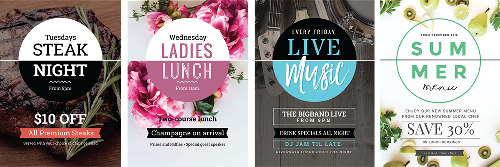
3. Pick a Suitable Template
This step is where the real fun begins! Scroll through pre-designed templates and see which one speaks to you. Remember that the template should suit the occasion; a poster for a children’s event should be fun, bright and cheerful, whereas a flyer advertising a wine tasting will be more elegant and subdued. You can even find templates for seasonal occasions.
Remember that whichever template you choose, every aspect can be changed to suit your needs. You can swap out the background, graphics, colors or move text boxes around to accommodate your text and images. The template just gives you the basic groundwork with ideas for layout and design, so the process is as easy as possible while still giving you a professional product.
4. Use Color to Grab Attention on your Poster
Once you’ve chosen a suitable template, start experimenting with color to make your poster really stand out. Colors carry a wealth of meaning, and if you prefer more minimalist images, using color is a good way to convey your message with less clutter.
Bright, bold reds and yellows draw attention and energize your image. Cooler blues, purples, and greens bring stability, calm, professionalism and even elegance. Stark black-and-white contrasts are a fantastic way to captivate and convey sophistication. Choose your color palette carefully, selecting colors that complement one another and fit the occasion and purpose of your material.
5. Choose Graphics and Typography
Photographs, imagery, and fonts are your next feat to tackle. First, place your text on your poster design. This is your bread and butter because, without it, your audience will struggle to understand what your message is.
Keep the main message in a place of prominence: if you’re not sure where to begin, start with your catchy slogan/title/name front and center, in bold lettering that is clean and easy to read. Details can be smaller or off to the side, but make sure, again, that your font is both readable and fits with the overall mood of your poster. Varying fonts can also be a powerful way to get attention, as contrasting flowy scripts with blocky lettering grabs the eye.
Imagery is another strong visual tool. You can use a photograph to send your message or add small graphics as supporting material for the text. Use image placeholders already found on your template, and scroll through Easil for other relevant pictures that go along with your theme or upload your own images. Consider using Image Frames/Shape Masks to create a different look for the placement of your images.
6. Clean Up Any Clutter
Once you’ve arranged your text and imagery how you want it, it’s time to give your poster the old once-over. Have someone else look at your flyer with you to give you a fresh perspective. Is the message clear? Are any of the colors overpowering? Do the graphics look clean and well-placed, or do they give a cluttered appearance? Answering these questions will help you edit and filter out any unnecessary elements, or add in anything that may be lacking. And don’t forget to proofread for spelling or grammatical errors!
OVER TO YOU
With these principles in mind, anyone can design their own promotional materials for any occasion. It’s as easy or as complex as you want to make it, but whether you just drop your own text into a pre-made framework or give your template a complete overhaul, you can be sure you’ll have a finished product that is sleek, professional, and ready to draw a crowd for your next big affair.