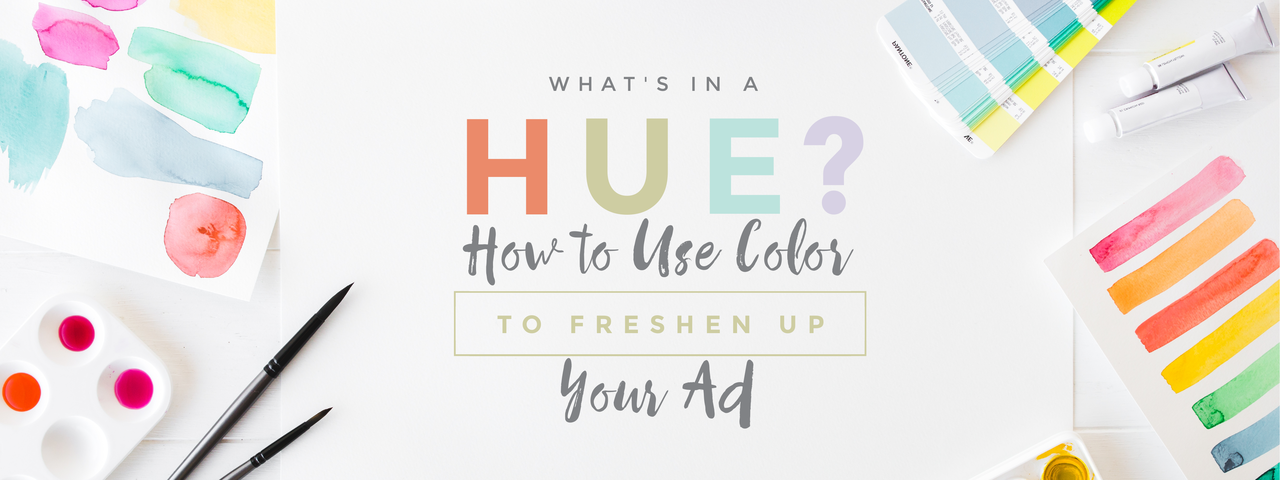
Ever wonder why some ads capture your attention more than others? With as much marketing as we see every day, you would think that eventually, it would all just blur together. Yet time and again, we find ourselves surprised by an ad that sticks in our minds or draws our eyes in unexpected ways. Obviously, many factors go into creating such an ad, but one of these powerful traits is color. Color doesn’t just create variety — it can convey feelings, evoke memories, and even stimulate certain physical responses. This makes it a strong tool in marketing, where images are used to inform and persuade an audience. However, different colors are used to provoke different reactions, so it’s crucial to understand the various hues and how to use color effectively in graphic marketing.
The Color Spectrum
Let’s go old school and remember the color spectrum with the acronym ROY G. BIV. This helpful memory device was used by many a grade-schooler to assist in keeping track of all the colors and their order in the rainbow: red, orange, yellow, green, blue, indigo and violet. When you split this spectrum almost in half, you get the reds, oranges, and yellows all together, and the greens, blues, and purples in the other half. The red side contains warm colors, and the blues are cool colors.
Now, this is probably all review, but the distinction must be made, as warm and cool colors have a very different impact on people’s overall moods. Warm colors are seen as very active and exciting — they draw attention, evoke energetic feelings, and convey positivity or cheerfulness. The cooler colors are more subdued and correspond to calmness, confidence, and stability. (Ever wonder why most bank logos are blue or green? There’s your answer.)
So when creating a graphic, whether for your company logo or a Facebook advertisement, think of the message you’re trying to convey before you pick out a color scheme. Research has shown that up to 90 percent of initial judgments on a product are based on color alone, so this is no small consideration.
Here are some hue associations to guide you on how to use color and how to choose a color spectrum for your imagery:
- Red: This dynamic hue is incredibly powerful, as it stimulates adrenal glands and evokes excitement and action. In Western culture, it also symbolizes love or affection. However, be careful not to overuse this color since it can incite anger or stress.
- Orange: Orange is another energetic, eye-catching color, but it also conjures feelings of cheerfulness or enthusiasm and is not quite as overbearing as red.
- Yellow: This color is seen as the happiest (i.e., the color of sunshine) and is even said to enhance concentration. But too much yellow can also fatigue the eyes, so be strategic in when and in what quantities you use it.
- Green: Calm, earthy, and confident; green evokes feelings of security and healing. It can also symbolize success, wealth, or nature (i.e., the Green Party).
- Blue: Blue is another cool hue that promotes calmness and security but can also denote creativity and trust. It also carries with it a sense of purity or cleanness due to its connection with water.
- Black: Want to convey a sense of power or elegance? Black is an incredibly aggressive color, but it also has sobriety and formality, making it perfect for creating a classy feel.
Important Notes
Culture does play a part in how colors are perceived; for instance, in Western culture, the color yellow is sometimes associated with cowardice, but in Japan, yellow connotes courage. This illustrates how your color message may change depending on who is receiving it. Thus, it is critical to investigate your target and keep in mind cultural differences when creating an ad, even making changes where necessary to accommodate these discrepancies.