So, you’ve done the hard yards writing an e-book, and now it’s time to make it shine with a spectacular e-book cover.
Self-publishing an e-book is easy these days, especially if you are distributing it digitally.
But, writing the e-book is just the first part. Promoting it with an awesome e-book cover is just as important, just like a cover for a print book.
There are a plethora of e-books floating around the Internet, so a top-notch, striking cover can set your book apart as a high-caliber work. Let’s take a look at what goes into an e-book cover design, and how you can achieve it… and maybe achieve a best-seller:
5 Keys to a Spectacular E-Book Cover
1. Keep it Simple
It’s important to remember that e-books will be viewed at a very small size by people searching on line sites like Amazon and Kindle. It’s important that you keep your design simple so it is easy to read at a small or large size.
Here’s a few tips:
- Remove anything that won’t be legible at a small size.
- Reduce everything back to just the title, author name and a powerful image that draws the reader in. You may have to leave out tag lines. Experiment with what fits.
- Unless you are well known as an author, keep your name smaller in text, and focus on having a bigger title.
- Test the image at a small size online and see if it “pops” against other images.
- Make sure your image instantly conveys the key message, genre, or story of the book.
- Use the highest resolution possible on the platform your are uploading your cover for. Then you can return to your design in future years (or 2nd editions!) to edit it easily. Using a template on a tool like Easil means you will always have access to your design.
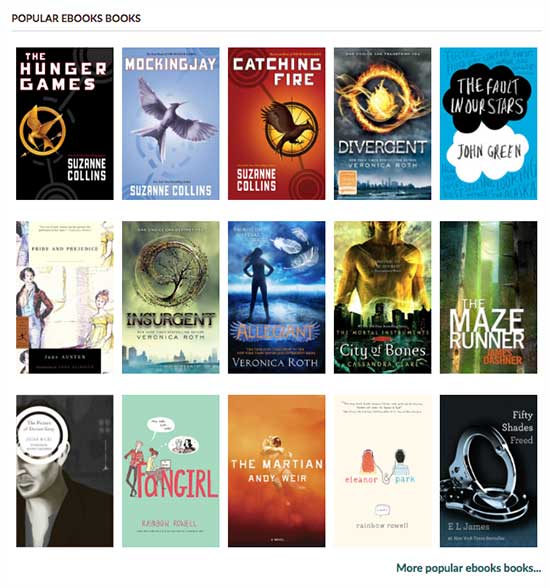
HOT TIP: Go to Amazon and search for e-book results. Reduce the size of your cover to the same pixel size and compare it to other books in your chosen category. Does your cover (especially title graphic) stand out?

Compare e-book covers online. What stands out?
2. Choose a Killer Background Image
We can’t stress how important this is. Whether it’s a blank or color backround with an iconic image or a full-cover photograph, you need to choose the background very carefully.
Here are some tips for choosing the right background image:
- Don’t choose your background image in isolation. Consider the typography, the image or photo and the background color as one united design. Each has to work with the other.
- As we mentioned above, start by reviewing other books in your genre/category and see what works in terms of mood, style and message. What images and photographs work well?
- Consider throwing a little money at your background image. Either buy a really high quality stock photo (be sure you have the rights to sell it on an ebook) or invest in a photo-shoot.
A strong cover image or background design can be the difference between someone clicking on your e-book cover or passing it by, so give it some careful thought!
3. Use Typography Wisely
There’s no doubt that a super flowy script can be stunning, but when you’re talking about e-book cover design, you need to be strategic about your typography usage.
In fact, typography is perhaps the biggest single factor in determining a great e-book cover design versus a lack-lustre one. In short, GO BOLD.
As we mentioned above, someone searching for e-books will usually only see a small thumbnail of your cover, which means your title font needs to be one that is clearly readable even in a small format.
Here are a few tips on typography on your e-book cover:
- Don’t cram too much text in. It can crowd your imagery and result in a cover that feels cluttered and is difficult for the brain to decipher.
- Go for big bold fonts. Remember that you only have a small space to catch attention, so avoid the curly fancy fonts and go for bold and big.
- look at what types of fonts work in your genre or category. Don’t try to reinvent the wheel. A quick glance at a series of books online will show you what works.
- Remember that like many things online, the top half of your book is prime real estate. As a general rule, use this area for your main book title.
- Only use one or two fonts – keep it simple!
4. Use Color and Contrast to Catch the Eye
Color and Contrast needs to be considered at all three layers of your e-book cover – through your typography, background and images/photography.
Here are a few things to consider when it comes to color and contrast:
- Use colors that pop online. Not all colors look good on a screen. For instance, red can sometimes pixelate in strange ways on certain sites, so it’s best to avoid using too much of this color.
- Remember that darker color schemes invoke mystery or melancholy, while bright colors convey whimsy or humor. Consider your audience when you choose colors.
- Choose colors that contrast well together. If in doubt go back to the tip above: look at what works already in e-books that stand out online, and use that to help guide your color choice.
- Use a template to help you get started. Our Easil templates are created by designers who know how to make colors pop. Use their suggestions to help you.
5. Think Differently
You only get one chance to make a first impression, so make sure your e-book cover stands out.
Here are a few tips to think differently, and create a cover that draws people in to read it:
- Browse through Easil’s vast supply of templates to help you create the cover that stands out. You’ll find thousands of ideas that you can then customize to create something completely individual and tailored to your e-book.
- Think “unique”. We’ve all seen those e-book covers that look like they were cranked out on an assembly line, rather than carefully crafted by a designer. Use unique typography, an engaging image and color to catch attention.
- Create a cover image that catches a viewer’s eye and acts as a sort of “teaser” that creates interest without really telling you much about the book. It’s important that you give viewers a reason to read rather than just skim right past.
- If you are considering that this book will become part of a series, pay attention to branding. It’s super important that your readers can recognise the e-books in your series. It helps keep their attention on your books and gets your fans ready to buy more. The typography will play a big part of this branding, which leads us back to #3.
Are you Ready to Create Your e-Book Cover?
If you use some of our tips, and try our templates to help you out, you should avoid creating an e-book that is lost in obscurity. Instead, you’ll create something that we can’t scroll past!
The cover of your book will be its first impression on the world; it can even be the deciding factor on whether a person chooses to pick up (or click) your book at all.
Never underestimate the power of a great cover! It needs to be magnetic and bold so that it captures the reader’s imagination and piques that vital curiosity.
Use the tips in this post and you’ll be on your way to a bestseller!
Your Turn
What do you look for in a great e-book cover?


