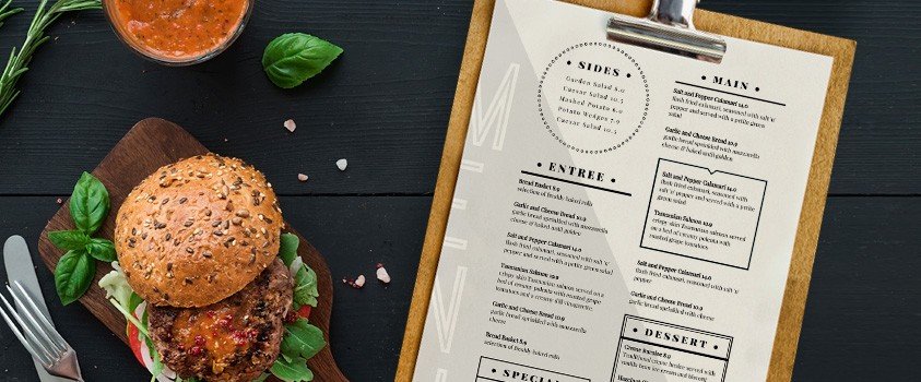
Nothing can ruin a restaurant experience more than a poorly made dining menu. Just think about it: If your menu is difficult to read or understand, it will make your customers ask dozens of questions about the food, slowing your waiters down and preventing them from tending to all their other tasks, or worse still – make them walk on by your restaurant. However, this can be easily avoided if your menu design is clear, well-designed and presented in an enticing manner.
Here are five features that your food menu must have in order to carry its weight and make its presence worthwhile.
1. Readability
Perhaps the most important aspect of your menu should be its overall readability. Use fonts that are easy to decipher – nothing overly stylized that may cause people to have difficulty reading. Also remember to use a font color that contrasts with the background so that it pops off the page.
In terms of the content, use language that is vivid and appealing, but don’t cram in too much or your menu will be cluttered. Be concise. After all, you don’t want your customers spending all their time just reading the menu!
2. Allure
Your language isn’t the only way to make your food sound appetizing. Photos also say a great deal about your menu items, so any pictures need to look inviting and delicious. Don’t use photos with poor lighting or where the food is sloppily put together – be detailed in the photography process so your images always look tempting and ready-to-eat.

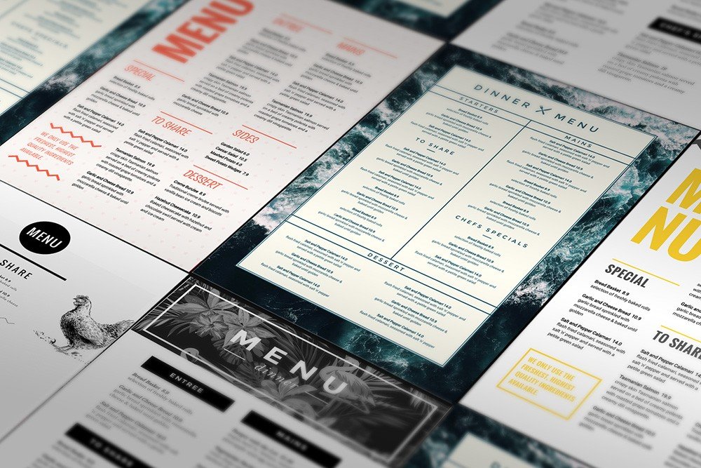
However, alluring imagery doesn’t stop at the photos. The design of the menu itself should be welcoming and consistent with your theme. Choose a color scheme with only a few main colors, and don’t try to utilize too many different hues, as this will only serve to distract from the design and create tension. Don’t forget to add borders or other graphic touches to tie your menu pages together.
3. Variety
While this point refers more to the menu items than to its design, it’s still an important factor. People like to see a range of options (both in food and pricing), so there should be some variety on your menu – not an overwhelming amount, but enough to appeal to diverse tastes. Add some seasonal items to your rotation to create some urgency. Nothing gets people interested like a “limited time only” deal!
4. Branding
Sometimes it’s important to remind people who they’re dealing with. Keep your brand front and center by including your logo or name on the front page of your menu. You can also use other branding elements like a unique font or color scheme, as long as they are all consistent throughout the menu. The idea is to create a unique atmosphere, and your menu can contribute this if you let it speak with your brand voice and characteristic traits.
5. Organization

Don’t make your patrons do all the work in finding menu items. Clearly organize your menu based on sections (i.e., Appetizers, Beverages, Lunches, etc.) so that it is logical and your customers don’t have any trouble finding what they want. Again, the less time they spend on the menu, the more time they have to eat and enjoy the food, and the better impression your restaurant will make.
Need to create the perfect menu on the fly? Easil has tons of menu templates so you can display your eats in a professional setting, while you save money and time. Select your menu template and start crafting your ideal spread!
