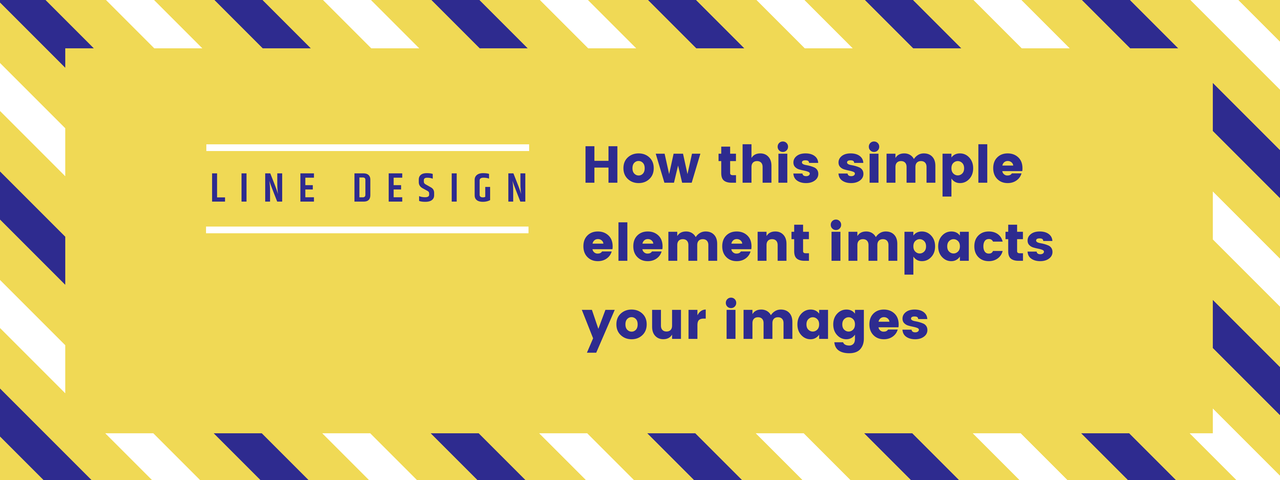
You use it every day without fail, and maybe even without noticing. It helps you form images and words. It’s an essential building block of design. It’s the humble line, and it may seem like an unimportant detail, but this fundamental element wears many hats as it assists you in creating well-formed images. Let’s outline some of the roles that lines play in design, and how to use lines to your advantage as you shape your imagery.
Divide and Conquer
To quote your 10th grade geometry textbook, a line is the distance between two points. In art and design, they will come in all shapes and sizes — wavy, curly, straight, long, short and everything in between. Obviously lines help you to create basic shapes and letters, but they also play other roles that are less often considered, but no less important.
One of the basic roles a line fills is dividing the space. A free-flowing design without any distinguishing lines or shapes is difficult for the eyes to interpret, especially if there are multiple colors, textures or images in the design. Well-placed lines eliminate this problem, creating hard edges that the brain can easily translate and dividing the design into more manageable chunks. This leads us into the next part that lines play in the design world.

Direct Traffic Flow with a line
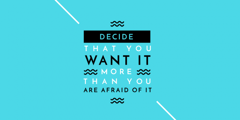
Aside from just dividing space and creating clarity, lines also help direct the eye. They provide a sort of visual guideline that helps you focus on points of emphasis in the design.
Imagine you have a graphic with a colorful but formless background and a text over the top. The text may get lost as your eyes bounce around the background, searching for a place to land. Even the lettering may be hard to focus on, as the flowing script font lacks structure. By using more straightforward lettering, a simple lined border around the text, or both, you direct the eyes — the straight lines act as visual arrows pointing to spots of interest. For this reason, even the most expressive designs need to include some lines (even if they’re softer or only implied) to keep viewers engaged.

Texture and Motion
We don’t often think of lines as texture, but they certainly can create the illusion of it. Think of a pen and ink drawing that uses super-fine lines close together to create different surfaces, from brick to fur to wood. Lines don’t just delineate — they can also be used to form these texture qualities that give your vision tangibility.
Lines can also imply motion (or lack thereof). For instance, diagonal or slanted lines feel unstable, as if they are imbalanced. They create a sense of apprehension or even movement. Vertical lines, however, are balanced and stable, and can help create a sense of height. Thus, the orientation and placement of lines can be a critical aid in forming the mood or action of an image.

Adding Lines to an Easil Image
Does your graphic need a few well-placed lines to emphasize a point or create movement? You can add lines to your Easil template by clicking the “Add Graphic Elements” icon and selecting “Lines.” You’ll see a variety of types that you can use to accentuate your text, divide the graphic, or point out interesting elements. You can change the colors, sizes and orientation to suit your purposes, or even add borders around text.
Start experimenting and discover what a simple line can do for your graphic design!

