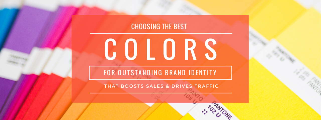
Choosing the right colors can help you establish a brand identity that stands out from competitors, boosts sales, and drives traffic. Of course, other design elements are also important, but the right color choice can mean the difference between excellence and mediocrity.
From logos to letterheads, digital images, posters, and banners having an attractive font and an interesting image might not matter if you don’t choose the right color to distinguish you from the competition.
What Does Psychology Say About Color Choice and Marketing?
The study of the effects of color on human psychology shows a strong relationship between color and mood. As such, color (and the mood it evokes) can also influence what a buyer thinks about your product or service.
It’s important to keep this in mind as you establish your brand identity. For instance, yellow and red have been found to be the most stimulating colors, while blue and black are the most calming. When used in the classroom, yellow, orange, and red were shown to help improve academic performance.
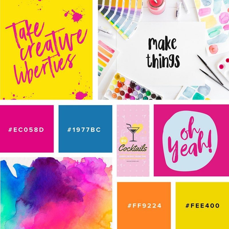
What Savvy Color Trends Are Worth Investing in Right Now?
Consumers tend to prefer different colors according to the season or year. Currently, the following colors have become particularly successful marketing tools:
- Jewel tones: Trending across all design fields are beautiful jewel tones. Ruby, emerald, jade, sapphire and onyx are making bold and dazzling statements in every design field this year. The emphasis is on bold statement and lux ury living.
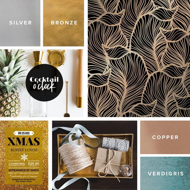
- Metallics: Eclectic industrial tones that echo the strength and brilliance of metals are also popular design trends. Copper, verdigris, bronze, silver and gold are being featured against darker backgrounds in order to provide a sense of illumination and preciousness.
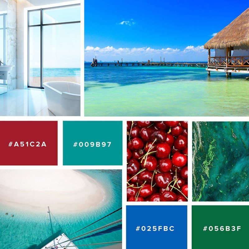
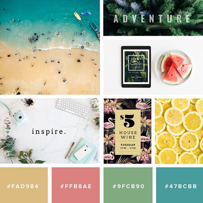
- Colors inspired by nature: In addition to verdant greens, think colors inspired by the foods we enjoy, such as tangerine, aubergine, grape, lime, lemony yellows, soft yellows and bright saffron. The soothing and invigorating colors of the waters are also strong trends, such as aqua, sky blue and turquoise. These colors remind us of the vibrancy and resilience of nature. They are invigorating even when presented in softer hues.
- Stripes and bold-colored rainbows: Stripes are larger, bolder and brighter this year, and this attractive and eye-catching trend can be seen in textiles and home decor.
Color Trends, Color Fads and Digital Marketing
Adjusting colors on print materials, such as packaging, logos and print ads, can be an expensive change. Digital marketing offers you the opportunity to explore color trends by season and even highlight color fads effectively to engage customer interest.
While fads were a big no-no in past marketing campaigns and spelled disaster for some companies, digital marketing has transformed the design playing field by allowing companies to make rapid color changes part of their mandate. In fact, many successful companies are making regularly scheduled changes to their social media and website logos, banners, posters, and digital images, and that kaleidoscopic color technique is really working. Consumers are taking notice, communicating with companies about color, and investing in products because they are inspired by what they see.
Noticing a color fad and working with that color scheme for a while is now an intelligent and market-savvy sales technique that shows your audience you are really listening to them. Establishing a brand identity that consumers associate with really caring leads to long-term design and business success.


