Serif vs Sans Serif Fonts
What are Serifs?
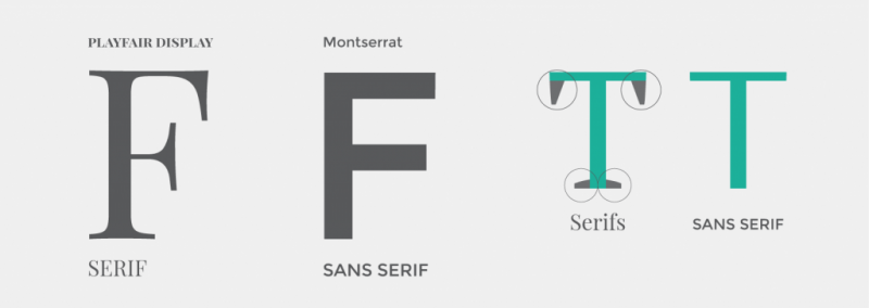
The small features on the ends of strokes in some fonts are known as “Serifs.”
Some common Serif typefaces are Times New Roman, Georgia, Palatino and Garamond.
In contrast, common Sans Serif typefaces include Arial, Helvetica and Tahoma.
When to use Serif and Sans Serif Fonts
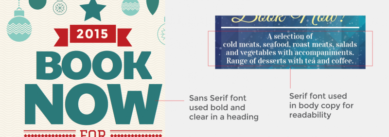
There are advantages to using both Serif & Sans Serif fonts in different designs. To break it down very simply, Serif fonts are easily readable at small body copy sizes, and Sans Serif fonts really stand out in large titles. There are many exceptions to this, but that is the most common usage.
One major exception is web. Since most displays are not as high resolution as printed media, Serifs can display poorly at small sizes. This is becoming less of an issue with improvements in technologies like retina displays, and 4k screens becoming popular, but the vast majority of displays are still low resolution when compared to print. So currently it is still best to use mostly Sans Serif fonts for web use.
Wrapping up the Difference between Serif and Sans Serif Fonts
Because of the difference between Serif and Sans Serif fonts, it’s important to be aware of a few key things:
- Don’t mix too many fonts in the one design. Keep it to 2 fonts (for a ratio of Serif vs Sans Serif fonts, one of each is probably enough).
- Think about the “mood” of the fonts you choose. This is often a key difference between Serif and Sans Serif fonts. Serif fonts can be very classic or formal and sometimes you hear them referred to as elegant. Sans Serif fonts are often described as modern, friendly and minimal because they have a stylish simplicity about them, without the decorative strokes.
- Consider which font suits best. Whether you choose Serif vs Sans Serif fonts (and how you use them) varies according to a number of factors, including the application you are using them on, the mood you want to convey and the project itself or content you are delivering. It also depends on factors like color and images used in the project. Yes, there is a difference between Serif and Sans Serif fonts, but they can both be used in a wide number of projects and applications.
Get started with Stunning Fonts in your Designs!
Check out our guide to the best free fonts here. It’s packed with 73 of the best free fonts you can use right now!