When you’re in the business of making impressions, it pays to have a physical card on hand. With so many people looking for ways to stand out from their peers and create that fantastic first impression, there is no better way to introduce yourself to prospective clients than with an on-brand, professional business card.
Designing a business card yourself, and with a limited ‘design eye,’ does not need to be complicated. The free tools and low-cost or free templates available online make it easy to design a custom card for your brand without the expense of hiring a graphic designer. Or the hassle of going through rounds of changes – and worse – not even ending up with being supplied the working files for when you need to create more in the future.
In this article, we’ll run through 5 helpful tips to help you create a stand-out business card in less than 30 minutes and also provide you with five free templates created by our Easil DesignStudio team!
WHAT INFORMATION DO YOU NEED TO INCLUDE ON YOUR BUSINESS CARD?
Before you get started, make sure to note down all the information you need your card to include and categorize these elements into Essential, Important, Optional.
Some examples of essentials are your name, your business or brand name, and your website, and contact details. Important items can include your location and business tagline. Optional items could be social media icons, a QR code, or even a ‘notes’ section for you or your recipient to write on.
1. FIND A TEMPLATE THAT SUITS THE AMOUNT OF INFORMATION YOU WOULD LIKE TO INCLUDE
Using the information you’ve compiled to include on your card, look through templates that will suit the amount of content, work through the essentials first, and then also ensuring you can fit the important items.
Consider whether you prefer a portrait style card or landscape, but unless there is a practical reason not to choose the other – be open to either style when you’re first browsing through templates! You may find that an alternative layout works better to display the contact information you have in a better format.
Ensure you make use of both sides of your card, spreading out the information to keep white space and balance and avoiding unsightly clutter, which can make your business look unprofessional.
2. USE A LEGIBLE FONT FOR YOUR CONTACT INFORMATION
Business cards are all about keeping in contact, so it’s essential to ensure that the details you put on your card are legible to the recipient, and allow them to do that – contact you, without any hassle – or squinting at the details!
It’s best to avoid the temptation of scripted fonts or modern serif fonts with extra detail when designing your business cards, as when used in smaller font sizes, they can be more difficult to read for anyone with sub-standard vision.
Wherever possible, you should use your brand fonts, selecting the options that have been created to use for ‘Copy’ or ‘Body Copy’ in your brand style guide.
Hot tip: Keep in mind that most times, when you’re designing your card on a computer, you’re looking at it zoomed in! Be sure to print out a copy on your home printer if you are not sure if the text will be legible or not, and adjust accordingly.
3. ADD YOUR BRAND LOGO, COLORS, AND GRAPHIC ELEMENTS
It’s easy to get lost in the shuffle! That is why if you want your business card design to be memorable for all of the right reasons, it must remain on-brand. Make sure that your logo and brand colors are prominently featured so people will instantly identify a trip down memory lane when they look at yours.
If you want to include some graphical elements on your card, make sure that they are on-brand, tying in with your website, printed collateral, or other existing materials. If you don’t yet have other marketing materials, keep it simple to start off with. Aim to avoid the card looking overcrowded, which can be distracting for recipients.
Consider using a professional photograph on your cards only if it’s a standard in your industry – such as Real Estate, Law, or Medicine.
4. PROOF YOUR BUSINESS CARDS – EVERY.SINGLE.LINE.
Always remember to double-check every part of your business card design before ordering or printing!
Many business card templates have placeholder phone numbers and other elements that can be missed if you rush through the proofing stage. That means going through all phone numbers, website URLs, social media handles, and QR codes. Print out your card proof at actual size, check that you can read it, and where possible, also run it by another couple of colleagues.
In addition to this, you’ll need to check the setup of your card is correct for print.
- Check that any images you’ve used are high resolution. It’s best to do a printout and eye-ball your proof to ensure it looks crisp enough, or double-check with your print professional if you’re unsure.
- Download your file as a PDF (always!). Select the PDF for print option in Easil, and also check the ‘Crops and Bleed’ setting to be turned on. This ensures your business cards will be trimmed correctly.
- Check your downloaded file for anything you may want to fix. Also check that any including images that extend past the edge of your card, extend through to the bleed area. If unsure, check with the team at Easil!
5. UTILIZE YOUR DESIGN ACROSS OTHER PRINT & DIGITAL MARKETING MATERIALS
Once you’ve started the branding process, it’s important to be consistent across all marketing materials. With your Business Card signed off, you can now use Easil to create Letterhead (digital or printed), labels, email signatures and more. Simply use the Resize tool to create different options, or you can select all the items on your business card and copy & paste them to a new template.
Don’t forget about taking this consistency through to social media headers and banners too!
5 FREE BUSINESS CARD TEMPLATES YOU CAN USE RIGHT NOW!
Ready to get started with creating your own branded business cards? Click on any of the designs below to start editing in Easil.
- Sign up for your free Easil 30-day Plus trial account.
- Log into your Easil account with a desktop computer.
- Click on the image of the business card template that you’d like to start creating with, from the selection in the post below.
- Once you have the template open, click on the elements you’d like to update – double click to edit any text boxes. Click on any image box to select it, and then drag across new images from the right sidebar ‘Images’ tab, on top of the existing ones to replace.
- Click the download button at the top right of the editor, and select PDF – Print as your file format. Ensure ‘Crops & Bleed’ is selected. Send off to your print professional.
Note: You can order cards directly through Easil’s on-line ordering too! Simply complete your design, and then click on the Purchase button located at the top right of the editor.
Available for clients in the USA, and Australia.
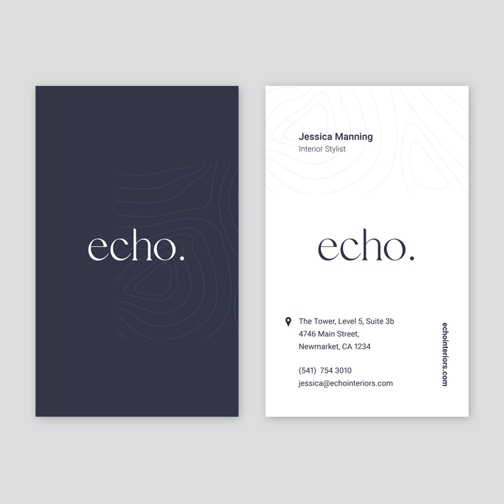
FREE BUSINESS CARD TEMPLATE 1: NAVY & WHITE CONTOUR DESIGN
This portrait business card design is clean and professional and suitable for a wide range of industries or brands. Easily customizable with colors and fonts, you can choose to keep the contour pattern design lightly watermarked on each side of the business card, remove it entirely, or update with a similar pattern placed into the background.
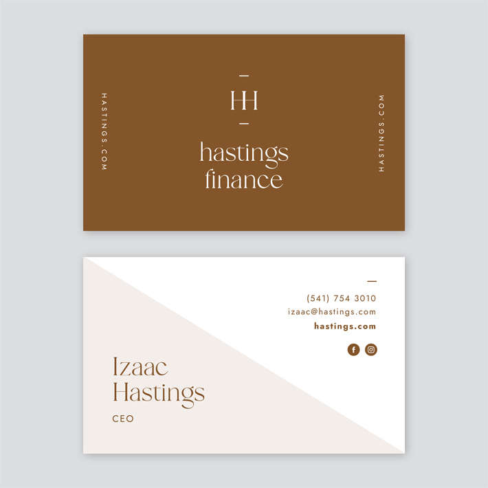
FREE BUSINESS CARD TEMPLATE 2: COPPER & WHITE COLOR SPLIT
The Copper & White Landscape card format features modern simplicity that is again useful for many corporate and personal brands. Choose to update the color scheme to any other darker color, to ensure there is a contrast between the text and the background for legibility.
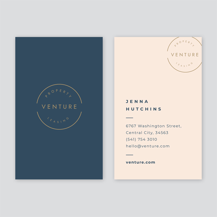
FREE BUSINESS CARD TEMPLATE 3: NAVY, BEIGE & GOLD CORPORATE
If you’re looking for a starter personal brand logo and card in one – this is one you should consider! Simple and stylish, the circle typesetting allows you to create a personal brand for first-time interviews, meetings, and more! As per other templates within Easil, you can edit it all, including fonts, colors, positioning of text & elements, in just a few clicks.
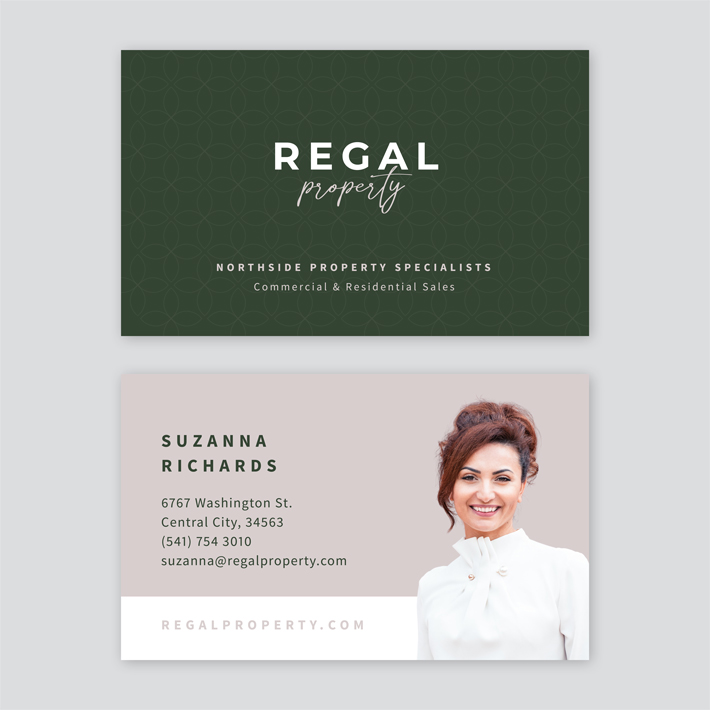
FREE BUSINESS CARD TEMPLATE 4: DARK GREEN & MAUVE
Featuring a personal image placeholder, this card template is perfect for Realtors, Legal Professionals, and more. Update your colors, logo and fonts, and add a clear photograph of yourself with the background removed, to polish off this card as your own.
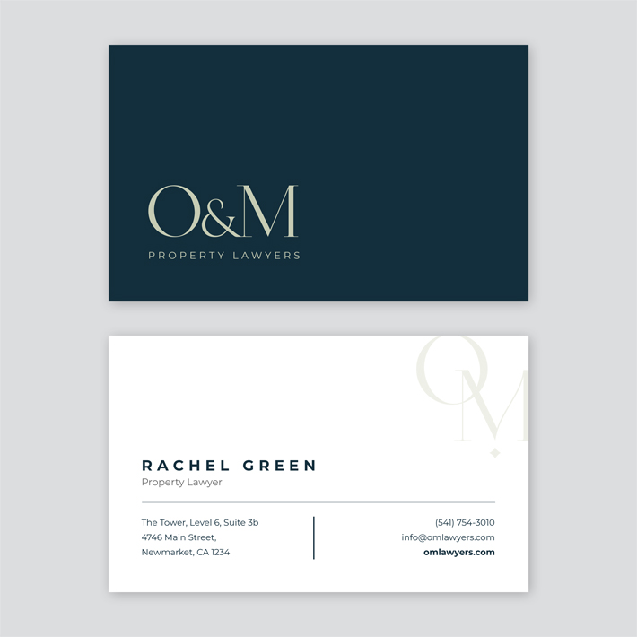
FREE BUSINESS CARD TEMPLATE 5: NAVY & NEUTRALS
In absence of a logo, monogramming your initials is a perfect option for anyone starting out in business or attending their first networking events. This navy and neutral business card will ensure you look professional from the start, and is easy to adapt to any other color and font. Remember to keep it simple for the best result.
OVER TO YOU
Are you ready to start DIY-ing your own personal or brand business cards? Our team is here to help! If you have questions about designing your cards, or the printing options available, click the (?) icon within Easil, leave your design link in the chat, and we’ll get back to you as soon as possible!
