
Keeping your design tidy and well organized isn’t the most fun part of drag-and-drop or DIY designing. But trust us when we say that just like keeping your pantry at home clutter free, doing the same with your designs and all their included elements will save your sanity, especially as they become more complex!
If you’re yet to discover the Layers Panel (located within the Easil editor, on the right sidebar), get set to have your mind blown with all that you can do! From easily selecting a design element or two, through to creating groups of layers that you can copy and paste from one design to another.. let’s dive in and take a look.
HOW TO USE THE DESIGN LAYERS PANEL
The layers panel is accessed in the right sidebar in the editor, and is available to all users, on every Easil subscription plan. When you have a design open that has any elements (eg text, graphics and/or images – anything apart from a ‘Blank’ design), click on the Layers panel to inspect how it looks.
Every element will be visible listed on it’s own separate line, which is a ‘Layer’, and on each individual page within your design.
Items at the top of the layer list are ones that display at the ‘top’ or the front of your design. And layers that are underneath those in the Layer list format, are behind in the design, with the lower most layer often being a background image.
Both layers, and layer groups are able to be clicked and dragged up, or down, within the layer stack to re-arrange their order and how they display in your design:
Layers in the panel also contain other icons and identifiers that you should become familiar with:
Visibility Icon:
The eye icon located on the left side of each layer is used to toggle the layer visibility on and off. With this functionality, you can ‘hide’ or turn off any layer (or group) from showing in your design, including on download.
It’s handy for when you’re not sure if you want to delete an element permanently or are still exploring design options, or even to temporarily work on your design without having obstructions. Click to turn it off, and you’ll see the layer eye turn to the hidden layer icon. Click to return it back to visibility at any time.
Layer Type Icons:
Next to the visibility icon, each layer contains a layer type or ‘kind’ identifier. These include Text, Graphic, Curved Text, Image, Text Table, Photo Grid and Groups.
Each type of layer can be manipulated with different types of editing features within Easil and can quickly clarify whether an element is a photo or a graphic, curved text or a standard text box, etc:
A standard text box is identified with the ‘T’ icon. This type of text box can have rich text applied to it (multiple fonts, colors and sizes) within a single text box. It can also have text effects (drop shadow, glow and text mask) applied.
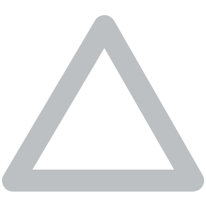
Graphics; also known as vector elements are identified by the triangle icon. These are graphics that are found in the Easil Elements tab and have various editing capabilities, depending on the category. They can include changing the color/s of the graphics, scaling them to any size, and also the ability to drop an image into a shape (Shape Masks, Photo Grids).
Image layers are symbolised with the ‘landscape’ icon. Images layers can be updated with a new image dropped on them (click image on design canvas, go to Images tab on right sidebar and click on new image to replace, or drag new image onto the placeholder). They can also have styling options such as filters, opacity out outline applied to them.

Curved Text is identified with the ‘T’ icon with the curved arc underneath. Curved text is limited to one font, color and size per text box, and cannot be edited from the layers side panel.
Text Tables are configurations of text in multiple columns and rows. These are a beta feature in Easil and are identified by the multi-column/row icon. You can read more about tables in this article.
Group Icon:
The group icon is another toggle option. By clicking on the Group arrow, you can open the visibility of the layers contained within that group. When expanded, each of the Layer type icons are viewable, as well as the toggles for visibility of individual layers within the group, for ultimate control.
Locking Icon:
If you (or a team mate) have applied any sort of locking or restrictions to the design you are working with, a padlock icon is applied to the right side of the layer, next to its title.
To view what the fine grained restrictions that have been applied to the layer are, click on the layer with the lock icon, and then down to the Locking panel (underneath Layers) in the sidebar.
Duplicate Group Icon:
This icon applies on hovering over any Layer Group. To quickly duplicate an entire group, hover your mouse over the group in the Layers panel and then click on the Duplicate icon that appears on the right side.
This duplicates the group with the same name applied, and moves it to the top of the layer stack. From here you can rename the group (double-click on the title and then rename), or click to drag the group to a new position within the stack. We’ll teach you more about manipulation of groups further on in this article.
New Group Icon:
The starting point to getting your designs organized is to learn how to create groups. It’s just a couple of steps:
1. Click on the New Group icon located at the bottom center of the panel, and name your group.
2. Click on any layers in the Layers sidebar (shift-click to multiple select) and drag them into your new group that has been created at the top of the layer stack.
10 WAYS KEEPING YOUR DESIGNS ORGANIZED BY USING LAYERS [& LAYER GROUPS] WILL SAVE YOU TIME!
When you first start designing with Easil, you’re likely to use one of our pre-designed templates. Within these designs, we like to practice what we preach and set up our designs with the Layers all neatly filed into Layer Groups.
Generally, we’ll have the elements grouped by their location within the design. For example, Heading, Copy, Image, Footer. The primary reason for this is to make an entire group of elements able to be manipulated at the one time, and the most frequent time this happens is when resizing. We’ll go into more detail on that shortly.
1. SELECT AND RE-ARRANGE LAYERS
If you want to quickly add a new graphic element and position it within a certain order within your design, the layers tab is the place to go! Simply click and hold on the layer you want to move, and drag it either up (to display at the front/top of your design), or down (to display further back).
You can do the same with moving groups of layers up and down within the panel, and saves clicking on the ‘Send Backward’ button several times.
2. HIDE VISIBILITY OF LAYERS
If you’re finding it tricky to select a layer by clicking or dragging on the design canvas itself, it’s likely due to the layer you need access to being located behind other elements. Using the visibility icon (the eye) to toggle the layer from showing on or off is a quick way to work without any obstructions.
As mentioned earlier, it’s also a useful feature for when you’re not 100% sure if you want to delete a layer from your design. If you might want it later, just toggle the the eye icon to ‘off’ until you’re sure you don’t need it.
This visibility setting is also available for entire groups of layers, or layers within groups.
3. GROUP LAYERS
Grouping layers is essential when you’re working with a complex design with many elements. As well as keeping things organized, it also allows you to take advantage of other features (outlined in the following few points!).
To create a group:
- Click on the ‘New Group’ button located at the bottom center of the Layers panel.
- When the pop-up appears, enter a name for your Layer group, such as ‘Heading’ Body Copy, Footer, etc.
- Your group ‘folder’ will appear at the very top of your layers. Click on your layers to drag them into the folder, either one by one, or by clicking Shift on your keyboard and adding multiple layers to your selection, and then dragging them into the group folder in one go. Alternatively, you can drag to select layers with your mouse on your design, and then move them into the folder in the layers panel.
Tip: Quickly duplicate groups including their folder structure by hovering over the layer group name. The Duplicate icon will appear which you can then tap to create an copy.
4. MOVE AND SCALE LAYER GROUPS
Now that you’ve learnt how to create a group, you can start working with the group of elements contained as a whole. And one of the most common ways to use groups, is to scale, or resize the group of elements in one go.
- Click on the group name in the Layers tab.
- Then click on the group on the design and drag to the it’s new position on your design.
- To scale the group of elements, click on the corner transform handle and drag outwards to increase the size of the group, on drag inwards to reduce the group size:
5. COPY & PASTE LAYERS [OR GROUPS]
This tip is our absolute favorite, and a huge time-saver! Try this tip if you have combinations of elements that you re-use in the same format over and over. For example a design footer (all your socials, logo and contact information) or how you style a group of graphic elements together for your brand.
Layers and Groups can be copied & pasted from one design to another, including other sizes in your Collection, and also to other designs in your Workspace.
- Click on the Layer Group name in the Layers panel.
- To copy, use your keyboard shortcuts (on Apple, use Command+C, and on PC use Control (Ctrl)+C to copy the group.)
- Click on the new design destination – that could be another design in your Collection via the Sizes tab, or a new design in your Workspace. Ensure you go to the new design in your workspace via the same browser tab, by clicking on the E logo at the top left to go to your Workspace.
- In the new design, either use your keyboard shortcuts to Paste (on Apple, use Command+V, and on PC use Control (Ctrl)+V), or you can also right click with your mouse to access the Paste menu.
Tip: If you have many groups of elements that you use frequently across designs, try creating one design that you store with all the group elements in the one document to easily open and copy/paste from.
6. RE-NAME YOUR LAYER GROUPS
By default, when you duplicate an existing group, the new group retains the same name as the original. Ensure you take the time to revisit the newly created group (that will be located at the top of your layers), and double-click the title to enter editing mode. You can then rename the group so it’s easily identifiable from the original when you return to the Layers panel:
7. UPDATE TEXT IN LAYERS
This is a handy tip for editing text on layers that are located lower down in the layer stack. Instead of finding the layer within the design canvas, you can locate it in the sidebar and double click on the text next to the ‘T’ icon. Replacing the content here will be reflected on your design.
Note that this tip only works on ‘standard’ text boxes with the ‘T’ icon, which means that curved text, and text tables are excluded from being able to be updated in this method.
8. RESIZE YOUR DESIGNS LIKE A PRO
You’ve learnt how to create a group, and also scale groups. With those 2 skills, you can apply them to resizing a design like a pro! Unfortunately, true resizing from one distinct size to another isn’t a one click option. Professional graphic designers adjust elements to make them fit in the new size document, and with grouping your layers and scaling them, you can work with these same principles.
- Group your Layers by their region on your design (eg Heading, Body Copy, Footer).
- Keep elements in the same hierarchy on your resized design.
- Adjust the size of non essential groups of elements on your resized design, or consider removing them (use the visibility icon to hide them while you decide).
9. MOVE A LAYER OR GROUP TO ANOTHER PAGE
You can quickly shift a Layer or Layer Group to its identical position on another page by dragging the layer or group via the Layers tab.
Just click and drag it up or down in the layers tab onto the page you want it to appear on!
10. LOCKING LAYERS TO STAY ON BRAND
This final tip is not so much about organization of your your personal designs, but one that is essential for teams that need to work together on templates to stay 100% brand compliant.
Applying restrictions to elements in your design is managed through the Locking tab. However, for your team mates who are just editing designs from your Team template masters the Layers tab provides a quick reference point to see which items have some type of restriction applied.
It’s also handy as a Team Designer to quickly look through the Layers list to see what has and hasn’t been applied to a design, as well as access selecting multiple layers to apply similar locking to at one time:
Read more about working with Locking & Restrictions here.
OVER TO YOU
The concept of design layers can be intimidating if you’re new to DIY-designing. But taking the time to get to know this feature is well worth your time! If you have any questions on it, jump into our Easil All Stars Facebook Group or reach out via the in app chat.


