
Creative or Photoshop-style text effects can provide the finishing touch to design projects such as special event posters, YouTube thumbnails, and other personal graphics where you are safe to veer off-brand and have some fun! In this article and video, Easil’s Art Director Kris, walks you through 6 awesome editable text effects that you can apply to any font in Easil; including your own uploaded fonts. These include:
- A realistic, glowing neon effect with lens flares and accents
- Gradient filled text effect with reflection
- Layered letters with shadows
- Cloudy smoke text effect
- Vintage style outline and shadow effect, and
- Glitter text effect with additional sparkle accents.
In the following examples, Kris works on an Instagram Post size graphic (1080x1080px). If you choose a different page size for your designs, you’ll need to adjust the scale of some of your effects.
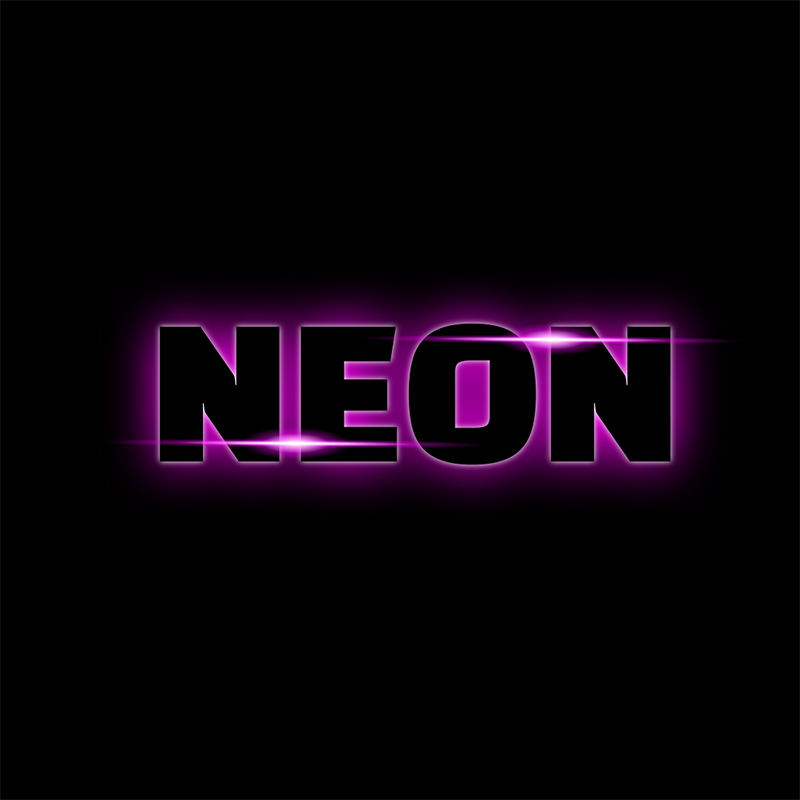
#1 GLOWING, NEON TEXT EFFECT

In this first effect, Kris shows you how to use dark text on an equally dark background, and use a hot pink glow to make it stand out. This is a great effect to use on Black Friday and Cyber Monday graphics, as well as Halloween posters and graphics.
- Add text to your design by adding from the ‘Text’ tab on the right sidebar. In this example, Kris has used Black Hans Sans for its retro styling and boldness.
- Apply a bright color to the text by selecting it and clicking on the color options. Choose a hot pink to duplicate the effect created in our example.
- Change the background color of the graphic to black by clicking off any elements (eg to the side of the page) and then choose black from the color picker from the top toolbar.
- This effect is made by using 2 types of glows, a background and a foreground glow. You’ll create the background glow first. With the text selected, click on the shadow button in the Actionbar and select the glow preset. Update the blur slider to 70 and choose the same bright pink we use in the text.
- To create the foreground glow, duplicate your text and update the color to match the background. Remember glowing effects generally work best on darker or super saturated colors.
- With the foreground text selected go back to the shadow button in the Actionbar, choose glow again and update the blur slider to 8, and set it to white.
- Select both text boxes and use the align tool to position them exactly.
- Add in some lighting accents by going to images, selecting Stock Images and search for ‘flare’. Adjust the size and move it over the top of your letters. To get an extra accent duplicate it and make it slightly smaller.
- To adjust the lighting effect to white, click on effects in the Actionbar and drop the brightness slider down to -100 Then check the Invert toggle to make it white.
- Select both flares and use the align tool again. Click ‘align middle’ and position them on the edges of your letters. With both flares still selected, duplicate them again and re-position as per Kris’ example.
Hot tip: By opening the Layers panel and selecting both text items you can then try out different fonts using the same effect. Some other good one to try are Anton and Jost Black.
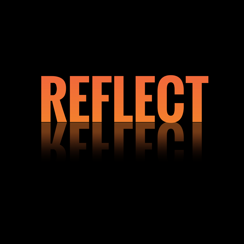
#2 GRADIENT FILLED TEXT WITH REFLECTION

This next effect combines a font filled with gradient color, and teamed with a reflective effect. Follow Kris’s steps to recreate this text style:
- From the right sidebar in the editor, add a new text box and type in your text. Then apply a condensed font – Kris has used Oswald Bold.
- To add the gradient to your text, ensure it’s selected and then click on ‘Mask’ from the Actionbar. Then go to Images in the sidebar, select Stock Images and search ‘Gradient’. Click to add your chosen gradient to fill your text.
- To create the text reflection effect, you’ll need to make a copy of the text and convert it to an image so it can be flipped. To do this, go to your Colors pop-out, and change the background color to transparent. Then click Download, choose PNG, and check ‘Export to my Images’. The image will be saved to your ‘My Images’ section!
- Select it and drop it onto your canvas. Stretch the edges so it fits the proportions of your canvas and it sits over the original text.
- Select crop in the Actionbar and bring in the edges like this. Click flip vertically in the Actionbar and shift it down. You can use your arrow keys to get the perfect position. Then right-click, and select ‘Send to Back’.
- Update the background color to black, and drop the opacity of the reflection to 40 percent.
- To finish off this effect, add in an extra fade. Go to images, select ‘Stock Images’ and search for ‘fade’. To change the color, go to Effects (in the Actionbar) and bring the brightness slider down to -100.
#3 LAYERED LETTERS WITH SHADOWS

In this part of the tutorial, Kris shows you how to add shadows onto your text – but not like you’ve used them before! You’ll create individual letters to create shade between each letter pair:
- Start by adding a text box to your design, and selecting a bold font. Kris has used ‘Jost Black’. Then typeset the first letter of your word, eg the letter ‘S’.
- Reduce the size of the text box bounding by dragging the edges in – this will make it easier to work with this effect for the rest of the design.
- With the letter selected, click on Shadow in the top toolbar and open the settings. Make the blur 60, keep distance at 10 and set rotate to 180. This creates a strong shadow around the letter.
- Change the color of the letter to white, and make the background black.
- Duplicate the letter, and then double-click to edit. and change to the second letter in the word.
- Move the second letter so it’s slightly overlapping the first and the shadow effect will begin to show!
- Continue to duplicate and update the letters until your word is complete. Position them so each letter is slightly overlapping the letter behind.
- Select all the of letters by dragging your cursor over them, and then tidy up the design using the align button and selecting align center.
As this effect is fully editable, you can play around with different fonts! You may need to adjust the position of the individual letters to achieve the overlapping letters
Hot tip: If you want to adjust the color, remember to keep your shadow color on each letter the same as your background.

#4 CLOUDY SMOKY TEXT EFFECT
The next effect is a smoky effect that combines layered images from the Easil library with your own text. Here’s how Kris created it:
- Add in your text, enlarge it and position it to center. Change the font to Oswald. Apply effects like bolding or italicising if it suits your style!
- Tidy up the bounding box and rotate it to 350 degrees.
- Set the text alignment to left, and adjust the letter spacing to -75 to make the letters look like they are joined.
- Make the background black, and the text white.
- To start building the smoke effect, click on the text and then on ‘Mask’ from the Actionbar. Go to images, select stock images and search for ‘Smoke’ and click to add into your text.
- To update the color to the same as your background, click on effects and bring the brightness slider to -100. Then click on opacity and set it to 40.
- To add in the rest of the smoke, go back to the Images tab, select stock images, and search for ‘smoke’. Kris added in the first one in the results, deselected that copy on the design, and then added in the second smoke option. Right click and send to back so it’s behind your text layers.
- To make the effects white, select both and click on Effects in the actionbar. Drop the brightness down to -100 and check invert.
- Add in an extra glow by going to the Images tab, select stock images and search for ‘Fade’. Choose the green option (as per Kris’s video) and repeat the same process to make it white.
Hot tip: As these effects are transparent, you can get some pretty cool color variations just by playing around with hue effects in each layer via the Effects > Filters options in the top navigation bar.

#5 VINTAGE STYLE OUTLINE & SHADOW EFFECT
We’ve called it vintage, but this text effect looks striking as an enhancement on many modern fonts too. Our picks are chunky scripts – like this example!
- Start with a blank post size and add a text box. Choose a Vintage retro style font such as Vervelle Script.
- We want to make sure our background color is always bright, in a slightly darker tone to make sure your effects stand out, so something like a deep purple is great. Then make the text white.
- To start getting the shadow layers on your text, click on shadow in the actionbar and select the ‘hard’ preset. Keep the distance at 10, and from template colors select the same color as your background. Scroll down and click on the color picker to open up more options. Select one of the tints which run down the side of the color picker.
- For the first shadow we’ll choose the first tint.
- We want to create a few more shadow layers so duplicate the text and open the colors pop-out. Select the same color as your background again and open the color picker to see the tint options. Click to select one of the tints.
- To update the shadow, go back up to Shadow in the Actionbar and from template colors choose the background color again. Open the color picker and this time select the darkest tint. Scroll back up, and update the distance to 20, right-click and send to back. Select the top layer and shift it down so each shadow is slightly overlapping.
Hot tip: Duplicate your page and try out some different fonts to see what works best! And if you want to give different colors a go, remember to use those pre-selected tints from the color-picker.

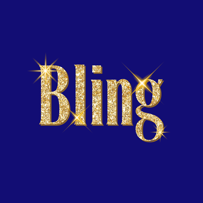
#6 GLITTER TEXT EFFECT

The final text effect Kris takes you through is this awesome glittery, bling style text. It’s an OTT effect that you can use for event promotions and celebrations.
- Start with a blank design post, and add a text box, along with your font choice. Octane Condensed is used in Kris’s example.
- With the text selected, click Mask in the Actionbar and go to the images tab. Choose Stock images, and search for ‘Glitter’ in the search input field.
- Go to the Mask effects click on ‘View more’ and bring the saturation up to 60.
- To update the background color, go to colors and scroll down to color picker to see more options. Choose a blue, and on the colour map move the selector down to get a nice deep blue.
- To add in the edge to the text go up to shadow and select the hard preset. Scroll down and click on the eyedropper. Hover over the glitter and choose a dark tone. Open up the color picker and adjust the color on the color map to get the perfect dark color.
- Now let’s add in our lighting accents. Go to images, choose stock images, and search bling. Let’s choose this one. I’ll resize and position it like this.I want to get some color and depth on my lighting accent, so I need to update the color first. So with it selected, go to effects, click on invert and then view more, And make the hue to 300 – this changes the pink to gold. I’ll add the filter id into the description so you can just copy and paste it into your design.To add depth to the lighting accent, I’ll duplicate the bling and resize it down to around half the size. Now go back to the effects and bring the brightness down to -100. Because it’s already inverted, it will make the bling white.Select both blings and click on alignment in the actionbar. Select both Align Center and Align Middle.
Duplicate the bling/sparkle effect and re-position to the other side of the text. Then for variations to the lighting accents, choose another bling style and repeat the process.
A word of caution to wrap it up! Using text effects like these is fun, but keep in mind that simplicity is key! Once you add a text effect with this much impact to your design, you won’t need much else, or the elements will all be competing for your audience’s attention, and will be overwhelming. Just like photoshop text effects, you should only use them in the right application, and in small doses!


