From the types of content you can create on LinkedIn to the correct LinkedIn Image Size, let’s dive into how to get results on LinkedIn with your visual content.
By the end of this post, you’ll have all the LinkedIn Image Size templates and sizes you need – and strategies to use them – at your fingertips.
Far too many people underestimate LinkedIn. If you think of LinkedIn as a dry and dusty place to visit only when you need a career change, you are missing out on opportunities that could make a big difference to your wallet.
In 2018, reports indicated that LinkedIn had reached well over 590 million users and over 260 million monthly active users. It’s been reported that 40% of active users are using LinkedIn daily, and LinkedIn is not showing any signs of growth slowing! This is up from Apptopia’s estimates that there were 227 million monthly active users in 2017 which was just about double the monthly active users in 2016.
It should be noted that LinkedIn doesn’t specify monthly or daily active users, only users in general. Not all of LinkedIn users are active each month. This is likely because a cohort of their members visit the site sporadically (ie to update resumes) when in ongoing employment. This is in contrast to other members that are more active when they are using LinkedIn for business or networking purposes. And of course, many users become more active on LinkedIn when they are in job-search mode.
What’s working on LinkedIn right now?
If you haven’t been on LinkedIn for a time, you will notice that there are far more images and videos in your news feed. And more people interacting! Microsoft bought Linkedin in 2017 and since then, the outdated and slightly stodgy LinkedIn user experience has been updated. The most important improvement has been the Facebook-like news feed experience. Engagement levels are up.
Now, here’s an exciting figure: Only 3 million people post to LinkedIn each week! This means that if you’re proactive on LinkedIn and post content regularly to LinkedIn, you will get noticed.
It’s also worth noting that 60% of LinkedIn traffic is generated from mobile devices. This is lower than 95% of Facebook traffic and 85% of Twitter traffic but it is worth considering how your images appear on mobile.
Do you want to know the best LinkedIn Image Sizes to use? Keep on reading to find out how to make the most of your images whether it is on your Profile Page, Company Page, in Groups, in published articles or the posts you share. And there are even some places for images on LinkedIn that you might not have considered before!
Why Images Matter on LinkedIn
You may not realise it, but LinkedIn is one of the most visual platforms on social media, and has been for a long time. You can share images, video, SlideShare presentations, Live video and more! So with this in mind, let’s take a look at why you would consider using visual content on LinkedIn and what LinkedIn Image Sizes work best:
1. Personal Branding
If someone Googles your name, there is a strong chance that the first search results are going to include your LinkedIn Profile. Even if you have been building your personal brand for years, your LinkedIn profile is likely to be in the top five results.
Go on test it out, I’ll wait for you to get back…

Your LinkedIn Profile may be the first impression that someone has of you online, so you want your profile to shine.
2. Corporate Branding
LinkedIn Company Pages help build your brand by providing a place for people to find out more about the company without needing to leave LinkedIn. It’s also a great place to help recruit new talent.
Make sure you use the best LinkedIn image sizes on your Company Page whether you are a small or large business.
3. Engagement
LinkedIn is business networking on steroids. Interactions help to build business relationships and increase your visibility. More visibility creates more opportunities.
4. Traffic
If you’re Business to Business (B2B), then pay attention to this statistic: 64% of social media traffic to B2B corporate websites originate from LinkedIn, according to a large study by Econsultancy in 2013.
5. Leads
LinkedIn is highly effective for converting visitors to leads. Research by Hubspot in 2012 showed that LinkedIn was 277% more effective at lead generation for B2Bs than Facebook or Twitter.
Why Size Matters for LinkedIn Images
LinkedIn is a professional social network. Everything about your profile and your company needs to look professional. The last thing you want is your images letting you down even if you are a solopreneur working from a spare room in your house.
Three big mistakes that people make with images on LinkedIn:
- They don’t use images in all the available places. There are more places than you think!
- They post an image that has small resolution, so the image looks grainy. LinkedIn suggests that you use an image that is close to their maximum suggested size as possible. Bigger file sizes improve the quality of images on LinkedIn.
- They post the wrong dimensions, so the image gets distorted or cropped in the wrong place. If you add text to an image, make sure that your text is not hidden or cut off. We’ve provided tips for this below in this post.
Lets discover how to avoid making these mistakes and find out how a DIY design tool, like Easil, can help you to resize your LinkedIn image size to the perfect size. And you may be inspired with great design ideas too!
How to use the Perfect LinkedIn Image Size for Social Media Networking
A DIY design tool like Easil can not only help you to get your LinkedIn image size right every time, but will also help you to create great designs ideas too. We’re going to cover:
1. Image Sizes for LinkedIn Profiles
- LinkedIn Background Image Size
- LinkedIn Profile Image Size
- Multimedia Image Sizes to enhance your Profile
2. Image Sizes for LinkedIn Company Pages
- LinkedIn Cover Image Size
- LinkedIn Company Logo Size
- Enhanced Company Page Image Size
3. Image Sizes for LinkedIn Posts
4. Image Sizes for LinkedIn Published Articles
5. Image Sizes for LinkedIn Groups
You’ll have all the LinkedIn image sizes you need by the time we reach the end of this post!
LinkedIn Image Size Infographic
Let’s start with our super handy infographic that shows you an overview of the LinkedIn Image Sizes. Save it to Pinterest, bookmark it or add it to your desktop for furture reference. It’s a “Quick Reference Guide” to the key information in this post.
Then continue scrolling down for a full break down of all the LinkedIn image sizes in detail.

How to create all the Image Sizes that you need in Easil
A major benefit of using a DIY Design tool is that it lets you access up-to-date social media image sizes (or in this case, the perfect LinkedIn image size) as well as easily resize images to the size that you need.
At Easil we keep our templates as current as we possibly can. We’re also adding new size templates over time, including some LinkedIn templates. Currently we have templates for Company pages, but you can easily resize for other LinkedIn graphics using our size guides below.
Note: LinkedIn templates can be a challenge to create in a way that allows for optimization on every device and for every size orientation. We don’t have every possible type of LindedIn templates in our system yet (as there are many). However, we have provided tips for creating your banner or image in a way that will allow you to post it, without cutting off any crucial information.
Tips for Using LinkedIn Templates in Easil:
- Open your Easil Account and choose Create Design.
- Expand the choices for Social Media.
- Click on the recommended image size for LinkedIn ie LinkedIn Cover (Company)
- Choose one of the beautifully designed templates.
- Customise the image to the exact dimensions you need

As we mentioned above, if you can’t find a template for your desired LinkedIn image, do the following:
Tips for Resizing Your Designs as LinkedIn Images
- Open the design you want to use in Easil in your Workspace or choose a design from Templates.
- Click on the Resize Tab in Right-Hand Panel.
- A panel will open up to show the name and size of your current image and options as follows: Edit, Resize, Duplicate Design and Remove.
- Choose Resize.
- Choose Custom from the drop down options.
- Add the correct Width and Height in Pixels for the image you want to create in LinkedIn. Use our guide below to find the right pixel dimensions. For example, for a LinkedIn Background Image Cover Size, you would enter 1584 x 396 pixels (or the equivalent in 4:1 proportion).
Now that you know how to edit your designs and templates, it’s time to look at what image sizes work best on LinkedIn.
LinkedIn Background Image Size
Your LinkedIn Background Image allows you to add some personality. This image lets you showcase your branding or give a visual of what you do as a business. Don’t leave the default background provided by LinkedIn. It makes you look as though you’re not taking LinkedIn seriously, so add a custom image to your profile!
As we explained in this post about Twitter background images, consistency is key across social media platforms and your LinkedIn background image and Avatar are perhaps the most important of all.
Here’s an example of an effective LinkedIn background image from our founder, Annette McDonald:

Current LinkedIn Image Size – Background
- LinkedIn Background Image Cover Size in pixels: 1584 x 396 pixels or exactly 4:1 proportion.
- File type: JPG, GIF or PNG.
- No larger than 8MB.
However, there are a few things you should consider, as the LinkedIn Background Image is not all that it seems to be. Let’s take a look at what you need to know before designing your LinkedIn Background Image:
Things to know when you’re designing your LinkedIn Background Image:
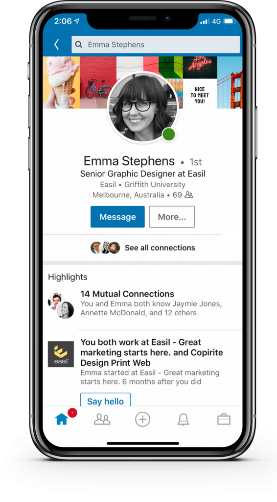
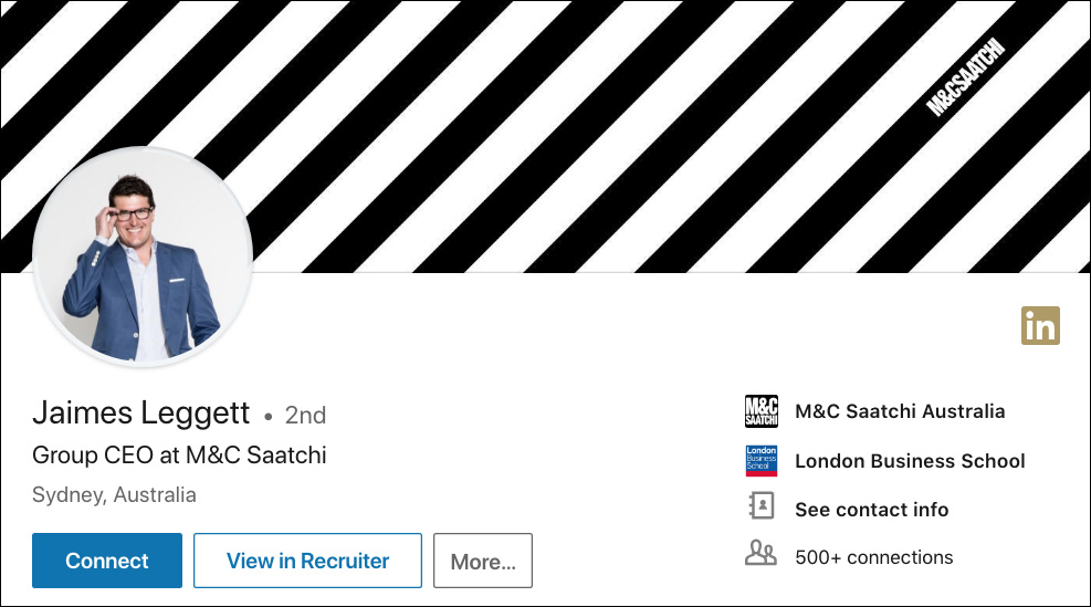
Designing the perfect LinkedIn Background Image is tricky because the image is quite narrow, especially when viewed on desktop, as in this example:


It’s important that you lay out your design so that content is not obscured on any device. Here’s what you should consider:
- Make sure that text is positioned towards the right of your image so it’s not obscured. The safe usable space is around 500px to the right of your cover image.
- Be aware that your Profile Picture encroaches into your LinkedIn Background Image to the left when viewed via desktop and in the centre when viewed on mobile devices. The display may change depending on the browser size, so design with this in mind.
- It doesn’t allow much space to add words, so keep text to the minimum and keep your design simple. Use Easil’s text tool to add text to your design.


Search “LinkedInGuide” in the Easil image library to use.
Note: LinkedIn also includes some handy features that allow you to do basic editing on your design. You can crop your banner, add filters, adjust colors. And if it doesn’t work out, you can delete the image and start again.
Hot Tip: If you want to source fabulous free photographs that you can use for your LinkedIn background image without worrying about copyright and attribution, read this article we wrote about Free Stock Image Libraries.
LinkedIn Background Image Ideas
It’s unlikely that you will change your image often. If you do want to promote an event or have a seasonal picture, make sure you put a note in your diary to change it afterwards.
Here are some ideas for your LinkedIn Background Image:
1. Give a visual representation of your profession, product or services.
2. Upload a picture of you at an event. Michael Stelzner’s image with speakers from his event, Social Media Marketing World is a great example:

3. Include your company colours with some text that highlights your philosophy, or your “why”.
4. Include a striking pattern or design that makes you stand out.

5. Add a picture of your city, or a local famous landmark to show where you are based.
6. Make a collage of pictures to show your values, as in this example from Bill Gates showcasing his not-for-profit ventures at the Bill & Melinda Gates Foundation.

7. Use a picture of your studio, restaurant, shop or office.
8. Add a beautiful image with a quote that shows an insight about how you think.
Here are some free Easil templates ready to go for your LinkedIn personal profile cover:


LinkedIn Profile Image Size
It’s important to get your LinkedIn image size and style right for your profile image. A friendly head-and-shoulder image makes you approachable on LinkedIn.
Don’t be tempted to use a logo. People connect with people. Save your logo for your company page.
It’s worth getting a professional photographer to take your image as it is the part of your profile that is viewed most often. The thumbnail of your image appears in the news feed, group conversations and in search results. It needs to be instantly recognisable as you.
Current LinkedIn Image Size – Profile Image
- LinkedIn Profile Image Size in pixels: Any size between 400×400 pixels and 20,000 x 20,000 pixels will work.
- Maximum size for Profile Picture: 8Mb
Things to know when you’re designing your LinkedIn Profile Image:
The LinkedIn Profile Image size is square. If your image isn’t square, you can use Easil’s square template to make sure that it’s cropped exactly the way you want it to be.
LinkedIn Multimedia Image Size to Enhance Your Profile
Did you know that you can add images, presentations and videos to enrich your LinkedIn Profile?
You can add multimedia to your summary and to your work experience. Here are some examples from Linkedin Top Voice and influencer, Goldie Chan:


Things to know when choosing multi-media images for your LinkedIn Profile:
You can upload an image, document or presentation to your LinkedIn profile.
Or, alternatively you can add a link to the online media you wish to display. Either way, LinkedIn has more options than ever before for adding visuals to your profile. That’s more ways for you to stand out!
Current LinkedIn Image Sizes – Multimedia Images
- LinkedIn doesn’t specify the size, but it’s best to keep your images to landscape format. It’s safe to use the same ratio that they suggest for posts which is 1.91:1 ratio or 1200×627 pixels.
- The following file formats are supported: PDF, PowerPoint, Word, OpenOffice, txt files, jpg/jpeg, png, bmp, tiff, gif (only the first frame will be extracted)
- Max file size: 300MB.
- Max resolution for images in 120 mega pixels.
Three Hot Tips for adding Presentations to your Profile:
- LinkedIn owns SlideShare. SlideShare is the YouTube for business presentations and it has 70 million monthly active users. If you have a presentation that you want to feature, upload it to SlideShare which will automatically add all the text of your presentation as SEO. You can share Slideshares across social media platforms and people will be able to click through your slides without leaving that platform. So, upload your presentations to Slideshare and then add the link to your LinkedIn Profile. Take advantage of it!
- Use 16:9 rather than 4:3 ratio when uploading for LinkedIn. This is the format that displays the best.
- Take a look at Easil’s templates for presentations to create a professional looking presentation, quickly and easily.
LinkedIn Company Page Cover Image Size
Make sure that you add a beautiful representation of business on your company page rather that leaving the standard background. Your cover adds another dimension to your business, so let’s look at the best LinkedIn Image size for your company page.
Current LinkedIn Image Size – Company Page Cover Image
- The recommended size from LinkedIn, in pixels is 1536 x 768 pixels. However a great deal of this size is not displayed on either desktop, nor mobile, so it’s best to observe the limitations with a guide:


Search “LinkedInGuide” in the Easil image library to use.
Things to know when designing your LinkedIn Company Page Cover Image:
When designing your company image page, follow similar guidelines to your personal LinkedIn Background image size. Again, the banner is narrow, so choose images that will suit this style.
For the most part, you won’t include any text. Keep it to images only, as a large part of it will be obscured with your Company name and information. Choose an image that represents your company well, and oozes your brand voice.
Also, be sure to check how your banner looks on multiple devices, including mobile. Ask your team to check it first on their desktops and mobile phones.
Here are some ideas for your LinkedIn Company Page Cover Design:
1. Show your products e.g. Lego

2. Show behind the scenes e.g. Airbnb

3. Show your branding in a striking visual way e.g. Burberry

4.Use a collage, or grid of images e.g. Nike or The North Face


As you can see, you can get really creative with your LinkedIn Company Page cover image!
Hot Tip: Use one of our Easil LinkedIn Cover (Company) templates to make it easier for you! Find them in Templates > Social Media > LinkedIn Cover (Company).
Here are some free Easil templates ready to use for your LinkedIn cover image:
1. Image Grid


2. Icons or pattern background, with or without your company slogan


3. Collage of images using creative frames to display artwork, photography, or any visual project


4. Word Cloud

5. Meet the team or behind the scenes

6. Our company logo or slogan


LinkedIn Logo Image Size
Don’t forget your company logo when it comes to the perfect LinkedIn image size. Your company logo will be displayed as a square. Make sure your logo looks professional if you have a landscape or portrait logo by uploading it as a square format.
Current LinkedIn Logo Image Size
- The recommended logo image size is 300 x 300 pixels.
Things to know when you’re designing your LinkedIn Logo Image Size
This is the one place you should use your actual logo (compared to your personal profile where it should be a photo of you and not a logo).
Use Easil’s blank Instagram template to do this easily, as it will give you a square blank canvas to work with to which you can attach your logo.
Enhanced LinkedIn Company Pages
If you have upgraded your Company Page to include a Careers Page, you will be able to add many more images. The following sizes will be useful to make sure you add the correct dimensions for each of the extra images numbered:
Current LinkedIn Image Sizes for Enhanced LinkedIn Company Pages:
- Overview tab image – 360 (w) x 120 (h) pixels
- Hero image – 1128 (w) x 376 (h) pixels
- Custom Module images – 502 (w) x 282 (h) pixels
- Company Photos – 900 (w) x 600 (h) pixels
Find out more information about the recommended image sizes in this article by LinkedIn.
Things to know about Enhanced LinkedIn Company Pages:
Posts on a company page will get substantially more reach if they are shared by employees on their personal profiles. According to LinkedIn’s Official Guide to Employee Advocacy, people on LinkedIn on average have ten times the number of followers than the average company page and content has twice the click through rate when shared by employees versus the company page.
Did you Know? Businesses that post at least once per month have been shown to gain followers six times faster than those who don’t.
LinkedIn Post Image Size
The days of text-only updates for LinkedIn has gone and most posts include visuals of some sort now.
Images work well, but consider also adding SlideShare and video into your content mix. SlideShare posts get shared ten times more often than any other post.
You should also consider adding video to your posts. Video posts get six times the amount of engagement than any other post. Note: at the moment LinkedIn doesn’t support gifs.
Current LinkedIn Post Image Size:
- Adding a link in your post will affect how your images are displayed. If you add a custom image to an update with a URL, use a 1.91:1 ratio (1200×627 px) which is exactly the same as Facebook.
- Your Linkedin image size for posts must be more than 200px wide. If your image width is less than 200px, it will appear as a thumbnail on the left side of the post.


Things to know about LinkedIn Post Images:
If you’re adding an image only or text with an image (no links), Linkedin says that the image will be enlarged to fit the feed and won’t be cropped on mobile. The newsfeed on both desktop and mobile usually shows horizontal, square and portrait images.
LinkedIn Published Articles
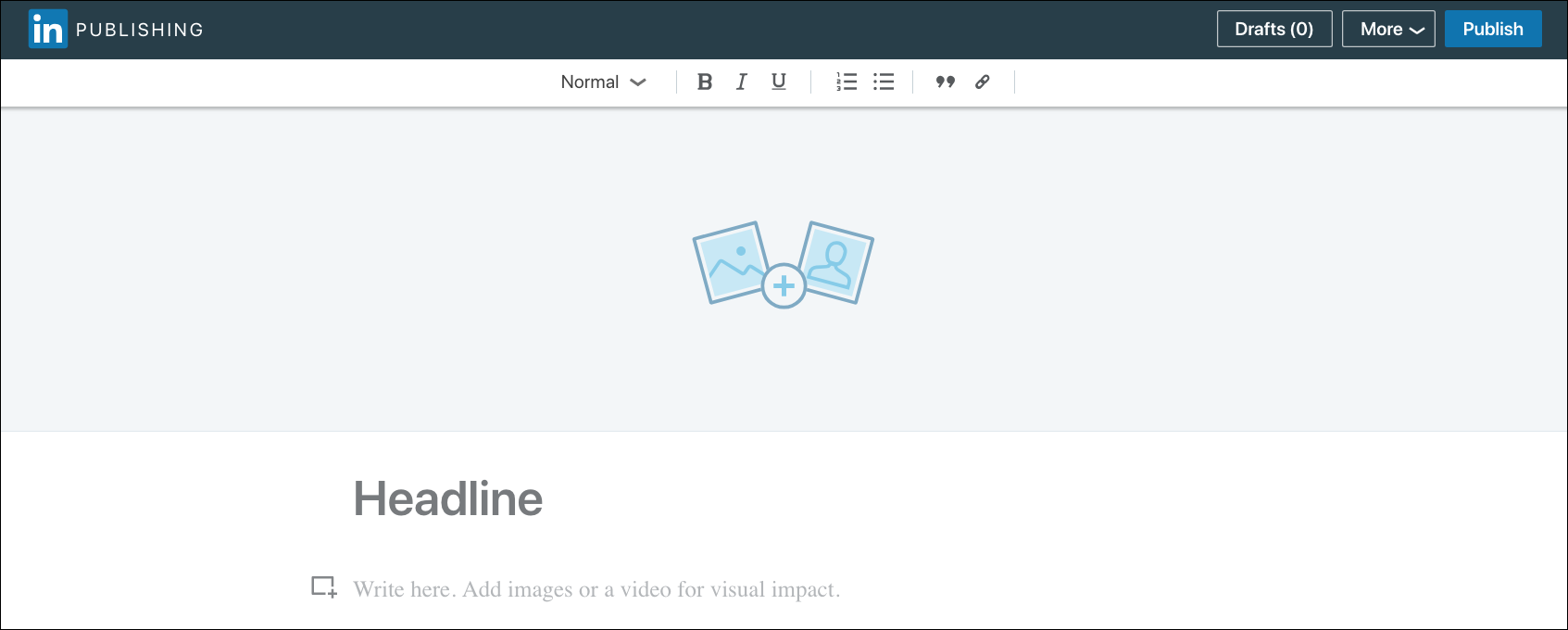
Over a million unique people have published an article on LinkedIn. A Published Article is LinkedIn’s long form content like a blog post. At the moment, 100,000 organic articles are published weekly on LinkedIn.

LinkedIn Published Article Cover Image Size
Create the best impression of your article by adding the right image size for the cover.
Current LinkedIn Published Article Cover Image Size:
- According to LinkedIn, the for best viewing results, the cover images in articles should ideally be 744 X 400 pixels.
- Tip: Use the Facebook Post template in Easil and customise the size.
LinkedIn Published Article Image Size
Break up your long form article by adding pictures. OKdork did research into the 3000 most successful Published Articles and discovered among other things that eight images are the optimum amount of images to add.
Current LinkedIn Published Article Image Size:
- According to LinkedIn, for best viewing results, the cover images in articles should ideally be 744 X 400 pixels.
- The file size limit for images you add to your articles is 10 MB.
- The LinkedIn publishing tool supports the following file formats for article images: JPG, Static GIF and PNG.
Find out more about LinkedIn Publishing articles here.

LinkedIn Group Image Size
LinkedIn Groups are a popular way to network on LinkedIn. They can also help you to establish authority in your niche. If you start a LinkedIn Group, make sure you include a professional Group Image.
Current LinkedIn Group Image Size:
- Logos are square images, at least 100×50 pixels in size.
- The image should be in JPEG or PNG format.
Things to know about LinkedIn Group Images:
LinkedIn will only allow you to make five changes to your LinkedIn Group’s identity and updating your logo counts as one of those changes, so be aware of this when changing your visuals.
Want more Image Size Posts?
Now that you’ve finished reading our LinkedIn Image Size post, why not check out our post about Twitter Image Sizes here.
Wrapping it Up
We bet that you’ve discovered that there are more places to add images on LinkedIn than you first thought. Are we right?
Make sure you put your best foot forward by adding the perfect LinkedIn images size to your LinkedIn Profile, Company Pages and posts.
And remember, if you get stuck, either use a template or refer to the optimum sizes we have listed above. It’s easy to resize designs in Easil so you can impress on LinkedIn!
Your Turn
Are you using the correct LinkedIn Image size for your needs? Let us know if this post has been helpful for reviewing your LinkedIn Marketing when it comes to visuals.


