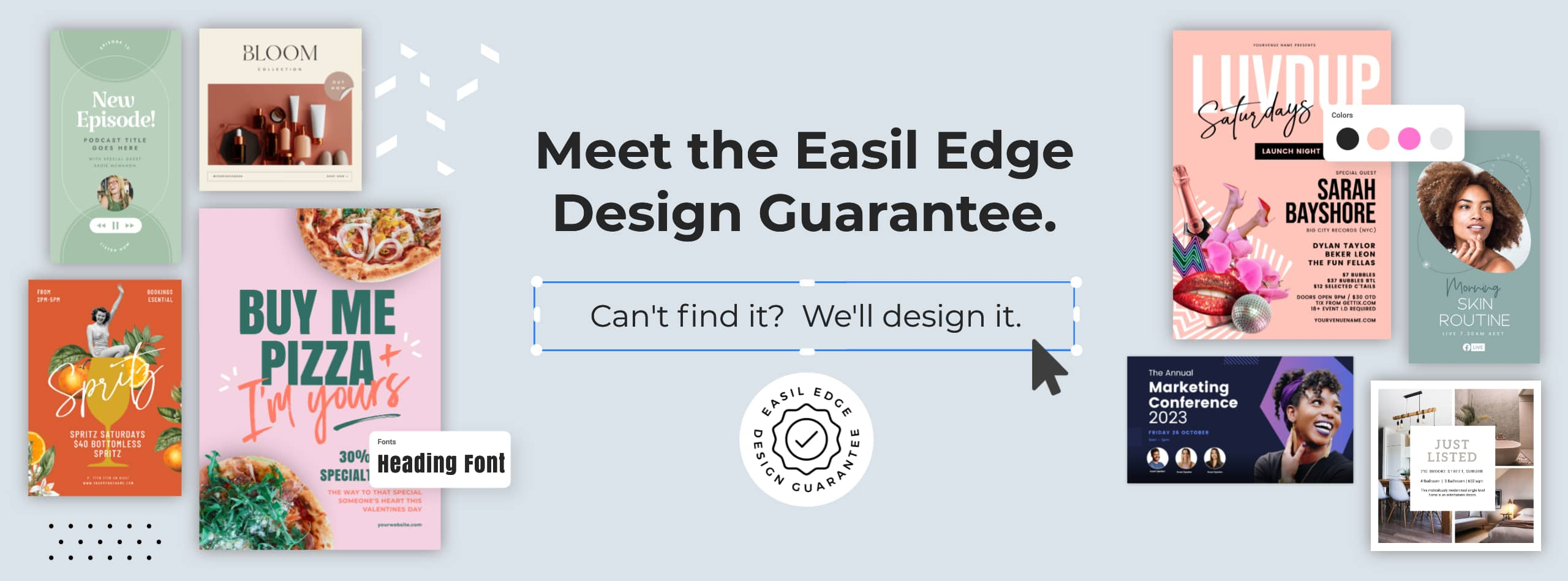
The world of graphic design is constantly evolving, and every year brings new trends and techniques that shape the way we create visual content. As we move into 2023, it’s time to start thinking about what’s in store for the world of graphic design and how you can stay ahead of the curve.
In this blog post, we’ll explore some of the top graphic design trends predicted by our Art Director, Kris, for the year of 2023. From tonal color schemes and futuristic typography to retro stickers and creative lighting effects, we’ll cover all the bases and give you a glimpse into the future of graphic design. Whether you’re a seasoned pro or just starting out in the field, these trends are sure to inspire and inform your work in the coming year.
Let’s dive into Kris’s predictions, along with some templates you can remix to get you started.
1. TONAL COLOR SCHEMES
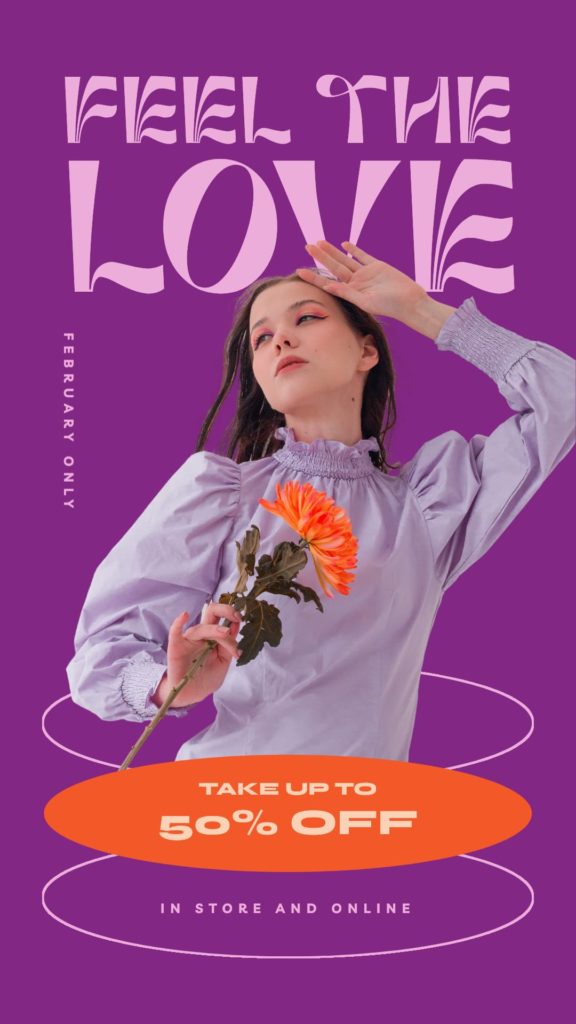
One design trend that is sure to be front and center is the use of tonal color palettes. Using bright colors, and tones of the bold color throughout your design, this trend is all about making a statement and grabbing attention with vibrant, eye-catching hues.
The days of muted, pastel tones and neutral palettes are behind us now, and instead, 2023 is all about embracing bold, saturated colors and using them in unexpected ways. One of the key elements of this trend is the use of multiple tones of the bright color, rather than just one flat hue. This creates depth and visual interest, and allows for a more dynamic and engaging design.
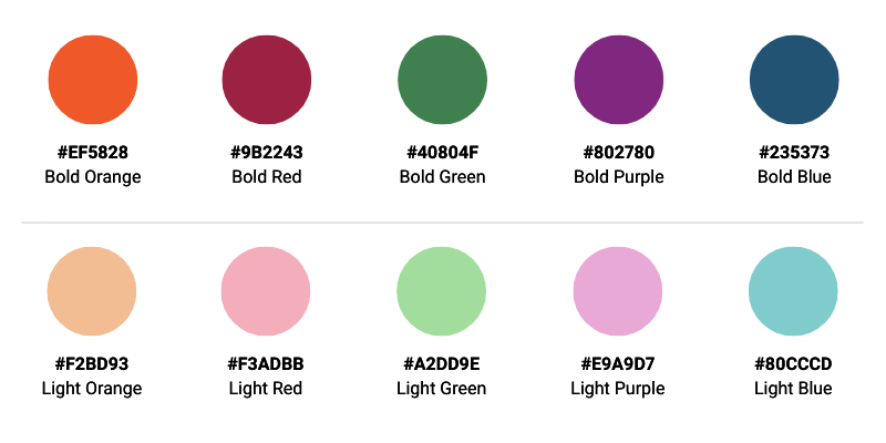
One way to incorporate this trend into your designs is through the use of color blocking. This technique involves using blocks of color to create a striking, graphic look. The key is to use bright, bold colours that complement each other, and to mix and match different tones of the same hue to create a cohesive and dynamic design (as per the Tacos poster example below – click here to make it your own!).
Another way to get into this trend is through the use of tone-on-tone color schemes. This involves using different shades of the same color in your design, rather than using a variety of different hues. This creates a sophisticated look, while still maintaining a bold and vibrant aesthetic.

The key advantage of this trend is that it can be easily incorporated into any design, whether it’s a social post, poster or flyer design, and can be incorporated (or expanded) into most brand styles. Simply choose a bold color as your base, and then use different tones of that color throughout your design. This allows for a cohesive and consistent look, while still maintaining a bold and dynamic aesthetic.
2. CREATIVE SHAPES & MASKS
Also predicted to trend in 2023 – the use of creative shapes as masks for images and videos.
Shapes are a great way to add depth and interest to a design, and make a traditionally simple layout more visually exciting. Forget boring squares, and instead experiment with exciting retro scalloped shapes, bold starbursts, and creative arches to frame your images and videos within your designs!
You’ll see a lot of designers using these shapes to mask main images and videos, and also as background elements containing textures, patterns or gradients. A key aspect to keep in mind when using creative shape masks is to use images or videos with more negative space, rather than tightly cropped and busy footage. This ensures that the focus of the image or video is always visible, even when it’s masked.


Overall, shape masks are a versatile design tool that can add depth, interest, and creativity to a design. When combined with flat backgrounds, you can make your designs stand out and grab the viewer’s attention.
Hot Tip: Use bold, flat background colors to help make the images and videos pop, rather than competing for attention. To get the perfect background color use the eyedropper tool to ‘pick’ a bold color from your image or video.
Get the look! These are some of my favorite shape masks to use, below. Learn more about using Masks in Easil in this article.

3. LIGHTING ACCENTS
If it’s not on your radar yet; fun, bright 90’s nostalgia elements that started gaining popularity in design in 2022 are going to be everywhere in early 2023! In particular lighting accents like glows, lens flares, blings and light bursts that can add depth and drama to any design!
Try using the accents to highlight text and headings, but also to make designs more interesting throughout by mimicking natural light, creating movement – and excitement. They also are a clever way to draw peoples eyes towards focal points within your design.
Keep in mind though that too much of a good thing can be bad – so don’t overdo it with lighting accents! Enhance – don’t overtake!

Get the look! When designing in Easil, open the Images tab in the right sidebar and select the Stock Images dropdown. Then search for ‘Bling’, and click to add or drag across to your design. Resize the size by dragging in our out on the corner handles of each element.
4. TOUCHES OF FLURO
Brightness levels have been dialled right up to include a full range of fluro colors that I encourage you to use in small doses on your graphic creations. These shades are a surefire way to get noticed and make an impact in 2023!
Neon colors have been popping up a lot in designs recently, and especially online where it’s easy to get the brightness factor, as compared to print (where the colors will likely appear slightly more dull).
Opt to use neon colors on important parts of your design to really make them stand out; eg headings, calls-to-action, and special offers. Or, you can add a bit of brightness to your background elements, and keep the rest of your color palette more subtle and subdued.

Get the look! For backgrounds, pairing pastels with neons can be a great option. Pastels can effectively balance out the brightness of neons for a more cohesive look. When it comes to using text with neons, high-contrast colors like black or white are the best options. Always check your legibility (and accessibility) are covered.
Hot Tip: When using neon colors in your designs, it’s best to stick to a maximum of two. Using too many of these super bright colours can overwhelm the design and make it unattractive to the eye.
5. 3D RENDERS
It’s looking like the next year ahead will be big for adding 3D elements and videos to our designs. More and more, people are using 3D assets on social media and in print collateral. And it’s no wonder – adding 3D makes things look way cooler and more unique!
This year we’re going to see a ton of 3D render videos and images being used as backgrounds, and matched with bold colors and simple text. It’ll be a game changer, taking creativity to a whole new level compared to just using traditional images. With 3D modelling tools getting easier to use, it’s making it simple for designers to jump on board with the trend and get even more creative!

Get the look: Try any of these ‘tech style’ font pairings with 3D style imagery:

6. CLEAN MINIMAL LAYOUTS
Combining fine lines, condensed fonts with serifs and sans-serif fonts, this style looks clean and simple, but requires some design skill to pull it all together cohesively. It’s the last of the design trends for 2023 that I’ll be outlining – but it’s one that is safe to say will be around for a while.

It’s all about simplicity and minimalism, featuring lots of white/clear space, sleek lines, and a limited color palette.
One of the main advantages of clean minimalistic layouts is that they are easy on the eyes, and give a sense of order and clarity. The goal is to create a design that is uncluttered, easy to read, and draws attention to the key information. We saw this trend starting to take shape last year with the Oracle style, but it has evolved to become even more stripped-back, incorporating thin lines and neutral palettes. Plain borders, color blocking, and simple fonts make this style visually appealing and effective.
Mixing script and san serif fonts also works well within this trend, adding a touch of elegance to the minimal look and feel. Matching background color tones with images and videos also helps to create cohesive, uncluttered and visually appealing designs that are easy to navigate and understand.
Hot tip: Use the eyedropper tool to get a background color tone that works with your image or video.
Get the Look: Try using these super sleek minimal font styles. Try mixing elegant script fonts with clean San serif fonts.

OVER TO YOU
That’s a wrap for what I expect to see coming to life in design trends for 2023! Keep track of our emails to see the latest new templates, where the design team here will be embracing these trends and sharing with you!