Color palettes for summer… at any time of year. The summer holidays bring to mind sandy beaches, cool ocean breezes, water sports, county fairs and amusement parks.
Summer colors can be used to lift your marketing at any time. In this post we share 5 awesome summer color palettes…. that you can use anytime in your branding.
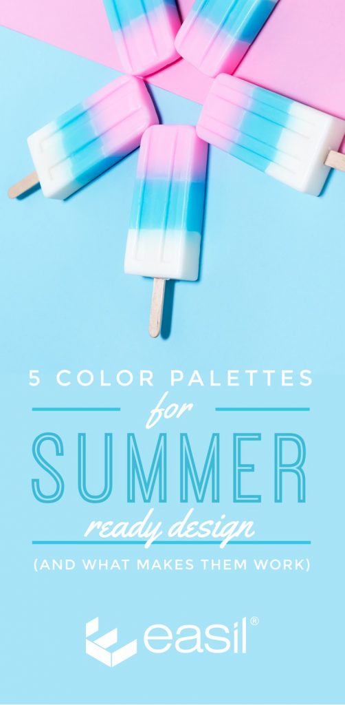
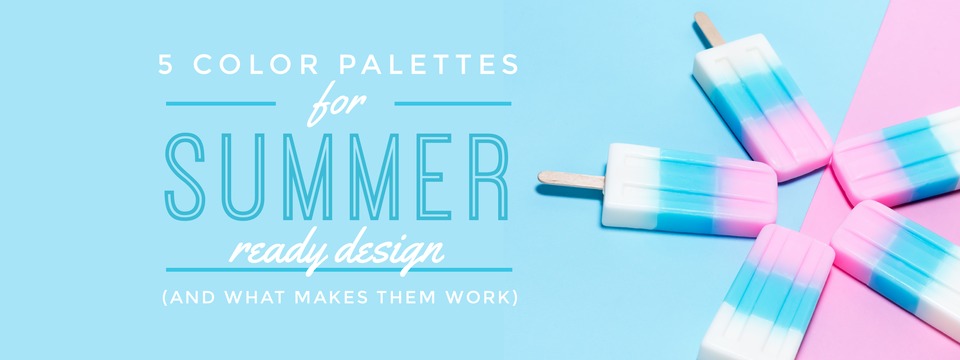
5 Color Palettes for Summer
A summer-themed project is perfect for evoking those “summer feelings” of excitement, fun and freedom. With color palettes for summer like those below, you can immediately inject this into your designs!
These five color sets don’t have to just be used in summer. Give your work that summertime feel at any time of year, regardless of the content.
To use these color palettes for summer in Easil, simply:
- Enter the codes into the Color code entry box.
- Apply the “summer” color to any graphic element or text.
- Boom… it’s summertime!
It’s easy to use colors in Easil to design like a Pro – especially if you take advantage of our color palette generator.
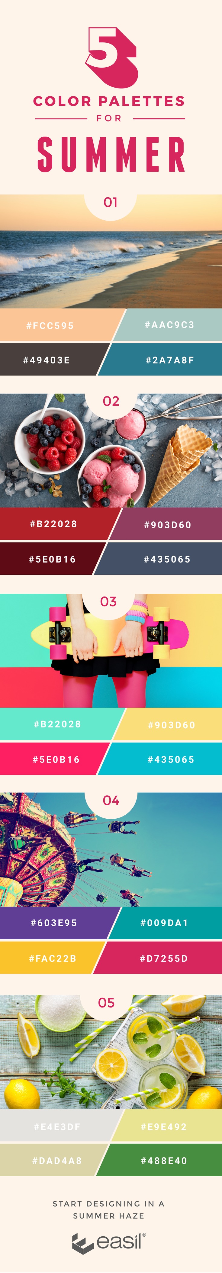
Here they are… complete with dreamy explanations of why each color palette is summer bliss. Have fun with them:
1. Beachy Tones

The ideal destination for many vacationers – of all ages – is the ocean. It’s the quintessential summer location.
From finding the perfect shell on an early morning beach walk to building the perfect sandcastle, nearly everyone has happy memories of time spent at the beach. The picture of a cool, relaxing summer and the tan and blue hues of the beach easily inspire thoughts of summer for the viewer.
It’s also the reason these colors often inspire the decor of the most calming bathroom retreats. When your goal is a calming, ocean-inspired look, this is the summer palette to use.
2. Shades of Berry

For those who can’t get enough of fresh produce, the beginning of summer is often marked by the start of the berry-picking season – or at least the better availability of berries and fruits in stores. From fields of ripe strawberries to roadside fruit stands, these sweet natural treats are a staple of the summertime.
An inviting palette of reds, purples, and other produce-inspired hues will easily reflect the delicious side of the season.
Share this Image On Your Site
Please include attribution to www.easil.com with this graphic.
3. Bright Beauties

While fall and winter’s fashion trends take their cue from the muted palette of the weather outside, spring starts to see the arrival of more color – both in nature and in clothing trends.
But it’s during summer that the really bright shades get their time in the fashion spotlight. From standout swimwear to the bright colors of Australia Day, and fluorescent accessories, fully saturated shades are a sure sign that the vacation season has finally arrived.
A rainbow of colors in their brightest varieties are sure to bring that summer style to graphic designs as well.
4. Carnival Colors

The young and the young at heart may think of summer as the best time for county fairs and carnivals. The rides and attractions – not to mention food like funnel cakes and cotton candy – are some of the summer’s most fondly remembered staples.
Whether you prefer to ride the fastest roller coaster or simply walk down the main carnival thoroughfare with someone you love, the right combination of red and turquoise – with a little bit of purple thrown in – will definitely inspire memories of summer fun.
5. Lemonade Shades

Any discussion of summer would hardly be complete without the one drink that most exemplifies summer: lemonade. After working in the yard (or working hard at play!) on a hot summer day, there’s just nothing more refreshing than relaxing on the porch or deck with a tall glass of lemonade.
Made with real lemon, the right balance of sugar and plenty of ice, this summertime drink makes the summer heat just a bit more bearable. Rich shades of yellow and white, with just a hint of green, will give your designs the same cool, refreshing feel of the perfect glass of lemonade.
What about you?
What’s your favourite style of color palette or color combination right now?