
Having a few filter design tricks up your sleeve is important for non-designers. The tips in this post will help you to take your designs pro! We’ll show you how to take any design and add filters using clever filter design tricks that will transform your visual content.
Filters are a secret weapon for Non-Designers. Just when you think you can’t do much with an image to make it go “pro”, you can add a filter and boom… image transformed.
It’s one of the quickest and most effective ways to lift your visual content, without having to lift a finger. OK, well maybe you have to lift one finger… on to your mouse. Then you need to click it a couple of times {wink}.
So with that in mind, let’s take a look at how Filters work in Easil, so you can be familiar with the filter tools before diving into our awesome Filter Design Tricks.
HOW DO FILTERS WORK IN EASIL?
All images in Easil can have filters applied to them. This applies to our “Standard” images as well as our “Cut Out’ images (with transparent backgrounds).
You can choose from thousands of Easil assets including free images and low-cost pay-per-use images. We have over 29 million of them from major stock libraries. And of course you can also upload your own images for use in any of your Easil designs.
Applying a filter to your image is easy. All you need to do is:
- Select the image or background that you would like to add a filter to.
- The Action Bar will pop up intuitively ready for action. Choose Filters.
- Click through the filter presets to see the different options.
- Click on a filter option to apply it to your image.
- The filter will be immediately applied to your image.
ADVANCED FILTER FEATURES
Want to get a little more ‘Advanced’ with your filter skills? Then click Show More on Filters to reveal our Advanced Filter features. Now you can adjust your image in some cool ways when you expand your options.
We recommend that you play with these advanced features! Experiment with the sliders to bring up various effects. You might just find something you love!
And if you do find a filter arrangement that you love, see our Bonus Tip below for how to create your own Filter ID and use it in a design.
Now that you have the basics down on how to use Filters in Easil, let’s blow your mind with what is ACTUALLY possible when you know a few Filter Design Tricks.
Get ready, you’re going to love these examples that our designers have prepped for you.
7 Easil Filter Design Tricks that Non-Designers can use
Here are just a few ways that you can use Filters to take your designs to the next-level with our Filter Design Tricks:
1 APPLY A UNIFORM COLOR FILTER TO A SERIES OF IMAGES
As we mentioned above, once you find a filter that you love, apply it to more than image. Apply it to a series of images for uniformity. This not only adds some serious style to your image set, but also saves you a bunch of time!
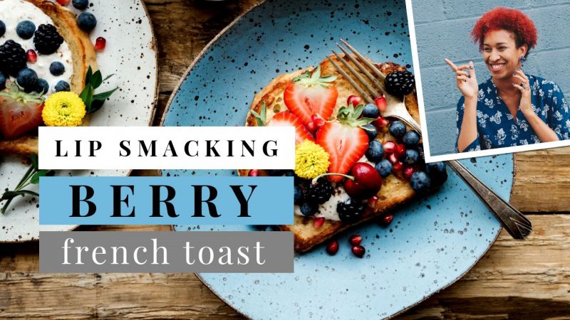
One way to use this idea is on a series of YouTube Thumbnail images. YouTube is a platform where viewers and subscribers can be very (very) loyal. What does this mean? Consistency is key. If you can add some consistency to your YouTube Thumbnails, then your subscribers are more likely to recognise your videos when they see them pop up in playlists. And then watch them.
It doesn’t mean that every thumbnail image has to be the same. That would be boring! But adding one consistent element will help your audience to recognise your images (and hence your videos). A color filter can do just that.
Here’s a series of YouTube thumbnails that we created:


To create this uniform filter effect we used the following filter design tricks:
- Chose a template from the Easil template library that had a bold heading and a background image.
- Switched out the background image to one of our foodie shots.
- Added our chosen color filter to the image.
- Added an overlay of our YouTube presenter.
- Changed the text.
- Pressed Copy to duplicate for a total of 3 pages in our design.
- Edit the additional pages as above, switching out the presenter images and text to create a series of YouTube thumbnails, ready to add to our episodes. Our color filter stays the same throughout, keeping consistency.
Hot Tip: Play with layers when using filters. Adding extra layers with images (not just text) can really make your design pop!
2 CREATE A GIF USING COLORED FILTERS
GIFs can be a fun way to add humour and personality to your visual content. GIFs can be used in messaging, replies and comments on social media, in emails and in blog posts or websites. They’re fun. We love GIFs at Easil – so much so that we created a Gif Maker. Our Gif Maker lets you animate text, objects, images… and even filters!
In this next example, we’ve created a GIF whereby the movement is due to nothing more than changing out the filters. It’s one of the easiest GIFs you can create:
To create this GIF filter effect we used the following design filter tricks:
- Created our design including a background image and text overlay.
- Duplicated the image using Copy to create a total of 5 pages, ready to add our filters.
- Applied a filter to each separate image using the Filters tool in Easil. We chose bright colors to make the final GIF animate with vibrant color! We didn’t change any other elements, only the filters.
- Clicked Download to publish the GIF and chose Slow speed.
- Saved and shared!
Hands down, this is one of the easiest ways to create a GIF. Yet, it’s also one of the most stunning!
Hot Tip: Keep it simple. Don’t be tempted to change anything but the filter when you recreate this GIF. Simplicity is where the magic happens when you create GIFs. Changing one or two elements is often more powerful than trying to animate a whole bunch of things. And possibly less likely to overwhelm the viewer.
3 CHANGE THE HUE TO CHANGE THE LOOK
By using the Hue slider in the Filters tool you can create some really cool effects with color filters. In this next example, we show you how to change the hue to transform a gold foil effect to teal in color.
It’s still sparkly and fun, and allows us to create the same effect in a different shade or hue:


To create this hue filter effect we used the following design filter tricks:
- Used a template that included an element of gold glitter effects.
- Clicked on the glitter image and chose Filters.
- Clicked Show More to reveal the Hue slider.
- Dragged the Hue slider until we reached the perfect teal color that changed the glitter image to a shiny teal hue.
Here’s another example where we take a gold foil effect and change it to rose gold color. Who doesn’t love a little rose gold in their life, right?
Hot Tip: To search for metallic gold images in Easil, search under the term ‘gold’ in the Easil image library. Use these in your designs and change them up with the Hue slider in Filters for different colors. If you like one, click on it in your template, then save that image to your favorites!
4 CREATE MONOCHROME EFFECTS WITH FILTERS
Let’s take a look at what happens when we add less color, not more. The minimalistic approach of monochromatic color can help us to create simple, powerful designs. Or we can say that it let’s us see things in black and white {wink}.
So in this example, we’ve paired a bold colorful heading with a monochromatic background using filters:
To create this monochrome filter effect we used the following design filter tricks:
- Used a template from Easil that includes a background image and simple text overlay.
- Changed out the background image to a high contrast image that would lend itself well to a monochromatic filter.
- Clicked the image and then chose Filters.
- Chose the Willow filter.
- We adjusted the brightness and contrast of the filter until the resulting image would work well behind our text.
- Edited the heading text.
- Changed the heading color to #C2289E using our Color Palette Tool, so that the heading would stand out against the background.
Hot Tip: When you’re working in black and white, you need to be a little more aware of contrast – especially without other colors to help differentiate elements of your graphics. Choose simple, precise images that have enough contrast to allow our brains to decipher what we see. Avoid adding too many extra graphics, patterns or fonts to confuse us. And make sure that you use high contrast images. In the example above, we’ve used a simple image and a heading. It’s all about simplicity!
5 ADDED A VINTAGE FEEL WITH RETRO FILTERS
It can be surprisingly easy to transform us to another time with filters. Vintage filters can take us to the Wild West with sepia effects, or the 70s with a hazy beach retro feel. And there are literally thousands of retro-style filters you can create with Easil’s Filters tool.
In this example we’ve gone back to the 70s with some retro beach vibe:


To create this retro vintage filter effect we used the following design filter tricks:
- Changed out the background image to a beach scene from Easil’s image library. We chose an image that would lend itself to lazy summer surfing days.
- Clicked the image and then chose Filters.
- Chose the Nashville filter, perfect for creating our retro feel.
Hot Tip: Use the Color Palette Tool and then choose Image Colors menu. This tool will pull in a series of colors directly from your image. These colors are perfect for matching up to your image for headings or body text! And remember, if you have your Brand Kit set up, you can pull images in from there too.
6 GET CREATIVE WITH BLURRY IMAGES
Hidden away in the Filters tool is a really handy feature that allows you to transform your image in many and varied ways. It’s called the Blur tool.
This means that you can get blurry with your designs, while simultaneously adding some serious wow factor!
In this example we’ve used the Blur tool to create an image that we transformed into a GIF. It’s a slow-reveal effect that will catch many eyeballs:

This type of “reveal” can be used on Instagram Stories where you add a series of images that gradually peel back from full blur to clear image. Or you can create a GIF like this one that steps through a series of images to reveal something. Then post it on Facebook or Twitter. Play with different ideas and get creative.
To create this blur filter effect we used the following design filter tricks:
- Created an image showing our product to be revealed on a bright background.
- Edited our text overlay with a suitable heading.
- Used the Copy feature in Easil to duplicate the page another 3 times to create 4 images in total.
- Clicked on each image in turn to adjust the Blur by clicking Filters > Show More > Blur and adjusting the slider. We made sure that each shift in the level of Blur progressed the image between full Blur and final, non-blurred image.
- Published the GIF at medium speed.
Hot Tip: If your background is too busy to add a text overlay, consider adding a touch of Blur to the background image with the Blur filter. This can shift the background just enough to make your text pop. Do this gradually… a little blur can be just enough!
7 USED THE BLUR FILTER TO CREATE A SHADOW
We haven’t finished with the Blur tool just yet. Next, we’re going to use it to create a simple but effective design using a stunning blurry shadow.
To create this blur drop-shadow filter effect we used the following design filter tricks:
- Choose an Easil template with a light colored background
- Search “Leaf Cutout” in the Easil images library or use remove.bg to remove the background of your own leaf image.
- Upload the image with a transparent background and add to your design.
- Use the filter tool to decrease the brightness to -100 so the image becomes completely black.
- Increase the blur to 15-18 until it looks like a shadow is being cast over the image!
Another way to give your design some depth is to add a shadow from behind a shape in your design, giving it a floating feel:
- Choose an Easil template with a solid color overlay over an image. Angled shapes work well.
- Duplicate the background image and use the layers tab to ensure that it is between the image background layer and the color overlay.
- Use the rotate tool to rotate the image to the same angle as the color overlay.
- Use the filter tool to decrease the brightness to -100 so the image becomes completely black.
- Use the filter slider to increase the blur to 15-18 until it looks like the color overlay is casting a shadow from behind the shape.
Hot Tip: Drop-shadow is definitely one of those less-is-more design tricks that can be used with great success. Or it can end up making your design totally suck. Easil’s Shadow Tool definitely helps with creating drop-shadows that don’t suck. You can use it to create drop-shadow, blur-shadow, glow effects and more. But there are still a few tricks to doing it effectively. Find out more tips for using shadows in this post, and start creating stunning drop-shadows and more.
BONUS TIP – CREATE A CUSTOM FILTER ID
If you find a filter effect that you love, then don’t lose it! Create your own Custom Filter ID. To do this, simply:
- Open the Filters tool.
- Click Show More to open up the Advanced Filters.
- Experiment with the sliders for different parameters until you find a unique filter combination that you like.
- Test it out on some images to see how different images render when you apply your custom Filter ID.
- Copy the Filter ID and then paste it into the Filter ID area on any future images that you create.
- Now you’ll be able to get that same look and feel – every time. Instagram, come at me!
We recommend that you play with the settings for Brightness, Contrast, Saturation, Grayscale, Sepia, Blur and Hue to get the filter that you’re looking for!
Custom Filter IDs are awesome for Instagram users who wants to have the same “look” on the feed. It also works for new websites, where you want to have uniform image style. Filter IDs let you take your images from DIY to Pro. And of course they can be great for branding!
Phew! That’s a lot of Filter Design Tricks. Now you have no excuse not to create pro-quality designs, even as a non-designer. You’ll be taking your designs from amateur to Pro in no time at all!
Your Turn
Tell us, what Filter Design Tricks did you like the most out of this article? Any questions about how we created some of these designs? Ask us via DM on our socials and one of our designers will answer!


