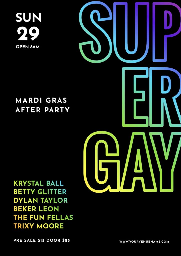
One of the simplest ways to lift your typography up a notch is to fill your text with a stunning rainbow gradient color blend!
In Easil, you can select any of our included fonts, or upload your own, and fill it with a gradient – and still be able to edit the text afterward. In this post, and the accompanying walk-through lesson, you’ll learn just how to do this with a couple of clicks, and without Photoshop or design skills!


STEP-THROUGH OUR IN-EASIL TUTORIAL TO LEARN HOW TO CREATE RAINBOW GRADIENT FILLED TEXT
The following skills are contained in our in-Easil lesson. Click through to interact and learn in the Application.
- How to find the gradient image options available in Easil.
- Adding a gradient color to your text.
- How to reposition the gradient color within your text.
- Learn how to adjust the Opacity of the gradient in your text.
- How to edit your text after adding a gradient.
- How to remove the gradient from your text.
HOW TO CREATE RAINBOW TEXT WITH ANY FONT
To create gradient filled text in Easil, you’ll need to access our Text Mask tool. You’re able to use this easy-to-use functionality on any font already in Easil, or by uploading your own font/s.
- Typeset your text within your graphic.
- Click on the text box, and select the ‘Text Mask’ button in the top ActionBar.
- On the right sidebar, enter ‘Gradient’ in the stock image search query box.
- When you find a gradient image you love, click the + to add it to your text.
- Adjust using the crop tools in the Edit Mask feature.
Text masking is available on our Plus and Edge plans.
CREATE A STAND-OUT HEADING BY COMBINING MULTIPLE FONT SIZES & FONT FAMILIES, WITH RAINBOW TEXT
With the ability to format a single text box with multiple font sizes (or even various fonts), you can combine typesetting with rainbows to create next level impact!
Start with adding your text content to a text box. Then use your mouse to select parts of the text to change to a new font, font size or font styling by using the options in the top Actionbar. Once you have styled your text box, you’ll be able to follow the text mask instructions to apply the gradient across the entire span of text.
Experiment with different rainbow and gradient effects by clicking on the different image thumbnails in the image search results tab.
HOW TO CREATE ADDITIONAL GRADIENT COLOR IMAGES TO ADD TO YOUR TEXT
Our design team has provided a selection of gradient images for you to quickly and easily use within Easil.
But if you’re looking for more, and in particular if you want to create a gradient using your own brand colors, it’s super easy to do:
- Visit the AngryTools gradient generator site.
- Set the size of the image you’d like to generate in px, in the ‘Generate Code’ section on the right side.
- Add your brand Hex Colors to the color slider by clicking on the color chips on each side of the slider.
- Use the ‘Orientation’ selector to choose between a linear gradient or a radial gradient. When selecting linear, you can also adjust the angle of the gradient.
- Press ‘Download Image’ and save your custom gradient color image!
Hot tip: Once you’ve created a gradient color combination that you’re happy with, create a few more! Keep the colors the same, but create several different angles and orientations, and then upload to your Brand Kit in Easil so you can use them in Text Masks, Shape Masks, and even for backgrounds.
DO’S AND DON’TS OF USING GRADIENTS
There are some things you need to keep in mind when working with rainbows. Our Art Director Kris has provided this list to keep you on track with looking professional:
DO: Use your gradient text against a simple, block colored background. Black looks stunning against brighter gradients, as demonstrated in some of our template examples.
DO: Ensure there is a contrast between your background color and each of the colors used in your text gradient.
DO: Experiment with fonts with different weights. Gradients can look stunning peeking through a fine font, as well as a bold one.
DON’T: Use gradients on small text. Stick to larger headlines and hero text within your graphic designs.
Get more tips from our Art Director, Kris, in this video on using gradient text:
OVER TO YOU
Are you ready to add some cool gradient colors to the text in your graphics? Tag us in your graphics with #MadeInEasil – we’d love to check out what you create!


