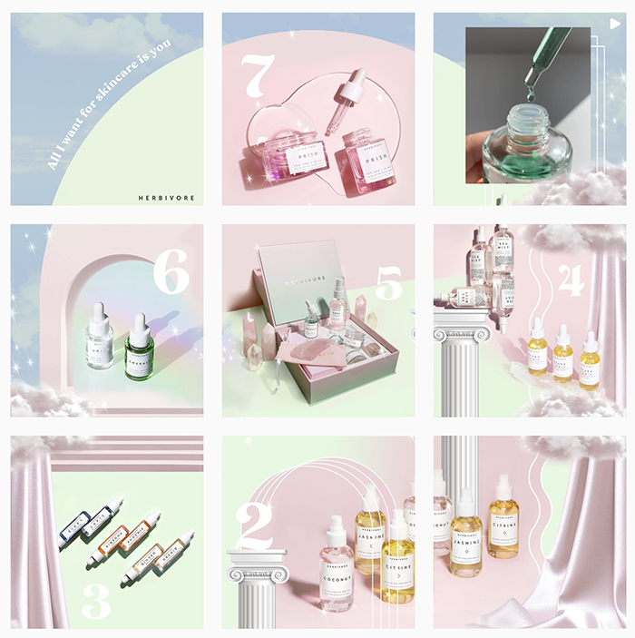
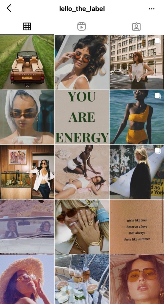
More and more consumers are turning to Instagram instead of Google to search for a brand, business or destination. People’s first reaction is to open their Instagram app to look your business up, not search for your URL. Your Instagram profile is quickly becoming your new website homepage.
And as the saying goes, you never get a second chance to make a first impression! Your Instagram aesthetic is the first thing potential customers will notice when they check out your brand’s profile. They will make an instant decision whether or not to engage with your brand.
Just like the goal of your website is to convert visitors to customers, the goal of your Instagram profile should be to convert visitors to subscribers.
A curated, aesthetic Instagram account can help show off your brand style, position your products or services in the most appealing light and help form a connection with your audience.
We’re shared our top tips [and the tools you’ll want to grab!] to nailing your Instagram brand aesthetic below.
Let’s get started.
Moodboard & Theme Development
An important starting point is establishing an overarching theme for your brand’s Instagram account. Take the time to think about your brand style and vibe. How would you describe your brand? What genre or niche does your brand fit into? For example, if you are a swimwear designer, your theme might be based around warm tones, Summer and the seaside. Is your brand minimalist and clean or is it loud and bright? Take the time to define this before you start creating.
Your end goal is to connect with your target audience and customers. So an important part of aesthetic development is taking the to understand the content your audience best relates to. Do some research into your competitors and the accounts your demographic currently follow to sense check your theme direction.
Start building your theme visually and draw inspiration by creating a Pinterest board. Pinterest acts like a Google search engine and you can type in terms that correlate with your brand. For example, if you describe your theme as ‘minimalist’, type this into Pinterest and it will bring up hundreds of results from images, graphics, fonts etc.
Top Tip: Add the word ‘aesthetic’ to the end of your search term to get more theme based results.
Start saving pins that inspire you or are relevant to your brand. Look at things like color palettes, textures, images and filters to inspire what your new feed might look like. Certain results will attract you more than others, so take note and be sure to save the ones you love.

Color & Tone
Establishing a color palette and tone for your Instagram is by far the most important element for a successful Instagram aesthetic. Color is the building block to an amazing looking feed.
An easy place to start is by integrating your current brand colors e.g. orange and black. You can extend your palette and shades to be more versatile and to fit your new Instagram aesthetic. Use your Pinterest board to determine the types of colors which work best for your aesthetic and create a color palette graphic through Easil.
You can download some of your color related Pinterest pins and load them into your Easil account. Simply go to the color picker, and underneath the spectrum you’ll find thumbnails of your image and a corresponding suggested color palette. Voila!

If you have a bank of photography and brand images on your feed already, it is important to determine how they will fit into your aesthetic. You will need to make sure at least one of your established colors are present in your images to ensure your Instagram aesthetic is consistent and works with the images you will be posting.
Don’t know where to start? My Insta Palette is a great free tool that shows you the most used colors of your feed. If you notice a theme, choose your colors from these selections. Alternatively, you can use filters on your images to ensure they fit into your aesthetic. Information on how to do this is coming up next!
Image Presets
The most cohesive Instagram feeds will have their image editing style nailed. You won’t see a mismatch of shades or filters. Everything will be uniform. A super easy way to create a feed of cohesive imagery is with a filter or preset app like Lightroom. You can purchase preset packs online or simply have a play around and create your own.
Other preset apps we love are Colourtone and Tezza which have a range of on-trend, aesthetic filters to choose from. You also have the ability to dial the intensity of these filters up or down depending on the effect you want.
Keen on adding other edgy effects to your images such as film borders, vintage overlays or light leaks? Try VSCO, this app can totally transform your feed.
Instagram Grid Patterns
Having a posting pattern will determine what your feed looks like overall. Deciding on a grid layout from the get-go will help you pinpoint exactly what content needs to be created for each individual square.
There are so many different grid patterns to choose from. Here are some common styles for inspiration:

Layout & Design
To create a truly unique, branded aesthetic you can design custom, graphic posts. Graphic design posts can be used to share brand information, announcements, quotations and reviews Easil gives you access to hundreds of free Instagram templates to get started. You can simply update these templates with your chosen Instagram aesthetic color palette and style along with adding in your fonts and logos.
Designing custom graphics for your feed will not only assist with completing your feed design but will also help increase brand recognition and recall.
Check out how these brands use custom graphics to develop a strong brand personality.


Typography
You can develop your unique aesthetic, brand personality and flair through incorporating typography. Good typography enhances the character of your posts and adds a tone of voice that reinforces what the words say to influence how those words are perceived.
Again, Pinterest will be your friend for inspiration and ideas on what this will look like and how you can incorporate it into your page graphics.
Be sure to also establish a consistent font for your headlines and body copy. Easil gives you access to a huge range of fonts and you can also upload your own into the app.
Planning your feed
Before you hit the go button and start posting your new aesthetic, be sure to plan out what your feed will look like as a whole. You want your page to look professional and cohesive. Keep in mind the grid layout you selected earlier, e.g. Checkerboard, Cross-fade etc. when completing this step.
You can use a free tool such as Planoly to upload your social media posts and see what posts look best next to one another and which ones don’t. It will help you to create a balance between tones, fonts and colors.
Don’t forget Stories & Reels
You’ve nailed your feed but don’t forget to carry through your brand new aesthetic to Stories, Highlights and Reels.
For Instagram Stories, you can use Easil templates to design eye-catching and aesthetic graphics with your new colors, fonts and elements.
With your Story Highlight covers, we suggest selecting colors and icons for these covers that match or compliment your feed. By taking the time to custom design these covers in Easil, you add an extra visually-appealing element to your brand’s profile.
Last but not definitely not least, there are Instagram Reels. You can extend your aesthetic here also by designing custom Reels covers. Want to learn more? We go into detail here.
Ready to create your Instagram aesthetic?
Putting in the time and detail into developing your Instagram aesthetic can do wonders for your brand and conversion on this platform.
Instagram is flooded with hundreds of brands, stores and businesses fighting for your customers’ attention. Stand out from the rest and connect with your audience instantaneously with curated and appealing content.
Keen to show us your eye-catching Instagram aesthetic designed in Easil? Tag us in your posts @teameasil


