
Designing for out of home advertising, or large format, can be difficult. Looking at your laptop or desktop computer and translating that tiny design to something that will be output to potentially 100’s of times that size is often also daunting.
Keeping things simple in large format will result in a far simpler and more professional campaign, and information retention from your audience.
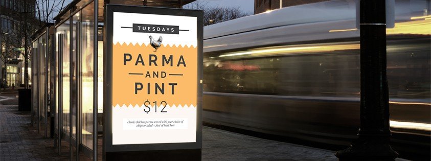
Our pro tips for ensuring your big designs grab their fair share of attention:
- Use large, bold, sans serif fonts whenever possible.
- Limit the amount of words that you use in your design. Generally in outdoor advertising you have a maximum of a couple of seconds to capture the attention of any passing traffic, so make sure that they can catch and comprehend the message in well under that time!
- Work on your design and text hierarchy. Work out what the main message is, and ensure that is the first thing that will be seen.
- Use a color palette of two to three colors, ensuring there is high level of contrast between your text color and any background colors.
- Choose a single, high quality image, and then place any text far enough away to let the image speak for itself. As a general rule, you should avoid layering your text over your image, to improve the visibility of the text, when designing for large format print.
- Create a secondary design (eg a duplicate page in your Easil design), and try removing excess text and design elements, to compare the versions. If you can get the message across with the simplified design – go with that one!
If you are designing for large format items (such as posters) that are to be displayed indoors, you can afford to bend these rules a little bit, as your audience will generally be a slightly slower pace, or even seated.
Read more in our Poster Design tips article.