A good poster design should grab attention instantly. It needs to convey a primary message and engage with your audience effectively while creating visual harmony.
Poster design for advertising or campaigning commands more attention than most other marketing pieces. Printed in large format and displayed in high-traffic areas, posters are arguably the most exciting format for any designer to work with, encapsulating all the design principles on a single page.
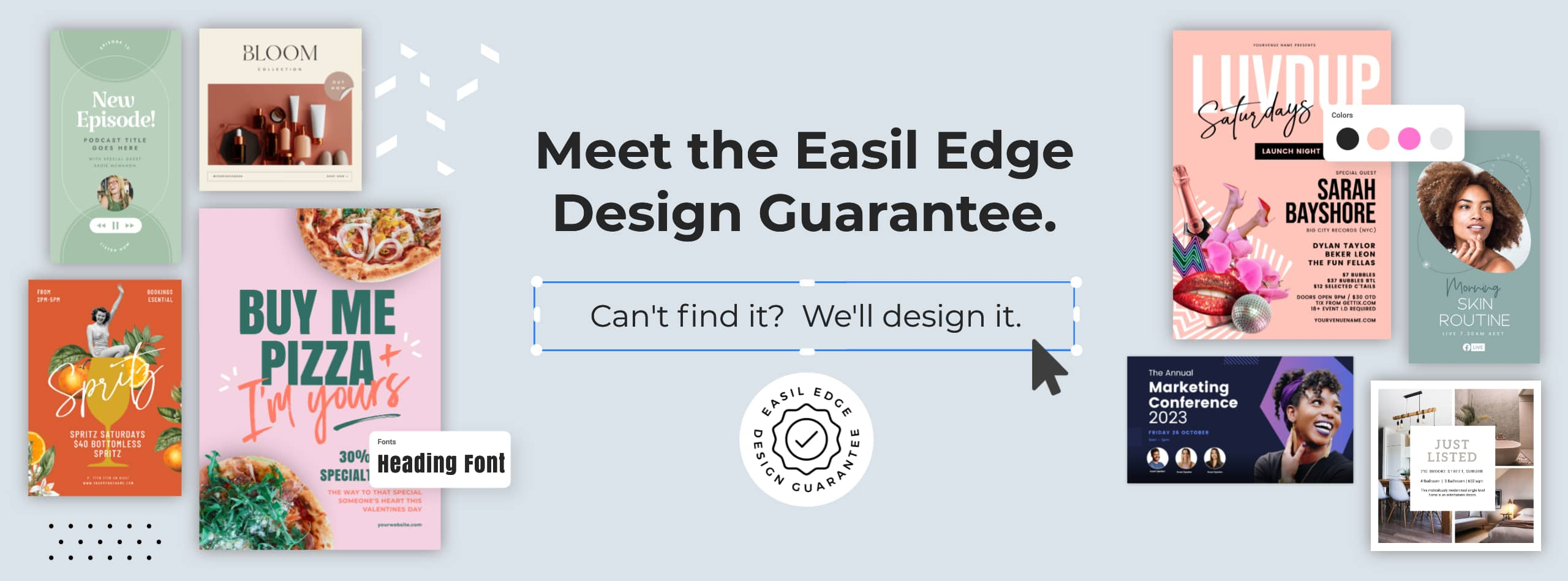
This can be tricky if you’re not an experienced Graphic Designer! In this article, our Art Director Kris has broken down the fundamentals of designing a quality poster into these ten practices to foolproof the process and make sure you achieve an effective design as well as some visual transformations from what not to do, to correct practices!
1. PLAN YOUR MESSAGE AND DESIRED OUTCOME
What’s the main purpose of your poster? Who will be viewing it, and where will it be displayed?
Different goals, audiences, and formats require different design approaches. Planning this out from the start makes the design process much easier. Think about:
- Who are you wanting to connect with your message?
- Can you get your message clear and concise?
- How can you communicate the desired outcome with a minimal amount of text?
- How do you want your audience to feel when they view the poster?
Work out your poster’s Goal and Target Audience
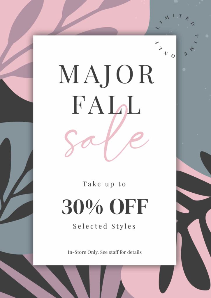
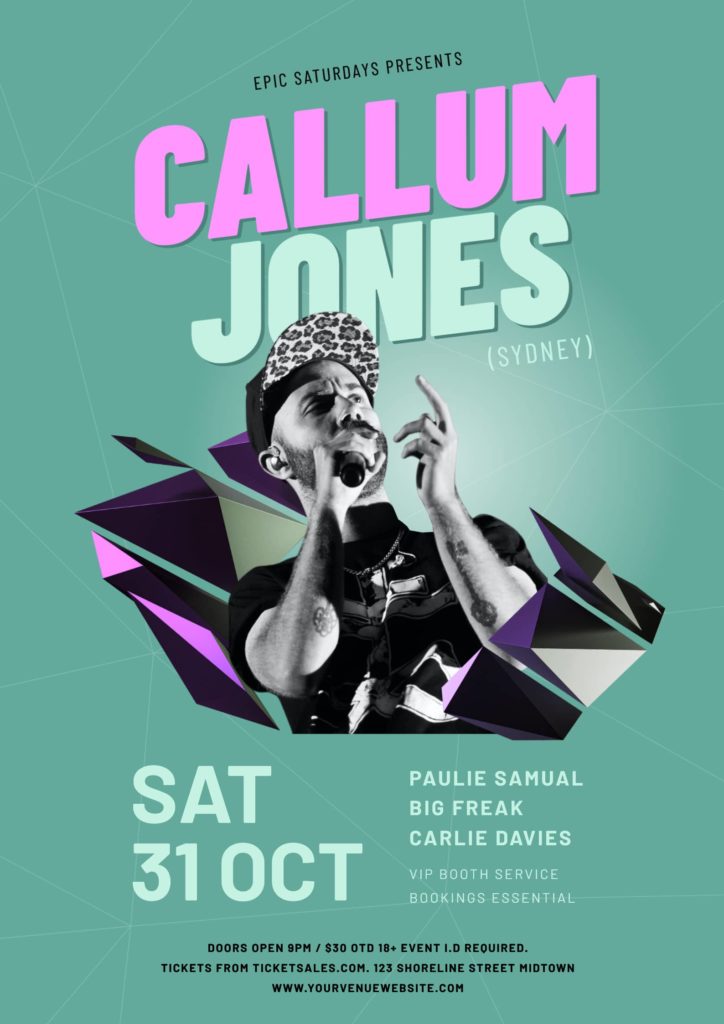
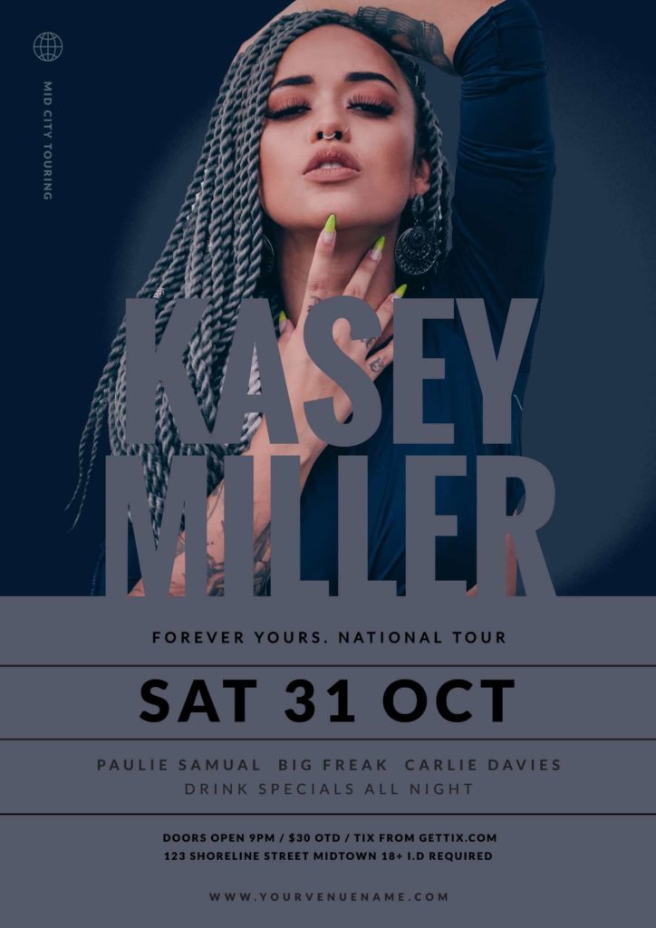
Do you want to highlight a clothing sale aimed at a fashion-conscious demographic? Or sell-out tickets to a Music event for University students? As you can see by these examples below, the two designs are very different in regards to the vibe of the design, who they will attract, and the desired outcome.


Plan out the text
What is the primary message, Call to Action (CTA), and any other information you may need to include in the design? If the poster is advertising an event or a physical store sale, do you need to include the store address and contact details?
Simplify your text as much as possible. This allows your design to convey the necessary information and engage with your audience faster. The less text that is contained in your final design – the easier it will be to comprehend within those crucial first couple of seconds you have to make someone stop to take further notice.


Consider if you’ll need to create additional design sizes
Think about all the different sizes that may be required, e.g., flyers, digital screens, and social formats like Facebook, LinkedIn, and Instagram. Keeping these items in mind from the start will help you decide on the design’s complexity. As each of these outputs has a different orientation and aspect ratio, you will need to play the design version of Tetris – reshuffling some elements to fit into the available space.
2. DECIDE ON YOUR POSTER DESIGN STYLE
It’s essential to have a style in mind before starting. The style should be focused on the audience that you want to convert. For example, the style of a poster promoting a DJ at a nightclub will be very different from that of a point-of-sale poster for a pet food company.
Collect inspiration and use a mood board to decide on the style and vibe of your poster. Browse through sites like Behance, Dribble, and Pinterest to get ideas, [or even look through Easil’s poster templates!] You can pin designs to a private board on Pinterest or use a tool like Miro to put one together.
Your style should always carry throughout your overall poster design. Consider typography, color choice, imagery, and graphics/elements and how they will interact and unify as one design.
Tip: Try sketching out a rough outline of your poster layout on paper before you start designing on your computer.


3. SET A GRID FOR ALIGNMENT
A grid is a set of guides that are essentially overlaid ‘lines’ in your design. They are both vertical and horizontal and can help you map out where you’ll contain your text, imagery, and graphics to keep them organized.
When you have a grid clearly marked out, you can see when text and elements should be adjusted to create perfect alignment.
In the below before and after example, observe how an alignment guide placed on the left side of the design created the framework for all text to be typeset from this point to create more clear space and legibility.
Tip: When in doubt about how to manage large or multiple blocks of text, align all the left for best legibility.


Grids also help with the hierarchy and legibility of your text and create consistency within the space of your design.
In Easil, you can create a grid by setting multiple guides in place, marking out the left and right edges of each content area and the top and bottom boundaries.
4. SET THE CORRECT HIERARCHY
Ask yourself: What do you want (or need) people to see first? If one thing catches their eye, what should that be?
The way you combine and display text and images creates a visual hierarchy and brings attention to your primary message. Keep in mind that if everything is large type, nothing is large. For a non-designer, or beginner designer, it is best to take the text you’ve planned out from tip 2 and split it up into the hierarchy as follows:
1. The Hero: The Heading or Feature Image?
The largest element will be the main attention grabber and should always be clear and bold. If you have a high-quality, clear image that depicts the message you need to convey, then it should be used as the hero of your design.
If you do not have a strong photographic or graphic image to use as your hero, you can use the Heading to convey the primary message with bold or creative typography.
2. Subheading
This is the content to be noticed secondary after the heading. e.g. if you’re designing an event poster, the date of the event is the subheading should be noticed after the Event name. This could also be used to highlight a competition prize, special price point, or artist name.
Hot Tip: A good rule is to keep your subheading around 50% of the size of the Heading.

3. Details [Body Copy]
The why, how, who, and what details are only noticed by your audience after they have been captured by the heading and subheading. They should be displayed at a smaller size again – try between 50-70% of your sub-heading type size.
This is also the perfect position for price points, CTA, or a catchy tagline.
4. Poster Footer
Although usually the smallest text on your design, the footer still contains essential information like your location, contact details, social handles, and website. Under these is where any conditions or fine print should sit. These are the details that people won’t read unless the information in the header and the hero image has already caught their interest!
Hot Tip: Try using a graphic element like a circle or banner behind your text to emphasize your call to action and to separate it from a busy background.

5. CHOOSE YOUR TYPOGRAPHY WISELY
Typography can make or break your design, so it’s important to take the time to both choose the correct fonts for your style and mood of poster design and utilize text formatting options such as letter spacing and line spacing to create some interest in your type.
Top typography tips for poster design
- Limit your fonts to just 2 or 3 font families within your design.
- Choose typefaces that suit the mood and direction of your posters and ensure they are legible.
- Use the same family typeface in different weights to create a hierarchy.
- Ensure you pair your fonts correctly. Learn more about font pairing (including examples) here!
Learn more about typography in this article that also covers some of the text adjustment tools available in Easil.
6. RESPECT YOUR CLEAR SPACE
Negative space is your best friend. White or clear space around text and Images helps your audience absorb the information faster by placing more emphasis on the hero information on your poster design.
Wide margins of clear space between any typography and the edges of your poster page are essential. Nothing says ‘unprofessional design’ more than text placed to the very edge of the trimmed area – particularly when it’s a block of text.
Top clear space tips for poster design
- Keep text margins at ~1 inch around the perimeter of your design, depending on the final page size. The larger the poster, the further distance it will likely be viewed from, and thus increase your margins for larger print/display sizes.
- Distance any price points, call-outs and other graphic elements from body text on your poster design by at least the same distance as your page margins.
- If you have a hero product or element in your poster design, ensure that it stands out from the background or surrounding elements. It may not need to be totally isolated, but you can try removing the background from an image if it does not add any visual benefit to your design.


7. CONTRAST IS KING
Poster design is all about attention seeking. And if everything’s the same tone, nothing will be legible. Using high contrasting typography with images and bold colors will ensure your design will be noticed.
When starting out with design, it’s easiest not to clutter your design with multiple images and just start with a single image that helps to convey your message. From here, it’ll be easier to achieve higher contrast between the image and any text elements placed above and surrounding the image.
In our poster example below, the difference between applying a contrasting color scheme is tremendous. We pulled the color out of the hero image using an image filter in Easil to take it back to black & white which then matches with the black text overlaid over the gradient block panel.

8. KISS
‘Keeping it super simple’ is the ultimate way to create a quality poster design and get your message seen, particularly when you are starting out with design or DIY-ing it.
Try to use as few elements, images, and fonts as possible in your design without losing the integrity of your idea. The use of color also is important but applies to its use on fonts and elements. Use of a stunning full color photographic image to form the hero of your poster is perfect, as long as the additional graphics and typography do not overwhelm the overall design.
In our example below, we’ve stripped away the busy background pattern, aggressive starburst price surround and the excessive imagery. By removing these we’ve converted the poster design to a sleek retail look, that still shows the value/discounted nature of the offering.


9. ZOOM OUT, STEP BACK
The most effective poster design is one that you can read or comprehend from a distance. To see how effective your layout and typography is, step back or zoom out and ensure everything is in order before you send it to print.
A common mistake we see is sizing of text and content designed to be viewed from close up. This is fine and expected for social media or even a printed flyer, but simplicity also works best for these mediums and even more so for large format poster designs.
If time allows, keep your design with you for half or a full day before passing to your client or completing the task, and ensure it’s creating that eye-catching look when you come back to review it – from a distance! Another tip is to make a copy of the page you are working on and apply some sizing tweaks to the alternative version before viewing both at poster distance, and making your final selection.
10. SETTING UP YOUR DIY POSTER DESIGN FOR PRINT
Once you’ve completed all the creative – don’t forget these final sign-off items for professional poster projects:
- Proofread: Thoroughly double check (at least) every line of text, carefully ensuring any contact details, names, and phone numbers or booking details are correct. Often this is easier by printing out a copy of the poster in small format on your office printer and ticking off each item as correct.
- Double-check alignments:
- Print setup: Does your print file require bleed and crop marks on the PDF? If so, ensure that you select the PDF > Print option in Easil and check the bleed and crop setting to ensure the file is generated with these elements.
- Export as PDF for Print: Saving out your poster design as a PDF will ensure that the resolution of the file is suitable for printers (as long as your images used to design are also high-resolution). Formats such as PNG and JPG are generally unsuitable for printing as they use compressed formats that are better suited to online use, where files are viewed at smaller sizes/shorter distances and need to load quickly in browsers.
If you’re located in the United States, or Australia, Easil provides printing services to these regions, and our friendly team would be more than happy to assist with ensuring your file is set up correctly – just reach out! 🙂
OVER TO YOU
Try to have fun when designing your poster! And when you get familiar with these principles and skills of designing a great poster, try something new and push the boundaries.