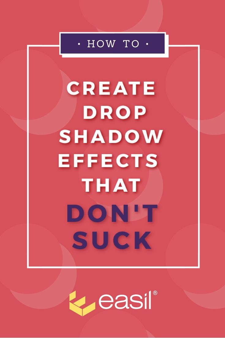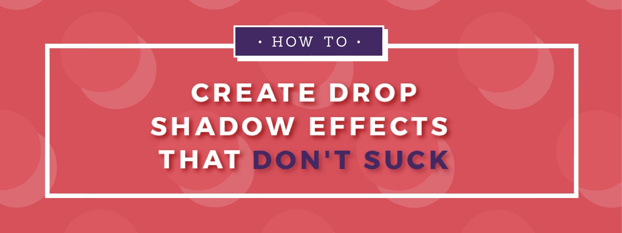
Are you sending your brand into the cringe-zone with bad drop shadows and text effects?
Design trends can be fickle – considered cool one year and cringe-worthy the next. Text effects like Drop Shadow can easily fall into the latter category when used badly.
Let’s not do that. Let’s create text effects that don’t suck.
When text effects are used well, they can draw people into your design, give it depth, and help to lift it.
This includes the clever use of light and dark, and text effects like drop shadows and glow.
But those same effects, rendered badly, can instantaneously make your design unpleasant to the eye, overbearing, or even worse… cheesy.
There are so many DIY tools letting us drop shadows. But unfortunately, many DIY designers missed the memo about how to use them correctly… to create text effects that don’t suck.
Let’s take a look at some Do’s and Don’ts for using text effects (in particular drop shadows and glow effects) in your designs. Oh and there’s an Infographic and a super cool video if you prefer the visual way (scroll down).
Do’s and Don’ts for Creating Drop Shadow Text Effects that Don’t Suck
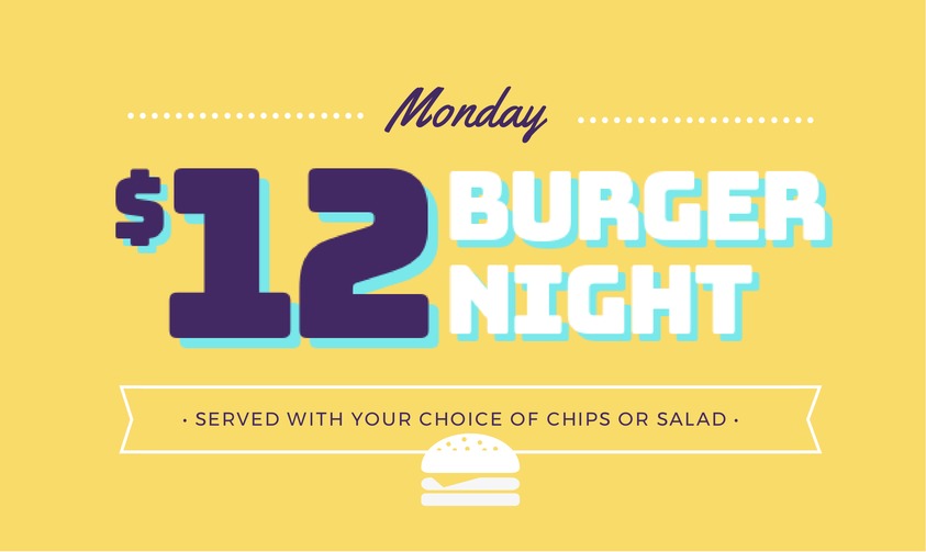
1 Do – Use Contrasting Colors
When it comes to design, contrast is pretty important. It tells your design “who’s boss!”
By that, we mean it tells us where we want someone to focus when they look at an image.
Text effects are no different and require you to decide who’s boss!
So, over and above thinking about brand colors, you need to think about which ones are the most important.
Contrast can be achieved with light and dark, color, shape, texture, size… and of course text effects.
Ensure that your type color contrasts with the effect you use (shadow or glow). Your text effect should also contrast with the background.
Here’s an example of cringe-worthy color contrast:

Here’s an example of contrasting colors that don’t suck:

Remember to keep balance though. Too much contrast in a design .. well.. it sucks.
2 Don’t Go to the Dark Side with Opacity
Opacity refers to the level of transparency of an image or element.
Opacity can be fun to play with when you have a design tool, and adding transparency to a background can really help your text to pop over the top.
But there are a couple of rules to help guide you:
- Text on lighter color backgrounds will require less opacity.
- Text on darker color backgrounds will require more opacity.
3 Do – Go Hard
Hard edges are a type of drop shadow that work – especially for modern designs – and remain popular choice for text effects.
Use a solid, hard edged shadow that matches your main font and you’ll avoid creating text effects that suck.
4 Don’t Give us Blurry Eyes
We love “blur”. It can be such a fun text effect to play with.
When you discover blurred backgrounds and the way it can help to make your text “pop”, inevitably you go on a mission to blur everything. I mean you have to agree, blur looks pretty amazing over background pictures.
It’s hard not to want to #BlurAllTheThings.
But then… if you are lucky, you will realise that your over-blurring is making your designs suck.
So what should you do instead?
Be subtle with your blur. Minimum blur usually works best, especially for text effects and drop shadows.
Here is a great example of the blur effect done well:

Now that we are half way through the Do’s and Don’ts, let’s take a look at the infographic:
The Infographic (on how to create text effects that don’t suck)
Share this Image On Your Site
5 Do – Keep it Subtle, Silly
This tip speaks for itself. One of the biggest dangers with text effects is to over-do them. Don’t be too dramatic!
If all we see is a drop shadow, then you need to rein it in a little.
And please, for the love of all things typography, only use text effects on type that you want to highlight. …really highlight.
Keep it for when you need it!
Let’s say it together: Not all type needs a text effect.
6 Don’t Overshadow Your Text
Overshadowing is one of the most common mistakes people make.
Here are two simple rules to help you keep your drop shadow text effects in check:
- Use a dark color for a shadow effect
- Apply a light color for a glow effect, against a dark background.
7 Do – Be Gentle
Your drop shadow or glow effect should “lift” the design… it shouldn’t become the design.
If you can blur the shadow into the background, it will make your text pop just enough to really catch the eye (without being overbearing).
Think “soft”, “faded” or “blurry” effects over your images.

8 Don’t Blow it Out of Proportion
When it comes to drop shadows, let the text do the talking for you.
Your fonts will guide you as to how to create text effects that don’t suck.
It’s simple:
1 Bold fonts love chunkier shadows.
2 Thin fonts love skinny effects.
Apply this to your designs!
So are you ready to take the pledge? The pledge to only create text effects that don’t suck?
Then listen up – we have a new Easil feature to help you!
Check out the Video!
Check out this video to see our text effects tool in action to create some drop shadow and “glow” awesomeness.
Leave a Comment
Are you a fan of drop shadows and text effects?
What’s your biggest challenge with getting them to make your designs POP?