With so many visual marketing ideas to choose from, it’s hard to know where to start. A compelling graphic is like eye candy for your content, but do all types of visual content boost your marketing?
Let’s take a look at what visual marketing is, and 15 Powerful Visual Marketing Ideas that can boost your results.
When visual marketing is combined with effective copy, it becomes a powerful one-two marketing punch. Let’s break down the concept of visual marketing:
WHAT IS VISUAL MARKETING?
We all know that content marketing is about creating value for your audience and sharing it in a way that is useful to them.
Visual content marketing serves the same function. It just offers another medium via which your content can be shared. This is especially true today with visual content being the preferred content form of social media platforms.
Some major visual content types are:
- Images
- Presentations
- Videos
- Infographics and datagraphics
- Animated gifs
- Comics
- Illustrations and screenshots
- Memes
The right kind of visual content can be the difference between ads and graphics that convert and those that make little impact.
How do you create or select visual content that produces engagement and sells?
And how do you wean out visual marketing ideas that do not boost your results?
In this post, I’ll share proven examples of visual marketing ideas successful brands have used to make their content marketing effective. Put these visual marketing ideas to use right away, to give your results a boost.
Visual Marketing Ideas that Boost Results
1. TELL A GOOD STORY
For visual content to work well, it needs to:
- tell a story quickly
- be shareable
- be memorable.
Visual content can also evoke emotions. You have heard of the expression “a picture is worth a thousand words,” and that is certainly true of visual content.
To learn how to create a compelling story with visual marketing ideas, read the post ”How to Tell a Magnetic Visual Story on Social Media.”
TOMS Shoes – sharing their mission via visual stories
TOMS Shoes is an example of a brand that uses visual storytelling in their content strategy. Their social media channels feature photos of their products but also the social impact they make.
The “One Day without Shoes Campaign is an example of this. TOMS donated a pair of shoes for every shared photo of a pair of bare feet with the hashtag #withoutshoes.
They planned to donate a million shoes and with a 65% audience engagement rate —almost unheard of for a product – it was a bold but achievable goal:
As a result of their efforts, they managed to get major celebrities, such as Pink, on board.
Getting ready for a day #withoutshoes #TOMS pic.twitter.com/spYxucqLdY
— P!nk (@Pink) May 18, 2015
Why did it work for TOMS?
Here are a few reasons:
- 25% of TOMS customers are from outside the US, which makes that focusing their efforts on an international social media platform like Instagram achieved success.
- They weaved a great story and set an appropriate mood around their products.
- They came up with a catchy and relevant hashtag – #withoutshoes
- They gave the audience a sense of fulfilment – the audience feels they are doing good just by posting a picture of their bare feet – and made it a social challenge.
2. GRAB ATTENTION WITH SOCIAL IMAGES
No matter what content form you use in your posts on any platform, one thing we can agree on is that compelling images make a difference.
This is especially important given the fact that organic reach is declining on platforms such as Facebook and non-chronological algorithms make it harder to reach our followers.
Learn from traditional newspapers how to use images effectively. They have long used enticing images with short, sharp headlines complementing the images. In a time of overcrowded feeds and overwhelming amounts of information, this is a great way to catch your audience’s attention.
Gaining a competitive edge requires not just attention-grabbing images but images that are:
- Optimized for the specific platform in terms of size and format
- Related to your industry or niche. Generic images may look great but will do little to attract the attention of your target audience.
- Featuring your brand colors to help your audience recognize the content is from you.
Volkswagen – sharing history visually
Take, for example, Volkswagen. On their Facebook page, Volkswagen has created a visual timeline of the company’s past to educate its consumers about its history and evolution.
Why does it work for VW?
Facebook is used by audiences to view and post updates about everyday events as well as to track significant moments and experiences. Thus, it is an ideal platform for Volkswagen’s legacy and culture-oriented promotional strategy.
The company posts content every day, sharing primarily visual timelines and photo posts.
How do they do it?
- On their Facebook page, they share photos to tell stories about their automobiles and consumers.
- They use the Facebook feature Milestones to commemorate the history of their company. This gives the consumer a cultural lesson on the background and the experience of the VW brand.
- Visual representation of the company’s history helps foster an emotional connection between the consumer and the brand.
Creating and scheduling these images can be very time-consuming, which is why using the right tools can make all the difference in your marketing.
Use visual marketing-oriented tools
To make the most of your visual content, you need to be able to create images and schedule them with ease in coordination with your content planner. This is where online tools can help. Use Easil, for example, your graphic design needs, and CoSchedule for your planning/scheduling needs.
Tools like these can help batch-process your visual content and have it scheduled in advance to be shared on your social media accounts.
3. THINK MEMES
Memes are a form of communication that transmit a social idea or a cultural symbol – usually picture-and-text images that spread online. They can be a great source of visual marketing ideas.
Norwegian Airlines – newsjacking with memes
Following Brad Pitt and Angelina Jolie’s divorce announcement, Norwegian Airlines released an ad offering cheap flights from London to Los Angeles.
‘Brad is single’: Norwegian airline cashes in on Brangelina’s splithttps://t.co/AXwzz3N2ti pic.twitter.com/hcXknd1iMw
— Telegraph Travel (@TelegraphTravel) September 26, 2016
The ad first appeared in newspapers, but the clever captions and celebrity intrigue captured people’s attention online as well.
London to LA from £169* one way #FlyNorwegian https://t.co/Oezj6tshj0 pic.twitter.com/vkpfzDmT9e
— Norwegian UK&IE (@NorwegianUK) September 22, 2016
Some researchers say they can accurately predict the spread of memes based on science. When Australian politician Bronwyn Bishop was embroiled in an expenses scandal (she took a helicopter flight the short distance from Melbourne to Geelong for a fundraiser at the cost of $5227) a spate of “Choppergate” memes popped up.
According to Ari Spool, a “meme scientist” at Know Your Meme, a good meme involves absurdity and a certain degree of inside joke quality. With reference to the spate of Choppergate memes, he said:
For most tax-based government scandals, the visuals would be bland, or perhaps repetitive—maybe an old politician sitting on a pile of money or something. Boring. But for this one, you could use these images of a helicopter walking a dog or picking up a bus, which are absurd.

To create a good meme, use the following tips:
- Keep an eye out for memes, especially those that have gone viral recently. They can provide inspiration for visual marketing ideas.
- Pay attention to trends, especially on social media. Note what makes you laugh and gets the most responses, in particular around entertainment-based topics.
- Choose a subject you can relate to or that’s easy to imitate.
- Decide on a medium. Photos are the easiest to use and the most popular.
- Decide on the content and acquire images if needed. Grab video stills or photos you might want to use.
- Keep it short and simple to cater to enable your audience to consume the content quickly as they scroll through their feeds.
- Ensure the visuals match the sentiment of the message you are trying to convey.
4. CREATE VISUAL QUOTES
Visual quotes are still very popular. You only have to hang out on Facebook, Instagram or Pinterest to see them in action. People love sharing quotes as they are a simple yet powerful way to share your thoughts, beliefs and event excerpts from your programs and content.
But how can you compete with those quotes layered on a gorgeous image, especially if you are graphically challenged?
Tools such as Easil will help. See for yourself how easy it is to make a creative visual quote with Easil.
Nike – creating custom designs
Nike uses Instagram posts and hashtags to motivate and celebrate its consumers with a consistent message that fans come first. Their feed features images of everyday moments in sports, coupled with motivational and inspirational hashtags to empower and engage consumers.
5. REPURPOSE CONTENT VISUALLY
According to a report on LinkedIn, most businesses face two challenges when it comes to content creation: (1) having enough resources and (2) creating enough content variety.
It is therefore important to make the most of your existing content and resources before creating new types of content. Here are some visual marketing ideas for the types of content you can repurpose, by turning your popular content into:
- Infographics
- Webinars
- SlideShares/Slide Decks
- E-books
- Podcasts
- Video
Creating these forms of content will also allow you to reach audiences who prefer alternative forms of content, e.g., a podcast as opposed to video. It will also help increase your backlink profile.
Cooksmarts – enhancing content visually
Cooksmarts uses this visual marketing idea to enhance its content. They provide weekly plans and information related to cooking and health in the form of simple and easy-to-understand infographics. These are supplemented with detailed articles and how-to videos.
Their guide to cooking oils, for example, contains detailed information and explanations on the subject, combined with visuals and infographics.
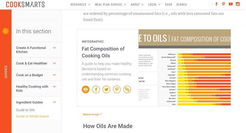
The company’s platform of choice is their own website with a posting schedule of once a day. The content includes meal plans, recipes, ingredient guides, information on cooking and health, kitchen essentials and organization tips.
Why does it work for Cooksmarts?
Here are a few reasons:
- Every infographic is linked to a detailed and informative resource page
- Infographics are categorized according to seasons, topics, etc.
- The audience can subscribe to receive infographics (including an A4 printable version).
- They pitch their infographics to sites like Lifehacker
- Their content is evergreen
6. USE GIFS AND GET GIFFY WITH IT
Need to share step-by-step instructions on how to do something? Do you usually share screenshots to explain the process?
Why not use animated GIFs instead? The added benefit of this method is you can share such GIFs on multiple social media platforms—think Pinterest, Twitter, Facebook and GooglePlus. The animated GIFs auto-play in the feed of these platforms, attracting the attention of your audience.
To create animated GIFs, use tools such as Jing and recordit.
Animated GIFs have been around for years, but as Adam Leibsohn, Giphy’s chief operating officer, says:
We are starting to see this behavior where people are using content and culture to communicate—they’re not using words anymore. When they’re doing that, there’s an opportunity for that culture to come from a brand.
Consider these statistics from the New York Times:
- 23 million GIFs are posted to Tumblr every day
- More than 22 million GIFs are sent through Facebook’s messaging app every day
- Slack has more than 2 million GIF integrations each month
Branded GIFs are an engaging mix of content marketing and interactive communication. Don’t miss out on them.
DiGiorno Pizza – using animated GIFs
DiGiorno Pizza noticed a major upswing in its social sharing when the company started posting animated GIFs on its social media channels.
You are getting hungry, very hungry. I see delicious DiGiorno pizzeria! pizza in your future. pic.twitter.com/9EyHLEk0K1
— DiGiorno Pizza (@DiGiornoPizza) April 9, 2015
The proof is in the shares. In an interview with Adweek, the director of social content at Resource/Ammirat, Luke Oppliger, stated:
We were happily surprised that when we started to do GIFs, they got even higher engagement. We typically get a few hundred retweets and favorites, but we are seeing GIFs in the thousands.
7. EMBRACE VIDEO
Social video is huge on every social network. Even LinkedIn recently introduced native video to their platform. Here’s just a few reasons to embrace video:
- Native video gets more reach on the Facebook newsfeed.
- Consumers are more likely to watch behind-the-scenes videos, funny videos, emotional videos or educational videos
- 39% of consumers are more likely to finish videos with subtitles (we keep the sound turned off up to 85% of the time on Facebook!).
Statistics provided from Animoto – read more here.
Upload video content natively
Social media platforms are increasingly focused on keeping users on their platforms for longer. As such, they tend to frown on activities that could potentially take users away from the platform.
When it comes to video, this means that you should upload video natively to the platform you are on, wherever possible. Facebook, for example, tends to boost videos uploaded natively on the platform compared to videos shared through a link. The same is true of images, which would explain why posts with content uploaded natively tend to get more engagement than those with links.
8. GO LIVE WITH VIDEO
The use of live video is on the increase, especially since platforms such as Facebook, Periscope, SnapChat and Instagram all cater to this. Consider these statistics:
- 81% of respondents watched more live video in 2016 than in 2015.
- Live video is more appealing to brand audiences: 80% would rather watch a live video from a brand than read a blog, and 82% prefer live video to brand’s social posts.
The rise of live video can be attributed to a few factors:
- It is live and real—and perhaps a bit messy, but that makes it more relatable and human.
- It’s quick and easy to make as you only need a smartphone, a social media app and time to create the video.
- It allows for direct communication with your audience, greater transparency and behind the scenes access.
To make the most of live video, consider creating content that includes:
- Behind the scenes activities in your business.
- Interviews with industry experts.
- Discussions around topics relevant to your community.
- Actual stories and customer feedback that showcase the brand value.
The following businesses use live streaming to grow their audiences and sales. Follow them for visual marketing ideas when it comes to live video:
- Grant Cardone built his audience via live streams
- The Verge connects with its audience, namely bloggers, by allowing them to share their thoughts, inspiration and related information on blog posts!
- Kenra professional uses it to show how its products work.
To make the most of your videos, keep in mind the ultimate goals of the video platforms: they want their users to stick around for as long as possible.
9. MAKE YOUR VISUAL CONTENT DISAPPEAR
Snapchat, Instagram stories and even Facebook use or have tried ephemeral messaging to get their audiences more engaged. For the uninitiated, TechTarget defines ephemeral messaging as:
…mobile-to-mobile transmission of multimedia messages that automatically disappear from the recipient’s screen after the message has been viewed. The word “ephemeral” describes something that only lasts for a short period of time.
Why is ephemeral content so popular at a time when information is so available and so easily accessible at any time? Because it plays on the Fear Of Missing Out (FOMO) and exclusivity.
Once you miss a temporarily-available message or post, it is gone for good. This, of course, entices people to keep coming back to get the latest and be in the know.
Taco Bell on SnapChat
Taco Bell uses Snapchat to post short, witty and highly-targeted video campaigns. The focus is on weaving together moments to create a visual narrative. They don’t adhere to a fixed schedule but feature custom-sponsored Snapchat lenses, photos and videos.
Snapchat-exclusive promotional campaigns are common on their channel, especially when it comes to launching new products like the Quesalupa. They created a visual campaign and a snap-by-snap live film to promote the launch of a new DLT flavor.
More recently, they launched a sponsored lens campaign on Snapchat. This campaign provided their audiences with a taco shell filter to celebrate Cinco de Mayo. This alone resulted in 224 million views in one day.
Why does it work for Taco Bell?
Here are a couple of reasons:
- Taco Bell was an early adopter of Snapchat and used real-time marketing methods to engage with its audience in a more savvy and candid manner. This has solidified Taco Bell’s image as a youthful brand.
- Its sponsored lens campaign on Snapchat was based on audience involvement and participation. The audience used the taco shell filter to send snaps to their lists. The subtle branding of the campaign helped it become a massive success in terms of audience engagement.
The platform you choose will depend on where your audience hangs out.
However, keep in mind Instagram now allows Instagram stories to be used to run time-limited offers. This fairly recent feature allows you to link an image to an external webpage. Such campaigns seem to show swipe rates of 15-25%.
How do you make the most of disappearing, ephemeral content?
- Experiment with formats. For example, test using videos vs photos, background sounds vs no sound.
- Change things up each time you share. For example:
- Highlight events you attend or host.
- Post teasers of product launches.
- Reveal behind the scenes insights.
- Share perspectives outside your brand. For example, Marriott Hotels posted a series that followed a traveler visiting various boutiques in Atlanta.
- Interview people.
- Show your audience how to do things or use products.
- Newsjack breaking news in your industry.
- Use text, emojis, doodles, stickers and filters to add dynamic elements to your story
- Make it short and snappy to keep your audience’s attention.
Be inspired by TacoBell for “disappearing” visual marketing ideas!
10. LEVERAGE PINTEREST
AMC Theatres uses Pinterest to engage with consumers over their shared interest in movies.
On Pinterest, audiences seek out content based on very specific interests. Thus, it is the ideal platform to achieve maximum engagement on the kind of content AMC shares. This Pinterest board is an example of the content they share:
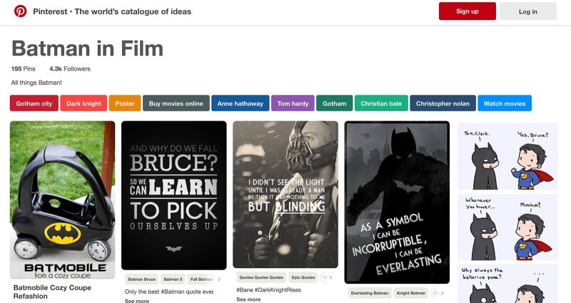
AMC Theaters doesn’t follow a fixed posting schedule. They pin visual posts related to movies and Hollywood, e.g., movie posters, quotes from movies, and movie-related memorabilia.
Why does it work for AMC Theatres?
Here are a couple of reasons:
- Their pins don’t directly promote AMC. However, for movie aficionados, their Pinterest boards act as a valuable resource of movie-related memorabilia without being overtly promotional.
- AMC Theaters inform their audiences as film experts and entertain them as film lovers, which aligns with their brand and their target audience.
To make the most of your visual content on Pinterest, use the following visual marketing ideas:
- Focus on making your boards a valuable resource for your target audience. Make your audience’s lifestyle aspirations—not your products—the focus of your content.
- Use Pinterest analytics to identify top content and audience interests. Also look for seasonality and trends.
- Craft search-friendly descriptions.
- Add plugins like the Pinterest Pinboard Widget to your site to make your images pinnable.
- Follow other like-minded Pinterest users.
- If you are a local business, add geographic information to your profile and optimize your pins and boards for local searches.
- Connect with fellow businesses and explore areas of collaboration.
11. MIX UP YOUR VISUAL CONTENT
Visual content doesn’t have to consist of images only. Buzzfeed, for example, is known for its visual content, which includes infographics, animated gifs and videos in addition to static images and memes. All of which help tell a story. Check them out for visual marketing ideas.
Consider mixing things up, and use proven visual content types to build out your visual content strategy.
12. GO OFFLINE
These days, when people think of advertising or visual content, they usually think of online spaces. However, offline spaces can work just as well for visual marketing ideas. You can find locations that aren’t very ad heavy and where traditional marketing can get you much-needed exposure.
Business cards, flyers, and other print documents can drive traffic to your site or store and generate leads for future business. Costs of these traditional marketing methods have come down significantly over the years, making them a good investment.
Easil, in addition to being an online graphic design software tool, also lets you print your materials and delivers them to your door.
13. JUMP ABOARD THE FOOD TRUCK
Apicius, a first-century Roman gourmand and author, is credited with saying:
The first taste is always with the eyes.
According to a study from advertising agency Havas Worldwide, young people are obsessed with food like never before. They view food not only as nutrition but also as a source of entertainment, a hobby and a craft. Stuck for visual marketing ideas? Look to food for inspiration.
Over 62,000 photos of food are uploaded every day with the #foodporn hashtag alone.
Forty-four percent of millennials posted a food or drink photo on social media in 2015. In fact, this trend caused the US chain Chili’s to change the décor and menus to make its food photograph better.
Dunkin Donuts – riding the #foodporn trend
Instagram’s photo sharing option is great for the fun and unique photos, edits and memes that Dunkin’ Donuts likes to share with its followers. Their account is a great source of visual marketing ideas. They use an indirect promotional strategy on Instagram by sharing photos from the office as well as posting general, unique content. They also regularly hold audience photo submission contests.
Dunkin’ Donut’s weekly posting schedule looks like this:
- Regularly updating their Instagram account with photos of the various items from their menu.
- Creating and sharing unique content that shows off their products in creative yet subtle ways.
- Using a witty and fun tone, reflecting the brand’s image.
- Regularly holding photo challenges, contests and sweepstakes tied to their market calendar initiatives.
Why does it work for Dunkin’ Donuts?
- Dunkin’ Donuts creates Instagram content and shares it based on how the fans and consumers are already engaging with the brand on the platform as well as other social media networks. This makes the content relatable and, thus, highly shareable.
- Dunkin’ Donuts’ Instagram strategy is designed not only to engage fans but also provide content they are interested in: relevant, unique and playful. This, again, results in shareable content for the consumers.
14. SHOW USE CASES
If you sell everyday household products, look at other companies that are creative with their products, for visual marketing ideas.
Target, for example, creates content that showcases their products used in real-life scenarios and settings. This makes their content more interesting and appealing as people are always on the lookout for ideas to better their homes and lifestyles.
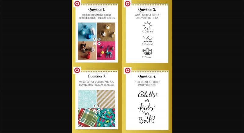
Target utilizes Pinterest to drive their in-store sales. The company shares a variety of products, recipes, home decor ideas and more on their Pinterest boards. They have also collaborated with designers and bloggers to broaden their reach on this platform. For example, check out Best.Party.Ever & Party with Pinners.
Target has also introduced in-store tags for their most pinned items. Sharing products in the context of unique and relevant to their audience topics has earned them over 527K Pinterest followers.
Why does it work for Target?
Here are a few of Target’s visual marketing ideas that have worked well:
- Best Party Ever Campaign – they collaborated with David Stark, a designer, to help pinners plan their own parties.
- Collaboration with top pinners, Oh Joy!, Poppytalk, and Wit & Delight, to create content and design a line of party supplies.
- Integrating Pinterest experience with in-store experience – they have in-store tags attached to their top-pinned items.
15. MAKE YOUR VISUAL MARKETING IDEAS INTERACTIVE AND RESOURCE-WORTHY
To maximize your content’s engagement ability, you need to create visual experiences for your audience. Consider these statistics:
- Content with relevant images gets 94% more views than content without relevant images.
- Eye-tracking studies show Internet readers pay close attention to information-carrying images.
- Infographics are liked and shared on social media three times more than any other type of content.
Movato – resource-worthy visual marketing
Movoto, a real estate company, has used infographics to great effect with visual content related to the real estate industry.
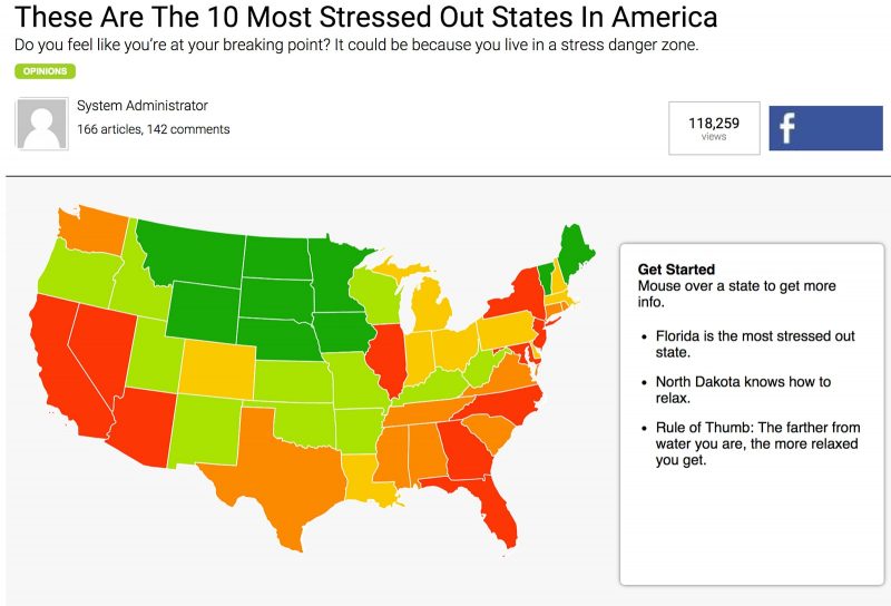
The company’s main platform is its website, which hosts a number of interactive real-estate related infographics. For example, ranking US states/cities by criteria such as stress, caring for others, how exciting the area is, unemployment, home improvement, gardening, decor, etc.
Why does it work for Movoto?
Here are a few reasons:
- They use in-house research and analysis of the data for their infographics.
- They show the audience how they created the infographic.
- They create detailed and reliable resources that journalists can use to write articles.
Another example of a company employing interactive marketing strategies is the retail giant Kate Spade New York (KSNY).
KSNY – interactive visual marketing ideas
In 2013, KSNY launched a campaign, encouraging consumers to use interactive window displays in the city to shop for products. It allowed customers to browse through the catalog and order a product, which was then delivered by eBay. This campaign was an effective marketing tool as the visual content of the displays was interactive, increasing the consumer engagement manyfold.
KSNY also creates visual content on Facebook and Pinterest relating to the retail industry. Since the brand specializes in bold and stylish wear, KSNY regularly showcases their style and work on Facebook. While they don’t follow a specific schedule, groups of photos following a theme are often posted together.
Why does it work for KSNY?
The success of Kate Spade New York lies in their use of color – one of the key factors in effective visual marketing. KSNY’s use of graphic prints and crisp color as well as their playful sophistication make them a powerful presence on Facebook and Instagram, and one of the most followed brands on Pinterest.
Phew, that’s a lot of visual marketing ideas!
Use this post to refer back to when you need some inspiration for visual marketing!
