Gradient blends are a popular design trend that can add a modern touch to any design. But adding some grit, or grainy type texture to this normally smooth and soft transition of colors, and teaming it with fine-lined graphics, bright fluro colors, or even animation, can take your designs up another level!
Subtle texture in the form of distortion, noise, and grain can also work beautifully over solid colored backgrounds, placed inside large display text, or into shapes that are layered throughout your design.
So in this post, we’ve come up with 6 different ways to use them in your next DIY design project, along with free templates for each to get you started. Plus, we’ve loaded up our free stock image library with grainy image options so you can customize each design even further!
6 FREE DESIGN GRITTY GRADIENT DESIGN TEMPLATES YOU CAN USE NOW!
Ready to get started? This is how you can use the gradients and textures DIY design templates in Easil:
- Create your free 30-day Plus account by clicking here.
- Click on any of the links below to create your own copy of the design in your Easil account.
- Editing text is easy! Double click any placeholder text to enter Edit mode, and type in your new content. Use the top toolbar to select new fonts, colors, size, and more. But keep in mind the golden rule of editing templates – replace like for like!
- Read further on in this article to discover more gradient options and how to use them in your designs.
#1 GRADIENT BURST TEMPLATE
Bring your static graphic post to life [and stop that scroll] by adding a stunning gradient burst animated GIF background.
This stand-out effect can be found in the Graphics tab. Click on Animations, and then the search term ‘Gradient Burst’. Click to add the animation to your design, and then set it as your background by right-clicking and selecting ‘Set as Background’. This will move the graphic to the back of your design, and also resize it to fit the entire size of the post.
Before you download it as an MP4, don’t forget to set the animation playback time by clicking on the ellipsis (…) on the left side of the design editor, under the Play button.
#2 LAYERED SHAPES GRADIENT TEMPLATE
Using grit and grain in one area of your design is a great starting point, but layering the same texture amongst various shapes and layers will bring more depth and a professional all-over look.
Try this effect for yourself by adding ‘Shape Masks’ (located in the right sidebar, Graphics tab) to your design, and then dropping in a gradient image from the stock image dropdown – or upload your own!
#3 GRADIENT INSTAGRAM CAROUSEL TEMPLATE
Carousel posts are known to be loved by the Instagram algorithm, increasing your visitor’s view time on the post and encouraging interaction.
This design template is ready for you to apply the gradient trend, and share knowledge with your audience over 5 seamless, swipeable pages.
Appearing as a single design in Easil, you can work your way through updating the content, and then when the design is complete you can access an online image splitter tool to create 5 perfectly sized IG posts for your carousel, ready to post!
Hot tip: Click on the Rulers & Guides button to the right of your design to enable the guide visibility, and where each post will split.
#4 GRITTY BRIGHTS STORY TEMPLATE
This template incorporates a bright pink background image that includes layers of gritty shapes and contrasting bright colored text to keep the whole look ultra-modern!
The key to keeping this design looking professional level is to limit the number of bright colors used. For example, keep the background as one color, and then use a contrasting color for the heading and other small enhancements.
Try these bright color options for your social posts:
Yellow: #EAF02C
Green: #5EFE41
Pink: #FF72E2
Blue: #45FFFB
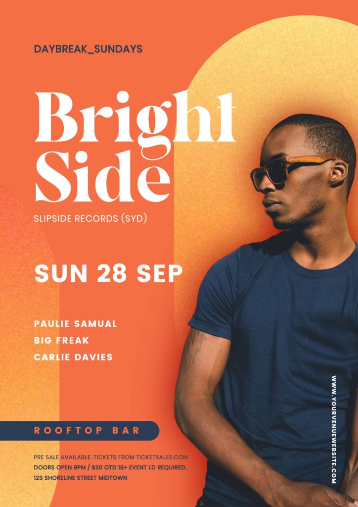
#5 GRITTY TEXTURED EVENT POSTER + POST TEMPLATES
This design technique is perfect for creating a campaign that spans both print and digital outputs. With its bright, bold color scheme, it’s best used with a hero image of your event entertainment or drawcard act.
On the matching square post (for use on Facebook, and Instagram), we’ve added a similar animated GIF motion to bring it to life. Keeping in mind that Instagram favors video above all else, even a subtle animation will take your static post to export as a video, and should garner more views!
Use the same editing method as the poster, double-clicking to edit any existing text to update to your own, and click on the image placeholder to drag in your own photo after you’ve removed the background.

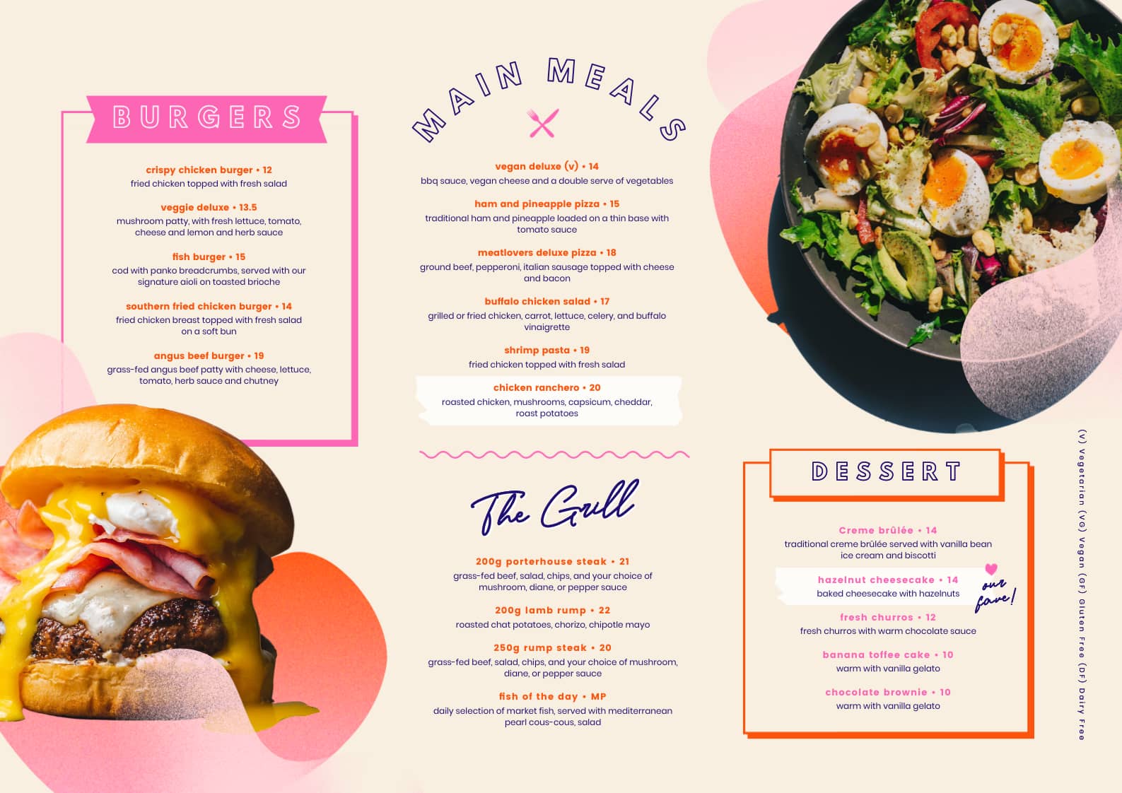
#6 GRADIENT MENU TEMPLATE
Banish boring food and wine menus, and instead inject some fun, color, and gradients!
In this landscape menu template, our design team had fun creating a modern menu design that can easily be edited by non-designer folks. By incorporating ‘tables’ into the menu content, you can quickly update and tab through to each section, and even re-arrange the order of the content by dragging up and down within the table stack.
To fully make this design your own, upload some high-quality food snaps to Easil. Then head to your Workspace > My Uploads, and locate the image in the list. Click on the black arrow to access the Remove Background functionality* and once it’s saved the new background-free option, you’ll be able to access it in the editor in the images tab. Drag across to your design to complete!
*Remove background credits are available on paid Plus and Edge plans.

HOW TO FIND A GRADIENT IMAGE TO CUSTOMIZE YOUR DESIGNS
You can find a great range of gradient images ready to drop into your designs right in the Easil image library.
Grainy textures:
Use the Images tab on the right sidebar, select Stock Images from the dropdown, and enter ‘grain texture’ in the search input field. This result will yield various shapes with textures and bright colors that you can add to your design, and even add filters to, so you can adjust the colors to work with your brand.
To apply filters: Add the static image to your design, and while you have it selected, click on Effects in the top toolbar. Within the Filters sub-tab, click on View More and then use the ‘Hue’ slider to change the color of the graphic elements.
Gradient blends and images:
Within the Images tab, use the Stock images dropdown, and enter ‘Gradient’. Drag any of the results onto your design, or try using them in a Shape Mask (Graphics > Shape Mask > Add to your design > Drag image onto Shape Mask).


TIPS FOR USING GRAINY GRADIENT TEXTURES
If you’re moving beyond using Easil’s pre-designed graphic templates and instead want to build your own, try the below tips for creating your own unique look:
- Experiment with increasing the size of the texture: Expand the ‘graininess’ by making the element larger within your design. Click on one of the corner handles and pull them outwards to increase the size. This applies to images placed within shape masks too. Just double-click to activate the transform handles and pull outwards in the same way.
- Layer similar colored textures over your background: Try layering gradient images in a similar color to your background color to add subtle texture, and save the contrast for text and other design elements. Alternatively, adjust the opacity of an applied gradient to blend it into your background color or image for a more subtle effect.
- Rotate elements to reposition the gradient direction: Play with rotating your textures placed on your design or those in shape masks, to update the direction of the gradient and gritty effects.
OVER TO YOU
As business owners, we know how important it is to keep our brand looking fresh, relevant, and on-trend, especially on social media. Will you be looking to bring these grainy gradients and textures look to your brand graphics or those for a client? Tag us in your designs on social media so we can check them out!


