There’s nothing fun about a real life lockdown, or quarantine. Staying indoors, being away from your friends, and adhering to more rules than we’ve had since leaving school.
But taking a light-hearted view, we have noted that some of the life tips devised to keep you safe during COVID-19, can be doubled up and applied to DIY design, to curb the spread [of bad designs], and do more good for your graphics, and your brand wellbeing.
Join us while we examine these tips and skills from a Design Police point of view, and get you familiar with the tools that will lift your creations out of the confines of your home, and ready to take on the world:
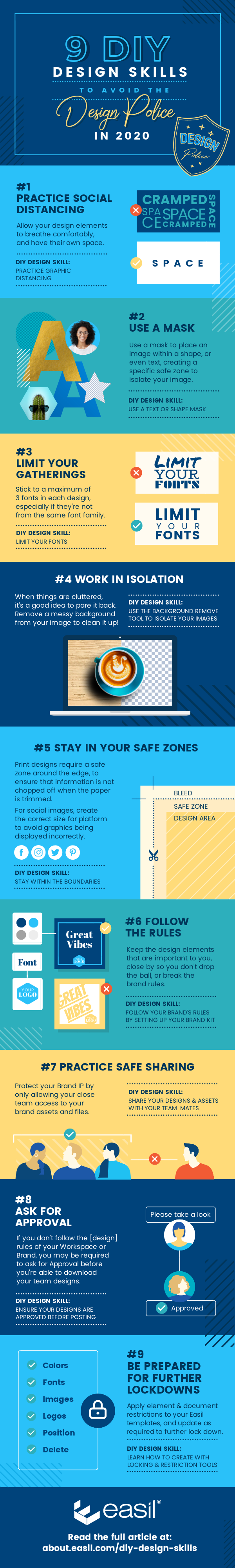
- Practice social (graphic) distancing
- Use a (text or shape) Mask
- Limit your (font) gatherings
- Work (your images) in isolation
- Stay in your (document) safe zones
- Follow the (brand) Rules
- Practice safe (design) sharing
- Ask for (design) Approval
- Be prepared for further Lockdowns.
Let’s get into each one of these DIY design skills in more detail, and how you can stay out of the DIY Design sin-bin..
(Pin this infographic for later!):
#1 PRACTICE SOCIAL DISTANCING
[DIY DESIGN SKILL: PRACTICE GRAPHIC DISTANCING]
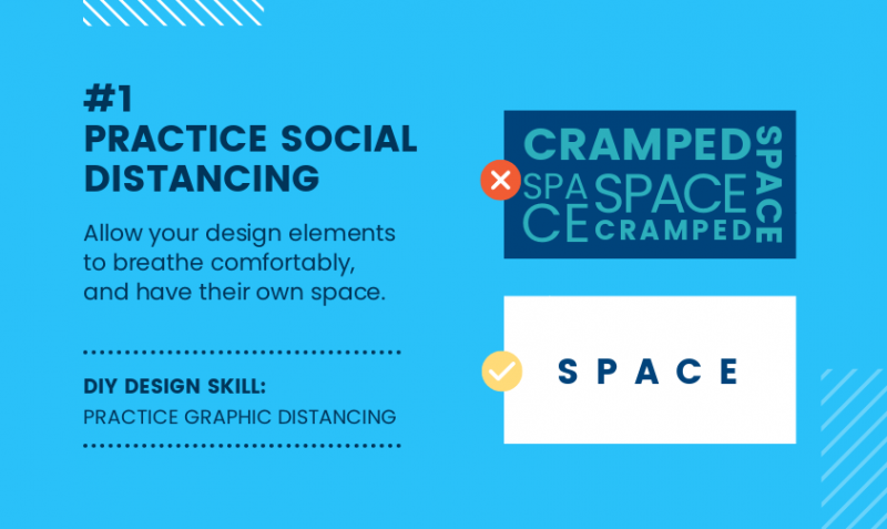
In the world of graphic design, there are many instances where more space, and distance, equals a better design result.
Practice the use of ‘active’ white space around images and graphic elements, and most importantly around text boxes, to ensure legibility.
This is when you consciously separate elements by adding space, whether that be white, or another color, to ensure the end result is not crowded and cluttered. Think of it as allowing your design elements to breathe comfortably, and have their own space.
#2 USE A MASK
[DIY DESIGN SKILLS: USE A TEXT OR SHAPE MASK]
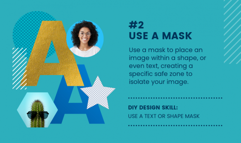
Using a mask in a design enables you to place an image within a shape, or even text, creating a specific area that will be filled with your placed image. Within Easil, you have two options for using masks, which create a multitude of creative options.
The first option is ‘Shape Masks‘, which can be found in the editing screen, on the right Sidebar, in the Graphics tab. To use them in your design, click or drag and shape from the category, and then once placed on your design, click on the ‘Images’ tab, and drag & drop an image until it clicks into place in the Shape Mask.
The second option is a user favorite – ‘Text Masks’. This is when an image can be placed within any font (Easil fonts or your own uploaded fonts). To start using Text Masks:
- Typeset your word or phrase that will contain your image. For best effect, start with using a bold or thick font first.
- Click on the Text Mask icon, in the top ActionBar.
- With the text still selected, to to the Image tab in the right Sidebar, and add an image from your own library or Easil’s, by clicking on the image. It will fill your text in the default position.
- Reposition the image by using the crop and resize tools in the mask tool subset.
TIPS FOR USING SHAPE MASKS:
- Try using metallic textures such as gold and silver masked in a shape, and placed against contrasting solid blocks of color.
- Profile photos and images are best placed into simple shape masks such as circles, squares or diamonds.
- Avoid use of several different shaped masks in the one design. If you need to display more than one image within a shape, repeat the same size for best effect.
TIPS FOR USING TEXT MASKS:
- Like Shape Masks, text masks also work fantastically with metallic textures. Experiment with textures that are consistent across the image, so that when placed into the typeset area, there is not too much variation between how each letter appears.
- Text that contains a mask image is still editable in Easil, including the ability to change the font that is applied. So if you’re not sure that the image and text masked together are working, experiment with different fonts, as well as images.
- Limit the use of other text effects such as drop shadows, underlines, or glow, when using a Text Mask.
- Restrict text masks to use in large headings, or a single feature text area.
#3 LIMIT YOUR GATHERINGS
[DIY DESIGN SKILL: LIMIT YOUR FONTS]
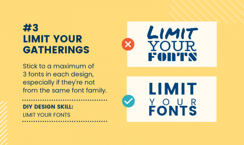
As a general rule, to keep your design looking pro-level, you should stick to a maximum of three fonts in each design, especially if they’re not from the same font family.
But before you venture out with that group of 3, start with pairs only. Font pairs, that is. Only after you’ve mastered that, should you add a third [font] to the party.
TIPS FOR PAIRING FONTS TOGETHER:
- Contrast a Serif fonts with a Sans Serif Font. Serif Fonts have small decorative lines or embellishments at the ends of characters, while Sans Serif fonts do not include the decorative lines.
- Headline vs Body Font. Select a Sans Serif headline and a Serif Font for the body text. This pairing works because there is high contrast, and it’s also a good match between classic and modern. Start with your preferred heading then pair it with a few body fonts to see what works best.
- Think about the personality of the font. Consider the mood you wish to achieve with the final project. If it’s a formal occasion or invitation, then flourish-y, fancy fonts will work. But they won’t work for a sale announcement where you want to make impact. Instead, choose a bold font.
- Check for legibility. Look at your font choices from different distances and in different sizes. Are they legible and easy to read when used alone and when paired together?
Read more about Font Pairing, and examples here.
#4 WORK IN ISOLATION
[DIY DESIGN SKILL: USE THE BACKGROUND REMOVE FEATURE TO ISOLATE YOUR IMAGES]
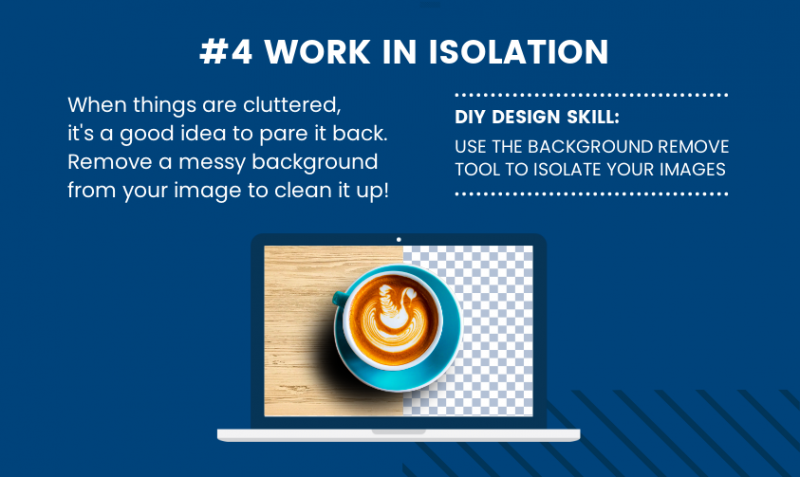
When things are too busy or cluttered, it’s a good idea to pare things back. In this tip, we’re talkin’ about isolating images, and that means, removing the background from them.
Thankfully, in Easil self isolation is quick and easy. We’ve got a magic button integrated right into the Workspace + My Images interface that can remove the background from even the trickiest of images, to allow them to be used in perfect isolation.
HOW TO USE THE BACKGROUND REMOVE FEATURE:
The Background Remove feature is located in the ‘My Images’ tab of your Easil ‘Workspace’. To get started with isolating your images:
- Click on the upload button within the My Images tab (in My Workspace).
- Once your image is uploaded and visible in the list, click on the black arrow icon on the right side, beside the image you would like to update.
- Select ‘Remove Background’ from the options.
- Your new image copy will be saved in the same location.
To use your images within an Easil design:
- Open a design or template in the Editor.
- Navigate to the Images tab on the right Sidebar, and locate the image in ‘My Images’.
- Click or drag to add to your design!
#5 STAY IN YOUR SAFE ZONES
[DIY DESIGN SKILL: USE THE CORRECT SIZES FOR YOUR DESIGNS & STAY WITHIN THE BOUNDARIES]
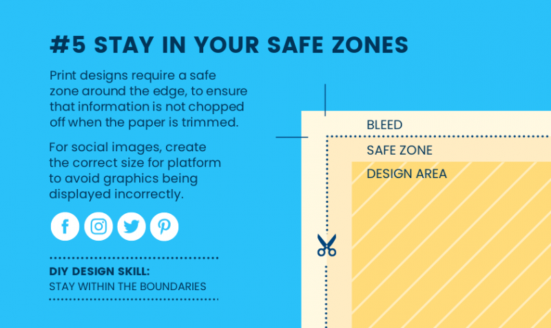
Did you know that designs have safe zones too?
For printing, designs require a safe zone around the edges of the design, to ensure that important information is not chopped off, when the paper is trimmed.
In the case of digital designs, safe zones can be viewed as using the correct size for the required output. For example, ensuring that you use a portrait sized image for stories, but not for a Twitter post, where part of your image will be cut-off in the feed. And for Pinterest, best practice is always to use a portrait image [at 600x900px to be exact].
#6 FOLLOW THE RULES
[DIY DESIGN SKILLS: FOLLOW YOUR BRAND’S RULES BY SETTING UP YOUR DESIGN KIT]
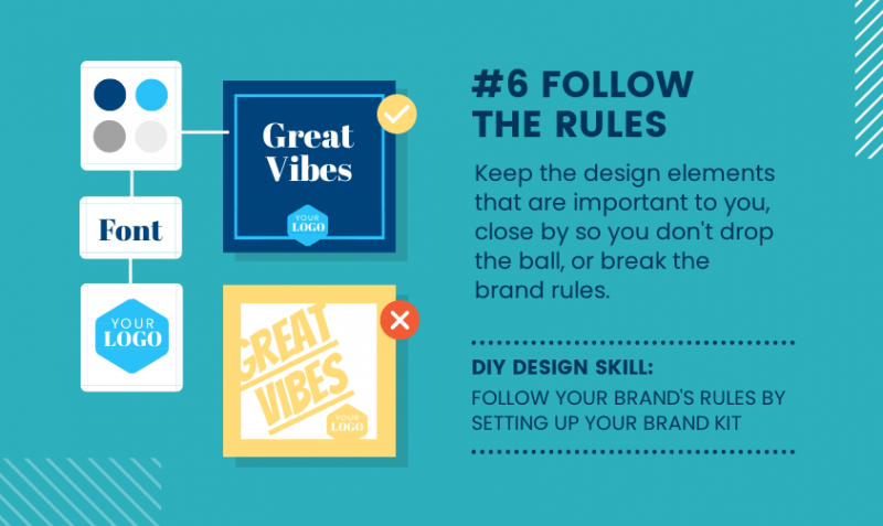
Keep the design elements that are important to you, close by. In Easil, you can ensure you’re never far apart from your brand elements, by storing them all in your Brand Kit, always at the ready to ensure Brand rules are not broken.
Setting up your Brand Kit will save you from looking for hex color codes, logos, or the right brand logo or font, and make sure your designs and templates are used the right way, every time.
TIPS FOR USING THE BRAND KIT:
- Add in all the usual suspects before you start work. That is; your logo variations, color palette, fonts, and imagery.
- Create variations of your color palettes, eg secondary colors, or seasonal color variations, into a separate palette.
- Invite your team mates to use templates within your organisation, and with the Brand elements already applied, to keep it simple.
- If any Brand elements update, or you re-brand, make sure you keep it up to date so they’re always on-hand!
#7 PRACTICE SAFE SHARING
[DIY DESIGN SKILL: SHARE YOUR DESIGNS & ASSETS WITH TEAM-MATES ONLY]
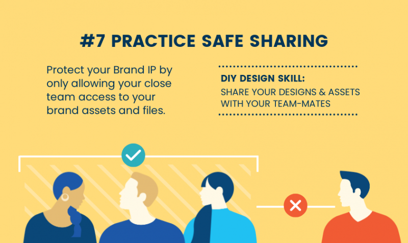
Nobody likes someone who shares something, that they should not be sharing. And when it comes to the IP of your brand, you’ll want to make sure you’re not letting anyone outside of your trusted team, access your files.
In Easil, you can assign ‘Admin’ roles to only the team members that you would like to have access to adding other users to your team. In turn, this will mean that designs cannot be shared outside of your Team, and will protect your brand IP.
#8 ASK FOR APPROVAL
[DIY DESIGN SKILL: SUBMIT YOUR DESIGNS FOR APPROVAL BEFORE USE]
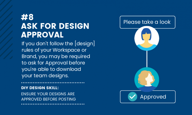
If you don’t follow the [design] rules of your Workspace or Organisation, you may be required to ask for Approval, before you’re able to download your team designs, aka Design Quarantine.
This process of Approvals can teach you more about what your organisation finds acceptable in terms of content and compliance, and improve your DIY design skills.
HOW TO SET UP DESIGN APPROVALS:
Brand Manager role will be required to activate the Approvals Workflow.
- Navigate to your Teams Template section, and locate the Design that you would like to activate.
- Click on the black arrow icon located at the bottom right of the design card.
- Select ‘Enable Approval Process’.
- This Template is now required to be submitted for Approval by any team members that create copies of the template. It will have a blue check-mark icon added to the bottom left corner of the card so that any user will clearly see that this design requires approval.
#9 BE PREPARED FOR FURTHER LOCKDOWNS
[DIY DESIGN SKILLS: LEARN HOW TO USE LOCKING & RESTRICTIONS FEATURES TO KEEP YOUR TEAM ON BRAND]
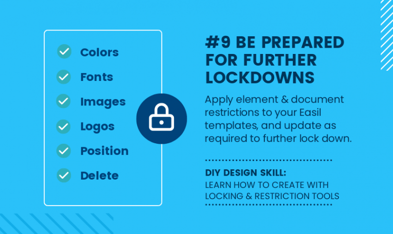
If requesting Approval is causing too much chaos for the workplace, you may find that your team Design Templates will be further locked down, to restrict your movements.
If you’re the Brand Manager [aka the in-house Design Police] you will be the one to enforce these Lockdowns, and keep your team inline. With Easil, you can restrict every element with granular permissions, ensuring you give your team just enough freedom to do what they need, but ensuring the graphic output is of a standard expected by you.
OVER TO YOU
Which of these DIY Design Skills will save you from ending up in the DIY Designer sin-bin? Send us a DM on social and let us know!