Whether you’re creating a simple quote or testimonial graphic for social media, or building an ebook with multiple pages, having a few professional typesetting tricks up your sleeve can take your DIY design from drab, to fab, in no time at all!
The moods, vibes and personalities that can be conveyed by selecting the correct font for your project, and learning how to apply various adjustments to that type are skills well worth learning. In this article, we’ll walk you through 8 basic typography tips and enhancements that you should keep in mind each and every time you’re adding text to your designs:
- Font Personality
- Letter Spacing
- Line Spacing
- Font Pairing
- Text Alignment
- Color Contrast
- Text Masking, and
- Curved Text.
Ready to up your design game? Let’s get into it!
1. CHOOSE THE CORRECT FONT PERSONALITY FOR YOUR PROJECT
Fonts can set the mood for a project, even before the words are comprehended, and selecting the right font can often make, or break your design.
In this invitation example, we show how two different fonts can set the mood of a casual, bo-ho style wedding when using a brushed script font, versus setting the scene for a more elegant celebration, when selecting a more sophisticated script.


When choosing fonts, note that Serif fonts (the ones with the little feet) are generally more formal and classic than Sans-serif fonts which are more modern, friendly and minimal.
Also note that display fonts (more creative and eccentric fonts), are created to be used minimally, and at large sizes. Likewise script and handwritten fonts should also be used sparingly, and not in large chunks of text.
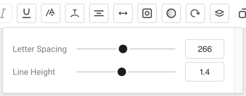
2. ADJUST THE LETTER SPACING IN YOUR DESIGN
Officially known as kerning, the spacing or lettering between pairs letters is our next tip for professional typesetting. Adjusting this spacing to move each character closer together, or further apart can evoke a feeling of exclusiveness and prestige, versus cheap and affordable.
As a general rule, more clear or white space in your design, including that between characters, gives the impression of luxe, higher end products and services. Whilst tighter spacing is often used to emphasise sale or ‘cheap’ messaging.
In Easil, you can adjust the letter spacing of all characters within a text box by using the ‘Letter Spacing’ slider, or input box that is accessible through the top editing Actionbar. Using the slider, drag to the right to increase the spacing between each character in the text box, and slide back to the left to reduce and tighten up the spacing.
To recreate the heading effect we have made here, follow these steps:
- Typeset your text – we selected Montserrat Bold.
- Enlarge the font size to suit the amount of heading text.
- Click on the Text Spacing icon in the top Actionbar, and use the Letter Spacing slider in the pop-out to adjust the amount of space to allow your image to peek through. In our example, we used the adjustment setting of 420. This expanded the lettering over 5 lines which covers our image from top to bottom. If you’re recreating a similar effect, you can also add in manual text breaks via the Return/Enter key.
3. FINE-TUNE THE LINE SPACING IN YOUR DESIGN
In the case of line spacing, ‘more is better’ is the general rule. Keeping lines of text spaced tightly together can create overlaps in ascenders and descenders, making the block of text illegible. But they do say – rules are meant to be broken?!
Using upper case letters provides you with an easier way to adjust line spacing and not have to worry about varying heights of characters, but you need to ensure that your message is not yelling at your audience, just to achieve this visual spacing.


In Easil, you can use the ‘Line Height’ Slider to adjust to give your lines of text more or less breathing space!
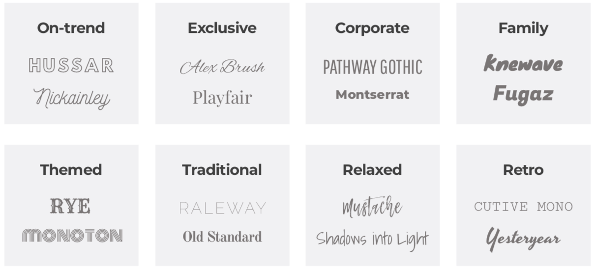
4. FIND THE PERFECT FONTS TO PAIR TOGETHER
If you struggle with choosing one font, let alone a pair, these tips are for you! We have built a comprehensive Font pairing guide here, where you can open the templates and copy & paste the combos, but it’s still a good idea to get a grasp of the basics!
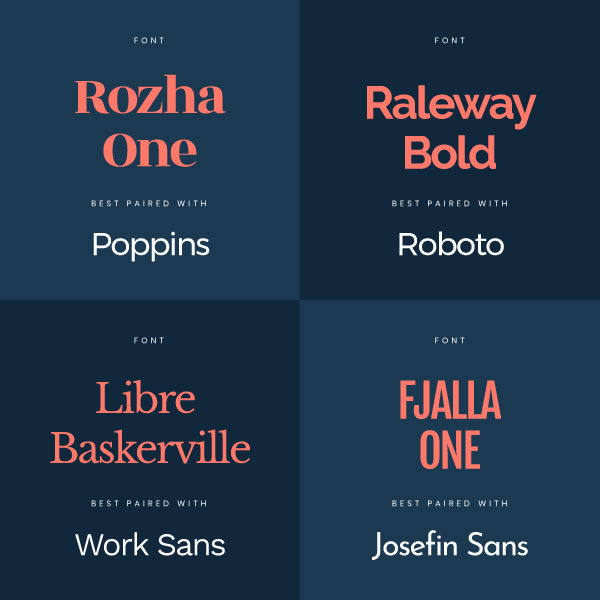
Keep in mind these pro tips for perfectly pairing your fonts together:
- Contrast Serif fonts with a Sans Serif Font. Serif Fonts have small decorative lines [or ‘feet’] at the ends of characters, while Sans Serif fonts do not include those decorative lines.
- Headline vs Body Font. Preferably choose a Sans Serif headline and a Serif Font for the body text. This pairing works because there is high contrast, and it’s also a good match between classic and modern. Start with your preferred heading font, and then pair it back with a few body font options before making a decision on what works best.
- Check for legibility. Look at your font choices from different distances and in different sizes. Are they legible and easy to read when used alone and when paired together? Step away from your computer, zoom out, and check all of these things at the size they will actually be viewed at.
If you’ve got your brand fonts locked into place, you should use those consistently in the font pairing combination provided by your graphic designer.
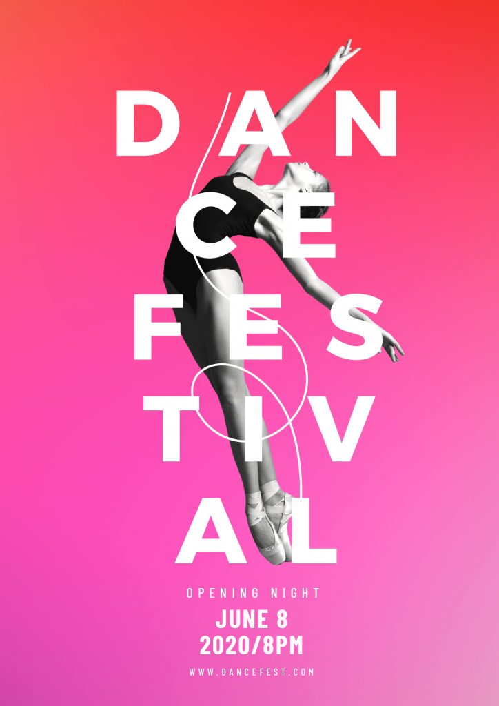
5. ENSURE YOUR TEXT ALIGNMENT IS CONSISTENT
Always [always!] be aligning your text! ~ Said in booming voice from our Art Director!
In the graphic example below, we have 3 sections of text that are floating within the white space to the right. After typesetting our header line, we ensure that the two text boxes below are left aligned to the same position, and that the text box content also has left aligned text.
In addition, the spacing between each block of copy is also kept consistent, which is easier on the eyes! [=Professional Typesetting!] Combining these two tricks results in a much cleaner design, and no-one will suspect it’s a DIY-job!
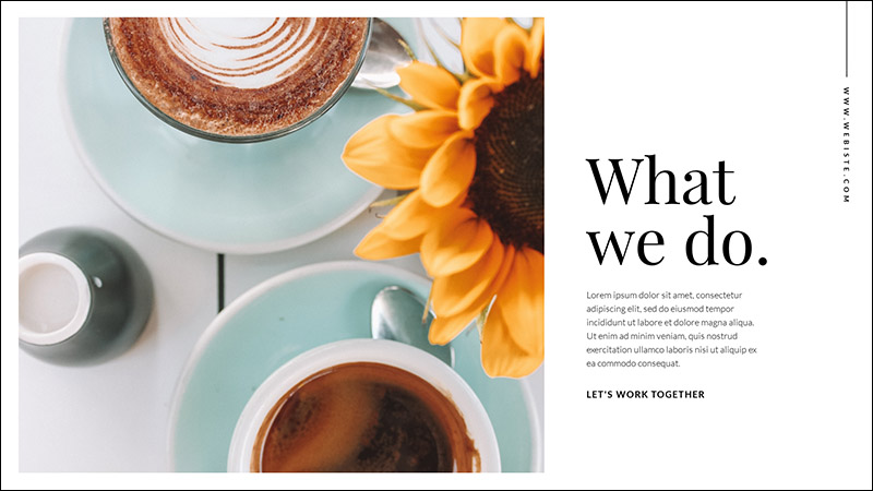
Hot tip: You can toggle the snap to guides feature on and off in Easil. Just hit the # icon to the right of the design canvas to switch between modes. These guides make alignment life much easier!
6. APPLY COLORS WITH THE CORRECT AMOUNT OF CONTRAST
Poor contrast of text to images or background leads to difficulty in reading, and thus likely your message being totally missed. We don’t want that!
If you’re placing text over images, you can use several tricks to ensure sufficient contrast. If your image is busy, or contains a range of colors you can try adding a graphic block or box behind your text [like in our example below]. You can also experiment with applying a filter to your image that can strip out some of the color, like a mono option.
And the busier and more detailed that your photographic image is, the bolder the text will need to be, if you’re not adding a block graphic behind it.

Hot tip: If you need to layer text on top of an image, try applying a slight drop shadow to the text to provide further contrast and legibility against the image.
7. ENHANCE YOUR TEXT BY PLACING AN IMAGE OR TEXTURE
This tip for professional typesetting is really a text enhancement. Text masking is the process of placing a photographic image within the text, and the text itself creates a mask, only allowing the image to show through the characters in the typeset area.
As our example here shows, a simple graphic that was originally typeset with a solid color text is transformed to designer level with the addition of the image placed within that contains a range of colors, and a subtle texture too. With this effect added, the overall graphic is complete without adding any additional imagery, and keeps the typographic message strong.
Learn how to use our Text Mask feature in this article.

8. TRANSFORM PART OF YOUR TEXT INTO A CURVE
Our final tip is learning how [and where] to used curved text. We love this effect so much, we dedicated the time to writing an article with 23 different ways to use it!
Curving your text into a full circle or a semi-circle is another great way to add visual appeal and differentiation to your designs, without the need for photos or other busy graphics. Try highlighting a sub-heading or call out within your typographic message, instead of the main headline, which you’ll still want to be the easiest part to read and comprehend.
Find the text curve tool in the top actionbar, as soon as you click on any text box!

A FINAL TIP – IF YOU LIKE IT, COPY & PASTE IT!
If you’re looking for new text pairing inspiration, browse through the templates in Easil. When you find something you like, and that ticks all the typography boxes listed above, you can open up the template, click on the text boxes, and copy & paste to your new design!
OVER TO YOU
Now that you’re armed with these pro-level tips, which of them will you be using consistently to achieve professional typesetting? Let us know your favorites by sending us a DM on social, or tag us in your designs with #madeineasil 🙂