If you want to use DIY Graphic Design Templates like a Pro then listen up. It’s easy to achieve – IF you avoid this one big mistake and follow the tips in this post.
The Challenge with DIY Graphic Design Templates
Here’s the thing. There are loads of DIY Graphic Design Tools on the market. New ones pop up all the time. The problem is that the resulting visuals – for the most part – aren’t up to par with what a designer can create.
This is not about being judgemental. It’s about reality.
The reality is that the average person is using DIY Graphic Design Templates in the wrong way, and it’s not their fault.
And so, inevitably we are left with with two scenarios:
- They don’t want to be creating designs that look “cookie cutter”. If they use the DIY graphic design templates just as they are, their designs look like everyone else’s, so they end up gravitating back to their designer for something more custom and unique.
- They don’t have the know-how or skills to change those “cookie cutter” templates in a way that looks like a designer created the image. Their editing looks amateur, so they end up gravitating back to using their designer to create pro-quality content.
Can you relate? We’re guessing YES (unless you are a creative person who “gets” design principles, or you just want to throw up a quick image and “near enough is good enough”).
So, this is where this post steps in.
We want to show you how to avoid the big mistake that is being made when using DIY Graphic Design Templates… and show you how to do it the right way.
The Big Mistake with DIY Graphic Design Templates
Here’s the big mistake:
You’re tweaking the template too much and doing it in the wrong way.
That’s it. Simple, right? Let’s elaborate:
The reality is that there is a tendency to take a template and change it.. then change it some more. Then add something here… or there. So you end up with something that goes from this:
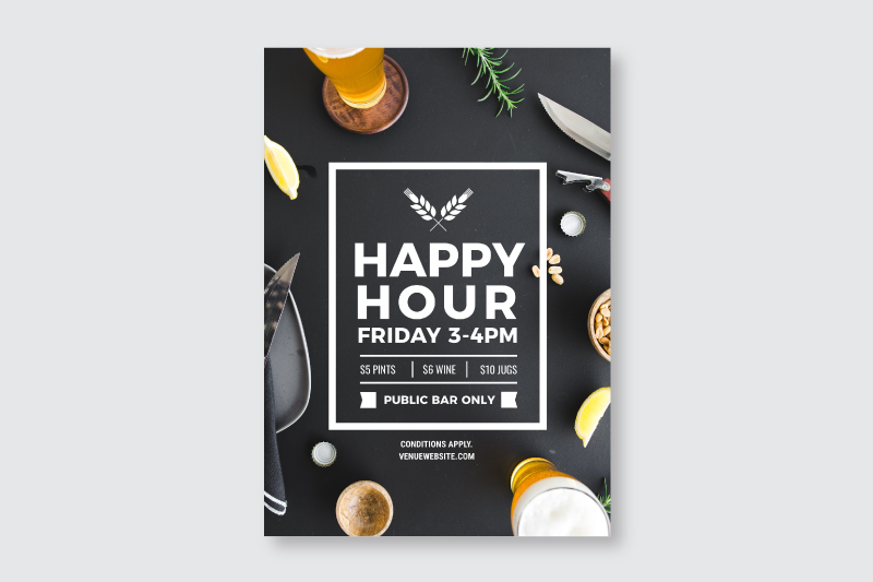
To this:
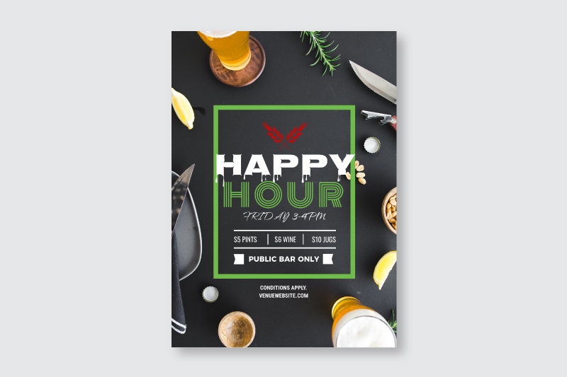
Can you see how quickly we can go from pro to butchered in just a few moves?
It’s not the fault of the person representing a brand, business or team that is using the DIY Graphic Design Tools. They’re not designers but they are trying to use the tools LIKE a designer.
That’s not how it should be. Inevitably they veer back towards using their designer more and end up ditching the DIY Graphic Design Tool altogether.
So how can they use DIY Graphic Design Templates in the right way to avoid this happening? Here are 4 easy steps you can follow:
4 Steps to Using DIY Graphic Design Templates like a Pro
These steps may look simple but that’s the beauty of it. Don’t over-complicate this. Stick to the steps if you don’t have design skills. It’s the best way to ensure your image looks professionally designed, while not looking like everyone else’s (Cookie monster you can back off, mate… this is a cookie-cutter free zone!).
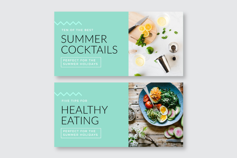
We’ll use the same template we used above in the following examples. Note how the the template includes fonts, colors, image and text that all balance well. It’s a pro-quality design created by a pro designer.
Now let’s change it up.. the right way!
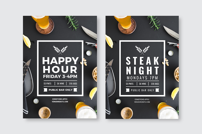
1 Switch out the text.
The first step is simple. If there is text on your image, then you will most likely want to switch it out to reflect your own message and branding. Here is an example of how our template looks now that the text has been changed:
Text Tips:
- Don’t change the position of the text if you can help it. Moving it around the template will potentially breach the rules of design and start to make your design look less than pro. There is a reason why the text is placed where it is. Try to leave it there.
- If your text doesn’t “fit” in the current text box, then reduce the font size only slightly. Just one or two font sizes is ok, but if you are moving it from 20 to 12 then you will be again messing with the design elements. Try to keep it the size as close as possible to the original.
- Take away but avoid adding text. If you need to remove an element of text that may be ok but try to avoid adding additional text fields. The designer that created the template is a pro. Trust them when it comes to leaving white space on the design.
- Line it up! If there is a text box that is currently centred on the template, keep it that way. If you have to extend your text, extend the text box to remain centred.
2 Switch out the fonts.
Step 1 allowed you to lay out the text using the fonts that came with the initial template. Now you can consider changing the fonts to suit your brand.
Be careful here. This is where you need to know a little about fonts – not as much as a designer does – but enough to know if two fonts look good together. Remember that the original design includes carefully chosen fonts, selected by a pro-designer. You can switch them, but make sure that you choose fonts that work.
Here is an example of how our template looks now that the text and fonts have been changed:
Font Tips:
- Stick with your brand fonts. If you have them and know then, then use them. This will make it super easy for you to switch out the main fonts. Match your main fonts with the fonts in the design. It’s most likely that your brand fonts were chosen by a designer, so you can rest easy that they are a well-paired match!
- Stick with the fonts in the design (don’t add extras). If it’s a quick image that you don’t need to brand too much, then stick with the same fonts. Even by changing out the text or background image or colors (or all 3), you’ll create a unique image. Just try to keep it to 2-3 fonts maximum. The designer who created your template included the perfect number of fonts for a reason.
- Check out Easil’s Awesome Font Guide in this post (73 Best Free Fonts to create stunning designs in 2018) to find fonts you love and see how they have been paired. It will give you some good starting points.
- Look at other templates for font inspiration. For example if you check out Easil’s templates for any design type you’ll see that they include perfectly paired fonts that were selected by our designers. Like a font pair? Simply click on the text fields in the design and take a look at what the font is. Use those same fonts in your template edit. Click on the existing text and change the font to the new ones. Hint Hint: Easil has one of the biggest range of unique, stunning fonts of any tool. Take advantage of it!
3 Switch out the image.
Switching the image will really change up your design and take it far away from cookie-cutter status. When we say “image”, we are referring to photographs, illustrations, and graphic elements like icons.
Here is an example of how our template looks now that the text, fonts and images/graphic elements have been changed:
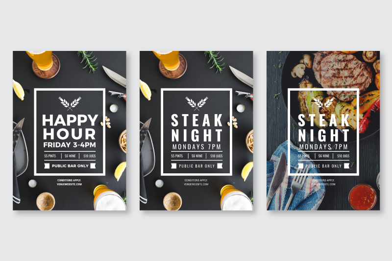
Image Tips:
- Choose a similar style of background image. If you are changing the background image then try to choose a similar style of image. If the current image has lots of white space, try not to add an image that is very busy. You don’t necessarily need to stick to the same colors as the original image as you can match colors to titles and text in the next step. But try to choose an image that fits the layout.
- Use templates with Frames. For example, many of Easil’s designs have frames that will snap your image into place. Our intuitive software will usually add the image in the best position and size within the frame. You can click on it and move it around, expand or reduce it in size. But generally that first snap will be pretty close to what you need. Use templates that include drag-and-drop frames wherever possible as it takes the guess work out of adding images!
- Replace elements but be careful adding extras. We can’t talk about adding images and background photos without talking about graphic elements. Often there will be a graphic element on a design that is overlaid on the background image or as part of the design with the text. It could be anything from an icon to an emoji, shape, line, border or flourish. Flourishes and lines or borders are generally best left where they are as they are an essential part of the original template design. If it’s a single icon, then by all means change it to match your message but avoid adding extra icons for the sake of it. HOT TIP: In Easil you can use layers to toggle between versions of your design to see if you want to remove or replace an element.
- Save your favourite brand elements, icons and images. In Easil this is easy to do, saving time and allowing you to edit designs quickly and easily.
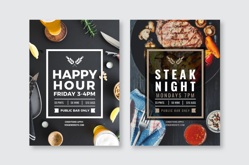
4 Switch out the colors.
Switching the colors can make your design truly unique and original while making it pop. It can also allow you to match your branding colors if you need to.
Here is an example of how our template looks now that the text, fonts and colors have been changed:
Color Tips:
- Change colors only if you need to. You don’t have to change colors for the sake of it. If your design looks good so far with the original colors in the template, run with that. The designer picked them so they are sure to make your image pop. This is especially true if you have changed other elements already or if you don’t need it to match any particular brand colors.
- Stick to the same number of colors that the designer used. Change them out, by all means, but don’t add new ones. Usually 2-3 main colors is enough, so be guided by the designer on this!
- Add a color overlay to the image. Simply add a color shape over the entire background. Then reduce the transparency so that you can see some of the background image, but the color of the image has changed to whatever shade or hue you desire with the shape overlay! Text can be brought forward above the overlay to make it pop if you need to.
- Use the Color Palette Generator to pick the right colors. If you want to change up the colors, this tool inside of Easil is your secret weapon. Simply click on the background photo or image, and the Color Palette Generator will choose a range of colors for you… straight from your image. Use these colors in your text and boom – perfectly matched and pro-quality colors! Here it is in action:
You’re all Switched … and looking Pro!
As you can see, any combination of changes (if you stick to the 4 steps and the tips above) can result in pro-quality designs when you use DIY Graphic Design Templates.
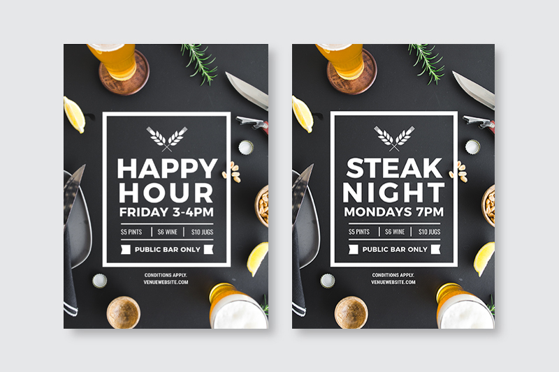
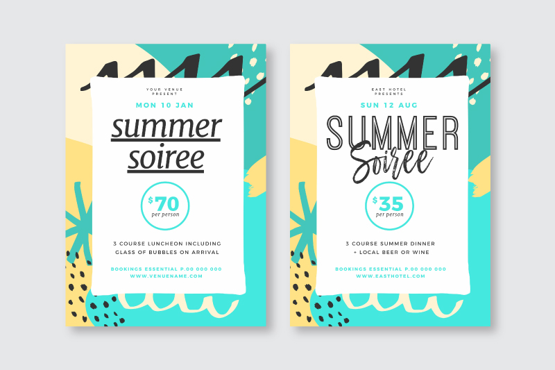
Here are a couple of extra examples so you can see how you can edit templates without using all 4 steps. Maybe one or two changes is all that you need:
1 Switching the font and text only:
2 Switching the color, text and font only:
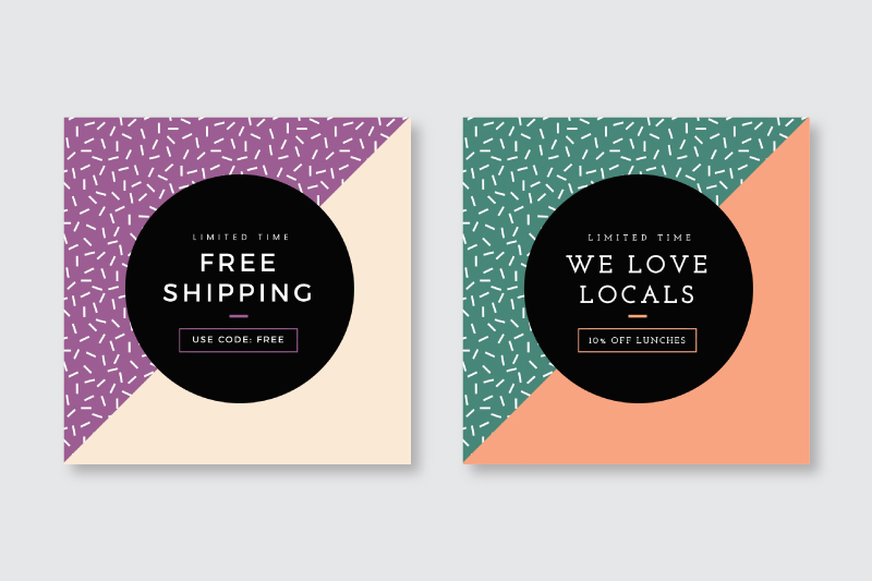
3 Switching the text and the image only:
See how this works? It doesn’t take a lot of changes to create a complete custom, non-cookie-cutter design… if you stick to the process.
Extra Resources to help you use DIY Graphic Design Templates like a Pro
Now that you can switch out your DIY Graphic Design Templates like a Pro, here are a couple of extra resources that will help you nail it!
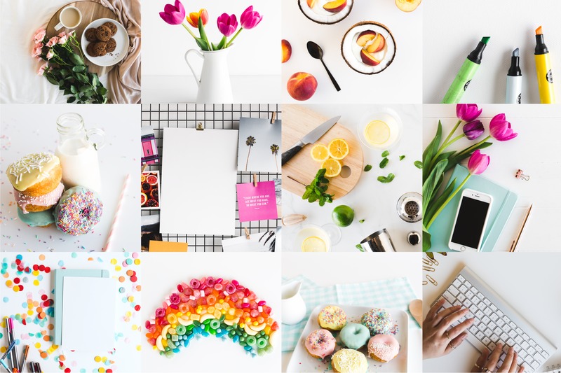
1 Easil Stock Images
Part of creating a custom image is to use unique fonts, graphics, images and colors. If you are looking for inspiration and something “different”, then check out our #EasilStock images.
Easil Stock photos are unique and perfectly suited for entrepreneurs, small business, hospitality and more. They’re a surefire way to stand out. Here’s an example:
2 Get Designer Assistance
We’re cheering for you and want you to create awesome DIY Graphic Designs… but sometimes you need a little help. This may be the case when you are creating an important design that needs printing or perhaps you get a little stuck.
Guess what? Easil has an exclusive Design Assist service for our users, so that you can access our professional designers in two ways:
1 Help with finishing off a design so that it’s pro quality and ready to share or print! Get in touch with our support team and we will quote to match you with a designer to finish off the design you’ve already started.
2 Help with creating your own, professional, bespoke branded templates. You work with one of our designers to create templates using unique brand colors, fonts, filters, logos and imagery, made available for you to use over and over to create designs.
It’s a Wrap
Hopefully with these tips and resources (and better understanding of what not to do) you’ll stick with your DIY Graphic Design Tool and continue to save time and money without relying on a designer.
We’ll look forward to seeing your Pro-Quality Designs out on the web!
Ready to Create DIY Visuals like a Pro?
Tell us, what have you learned from this post? Were you making these mistakes? What will you do differently now?