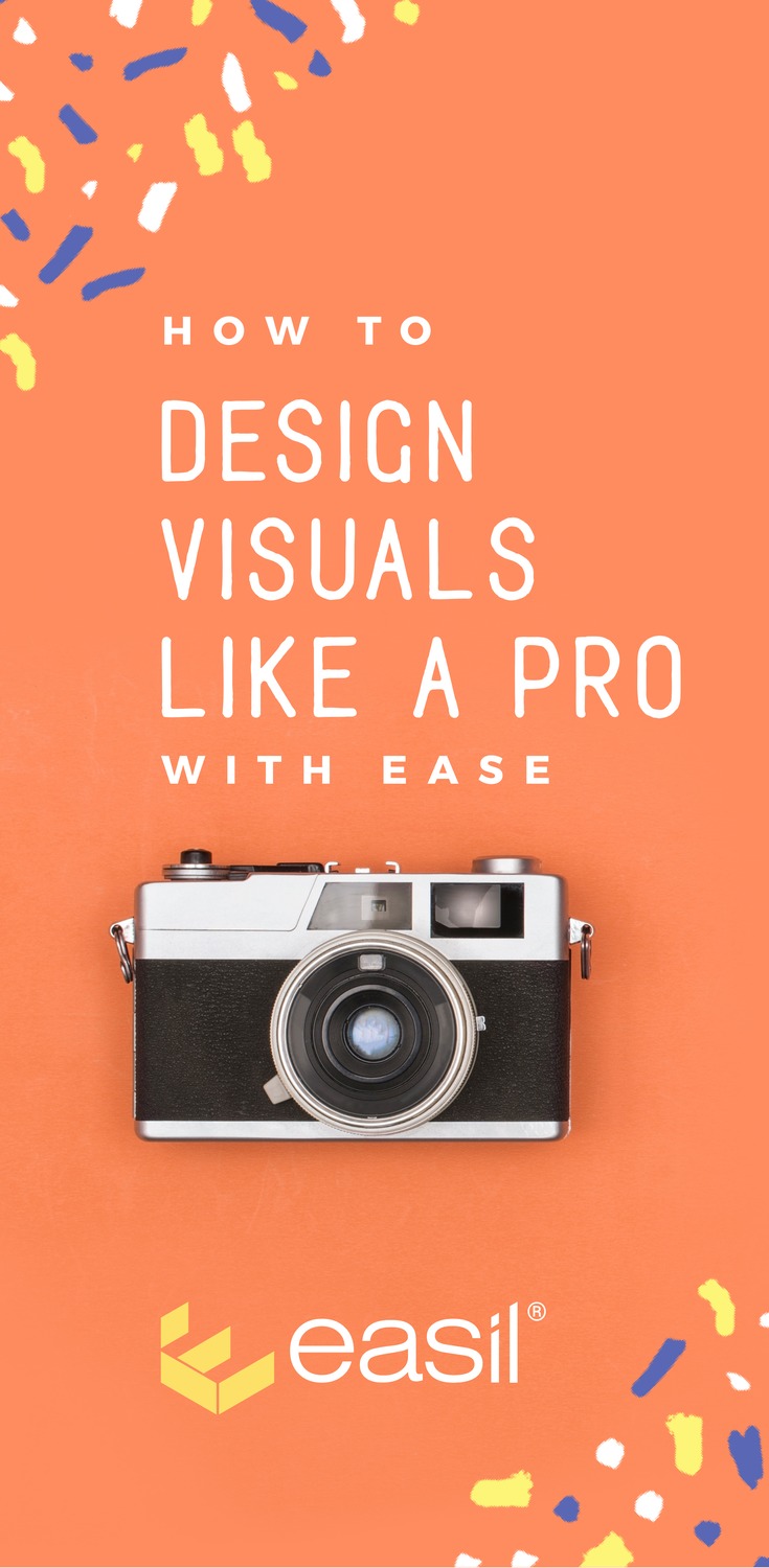
Want to Design Visuals like a Pro with Ease? Look no further!
In this post we share our top tips for creating visuals like a designer… and a few secret weapons you can use to do it easily and quickly.
If you think great-looking, edgy design is just for the pros, then listen up.
It’s not… if you have the right tools.
Let’s look at the key elements of an image that looks “designed by a pro” (and then we’ll share a shortcut for each, so you can do it too!).
Design Images Like a Pro with Ease
1 Choose the Right Image
Getting the image right is super important. It seems like a no-brainer but you’d be surprised how many people get this wrong!
Regardless of whether you use a photo you take yourself or you source one (make sure you have full rights to use it), then you need to make sure that the image:
- Supports or aids the message you are trying to convey
- Conveys the tone and emotion of your message
- Catches the eye – either through color, composition or the fact that it stands out and is unique.
- Has either space to provide text if you need to, or a background that allows you to add text effects so the text is visible.
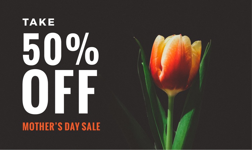
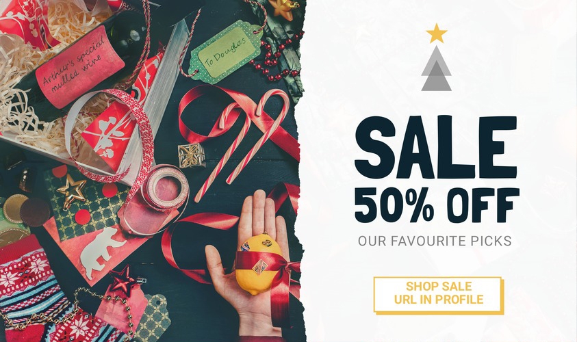
Maybe your image is perfect, but there is no space for a title or caption. No problems. Just use an effect like blur or a background shape behind the text. This way you can keep your background image and overlay the text.. still making it pop!
Just like this:
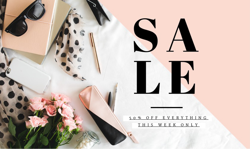
It’s also important that you consider the size of your image, size of the text and size of any graphics that you add. There needs to be balance, like in the following composition:
Shortcut to Pro Design
The obvious Shortcut to design visuals like a pro, is having professional photos taken in your daily life and business. The other option is getting a good camera (and having a good eye) to capture your own.
We all love raw, real, relatable images. Use those if you can.
The next shortcut is to use a visual content creation tool like Easil that provides easy resources for finding the right image. This can include:
- Using a template to get the right image layout and style – use it as inspiration to get the right fit. You can swap out the image when you are sure you like it, but start with a template to frame or style the image. There are plenty of template styles to choose from. Once you find one you love, the style and feel of the template will, in turn, help you to find the right image to swap out. Even if it is one of your own.
- Finding a quality stock photo that won’t break the bank. We’re not talking about the boring office Stepford-wife-like photos that make us laugh because they are so ridiculous and fake. We’re talking about quality, edgy, “real” images that could just have easily been taken by your team.
- Trying on a few different images for size. This will help you to see the photo that is the perfect fit, and you can snap it straight into the template.
2 Nail Your Focal Point
The focal point is all about where you want our eye to go. It’s a “point of interest” that makes an image (or a piece of art) unique.
When you nail your focal point, the viewer’s eye is drawn to exactly where you want it to go. Apparently focal points have huge power over whether or not we read and appreciate a design.
You might think that it is obvious to put the point of interest in the middle of an image. But, in fact, the best place to put it is along one of the grid lines for the Rule of Thirds. Here’s an example of this:
And here’s that same image with the grid lines overlaid on it. Can you see how the rule of thirds matters? It’s one of those magical rules of the universe that works every time. Get it right and you can design visuals like a pro.
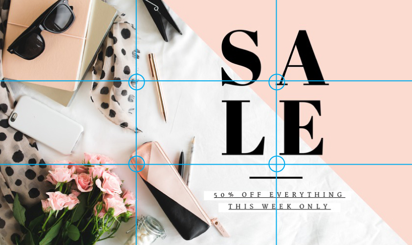
It doesn’t matter which of the meeting points your focal points matches up with on the grid. If you draw the eye to one of them, your design will work. If you can make your focal point match one of these points, you are designing like a pro.
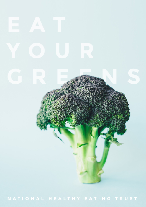
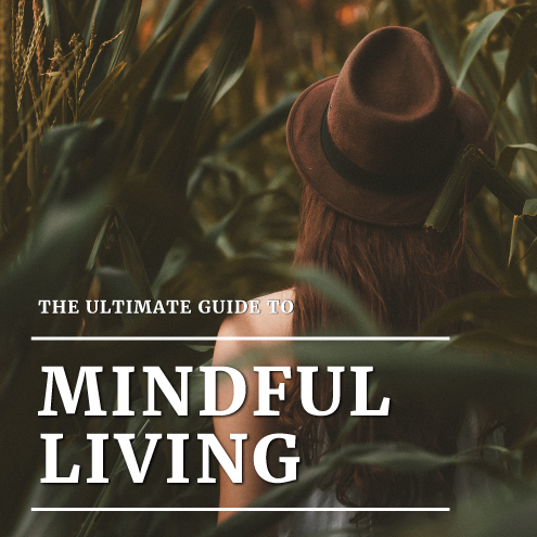
Sometimes the actual image or graphic will be the focal point, like this:
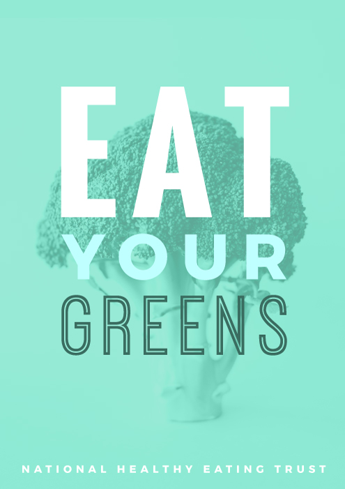
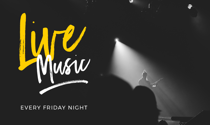
Sometimes the text will be the focal point, like this:
Light, color, depth of field and contrast all affect the focal point of the image.
Shortcut to Pro Design
Here are two shortcuts to help you design visuals like a pro when it comes to focal point:
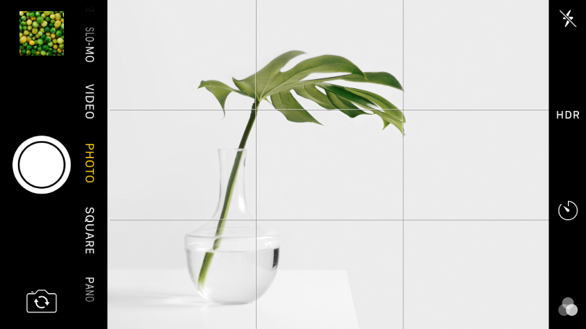
- When you take photos, use the “rule of thirds” grid in your camera. Most camera phones have this setting. It can make it super easy for you to line up your image with the focal point at one of the grid points for the rule of thirds.
- Use a template design and snap your own photo in to the template. Here’s an example of one of our templates where the focal point is already set via the layout of the design itself – you just need to swap out the photo!
3 Use Text Effects (but don’t do it badly)
We talked about this extensively (exteeeeeeensively) in our recent post “How to Create Drop Shadow Text Effects that Don’t Suck“. In that post, we talk about how drop shadows and their shady text-effect friends get a bad wrap.
Why? Because they often suck.
We have a history, as a society, of creating bad text effects. There are many examples of drop shadows done very badly in our online and offline worlds. We are on a mission to change that at Easil.
When you have all the tips, you can create text effects that don’t suck, right?
Text effects can (when done right) increase the readability of your image and help you to design visuals like a pro.
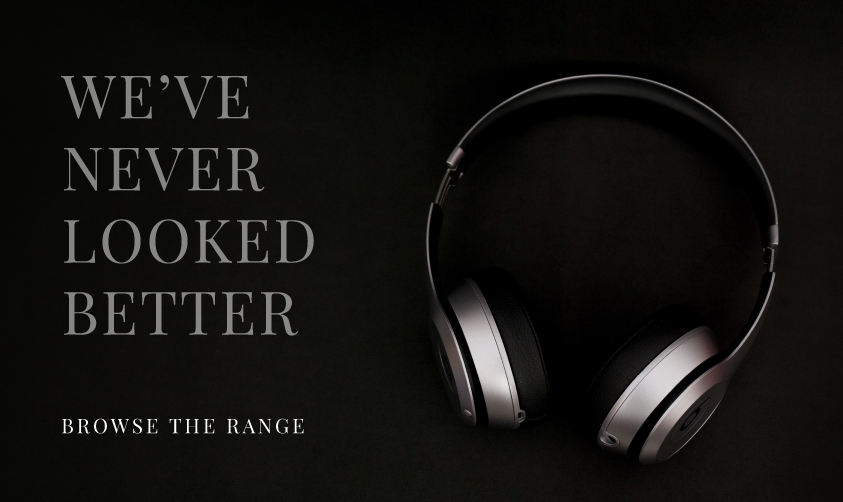
When you use subtle shadow effects, your text will stand out against complex backgrounds, like this:
ShortCut to Pro Design
Adding drop shadows, and ensuring they don’t suck, can be tricky. It can take a “pro” eye to know what works and what doesn’t, but if you follow the tips we outlined here, you’ll get better at it.
The best shortcut we have for this is to use our Text Shadow Tool in Easil. It makes it super easy to get your text effects to look great, with soft and hard shadows, blur effects and our really cool “glow” effect.
Here’s a video of our text effects tool in action in case you missed it in our recent post:
We love our Text Shadow Tool. It certainly doesn’t suck. It definitely helps you to design visuals like a pro.
4 The Right Colors
The right color and contrast can help your message pop off the page or screen. Conversely, bad color or contrast can make people want to look away. Yikes!
Sometimes color can be used to add visual interest to the image. Use contrasting colors to make it pop or match your text color to elements of the background image or photo.
Pulling out just one color from the photo to use as your header color can be a really powerful effect.
Here’s an example of an image we did this with, after using our Color Palette generator.

Another way to get some awesome color contrast is to use a bold color to make one part of your heading or text to stand out. Like this example:
ShortCut to Pro Design
Well, quite obviously we need to mention our Color Palette tool here if you want to design visuals like a pro.
It’s perfect for pulling one great element or color from your image or photograph and then using it to create overlay text that pops.
5 Great Fonts
They say you should always choose your words carefully. Well, you should choose your fonts carefully too when you design visuals like a pro!
Without a pro design background this can be quite hard (and quite overwhelming if we are completely honest – there are so many freakin’ fonts out there!).
While there are no fixed rules for choosing fonts, there are a few tips that can help you get it right, especially when pairing two fonts:
- Pick a font that matches the message and purpose of your design. Some fonts are bold and serious, others are light and fun. You’ll know them when you see them. Sometimes it’s just not a good match and sometimes it’s a “heck yeah” when you see the font work with the image.
- If you have a busy, detailed picture, go with a sleek, minimalist font. If it’s a super simple background, then you can get a little font-fancy with something a little more “out there”.
- Bold, heavy fonts will work better over detailed images. Lighter, thinner fonts will work better on clear backgrounds or flat color.
- Think about how the design will be used. If it is going to be printed on physical material, then it’s different to the web. Also think about the size of the finished product. Will it be a small business card, a huge billboard, a TV display screen or a website/blog?
- Get savvy if you have to make a font pop over a detailed background. Add a transparent overlay or blur the backgrounds slightly. When you do this, the letters will stand out better.

ShortCut to Pro Design
Here are a few shortcuts for designing visuals like a pro when it comes to fonts:
- Find font pairings that you love and then use a font checking tool to see what their names are. You can do this around the web when you see a great design. A tool that is easy to use is the WhatFont Tool on Google Chrome. It allows you to see what the fonts are on any website. And yes, you can call yourself an International Font Spy of Mystery.
- Find some great font pairings articles like this one, to see what you like and what works. Play around with different combinations. But if you have no design knowledge, it’s just easier to go with one that looks great!
- Use Easil templates where we already have hundreds of awesome font combinations paired up and looking rather stunning…. just for you. We’ve done all the hard work, so just pick a combination that works and start creating!
5 Balance
Getting the balance of your design will make it go “Pro”. The easiest way to make sense of the term balance is to think of a set of scales for weighing items. Too much of one element and you tip the scales too far.
Steven Bradley says that visual balance is important because an unbalanced design looks wrong and can be uncomfortable for the viewer if you get it wrong. He has this to say:
“When a composition is visually balanced, every part of it holds some interest. The visual interest is balanced, which keeps viewers engaged with the design. Without visual balance viewers might not see all areas of the design” – Steven Bradley
Who knew that balance is all we needed to get better social media engagement? (just kidding, we all know it takes a little more than that).
These are some of the challenges you can come across when it comes to balance:
Too much activity and you’ll lose your balance.
Too little spacing and your balance will go out the window.
If something is misaligned (my eyes, my eyes!), then we find it uncomfortable to look at. Incidentally, we have been known to carry a box of tissues around… just in case our designers are at risk of seeing bad alignment out in the real world. They have been known to cry tears of frustration.
Multiple focal points can give you the crazy eyes… where do you look when so many things are grabbing your attention at once?
Here are two great examples of images with balance:
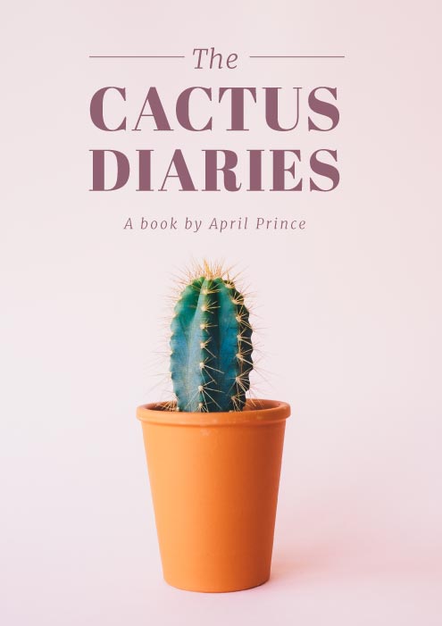
In the image above you can see that the Cactus has symmetrical balance and there is equal weight around the central point of the design. The heading holds equal weight to the cactus and it’s balanced overall.
In the next image, the balance is different – it’s asymmetrical. The bold heading in the bottom right corner is balanced by the busy image on the top left. It works, but it’s a different kind of balance.

Shortcut to Design Visuals Like a Pro
When it comes to balance it takes practice to be able to design visuals like a pro. Here are some ways to get better at it:
1 Keep lots of white space in your design. The less cluttered you make it, the less opportunity to tip the balance. Keep it simple, keep it balanced.
2 At the risk of repeating ourselves… use a template design. Check out these designs we have for posters!
Our pro designers have already set these up so you can use them, change out the text, color, font and photos and boom… you’re ready to design visuals like a pro!
Are you Ready to Design Visuals Like a Pro?
Use the shortcuts in our post and check out the tools to help you do it in Easil.
Whether it’s templates, our color picker, our text shadow tool or our font combinations, we’ve got you covered. Get started here.
Tell us – what’s your favourite shortcut to design visuals like a pro?