At Easil, our mission is to change DIY Design for the better, and with our 2019 Release of Easil+ we’re doing just that. With a powerful set of new and updated features, you’ll experience DIY Design like you’ve never seen it before.
And when it comes to DIY Design for Teams, we’re changing the game.
If you loved Easil before today, get ready to be beyond excited about our 2019 Release of Easil+. This has been a 2-year process to deliver to you new features and updated systems for DIY Design that will change the way you work individually, or in teams.
We’ve updated Easil’s Suite of Tools and we’re ready to reveal just what you can do with Easil+. In this post we’ll walk you through:
- WHAT’S NEW in Easil+. These are the NEW features and game-changing tools that you’ll want to know about!
- WHAT’S EVEN BETTER in Easil. If you loved
Easil’s features and tools before, then get excited, because we’ve made things better. So much better. We’ll walk you through the features that have had an update. - WHAT’S STILL TO LOVE in Easil. All of the
editing features that you know and love inEasil are still there … but with a shiny new coat of paint! It’s all yourfavorites but with a better user experience.
Ready? Let’s take a look under the hood of the all-new Easil+:
UNVEILING EASIL+ FEATURES – WHAT’S NEW, WHAT’S BETTER & WHAT’S TO LOVE
We’ve been cooking up a lot of great things behind the scenes at Easil and we’re excited to share “what’s under the hood” with you as part of our 2019 Easil+ Release.
There’s a lot of exciting new functionality in
Let’s break down what’s new in Easil:
1. WHAT’S NEW IN EASIL+?
If you’re looking for a better way to work across teams, you’ve found it. The biggest (and most exciting) updates to Easil are all about workflow with our new suite of tools.
From a single user to a multi-level team, our Teams, Brand Kit and Brand Restrictions features are set to redefine DIY-Design. It’s productive, collaborative and creative.
Here’s what’s NEW in Easil+:
1. Teams
With Easil+ you can get the whole team involved. Easil+ is DIY Design for Teams but not as you’ve experienced before. Our extensive “Teams” features go deep – two layers deep in fact!
Here are a few key features of Teams:
Work More Efficiently.
With Easil+ you’ll get to use folders, design tagging, and several levels of user permissions to work more efficiently across 1 or 1,000 team members.
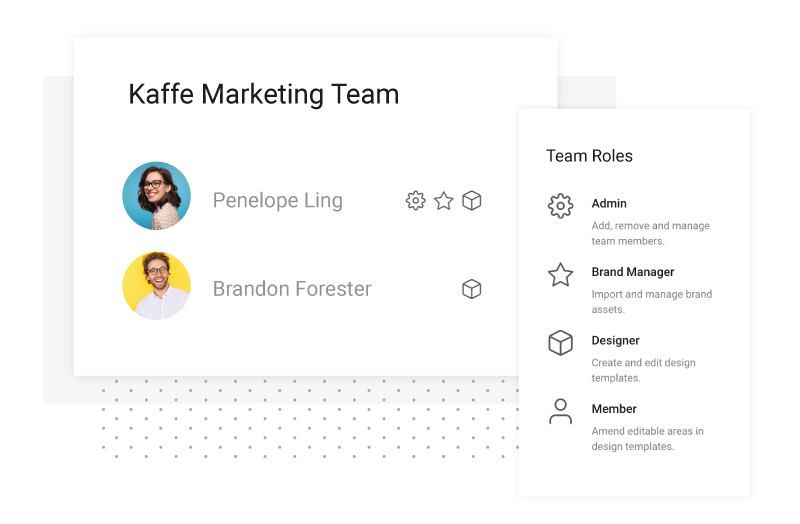
You can invite multiple team members into your team, and assign them with various cumulative roles, such as:
Admin: Manages team members with the ability to add, and remove.
Brand Manager: In charge of importing and managing your brand assets within the team’s Brand Kit, and manage Approval requests from your team.
Designer: Creates and edits design templates that are available to your team to create new draft designs from.
Member: Create designs from available master templates and amend editable areas within those templates.
Digital Asset Management Solution.
Design Control.
You can allow team members to edit the specific parts of any design that you want them to edit. And you can add or lock down the layers of a template in a snap. Scroll down to learn more about our Brand Restrictions.
2. Brand Kit
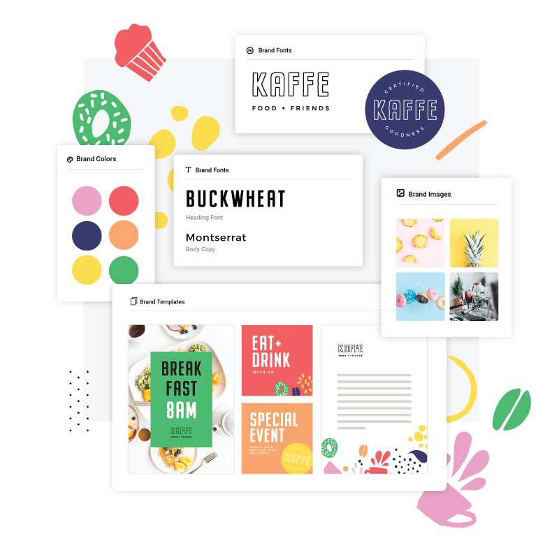
You asked. We delivered. Brand Kit is here. Let’s take a moment to take it all in visually. Here’s what it looks like:
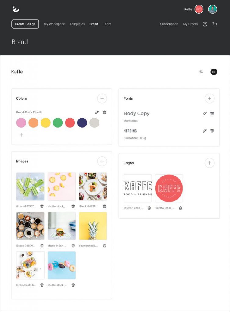
No more searching for the right assets for your brand – now they’re at your fingertips. Brand Kit gives you the right fonts, colors, logos and images, ready whenever you need them. You’ll always be on brand, no matter how big your team is.
You can also rest assured that everyone on the team has the most up-to-date assets to work with. From logos to Trademarks, Easil’s Brand Kit is a smarter way for you or your team to create visual content for your brand.
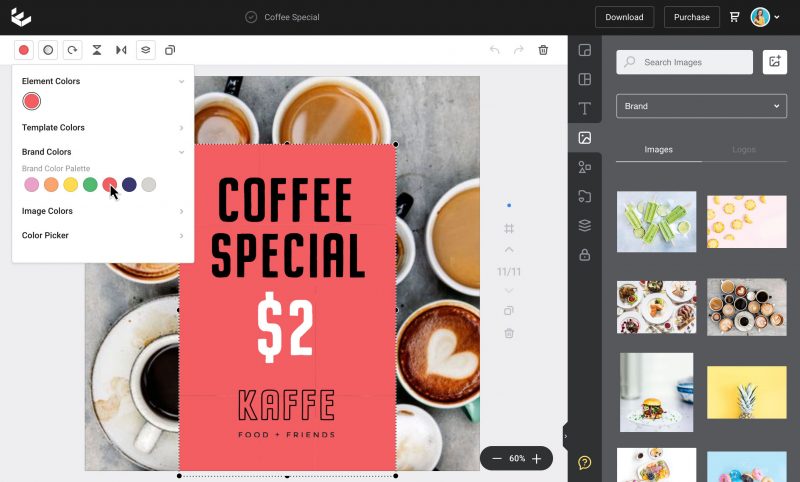
Here’s what you’ll have access to with Brand Kit, available on all of our Easil Plus plans and above:
Brand Fonts
Searching for your brand fonts is a thing of the past. Easil+ brings them all into your Brand Kit, where you can save the following all in the one place. This includes, but is not limited to:
- Heading Fonts
- Body Copy Fonts
- Default Brand Fonts
Now you can access any font you need, quickly and easily for every single project. You can also label the font types in a way that will make sense to your team and help them find the right font for the right project.
Important: In order to add your own brand fonts, you’ll be asked to confirm that you hold the correct licence to use the fonts in your designs.
Once you add your brand fonts, they’ll appear in our Fonts drop-down-menu, ready for your team to access – along with dozens of other Easil fonts.
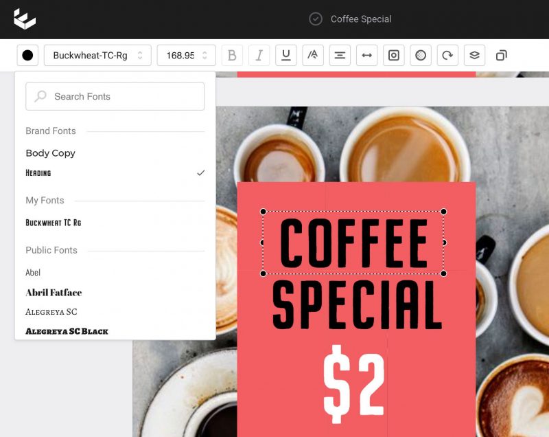
Brand Kit gives you clear, cohesive branding for every project across your entire team with the right fonts. Every single time.
Brand Logos
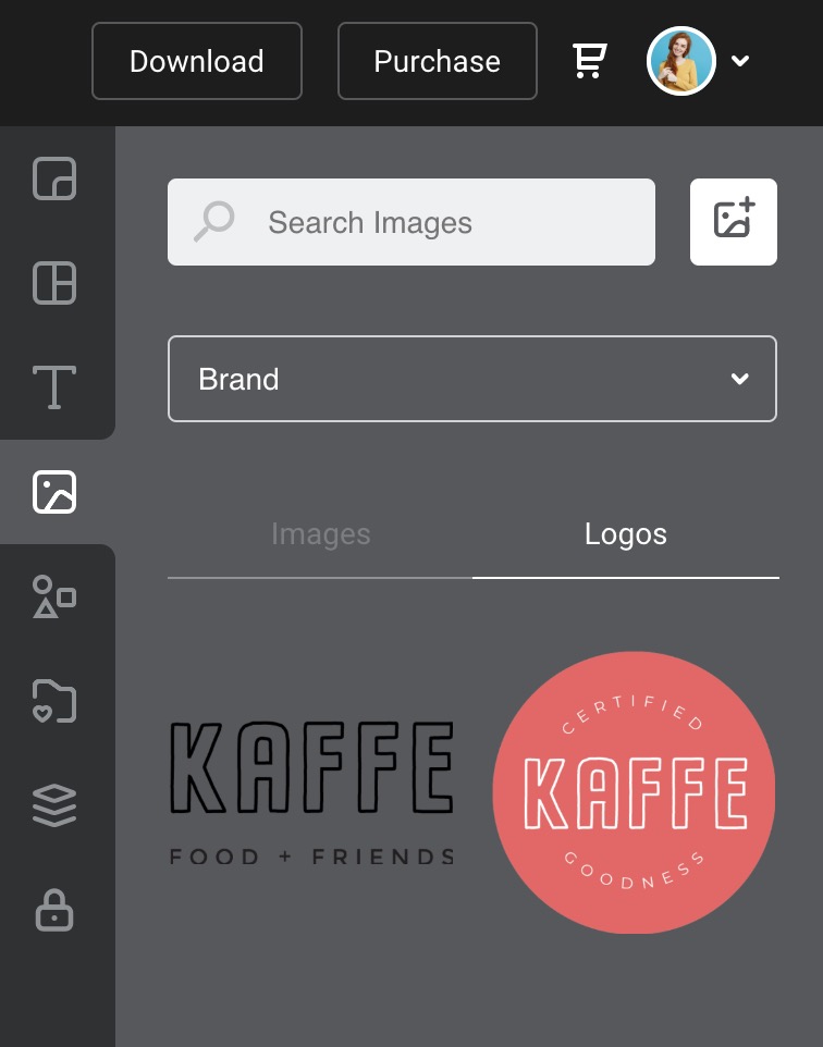
Your whole team will know exactly which logos are the most
With Brand Kit you can keep all of your logos in one place. Simply upload your brand logo variations directly into Easil’s Brand Kit.
And even if you are a solo user – having your logos and all the other elements in one place will save you loads of time.
Brand Colors
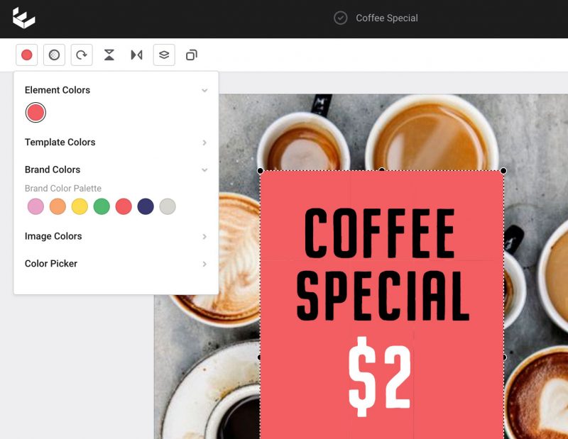
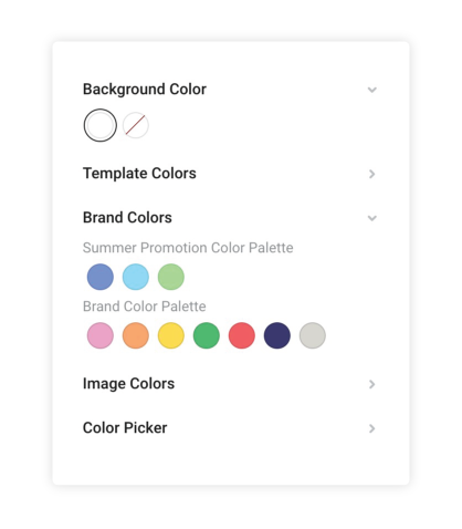
You’ll never have to copy and paste another hex code again – can we hear a Hallelujah? This has been one of our most requested features and we’re excited to say that you can now save your entire brand color palette into Brand Kit.
All of your brand colors are at your fingertips, ready for your entire team to access. You can even create and label multiple color palettes, for multiple projects. Here’s how it looks:
Brand Imagery
We’re excited to bring you something “extra” in the Easil Brand Kit for Easil+. We weren’t content with stopping at Brand Colors, Logos and Fonts like you will see in other tools. Brand Images, Icons and Illustrations are just as important … so we’ve added Brand Imagery!
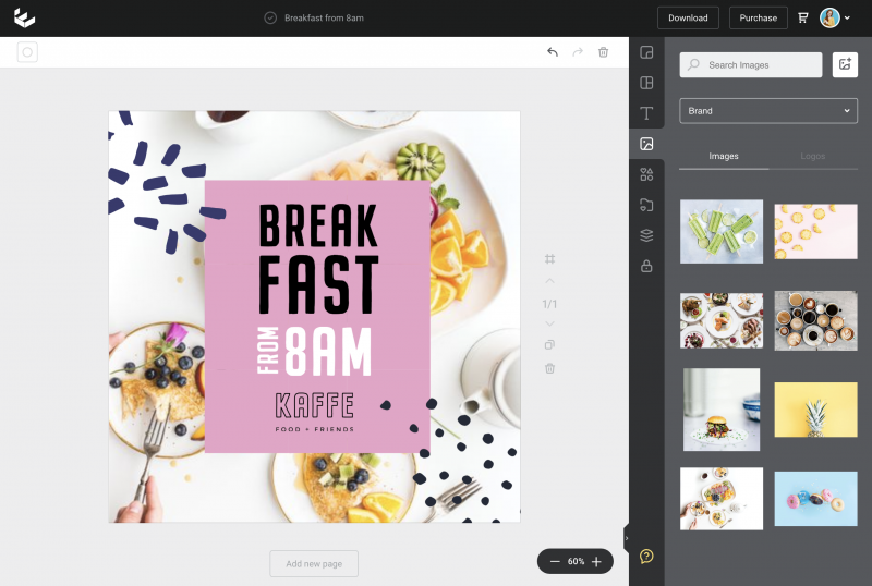
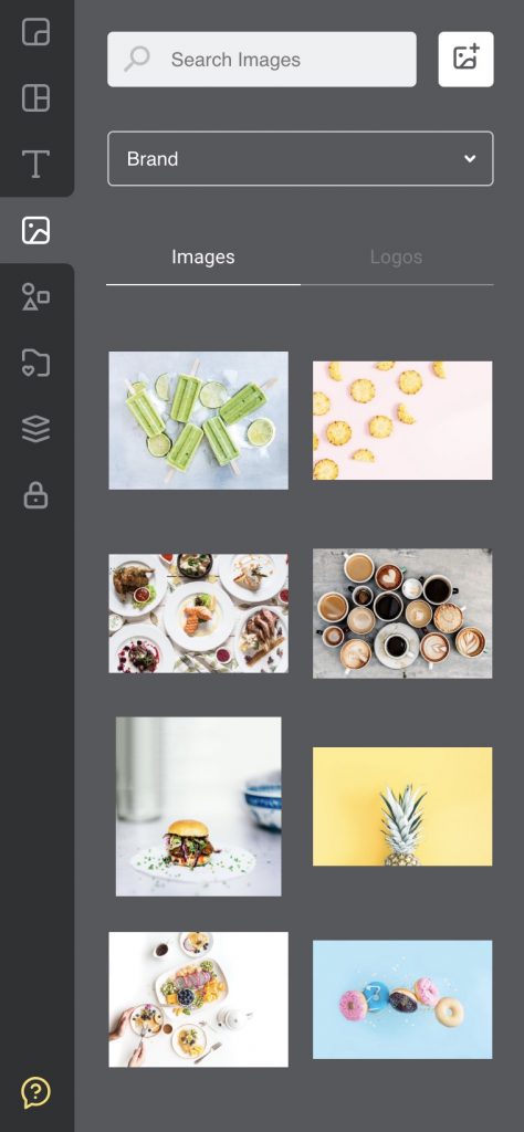
Now you can keep a catalogue of the imagery that is approved for your brand, right within Brand Kit. Team members can access approved imagery and use the time they save searching for images on more important projects.
Now that we have your Brand Kit in place, let’s take a look at how you can take teamwork to the next level with Brand Restrictions in our new Easil+ Release.
Oh, and if you’re not excited about our new features yet, you’re about to be!
3. Brand Restrictions & Locking Permissions
Never worry about Design Integrity again. You’re in control of a new, extensive suite of Brand Controls in Easil+.
Our Brand Restrictions and Locking Permissions allow you to have complete control over areas of your design that can or can not be edited by team members.
Let’s dive into what you can do with these powerful features:
Key features of “Brand Restrictions” in Easil+:
1. Control how you want designs to be edited.
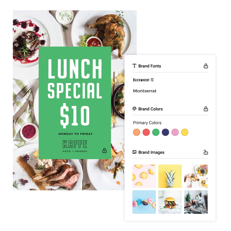
You can allow team members to edit the specific parts of any design that you want them to edit.
It’s so much easier for you to maintain brand integrity when you can set the brand restrictions, and definite things like which elements, fonts, images and colours can be edited.
2. Control what can be added or removed from designs with Design Locking.
Welcome to “Design Locking” in Easil+. We’ve added granular control over every design, such that your designer or brand manager can control what elements or images can be added to a design, whether the colours, fonts or text can be changed and more.
You can even prevent the deletion of certain elements from your team documents and designs.
Design Locking is perfect for designers working with
3. Use Locking & Layers to Set up Template Designs in Minutes
If you’re capable of togging a switch on and off, you’re ready to use
Your designer or brand manager can create templates that the whole team can use AND ensure that the master template remains intact – no accidental changes or edits. And with Brand Restrictions, you have complete control over which part of the template can or can’t be edited.
Locking access for your team can even provide users with multiple options within a single
Ready to Get Your brand Loaded and Locked?
It’s so much easier for you to maintain brand integrity when you can set brand restrictions, and define things like which elements, fonts, images and colours can be edited. We can’t wait for you to test it out!
Excited about our Suite of Team-Savvy Tools?
As you can see, with our Brand Kit, Library of Templates and Design tools, you or your designer can create and control exactly how the whole team will access and edit any single design.
Excuse us if we let out a little squeal of excitement every time we talk about the triple power-house of Teams, Brand Kit and Brand Restrictions. It’s seriously a big deal for
But, like we said, we’re changing the DIY-Design game and we’re even more excited about the potential for you and your team.
But we’re just getting started
2. WHAT’S EVEN BETTER IN EASIL+?
You’ll notice some subtle changes and an even better experience as you move around Easil+, even with so much going on “under the hood”.
The most noticeable differences are the spaces in which you’ll work. Let’s break them down:
1. Workspace vs Templates
Straight up, you’ll notice a difference in how the Workspace is organised. Instead of seeing “My Designs” and “Create New” at the top of the screen, you’ll choose from “Workspace” or “Templates” to get started.
- Workspace – this is where “your” draft designs now live.
- Templates – this is where Easil’s range of templates lives, as well as any templates you create as a team.
We’ve added this Templates button because our new suite of tools gives you more than one place to start a New Design. For example, within Teams you can create your own brand catalogue of templates, or you can use the Easil catalogue of templates.
It’s a new hierarchy of tools and systems that means a new (and we believe, better) experience, so you can use the full potential of Easil+. Here’s a brief overview of how you’ll get started on a design in the new Easil+ layout:
How to create a New Design in Easil:
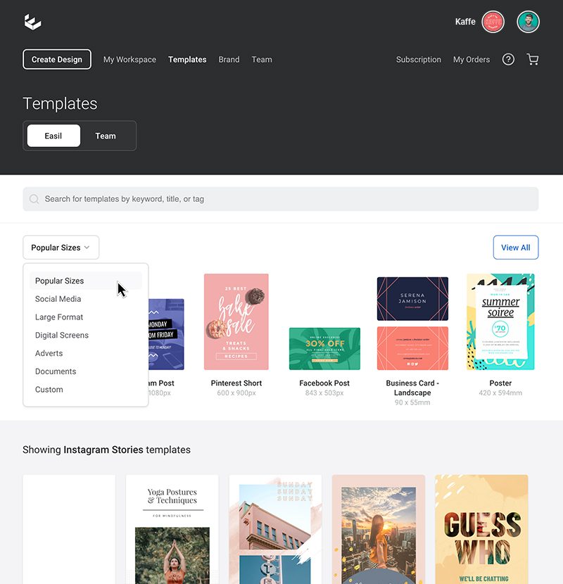
1. Click on Templates.
2. Choose the Design Type you wish to create. Select from the down menu for each of these styles: Popular Sizes, Social Media, Large Format, Digital Screens, Adverts, Documents, Custom.
3. Choose a specific design type or size. A library of designs for that selection will show on the dashboard that you can browse through.
4. Alternatively, you can also search
5. Start Editing from one of the pre-designed templates, or start creating from a blank template. You’re off and racing!
Hot Tip: You can also search by size within your own Workspace! As you add new designs in drafts, you’ll notice they automatically get categorized. Click on the category, and then the size, to get your refined search.
We’re confident you’ll love having a more productive workspace, multiple points of access to your templates and designs, and more powerful search to find the right template for your projects.
2. Larger Design Canvas Area – when you need it!
Easil+ gives you more space to design – when you need it. Our Design Canvas retracts and expands according to your needs:
Simply click the notch on the
3. Organising Designs with Folders and Tags
We’ve given you a whole lot more organisation across Easil. The way you can organise designs has been given an entire makeover, leveraging the use of Folders and Tags:
Never lose a design again – between folders and tags, you can always find what you’re looking for!
4. Improved Search for Stock and Uploaded Images
We’ve added a much-awaited improvement to our search functionality in Easil. Now when you use the top search box, the results will show both your uploaded images and all available stock images.
5. Tools for Working with Multi-Page Files
We’ve improved the functionality around multi-page files so you can be more productive. Now you can work with multiple page documents with ease – move pages around with the layers tab, or locate where you are on the page editor with handy page number indicators.
6. Change text size by dragging the text box
It’s now so much more efficient to edit text with Easil+. Quickly and easily make your text fit within an area by dragging the corner handles of a text box. Drag it inwards to reduce the size, or outwards to increase the size. Simple!
3. WHAT’S STILL TO LOVE IN EASIL+?
With all of these new features and updates coming to
Fear not – they’re all still here!
But they do have a fresh coat of paint and
Put simply, you’ll still feel at home in
And of course, it goes without saying that if you can’t find something… holler! Team
Let’s take a look at what’s still to love in Easil+:
Resize Your Designs with Ease
Our Resize Tool is still here, ready to help you to resize
Simply choose the size you want to resize to, and our Resize tool does all the work to get your digital or print design ready … in a snap!
Create Animated GIFs
You can continue to catch attention with creative, engaging animated GIFs made in Easil. If you haven’t discovered
Here’s an example of what you can do with it in

Our GIF Maker lets you animate your text, photos or graphics in eye-catching and creative ways. The best part about GIF Maker is that you’re never restricted in how you animate. You won’t find any boring, text-only animations here. Follow our blog to get ongoing ideas for how to create stunning GIFs, quickly and easily. Try this article or this article to get started!
And remember, you can add your GIFs to many of your marketing projects – from social media to emails to blog posts and websites to messaging apps. Wow-Factor guaranteed.
Hot Tip: Now you can use
Enhance Your Text with Text Effects
At Easil we take pride in Text Styling and we have made sure that our users have access to the same Text Effects that our designers use and love daily. That hasn’t changed with Easil+.
You’ll find all the favorites you know and love in our Text tools. Our Text Effect Tools pop up in the Action Bar any time you start working on Text in your projects.
With Easil+ you can keep on adding stunning shadows, blur or even
Drop Shadow
Make your heading text stand out with our Drop Shadow Tool. Whether it’s bold, subtle or a pop of
Find out more about how to use drop shadows (that don’t suck) in this post. You’ll see many examples of text effects in our Easil templates too.
Text Glow
Add a little neon to your life with our Text Glow tool!
From subtle glow effects to full-out Neon Sign Titles, our Glow tool gives another unique way to create stunning designs in
Add Images to Text
Our ever-popular Text Mask Tool is ready to make your Typography pop by adding images to text in stunning ways.
You’re all set to create amazing designs with our Text Effects and we know you’ll continue to love using them in this new Easil+ Release.
Design Merge
If you haven’t discovered Design Merge in
Here are a few things to love about Design Merge.
- Design Merge allows you to bring a page, single or multiple elements from another design, right into your current working file.
- You can take the typography from one design and merge it into another design or grab a footer from one design and add it to all of your page. Or it could be something more advanced like taking an existing menu to a new template/background. You can also re-use branding elements, add a single page from another design, and so much more!
- You can also access layouts from other Easil Designs or even your own previous designs with our Layouts Tab. This is perfect for working on presentations or large projects where you can utilise previously-designed content.
The possibilities and combinations are endless with Design Merge. It’s as simple as click – drag – copy – drop! Find out more about how to use it in this post.
Several Download Options
Got your project ready to download or print?
And of course if you have any problems or questions about download and print – reach out to our friendly team on Chat!
WRAPPING IT UP
We’re excited. We know you will be too when you get a chance to dive into Easil+ and everything that’s to love about our new release.
From our new
We’ve covered a lot in this post. But rest assured we have lots of tutorials, articles and hot tips coming your way. We’ll also send you tips and updates in the Easil app when you log in. We want you to get the best out of Easil.
OVER TO YOU
We’d love to hear what you think about our Easil+ 2019 release and can’t wait for you to take it for a spin. And don’t forget to tag us in your creations at @teameasil on Instagram or Facebook with #MadeinEasil.
Tell us – what’s your favorite feature of Easil+ 2019? We’d love to hear from you. Let us know in the comments below.
