Do you want to avoid Pinterest marketing mistakes and get more organic traffic from Pinterest to your Blog? Listen up, because in this post we share 5 key ways to use blog graphics the right way – for more pinterest traffic!
Did you know that Pinterest is more than a social media site? It’s actually a search engine in its own right. Images on Pinterest get shared months and years down the track on an evergreen basis. Now that’s more than a Fleeting Tweet or a Fickle Facebook Post, don’t you think?
Yet we still see Pinterest marketing mistakes on many business blogs. These are easily fixed – the key is in using blog graphics the right way.
5 Pinterest Marketing Mistakes You Are Making (and How to Fix Them)
Here are 5 Pinterest Marketing Mistakes and how you can make a few key changes to your blog graphics to get better results on Pinterest:
Mistake 1: You’re Not Including Vertical Images
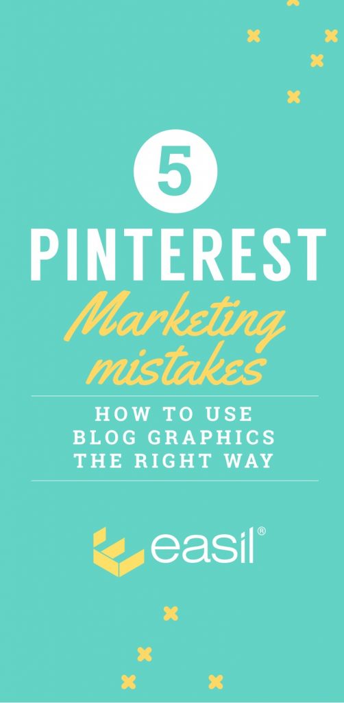
Pinterest is all about vertical images or at least 2:3 aspect ratio. You can use long images, tall images, portrait images, vertical images… the key is that they are taller than they are wide. Vertical images work best on Pinterest, like this one:

In fact, Pinterest actually “favours” vertical images – they are more likely to show up in the smart feed and pinners are more likely to discover and pin them. A Pinterest user on your website is more likely to pin a vertical image than a square or landscape image.
Is this one of your Pinterest Marketing Mistakes? Here’s how to fix it:
- Find your most popular posts or pages and add back some vertical images.
- Add vertical images on all new posts (at least one eye-catching, portrait-sized image)
- Refer to Mistake No 2 in this post, and add titles to your images.
Mistake 2: Your Images Don’t contain Titles or Text
The reality is that even the most attractive, eye-catching images can be lost in translation. We need to add context!
It’s important that you include at least one vertical (or portrait sized) image with a title on it, for each blog post on your site.
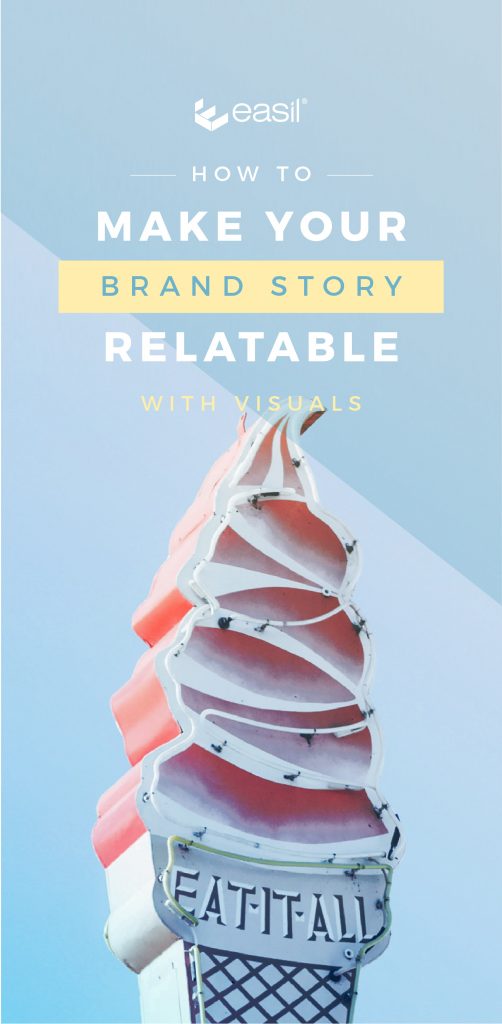
Why? Because if someone is looking to pin content to read later, they will usually choose to pin an image with text on it, over an image that doesn’t have text on it. We do this so we can make sense of the image as so much can be left to interpretation if you don’t add back the heading.
Here’s an example of a recent title image from one of our blog posts. Take away the title… and it could well be about retro diners along Route 66 or about recipes for icecream. The title tells us what it is about:
Is this one of your Pinterest Marketing Mistakes? Here’s how to fix it:
- From now on, start adding one tall or vertical image with title text for each blog post you create.
- Make time to go back and find your most popular or most shared blog posts and start to add vertical images with text on each of those posts. You can add it as a featured image (if relevant to your blogging theme) or you can add it to the body of the post.
- Start pinning header images with text to your own Pinterest boards.
- Use our Easil Pinterest templates to create header images that pack a punch! Click here to see our range of vertical images.
Mistake 3: You’re missing this step with your sharing plug-in
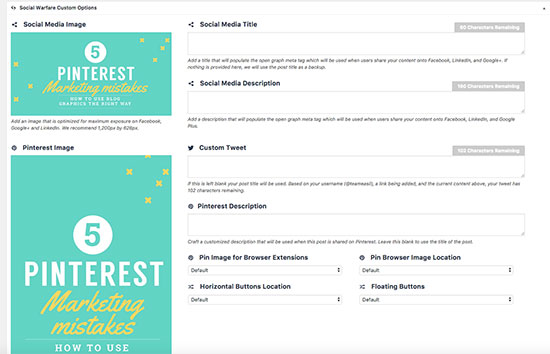
There are some really great WordPress plugins available (like Social Warfare) that allow you to lock in the image that you want people to pin to Pinterest (from a particular post). We use Social Warfare on this blog! It can be a great way to control the types of shares you get for a post.
Here’s a shot of how Social Warfare looks. As you can see, you can control the type of image that gets shared to Twitter, Facebook, Pinterest (including the text that goes with it):

Social Warfare lets you control what is pinned from your site.
But….
We recommend you also use one extra trick. Most people are triggered to pin or save an image when they see a vertical image to be pinned.
If a vertical image is not visible on the post (even if you have specified that image to be shared via a plug-in), you may be missing the opportunity for them to be reminded to pin it.
Oops, Are You Making this Pinterest Marketing Mistake? Here’s how to fix it:
We still recommend that you use plugins like Social Warfare, but you should:
- Add your vertical image to the actual blog post so that it is visible – even if it is at the end of the blog post! This way it will show up to remind people to pin the image.
- Choose the best image to be pinned, if you use a plugin like Social Warfare. For example, you might have two vertical images on your post – an infographic and a header image with text overlay. Choose the image that you want to highlight for pinning through the plugin. You can always change it later!
Normally we would add our Pinterest image at the bottom of the post, but today we will add it here (we love that this is so meta!).

Mistake 4: You’re Not Including Infographics on Your Blog Posts
We know…. infographics can be daunting to create! They can be a lot of work to research, write and design!
Infographics are “liked” and “shared” on social media 3X more than any other type of content.
At Easil we like our infographics to be simple, helpful and quick to make. They can bring a lot of traffic and shares, so we want them to be accessible to you and easy to create.
Is this one of your Pinterest Marketing Mistakes? Here’s how to create Infographics quickly and easily:
- Start by “shortening your expectations”. This means that you should aim to create shorter infographics. You don’t need to make them really long! As long as they are long enough to catch the eye, you’re going to increase your shares/pins and visits to your site.
- Keep it simple. Infographics can come in many styles and formats. Keep it simple and focus on content that will help or inspire your audience. Adding thousands of statistics, pie charts and fancy graphics can make it too busy.
- Use a template if you don’t have a designer on your team. At Easil we have created a whole bunch of easy to modify designs that will allow you to create an infographic easily and quickly. All you have to do is to snap in any photos or images or icons you have, change the text, change the font and colour scheme and you have a custom infographic. Check out our “Pinterest Tall” infographics here. Here’s an example of one of our Pinterest Infographic templates:

MISTAKE 5: YOU’RE NOT ADDING THE RIGHT META-DATA TO YOUR IMAGES.
Hopefully by now you are adding some new images into your blog post, including:
- At least one vertical/portrait sized image. Check.
- At least one vertical/portrait sized image with a text overlay or heading. Check.
- At least one vertical/portrait sized image visible on your blog for sharing (it’s not just uploaded and hidden in your sharing plug-in). Check.
- A second shareable or infographic sized image. Check.
But something is missing. You forgot to add the right descriptions and alt-text information to your image. Without this, when somebody DOES go to share your image, it will be lacking important “description” information that:
- (a) allows Google to find and read it;
- (b) entices Pinners to share it by giving a interesting, search-friendly description.
Remember that Pinterest is about search more than social!
IS THIS ONE OF YOUR PINTEREST MARKETING MISTAKES? HERE’S HOW TO FIX IT:
- Make sure you label your image as something relevant before uploading it. Instead of Image45722.jpg, label your image something like “5-Pinterest-Marketing-Mistakes.jpg.
- Add Alt-text to your image. The alt-text or “alt-description” is the description that will become your pin description once the pin is pinned or saved to Pinterest. Never miss the opportunity to add it. On WordPress, add an interesting, engaging description about your image in the Alt-Text field of your image. Remember to add keywords if you can but make sure it’s descriptive. You are writing it for two reasons:
- to allow Google to make sense of the image in search – this allows Google to better index your image.
- . to show up on the description of your Pin when someone goes to pin it. So remember to add something that will make sense as a Pinterest description too. Read this post for more information about Alt-text.
- If you are using a sharing plugin like Social Warfare, add a specific Pinterest Image to be shared. You can specify the description you want to use in the description field. This will be shared when someone Pins directly from the Pin button on your blog post.
Remember, that many readers will rely on the description you have already added. Follow the tips above to ensure that every pin that is shared from your website has the right description on it – to keep Google and Pinterest happy!
Note: Adding this data is a little extra work but it’s totally worth it in terms of setting your post up for getting better SEO results.
That’s a Wrap!
There you have it – our 5 Pinterest Marketing Mistakes to Avoid.
Now… go and fix your Pinterest Marketing Mistakes!
Over to You
Are you making (or have you ever made) any of these Pinterest Marketing Mistakes?


