If you want more eyeballs on your YouTube videos then you need to have an engaging YouTube Thumbnail Image. In this post, we break down why YouTube thumbnails are important, what should be included on your image and how to create them in minutes!
Why Do You Need a YouTube Thumbnail Image?
If you’re new to the world of YouTube then you let’s take a quick look at what a thumbnail image is and why you need it.
Youtube Thumbnails are a small (in size only) and mighty part of video optimisation. Think of it like a book cover, when choosing a book. Your thumbnail is the first image that potential viewers will see before choosing to watch a video on YouTube.
YouTube thumbnail images can be seen in the playlists on a YouTube channel, but also in the search results on YouTube, and in the related video section (where they are even smaller in size!).
Add this to the fact that most people are searching YouTube for videos to watch on their mobile phones, and we need to think about size. These small thumbnail images need to make a big impression so that we will click and watch the video.
Here’s an example of how YouTube thumbnails show up on a YouTube Channel and also the thumbnails as they appear on the channel playlists:
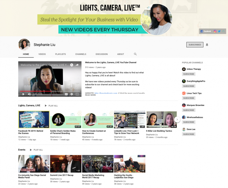
They’re small, right? And here’s an example on mobile:
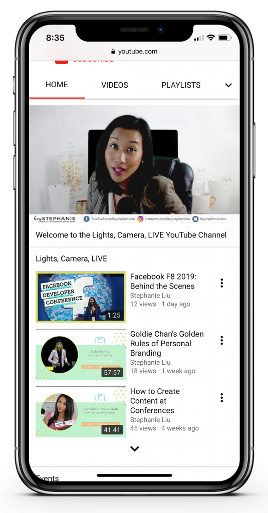
This small thumbnail size is the size that also shows up on Search and Related Videos when people are looking for content on YouTube.
Can you see now why you might need to be a little strategic about creating your thumbnail image, so that it catches attention? Unless you grab attention with your thumbnail, you’ll miss the opportunity for someone to click your video and then view it.
How big should your thumbnail image be?
The ideal size for YouTube thumbnails is 1280 x 720 pixels. When they are being viewed this can appear to be super small, especially if viewed on a mobile phone. It’s not a lot of space to grab attention with!
Let’s take a look at some tips for creating thumbnail images for YouTube that catch attention:
What Makes an Eye-Catching Thumbnail for YouTube?
To catch the attention of a potential viewer, your YouTube thumbnail image should include the following:
1. Add Bold, engaging headings.
Your text needs to be bold. No question. Without a bold heading, we can’t read it, so use at least one font that can be seen from a distance at small sizes.
2. Add limited text
If you add text to your image, it’s important that your text doesn’t cover the entire image. Leave space for an engaging visual to go with the image. Ideally, your text should be 3-4 words if you can manage it. The less words the better.
3. Add Context
Make a promise or a statement in the heading about what is going to be in the video. This adds context but should tell us what the video is going to contain. By helping us know what value you will add, we are more likely to click and watch. And it goes without saying that if you promise something, make sure you deliver it!
4. Add Humans
We relate to humans, so add a human face if it is relevant to your video. Even better, clearly show the eyes. This is how we make connections. If you’re the YouTube presenter, then it’s a no brainer to include a photo of yourself on your thumbnail. Even better, use a close-up photo.
5. Add movement and energy
Another way to create engaging YouTube thumbnail images is to add some movement or energy to your image. That doesn’t necessarily mean actual movement (because it’s not a video… it’s an image) But it does mean that you should choose energetic poses or images (especially where human faces are involved). This will draw us in. Think strong emotions rather than passive facial expressions. It’s better if there is some energetic facial expression or activity in the image. This gives the essence of energy and movement, and draws us to click.
6. Add branding.
A little branding and consistency goes a long way towards helping your YouTube thumbnail get recognised. Think about this in terms of adding a small icon or logo. But don’t overdo it. You an also “brand” your images with consistent text, images and style (using the tips above). When your audience recognises your video as one from your Channel, they are more likely to click and watch it.
In short, if you remember these 3 things, you’ll be on the right track to an engaging YouTube thumbnail. Your thumbnail image should:
- Catch our attention
- Clearly show us what is going to be covered in the video.
- Get us excited about watching the video.
That might seem like a lot of things to consider. But we have an easy way to remember it all: Use templates!
Before we jump in to the YouTube Thumbnail templates, here’s a handy infographic to save for later on Pinterest:

Easil has a growing library of YouTube Thumbnail templates that you can use now to create your thumbnails, quickly and easily. Here are just a few templates you can use to start creating engaging thumbnails:
7 Irresistible YouTube Thumbnail Templates To Get You Started
We’re going to look at 7 Thumbnail templates to get you started.
1. Flat Shapes + real-life images
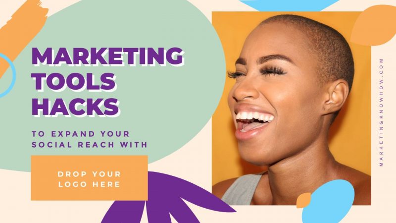
A popular design style for websites and social media has been this flat-design style using big, bold colorful shapes. Contrasted with a real-life photo of a person, this style can be very engaging with a 3-D type effect.
How to edit this template: Switch out the title to match your video and add an engaging, lively photo of a relevant person. Use Easil’s color palette tool to choose colors to match your image or grab colors from your Brand Kit in Easil.
2. White text on colored overlay

White text can be striking but sometimes your background is too busy or “light” to make it work. You need good contrast to pull it off. One way to achieve this is to use backgrounds, images and transparency in combination. This template has a blue background with an image layered above it (that has a black and white filter applied to it). To bring the blue into the image, we simply used the transparency tool to create this effect. Now the white text stands out and the image adds interest.
How to edit this template: Change the text to suit the content of your video and switch out the background color of the thumbnail. Change the background image too, if you wish.
3. Bold Backgrounds
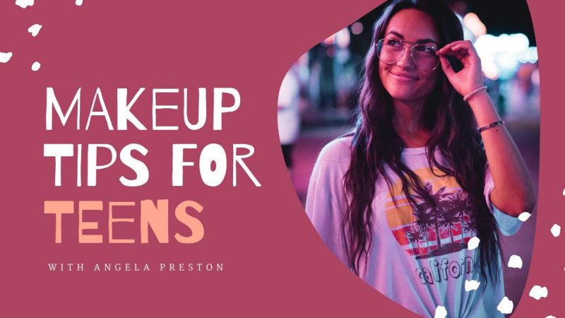
Adding bold, colorful backgrounds helps to provide contrast and interest for YouTube thumbnails. This example uses both, with the text pulling out elements of the photo to add contrast (white and peach colors). Contrasting your colors against a bold, colorful background can make your text pop. And the addition of a human face makes it even more engaging.
How to edit this template: Switch out the image to a photo of you or your YouTube presenter. Then edit the color of the design elements (dots) and title text to match your brand or photograph. Use Easil’s Color Palette tool to find colors in your photograph and pull them into your design. Remember to focus on colors that will contrast with the background.
4. A Pop of Color
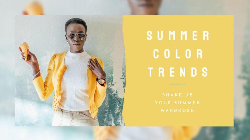
In this template, it is the pop of yellow color that really draws your eye in the photograph. We’ve added it to the text panel too. Use color effectively to attract attention to your YouTube thumbnail so it gets spotted before all of the other thumbnails in the search results!
How to edit this template: Switch out the image to another image containing a bold color. Change the background of the text overlay to the same bright color. Then edit the text!
5. Use Text Masking (Image in Text)

In this template, the text is the image and the image is the text. Using Easil’s Text Mask tool, creating an effect like this is easy. With the right colors and a big, bold font, this type of effect can really stand out on a YouTube thumbnail. In this case the green-blue gradient image works well as a Text Mask against the monochrome background image.
How to edit this template: Choose any gradient image from Easil’s collection or bring in your own image that includes a color or effect that is similar to our example above. It could even be an image with a watercolor gradient effect. Maybe a metallic or glitter effect will also suit. Choose something that matches the style and content of your background image.
6. Text Over Solid Shapes

Using a solid shape can also make your text pop. In this example, the text is set over a brush effect shape. This effect doesn’t impact the background image. Instead, it leads our eyes to the video heading.
How to edit this template – Change out the 2 images, and the text. If you want to change the color of the brush overlay shape, match it to the rest of the image or choose a contrasting color. Use Easil’s Color Palette tool to choose a text color from your photograph and pull it into the heading, as we’ve done with the blue hues in the words “Thailand” and “Santorini”.
7. Add a mockup

Let your subject speak for itself. In this example, we’ve used a mobile phone to represent the content the video will be showcasing – web design for mobile – so it made sense to add a mobile phone image. Adding an image to a mock-up of a book, phone or laptop can add a powerful design element to your thumbnail. It can also draw the eye, especially when you add a human face.
How to edit this template – Change out the mockup image to match your content. Use a human face if you can, to create connection with the viewer and draw them in. If it’s your YouTube channel, add your own face so viewers will recognise you. Switch out the background color to suit your Channel branding and choose a contrasting header text so that your heading will stand out.
Ready to Create Your Own Thumbnail?
If you loved these templates, then you’ll love our Easil library of YouTube thumbnails. You can access our templates with your Easil account. Get started here.
Hot Tips for Editing our Easil YouTube Thumbnail Designs:
Before we wrap up, here are some quick tips for editing the templates like a Pro:
1. Stick to the main elements of the design. Only change 1-2 elements, like fonts or colours or images. If you start changing every single element you run the risk of ruining the design itself. Hint: trust the designer – they know what they are doing! Find out more about how to design with templates in this post.
2. Avoid moving structural design elements. It’s safer to avoid moving borders or graphic elements. If you do move them or change them, replace them with an element of a similar style and shape.
3. Do the Squint Test. Look at your image from a distance and squint your eyes. Can you still read any text on the image? Can you make out what’s on the image. If you can do that, then it’s designed well and will stand out with dozens of other small thumbnail images on YouTube. Even better, ask someone else to do the squint test for you, to get an outside opinion.
Ready to rock your YouTube Channel?
Use our easy YouTube thumbnail templates and start creating your own eye-catching video thumbnails. Then watch the viewers come to click your videos, watch, and convert into subscribers!
Over to You
Are you creating your own Thumbnails for YouTube videos? What DIY-design styles would you love to see?


