Stand-out YouTube thumbnails are incredibly important to YouTube Success because they’re the very first thing that a YouTube user sees when deciding whether to click through to watch your video.. or not! If you don’t have a YouTube thumbnail that stands out and attracts people within that preview, what is going to get them to watch yours, instead of all the other competing for their attention?
After reading through our tips below, you’ll be able to better understand what makes YouTube Thumbnails stand out, and what doesn’t!
The first thing you want to do when designing your Thumbnails is to ensure that your design dimensions are set correctly to a minimum of 1280x720px or 16:9 aspect ratio with a minimum of 640pixels in width. Anything smaller than this, and the quality of your design will be reduced when loaded to YouTube and viewed by your audience. This same image is used in many places throughout YouTube, as well as externally to YouTube:
- Your Thumbnail is displayed on your own YouTube channel and your play lists,
- It’s also displayed at thumbnail size in the YouTube search results, and
- The ‘Thumbnail’ is displayed at full size when your video is embedded into other content such as blogs
6 DESIGN TIPS TO TAKE YOUR YOUTUBE THUMBNAILS FROM AVERAGE, TO CLICK-GRABBING!
What makes a good YouTube Thumbnail?
Thumbnails should be clear, to the point, and have limited text on them, yet still, create curiosity. Sound complicated? It doesn’t need to be. Keep in mind that your thumbnail is displayed on YouTube in conjunction with your video title, so you don’t need to repeat the title word-for-word in your graphic, but instead use the space to give an idea of the topic visually, and accompany it with a few keywords.
1. REDUCE YOUR TEXT WORD-COUNT, BUT MAKE IT STAND OUT!
Before you start creating your YouTube Thumbnail, you should plan out the content that you’ll be including on the design itself, what will be included in the video headline, and what you’ll leave out altogether.
Aim to remove as many words as you can from the graphic itself, and only keep words that add context to the image you are using or creating. With the word count culled, you’ll be able to accentuate those words with a heavy, bold font, to make them stand out from your image background.
Choose a bold sans-serif font to use on your designs. If you don’t have one in your current brand or branding style guide, it might be a good time to look to see if your brand fonts have a heavier weight available to purchase, to experiment with.
Some of our favorite fonts for creating thumbnails are included free to use on Easil:
- Anton
- Baloo Tamma
- Barlow Extra Bold
- Bebas Neue
- Black Han Sans
- Edmund
- Fredoka
- Jost Black
- Lato Black
- Monserrat Black
- Open Sans Extra Bold
- Poppins Bold
- Raleway Heavy
- Roboto Black
- Saira Extra Bold
Consider ‘boxing up’ your text to further assist with making it stand out. That is, placing a rectangular-shaped graphic element behind the text layer, in a contrasting color like the below example from StreamYard. By creating each short word in a separate text box, you can also rotate the elements to add some movement to your design and allow you to vary the size of the font used on each word so the correct words can have emphasis placed on them by using a larger size font than the other words.
When working on your text content, always ensure you are not misleading (or click-baiting) with your choice of video title or the image you create.
2. TRY OUT DIFFERENT EXPRESSIONS IN YOUR PHOTOS
Thumbnails showing faces, especially with eye contact are very popular with YouTubers, with around 72% of the most popular YouTube videos in 2020 featuring a human image. Through A/B testing of their designs, it’s also been proven that the zanier ‘surprised’ or ‘shocked’ or even ‘sad’ expressions pull in more clicks than those with a standard posed smiley face.
With well over 3 Million YouTube subscribers, Gary Vee is a great example of this.
Scroll down to our Free Template #10 to achieve a similar look comprising of boxed text, and radial background lines, that you can combine with your own imagery.
3. ADD SHADOWS & OUTLINES ON YOUR YOUTUBE THUMBNAILS
Adding an outline (or an outline plus a shadow effect) to the main speaker image or product image is a popular effect used by many YouTubers. It’s an amazing – but simple – way to separate the hero image from the background, and you guessed it.. make it POP!
To replicate this effect:
- Remove the Background from your featured speaker or product image, using Easil’s background remove tool. (Available on paid Plus and Edge plans as well as with individual template purchases).
- Add the image into your YouTube thumbnail design or template, and then with the image selected, click on the Filters tab in the top editing toolbar.
- Click on the Outlines tab within the Filters toolset.
- Use the Thickness slider to adjust the width of the outline.
- Click on one of the colors in ‘Template Colors’ to change the color of the outline to a color already used in your design, or choose a new color from the Brand Colors, Image Colors or Color Picker pop-outs.
- Repeat the process on any elements that you’d like to add depth to with shadows, by adjusting the Fade slider until the effect is a softer shadow.
Hot tip: To create the white outline plus a shadowed look on your hero image, create a duplicate copy of your image. Apply the shadow effect by using the Outline tool and adjusting the ‘Fade’ setting, using black or a dark color. Then, duplicate your layer and place it directly on top of the shadowed copy. Adjust this layer using the Outline tool to have 0 set on the fade, and change the color to white.
4. ADD TEXTURE & DEPTH TO YOUR BACKGROUND
If you’ve removed the background from your focus image, whether that be yourself/the speaker in the video or a focused product, you’ll likely be placing it into your design on a solid colored or block color background. That doesn’t mean that you must keep it that way!
Adding a texture or graphic element layer above your background but behind your hero image, will add a level of professionalism to your design!
Some good options to try include:
- Radial lines: (per the TubeBuddy example below) where the lines lead your eyes to the center of the design, but don’t add any visual clutter overall. To recreate this effect in Easil, head over to the Graphics tab on the right sidebar, and search for ‘Rays’ in the top search entry field. Click on your chosen graphic and drag onto your design. Then adjust the colors to match your brand or thumbnail design. Finally, use the opacity slider to take the color down to be a little more subtle if needed. Ensure you position the layer as your background, or just above the background layer.
- Repeating Patterns: Adding an all-over subtle pattern that is slightly adjusted in color from your background, can assist with creating depth. Search for ‘Pattern’ in the graphics tab, and stretch the design to cover your entire background. Update the colors to 2, and again adjust the opacity so that it sits close to your background color.
- Gradients: Search for gradients in the Easil ‘Image’ tab on the right sidebar or create your own to upload using an online generator. Creating a linear gradient using your brand colors is an easy way to add both depth, but also add an extra brand layer. Once you’ve created a gradient you’re happy with you can alternate how you use it in your thumbnails by flipping and/or rotating on different videos.
5. USE ARROWS / POINTING GRAPHICS & OTHER ICONS
When you’re trying to reduce the amount of wording that you include in your designs, a way to quickly communicate your message is to use icons and brand logos.
Try using arrows to link concepts together by using an arrow to show from ‘this’ to ‘that’ (like Sue B Zimmerman’s example below), illustrating the Followers to buyers or $$$s connection that she discusses in her video.
Arrows and hands pointing to your heading or keyword within the text overlay are also great ways to direct your audience’s eyes to the part of the design that you want to stand out!
6. ENSURE YOU USE CONTRAST
Contrast can be created in your design by using color, as well as graphic elements and effects. Use graphic shapes such as box shapes or banners to create separation and contrast between your background images and your text, and always ensure that you use colors with high contrast for your text to ensure legibility.
Before you finalize your YouTube Thumbnail designs, take a step back. That is, move away from your screen, or zoom right out, so you can see how that design is going to look when it’s shrunk right down. Also ensure that you’ve left the lower right corner of your thumbnail free from any text, or important elements, as it will be covered by YouTubes video timer when viewed on the platform.
10 FREE YOUTUBE THUMBNAIL TEMPLATES YOU CAN USE NOW
Are you ready to start creating stand-out Thumbnails for your YouTube videos? Click on any of the design templates below to start editing them in Easil, to save yourself the time of starting from scratch!
- Sign up for your free Easil account, and we’ll upgrade you to the Plus plan for 30 days! (No credit card required).
- Click on the image of the YouTube Thumbnail template that you’d like to start editing.
- With the Easil template open in the editor, click on the elements you’d like to update – double click to edit any text boxes. Click on any image box to select it, and then drag across new images from the right sidebar ‘Images’ tab, on top of the existing ones to replace placeholder images.
- Remove busy backgrounds from any images like magic with our built-in background removal tool. (For paid subscribers).
- If our templates contain elements like outlines on the images, they’ll automatically be added to the image that you replace it with. You can further adjust by using the Outline tool located in the ‘Effects’ tab, when you have your image selected.
- Once you have completed your design changes, click the download button at the top right of the editor, and select PNG (for the highest quality) or JPG format. You can now proceed to YouTube to add to your video!
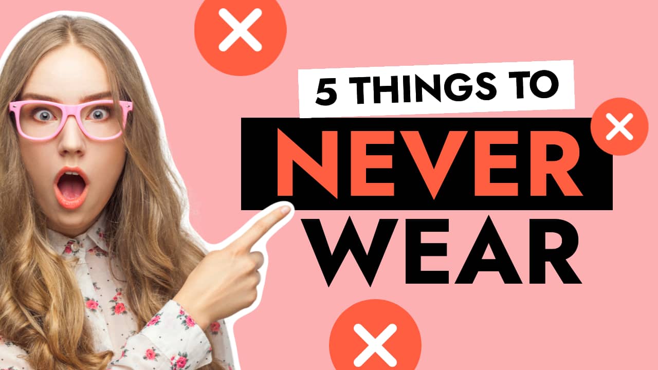
FREE YOUTUBE THUMBNAIL TEMPLATE #1
Accentuating a negative or pain point via expression of your featured photo, a highlighted word in the text overlay, or icons, is a great way to catch people’s eyes in a busy YouTube feed or search result. Add them all together into one thumbnail and you’ll have a scroll-stopping thumbnail design!
FREE YOUTUBE THUMBNAIL TEMPLATE #2
If you prefer for your YouTube thumbnails to have a little bit more depth, try adding a pattern or texture into the background of your design. Try to choose an image that adds context to your design for the best overall look.
In our example, we have chosen a techy type pattern, placed it over the entire background of our design, and then adjusted the Opacity to allow the background color to come through and to keep the overall look subtle so it’s not competing with our hero image or text overlay.
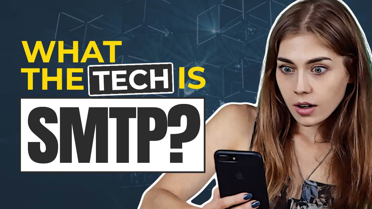
FREE YOUTUBE THUMBNAIL TEMPLATE #3
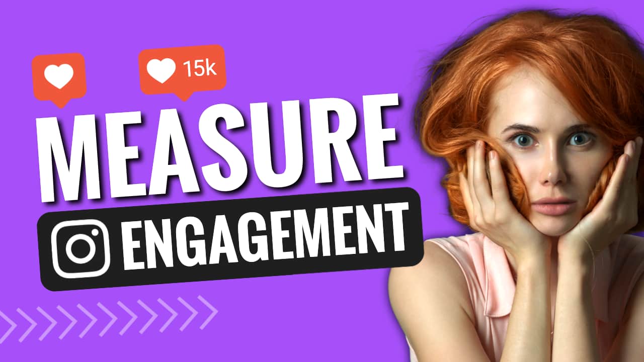
Sometimes using icons or logos is a much better use of space on your thumbnails, than typing out several lines of text. With space at a premium, try to think of recognizable icons that can replace lengthy words. For example, if you’re talking about social media platforms or engagement, or metrics in your video, try to include some simple icons that will be recognizable and cut out some of the unnecessary words.
FREE YOUTUBE THUMBNAIL TEMPLATE #4
Comparisons for products and services are a popular topic on YouTube, and your thumbnail design should showcase what you’re talking about, whilst creating some curiosity. Our template provides the foundation for a pros and cons style of video, and can easily be adapted for many topics, and brands.
FREE YOUTUBE THUMBNAIL TEMPLATE #5
Breaking up your text formatting to allow for keyword enlargement is a popular and effective way of designing YouTube thumbnails. In this template, each line of text is created in a separate text box, allowing for the word you want to leap out to be maximized to the largest part of your design. Using a bold, sans serif font with contrasting colors will help to make this thumbnail pop even when viewed on small devices.
Hot tip: This template includes the purple ‘glow’ effect on our placeholder male image. To update with your own photo, simply click on the image and then drag across your own image (with the background removed) on top of the selected placeholder. You’ll see it snap in to replace the image and you can then further adjust with the crop tool and the outline tool.
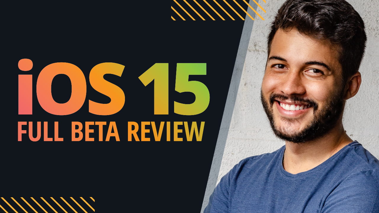
FREE YOUTUBE THUMBNAIL TEMPLATE #6
Placing an image inside your text, such as this gradient text example, can provide a link and further context to your design when used correctly. In this free template, we’ve inserted a multi-color gradient image from Easil’s image selection to give an Apple-vibe to the design and used it against a highly contrasting block color panel.
To update the text in this template, you can simply double-click into the text box and edit the content, and use the Easil text formatting tools such as different fonts and sizes, as you would on any other text box! Read more about using Easil’s text mask tool here.
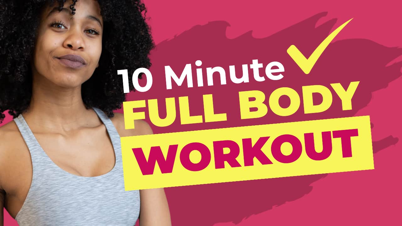
FREE YOUTUBE THUMBNAIL TEMPLATE #7
When appropriate, you can use the hero image in your thumbnail to do some of the talking through your outfit selection. Talking about winter clothing trends? Make sure you’re not decked out in a summer singlet for your thumbnail! In our example, our speaker is the instructor in the 10-minute workout video, and wears appropriate activewear to show exactly what this video is about – at a glance! The text overlay adds the important information, as well as an extra positive with the check-mark icon.
FREE YOUTUBE THUMBNAIL TEMPLATE #8
When your YouTube videos include a product that you can show off in your thumbnail, you should definitely consider doing so!
Take a clear shot of the speaker with the product in their hands where possible, and with an appropriate expression. Then, remove the background from that image, and add it to a thumbnail template.
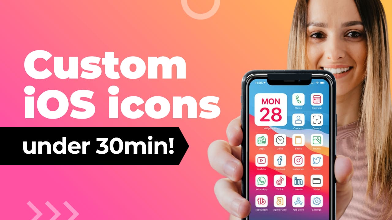
In our included example, we’ve included the phone and hand image as a mockup, so if your topic revolves around phones, apps, or relevant tech, you can update this template to include a photo of you behind the phone, and then drop a screenshot of what you’d like to be displayed on the phone into the graphic frame provided!
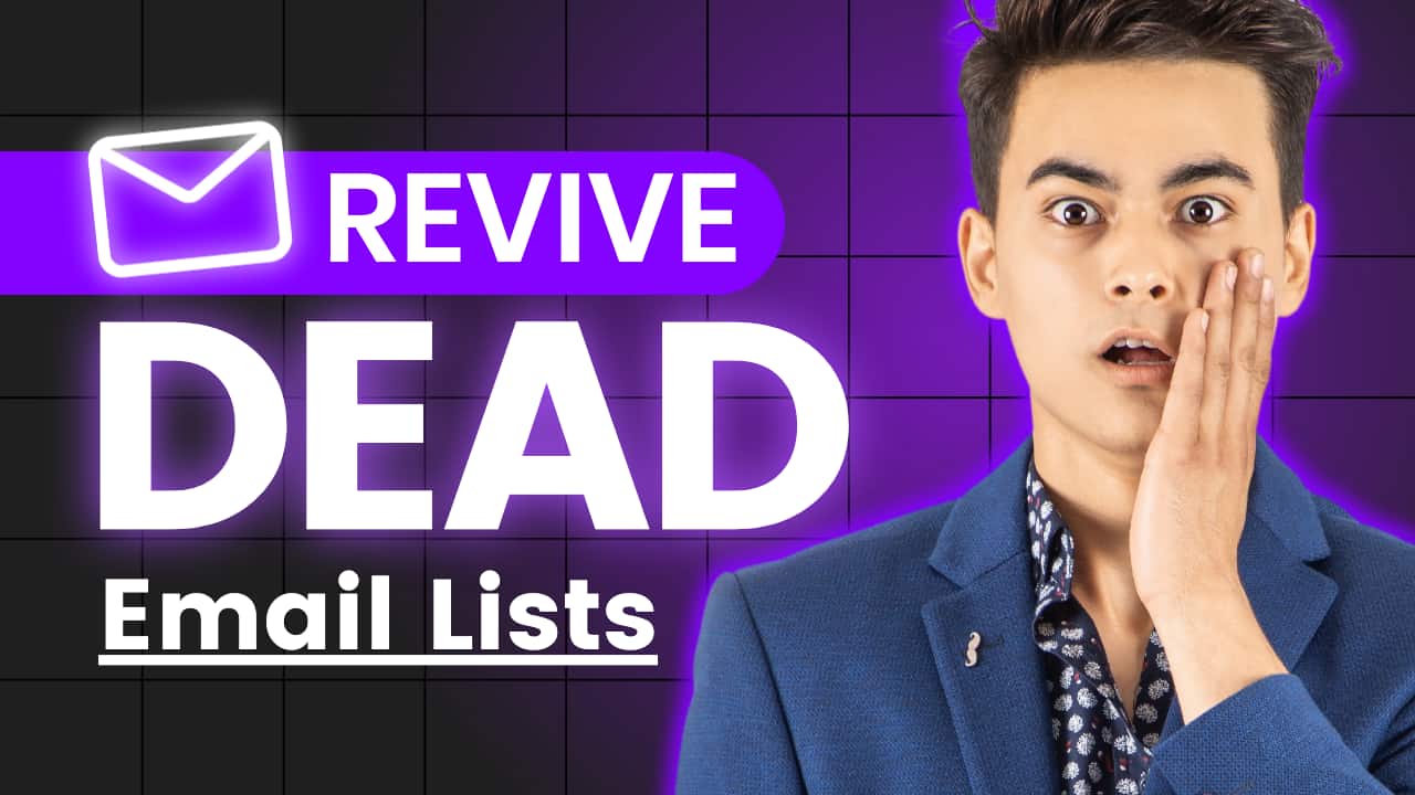
FREE YOUTUBE THUMBNAIL TEMPLATE #9
Using bright, eye-catching colors is another great way to stop the YouTube scroll and gain a click! In the design style, we illustrate here, we’ve extended the block color boxes from behind the text to bleed right off the thumbnail, to create a wrapped banner type of look. This template is quick and easy to update to your own brand fonts and colors and suitable for most different topics – as long as you keep that headline nice and compact!

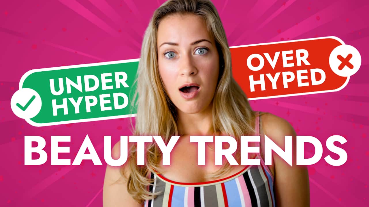
FREE YOUTUBE THUMBNAIL TEMPLATE #10
Our final YouTube thumbnail template shows how adding related imagery can really tell your story in seconds. Treating your thumbnail like a mini-billboard, you only have those couple of seconds (at most) to catch the attention of your potential viewer, so always do what you can with a combination of simple imagery, stand-out keywords plus a high-quality image of your speaker.
OVER TO YOU
You’ve got this far, so you’re all set to start leveling up your YouTube thumbnails! If you have any questions about creating, stop by our Easil All Stars Facebook group, or check out our videos on our YouTube channel, and leave a comment or question so we can help you out!