
If you’re creating visual content day in, day out, and looking to lift the standard of your graphic designs, you’ve come to the right place! In this article, we’ll be fast-tracking your DIY Design skills to help you master some quick and easy design tricks and image hacks to enhance your social media, blog, and Pinterest graphics to a professional graphic designer level.
On social media, we are expected to create visuals to accompany our written content, more than ever before. Creating everything from static graphics for Instagram, Facebook, our blogs and Pinterest, and videos for Stories and Reels – it can become overwhelming to keep up with things and stay creative at the same time.
If you are here as a non-designer, we’ve got your back. With these tips, tricks, and templates, you’ll be stopping the scroll and posting creative, original content that is appreciated and attractive to your audience. By the time you’re done looking through and testing out the below tips, you’ll be creating eye-catching images for email newsletters, social media, ad campaigns, and even printed collateral.
11 AWESOME [& EASY] IMAGE ENHACING HACKS YOU CAN LEARN NOW!
Keep in mind, it’s always easier to start with a template than it is with a blank design! If you’re new to the graphic design and visual content creation world, we recommend choosing one of our stunning pre-designed templates so you have the general look and feel already done for you. Then, you can just upload your own images, and customize them with your colors and fonts to make them your own!
If you’re more experienced, just follow the instructions in the designs below to learn how to apply the Easil design effects to any graphic you’re creating.
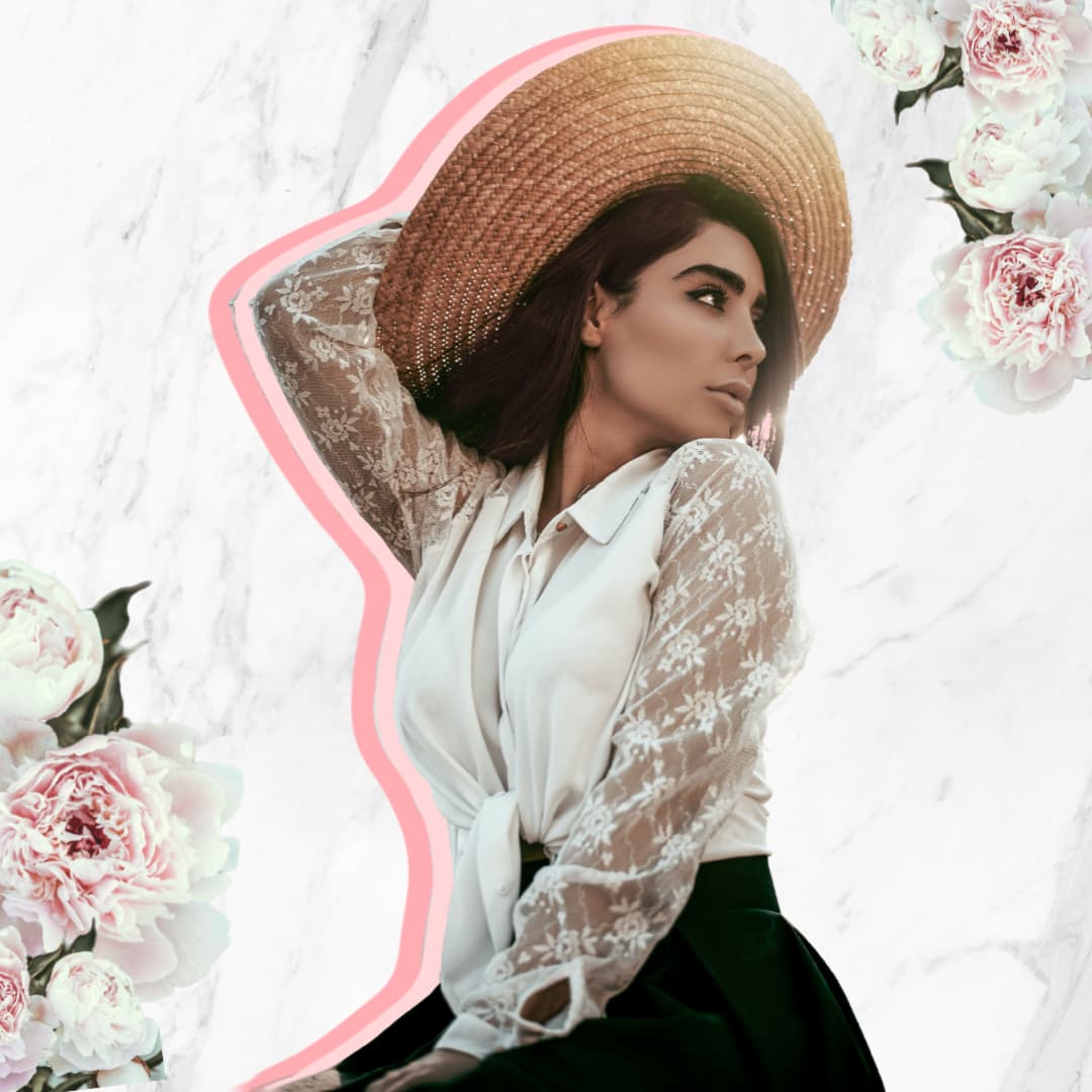
#1 CREATE A LAYERED, COLORED DROP SHADOW EFFECT
This effect looks great on images of people, or products, and creates a nice visual separation from your hero graphic element from a busy background.
With this outline effect, you can create a drop shadow effect on any image that is cut-out, and also play with duplicating and layering the image as we have in our example to provide a double shadow look.
To create this look we:
- Selected an image, and uploaded to ‘My Images’ in the Easil Workspace.
- Removed the background from the image.
- Opened our design in the editor, and dragged on the image with the background removed.
- Used the Outline feature (located in the Filters tab in the top Actionbar), to create a thick outline. We adjusted the color to suit the colored used in our design, and used the Distance and Rotate sliders to position the outline to the side.
- We then created a duplicate of the layer, positioned it slightly offset from the original layer, and changed the color of the outline.
#2 DROP AN IMAGE INTO A SHAPE
Break out of the box, and instead drop your image into a circle, or an organic shaped Image Mask, to instantly level up your graphics. Choose a shape that reflects your brand, and use it consistently across various collateral for a professional look.
How to add your Image into a Shape:
- Open your Design in Easil.
- Click on the Graphics tab on the right sidebar, and then into the Shape Masks category.
- Click to add your chosen shape to the design canvas.
- Once you have placed your shape mask, you can place any image into it by going to the Images tab on the right sidebar, and dragging and dropping onto the shape:
Read more about using image masks in our feature article, here.
#3 ADD SOME GOLD OR SHINY ELEMENTS
You can never have too much sparkle, right? In our opinion, sprinkling in a few shimmery elements in graphics equals happiness, and that’s why we have combined gold in both our text and as graphics in this example!

How to add metallic effects to your design in Easil:
- Incorporate glitter, gold or shiny textures into your typography by using Easil’s text mask feature, which enables you to place any photographic image into any font. Learn how to use the text mask feature here.
- Experiment with adding golden images into Shape masks – especially those with smaller elements like scatters of circles, and place them around the edges of our design.
- Alternatively, add them to larger graphic Shape masks (like the arch used in our example), and then layer them behind your hero image to create a framing effect.
#4 ZOOM IN ON YOUR SUBJECT
Taking things to maximum size, or creatively cropping, can be all the adjusting you need to create a scroll-stopping image. Take a look at the features of your image, and consider what you can zoom right in on to take an ordinary image to the next level.
How to do this:
- Place your image on your chosen design canvas size in Easil.
- Click on one of the corners of your image, and drag it outwards to increase the size beyond the edges of the visible canvas. Release to view the image positioning on your design.
- Drag the image to a new position within your design canvas and repeat increasing the size if required.
#5 KNOCK IT OUT!
The ‘knockout’ effect transforms a standard image (with its background removed) into a creative outline look, by knocking out – or removing – the primary image component, leaving behind just the outline. With this trick, you can make a copy of an image and apply the outline effect, and then slightly offset the completed outline from your main product shot for a professional creative touch. It’s one of our favorite image hacks!

How to use the knockout effect in your design in Easil:
- Add an image to a design, ensuring that you use one with the background removed.
- Duplicate the image to keep a copy in your design without the outline.
- Click on the image or element to be knockedout, and then choose ‘Effects’ from the top actionbar.
- Select the sub-tab ‘Outline’ and use the sliders from ‘Thickness’ and ‘Fade’ to reach your desired look.
- Tap on the ‘View More’ options button and then toggle ‘Knockout’ to the on position.
- Drag your knocked out copy slightly offset from the original image.
#6 LAYER UP THE TEXTURE
Adding a textured background is a fantastic way to make your DIY graphics look professional. The trick to making it work with other elements and layers in your design is to keep it subtle; you don’t want your background to be the hero of your graphic.
To help your texture to achieve this effect, send it to your background and then adjust the opacity slider to under 30% to dial back the intensity. Keep it at a level that it’s visible if you stop to look at the image, but (far) less than an effect you would see if you are quickly scrolling through a busy social feed.
Hot tip: If you find a texture you like, and it fits your brand personality, consider adding it to your brand guidelines and store it in your brand kit. Texture is an easy way to give your brand images more depth and can help draw a connection to your products and services if used correctly.

#7 USE LAYER TRANSPARENCY ADJUSTMENTS
Adjusting the transparency of elements in your design, or creating ‘see-through’ elements is a great way to make your designs more aesthetically pleasing, and professional in appearance. Using this method, you can easily dial back the transparency by using the Opacity slider in the Easil editor and stacking various images in your design.
You can also do this in a reverse manner, by layering a solid image with a shape placed on a layer above and adjusting the opacity of the graphic element to let the image layer below shine through.
How to create the layered transparency effect in Easil:
- Upload your Images to the ‘My Images’ section of your Workspace, and use the Background Remove tool to remove the background from your image.
- Open your design in the Easil editor, and then add your image from the ‘Images’ tab on the right side bar.
- After placing your image, create at least 2 additional copies of the image and place them slightly offset from each other, with a little of each image being revealed.
- Click on each layer in turn, adjusting the ‘Opacity’ slider located in the top actionbar to your liking.
- Keep one of your layers at full opacity, and play with the layering of your image copies by dragging them up or down within the Layers tab. There are no hard and fast ‘rules’ with how to make this work!
#8 ADD A COLORED GLOW EFFECT TO YOUR IMAGES
With the background removed from products or even people images, you can create a stunning neon-style glow by utilizing the outline feature.
To replicate this effect:
- Add an image with the background removed to your design canvas.
- Click on the image or element, and then choose ‘Effects’ from the top actionbar.
- Select the sub-tab ‘Outline’ and use the sliders from ‘Thickness’ and ‘Fade’ to reach your desired look.
- Apply a contrasting color to the outline to make it stand out from the background.


#9 ADD A SUBTLE SHADOW TO IMAGES AND SHAPES
Using a very soft drop shadow on a graphic element can create a ‘floating’ effect and is particularly attractive when used on UI-inspired graphic styles such as notification posts. You can also try using it applied to solid shapes when adding screenshots of Tweets to other social network posts.
Creating a soft shadow effect on graphic elements is via the outline tool. This option appears in the top actionbar when any vector graphic shape is clicked on and the key is to move the ‘Fade’ slider option a considerable amount. Keep sliding both the Thickness and Fade adjustments ’til you’ve reached a soft hazy effect with a black or dark color applied as the outline color.
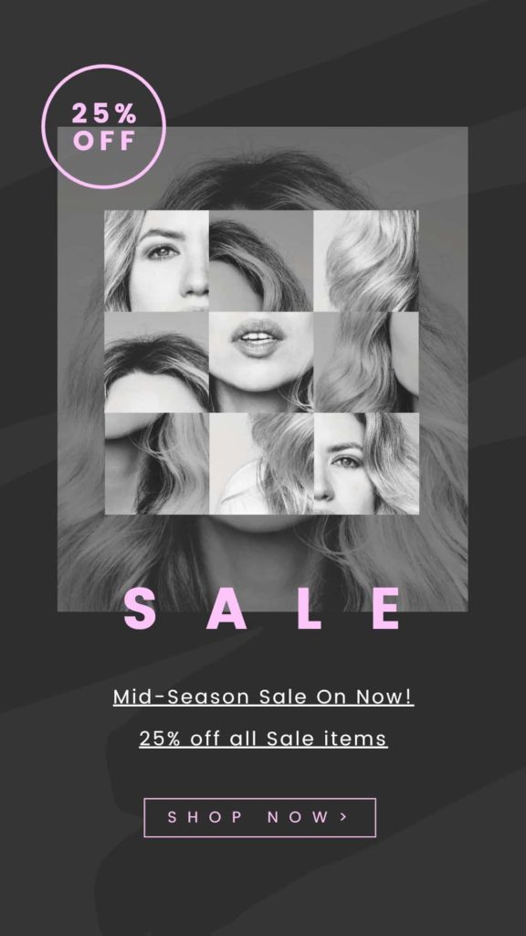
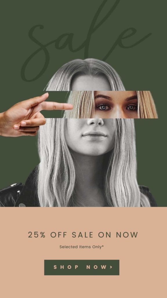
#10 PLAY WITH CREATIVE CROPPING
Cropping of images does not mean that you need to limit yourself to simple trimming adjustments. Try getting creative and cropping an image in an unexpected way, and then duplicate that image, crop again in a different way, and re-position on your design. Sometimes leaving something off your design can create more curiosity, and will stop that scroll in a busy feed!
How you can create non-standard cropping in your designs:
- Try using a photo grid element with several graphic windows. You can find these in the right sidebar > Graphics > Photo Grids. Experiment with placing the same image into each window, but adjusting the crop by double clicking, extending the image size by dragging the handles and then repositioning within the display area.
- ‘Cut up’ an image into several pieces by adding it to your design in 2 or more layers, cropping out different amounts each time, and then offsetting from each other. Also try slightly rotating one or more of the cropped sections, or even applying different image filters to each one.
- Crop or montage the same image into multiple shape masks (Graphics > Shape Masks), and repositioning the contents within.
#11 ADD A BOLD TYPOGRAPHIC STATEMENT BEHIND YOUR IMAGE
Switching your next up to be displayed behind your foreground graphic elements is our final tip for stepping up your DIY graphic designs. With this method, it’s essential that the message is still 100% legible and not distorted. Keep your text character count to an absolute minimum, and consider using ‘Letter Spacing’ in the top actionbar (toolbar) to increase the spacing between your letters where your foreground subject will feature.
If you’re wanting to use isolated photographic images to achieve this look, ensure you’re familiar with our Background Removal tool to get this done in a snap!


OVER TO YOU
Are you ready to try these DIY design image hacks in your next visual content production round? Send as a DM with any queries or feedback you have on these tips – we’d love to hear!


