So, you need to add text to photos, but you’re not sure how to make them stand out? Think of this as your 101 for creating awesome social media images and promotional graphics with a bang.
In this post we share 5 simple ways to add text to photos. Creating visuals is easy when you know how to layer text on your image with a bang!
Images are powerful. They catch our attention, make us feel and drive us to take action… whether it’s to like, comment, or share, or maybe something something bigger.
A simple word or phase on an image can add context in an instant, and transform the message of the visual. It could be to tell us how to do something, inspire us, motivate us, or encourage us to click through for more. Whatever your reason for adding text to images, you want it make it pop.
Let’s jump into 5 ways to add text to photos so that your visual creations go off with a bang:
5 SIMPLE WAYS TO ADD TEXT TO PHOTOS
1. Use shapes to frame your text
Simple shapes such as rectangles can be used to create block overlays on your image. This provides a base for your text to reside on. It makes your text on photos “pop”.
You can also reduce the transparency of the shape slightly. This allows just a hint of the background to appear through the shape, for a professional effect.
Here are some examples:



2. Contrast Your Text
Contrast rules when it comes to design. It helps the important parts of your text to stand out. It also tells us where to focus.
We can achieve contrast with elements of light and dark, with color or with shape, size and texture… and with text effects (see #5 for more on that) where your type color needs to contrast with the effect you use (ie drop shadow, glow).
Any effect or text color that you choose should contrast (and stand out against) the background.
When you get this right, you will be on your way to creating fabulous text over images that catches attention!
But don’t worry, if you are using Easil our templates and text effects tool will give you a nudge in the right direction with just the right amount of contrast.
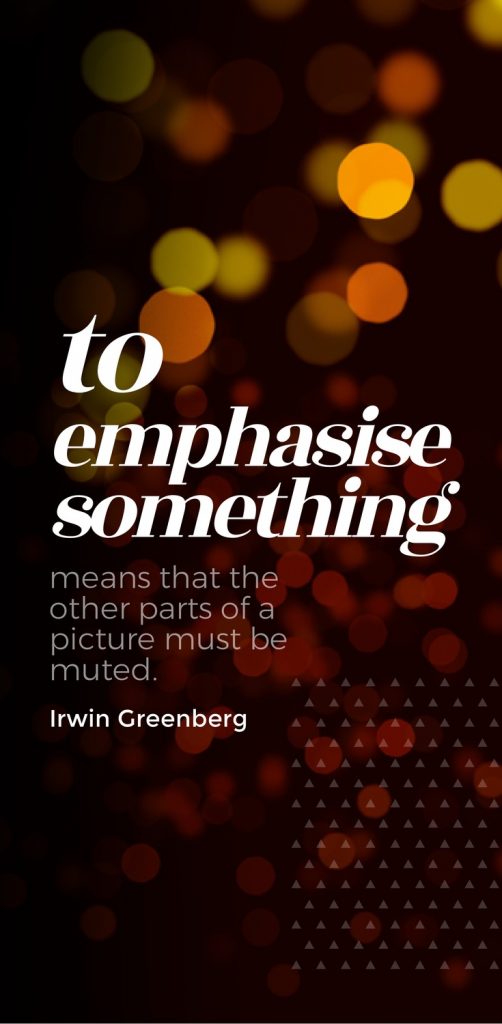
3. Select your fonts carefully
If you are selecting your own fonts to overlay on your image, consider the personality of the font and the mood you are aiming to project with your final image.
Flourish-y, fancy fonts don’t work for a bargain sale announcement, but they will look stunning for some formal occasions and invitations.
Case in point, here’s a bargain sale announcement:

.. and here’s all the flourish-y goodness on the formal announcement:
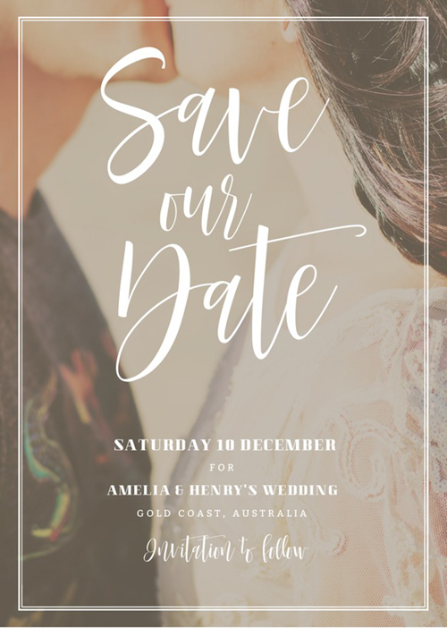
Both catch attention, wouldn’t you agree? Ensure the image and the font work in harmony. If you are stuck trying to find a good combination, be guided by the templates you have access to in your graphic tool.For example, at Easil, our designers do all the hard work choosing font combinations, so you can be sure you are pairing two fonts that are meant to be together. Using templates ensures that your designs will rock!
HOT TIP: If you want to change your font combination when adding text to photos, then follow some of the ideas in this post, including:
- Choose a sleek, simple, minimalistic font if you have a busy background. Get fancy with your fonts if you have a plain, simple background.
- Bold fonts work best over detailed images. Lighter or thinner fonts work best on clear backgrounds or flat colors.
- Blur the background slightly to make your fonts pop – this works especially well if your background is detailed.
4. Take advantage of Filters
Using the Filter presets in Easil you can change the appearance of your background images with a single click.
Play with the filter sliders in the Actionbar. This will show you a preview of how your text can stand out from the images with options including blur, contrast, greyscale and saturation.
Here are some examples:
In this first example, blurring the background makes the text pop:


In this second example it’s the filter under the text that makes it pop:


Congratulations, you’ve just added text (and a little design magic) to your photos!
5. Use Stunning Text Effects
Text effects like drop shadows (and our favourite “glow” effect) can be tricky if you don’t use a tool to help you.
When used well, these effects lift a design and give it wow factor. When used poorly, they can be unpleasant to look at, overbearing or just downright cheesy!
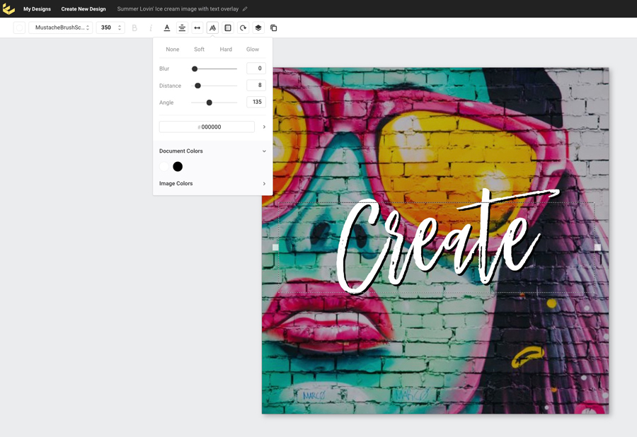
You can try to “go it alone” with effects like drop shadows – using light and dark, contrasting colors, blur and a whole swag of tricks to make your text look great. But in reality, if you are not savvy with design it is VERY hard to pull this off in a way that makes your image work.
Instead… try our Text Effects Tool. It takes all the guess work out of making awesome text effects. Here it is in action for adding text to photos with drop shadow:

And here it is in action for adding text to photos with our cool “glow” effect (did we say that we are loving our glow tool already?)
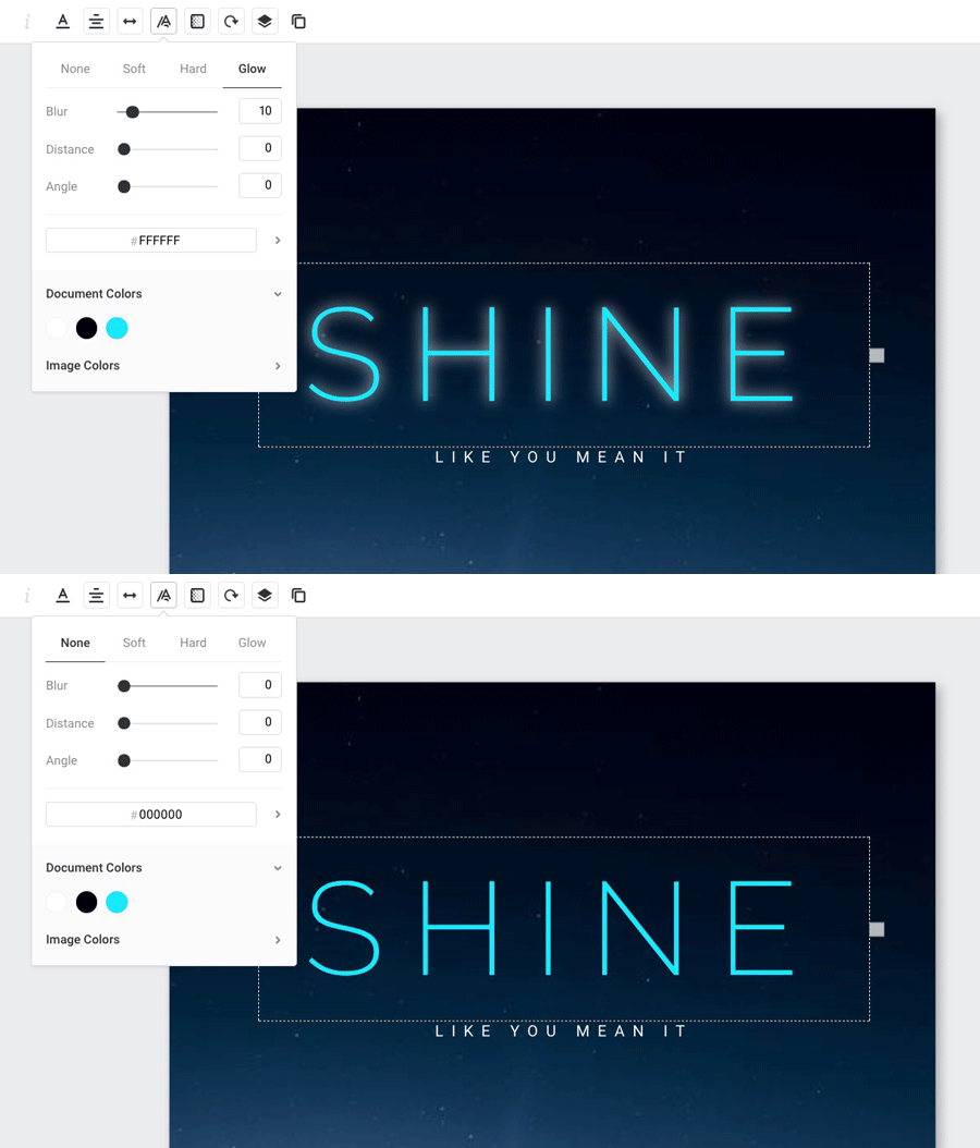
As you can see, when you have a great tool to help you, text effects like drop shadow and glow can become a huge asset when adding text to photos… with a bang!
What about you?
Are you creating images where you need to add text to photos? Try some of these tips and tell us how it helps!
