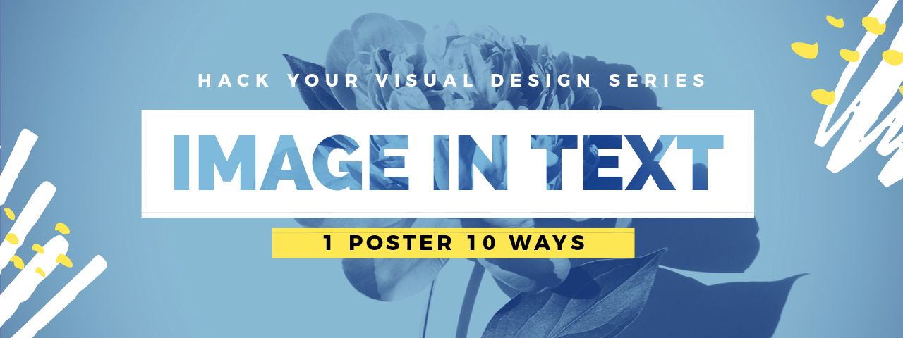
If you haven’t discovered these Image in Text Poster Designs yet, then get excited as you’re about to do amazing things with visual design!
We’ll show you how to take just one Poster template and turn it into 10 stunning poster designs in just a few clicks – using our unique Image in Text Poster style.
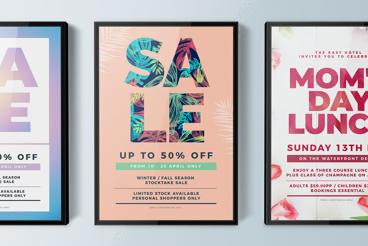
Let’s jump in because you need to see them straight up. Here’s a sneak preview of how our Image in Text Poster Designs look, all created with Easil’s Text Mask tool:
Are you ready to create your own?
Let’s do it! This “Hack Your Visual Design” series (here’s a previous post) is all about showing you how to take a single DIY Design Template and change it into 10 different designs. It’s easy with Easil!
We’ve used our Text Mask tool to transform 10 posters so that they will stand out and get noticed. Why are we so excited about this tool feature? Because in the past, creating image in text designs has been restricted to using tools like Photoshop. Which has made it difficult for anyone but designers to use. Until now!
These stunning Image in Text Posters are ideal for:
- in-venue posters to promote events, music and more
- Posting online for promotions. You can use them for any purpose that suits a poster-size dimension. Use them on your social channels too (they look awesome on Pinterest!).
- Converting the posters into any other size that you like with Easil’s easy resize tool – from instagram images to brochures and HDTV screens. You’re only limited by your creativity!
With our text mask tool, you’ll be creating pro-quality designs in minutes. Let’s get started…
One “Image in Text Poster” Template, Ten Ways
We’ll start with the base template, then move on to all the stunning poster designs you can make with it. We’ve also included some hot tips at the end of this post, to help you with your use of the templates.
#1 The Base Poster Template.
We’re using the following ‘We Love Live Music’ template in this example. Note how it looks before we make any changes. We’ve used two simple fonts, some line graphics and a background image.
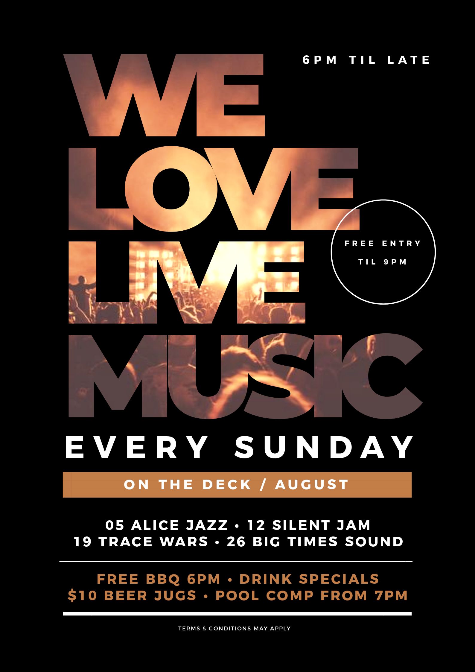
Notice that the main font is a large, bold font that suits the use of our text mask tool? You’ll see this trend continue throughout this post as we highlight the eye-catching image in text poster effect!
#2 Add Texture to your Heading with Matching Image in Text
What better occasion to use Image in Text than Mother’s Day?
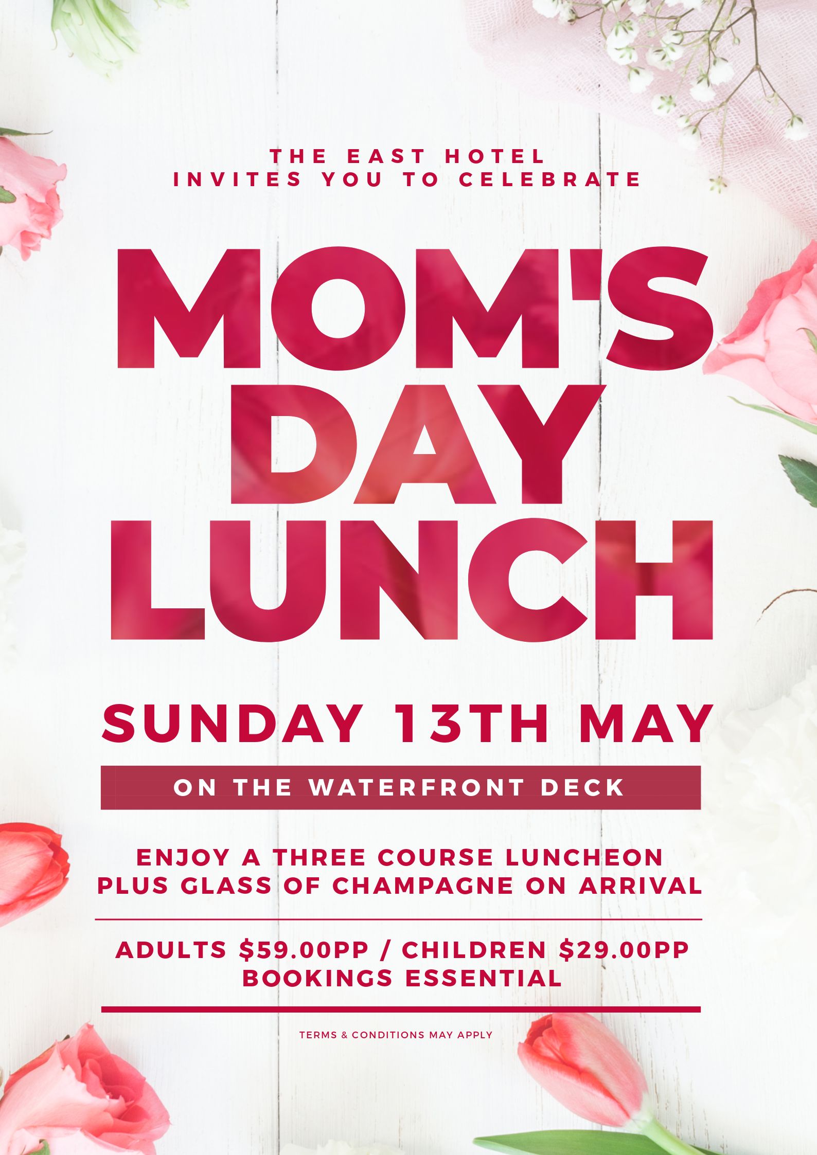
With this Mother’s Day example we’ve taken a few easy steps to create an gorgeous image in text poster:
- Firstly we changed the background image to suit the Mother’s Day theme. We chose an image with detail around the border area of the image to keep white space in the middle.
- We used the text mask feature to add a matching floral image to cover the entire heading, and adjusted back the opacity.
- We changed the color of all text and elements, including the color in the main heading to match and complement each other and the background image.
- We centered the heading, then removed the extra circle callout which was not required in this design.
Hot Tip: If you have a lot of text to display in your poster designs, use an image that frees up space in the middle, so your overall image is not too “busy”.
#3 Use a window-style heading where we “peek inside” to see the background image in text
This design is bold and draws you in… with bubbles!
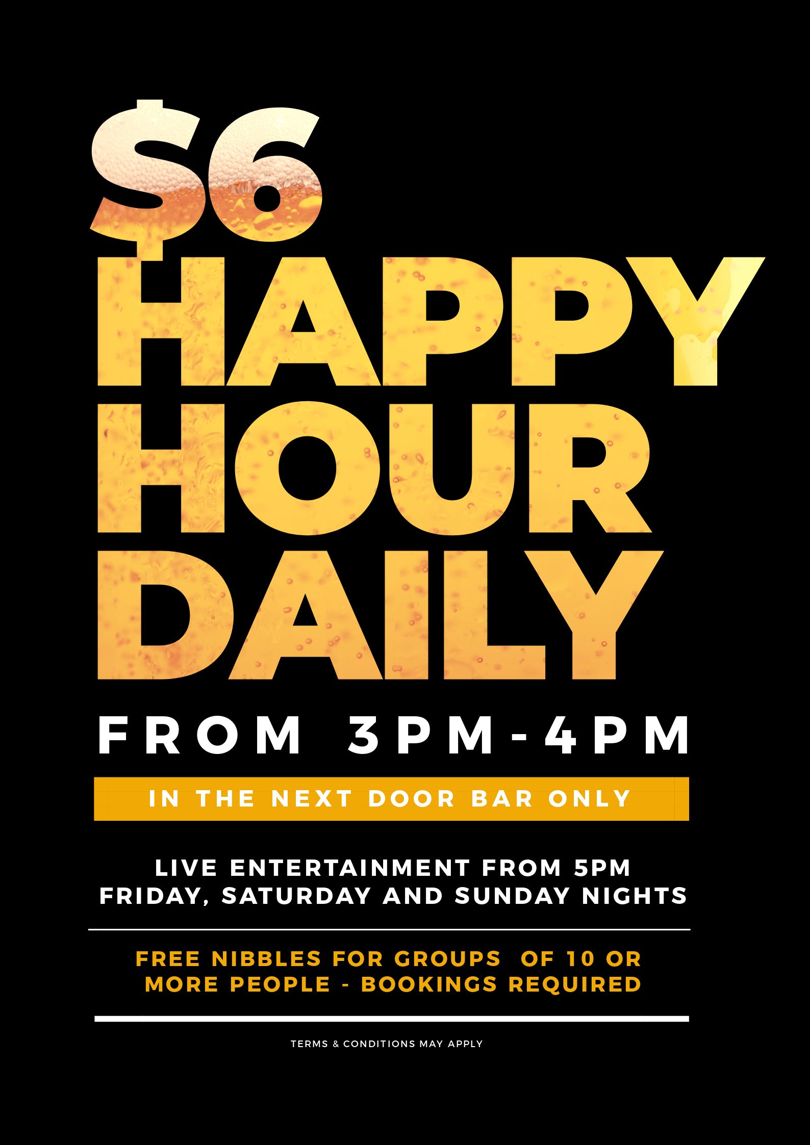
Yet it only took just a couple of key changes from the design above to make a custom new design:
- We’ve kept the same large, bold font in order to highlight the image in text effect.
- We added a close-up image of beer bubbles to the heading text using the Text Mask tool.
- We matched the text color in the rest of the design to match the image in the text.
Hot Tip: If you see a bold font that works (ie that you love) in a template that uses Image in Text, then keep it in your design. You already know it works… so why change it?
#4 Make Your Poster Shine with Glitter
Using glitter effects in an “Image in Text Poster” is something we are a little in love with right now:
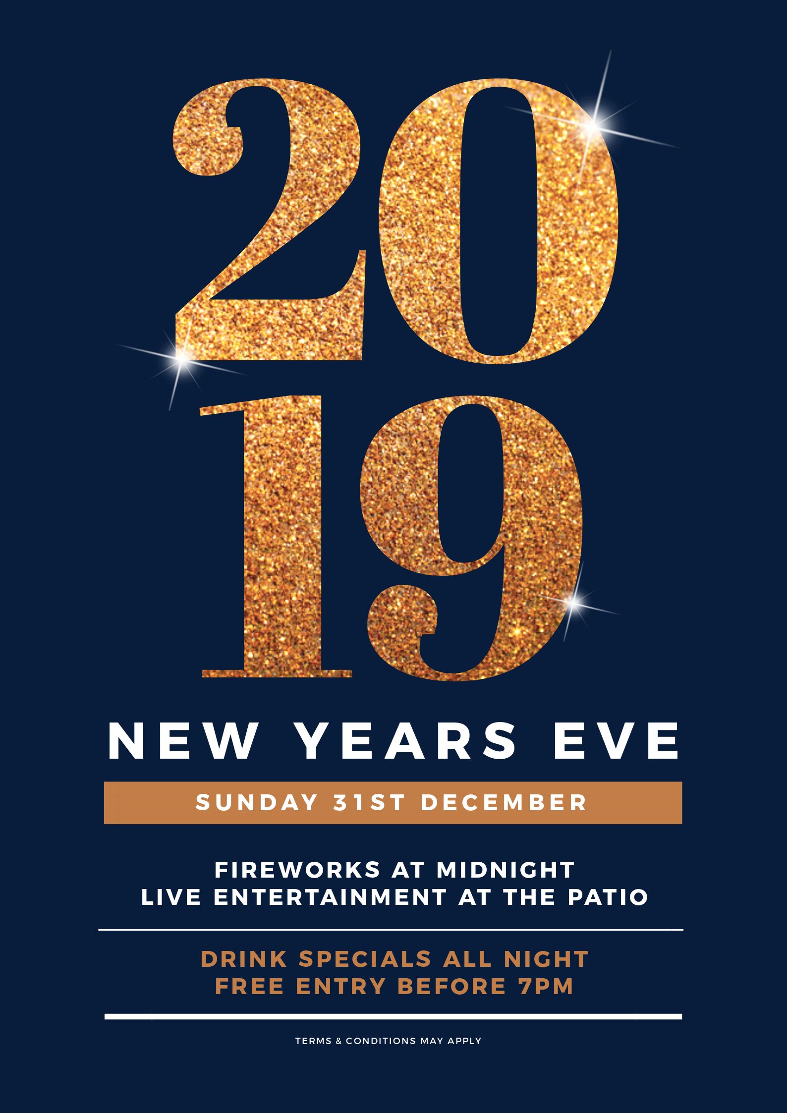
Here’s how we transformed this visual design:
- Changed the title (and font) to the numbers 2019 and increased the font size to be impactful when we fill out the image in text.
- Using the text mask feature, we added a glitter effect – search for ‘Glitter’ in the Stock Image Library.
- We then added some ‘bling’ stars and positioned them in various places on the glittery heading to provide more glitz to the design!
Hot Tip: If you want to add some more shine or bling to your poster designs, search for “bling stars” in the image library.
#5 Use a detailed pattern for your image in text heading
Let’s try some detail and really start playing with contrasts, using the Text Mask tool. It’s SALE Time:
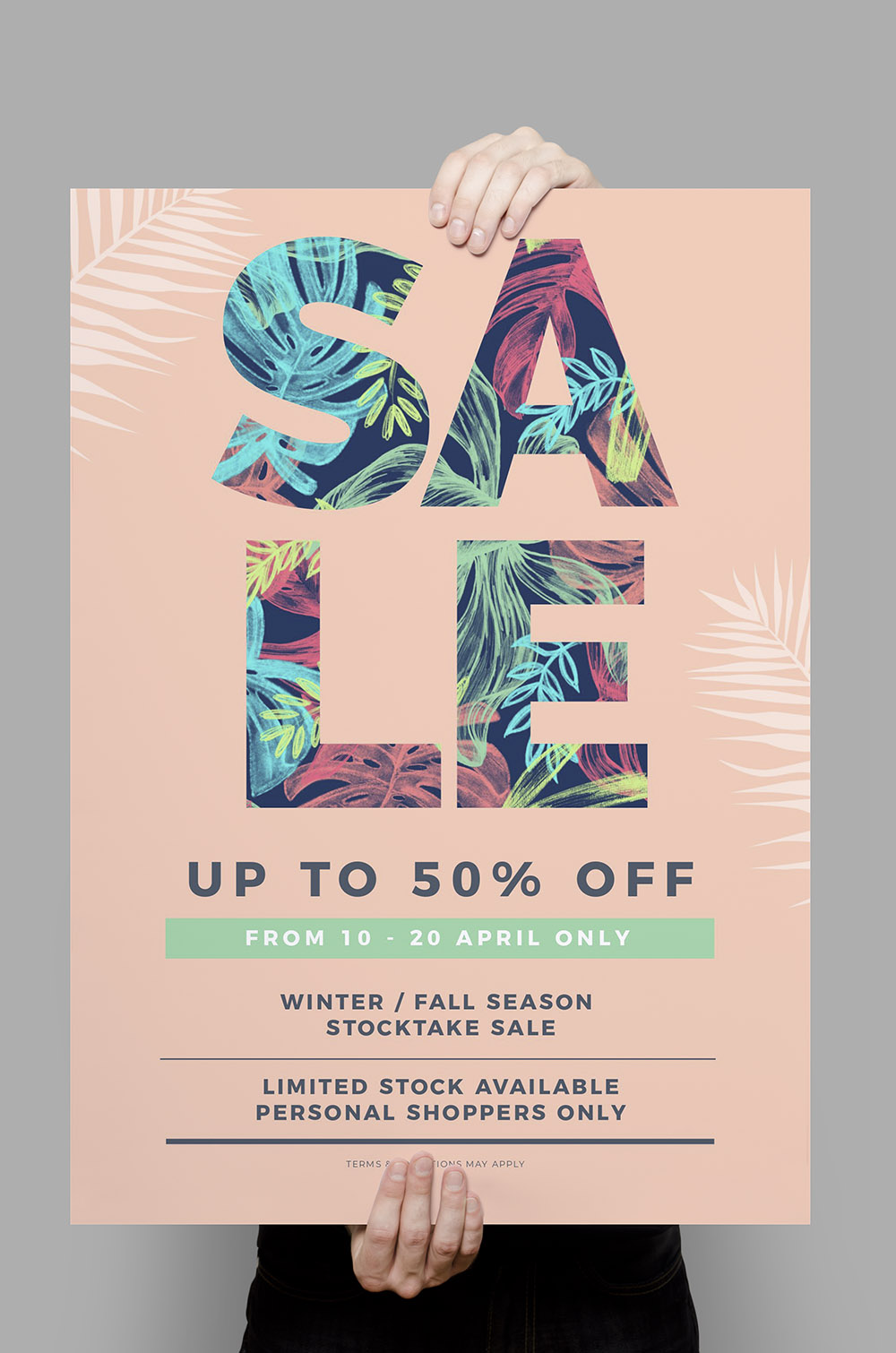
In this example, we added a few elements:
- Changed the background to a plain solid color and changed the text to SALE.
- Contrasted the background with a detailed pattern design in our heading.
- Searched on graphic elements for some leafy greens to overlay on our background, reducing the opacity slightly.
- Used Easil’s color picker to match the box banner with one of the green colors in the text pattern.
Hot Tip: If you have a detailed pattern to use for your “image in text” effect, then choose a plain background. For this example, you could also use a pattern from clothing in your sale items – perfect for product-based businesses.
#6 Extend your “image in text” into the border
With a couple of quick changes, the Sale Poster becomes something completely different:
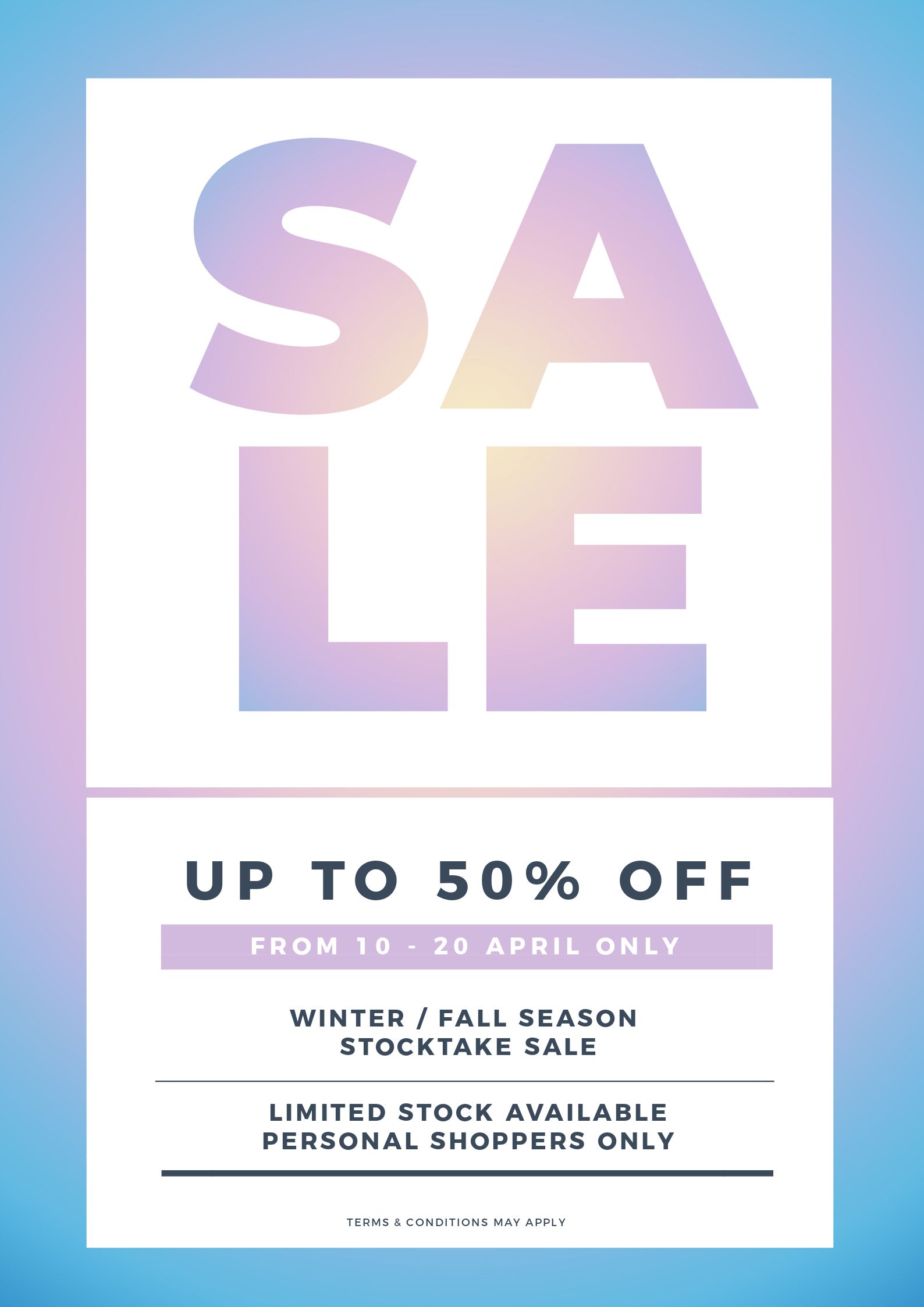
For this example of an image in text poster, we kept it simple, taking the background image from the heading into the border for a seamless design. We:
- Kept the heading from the previous example and changed the font to a similar bold font, perfect for using our text mask tool.
- Changed the body text but kept the same style, switching out the background color of the box banner to match the main heading.
- Added a new background image and used the filters in Easil to add a blur effect.
- Added a square shape layer above the background (use the layer tool to position your layers in Easil). We stretched out the shape behind the word SALE, leaving a small gap between to allow the background to show through. Note that we repeated the process behind the body text as well.
- Finally we used the same image from the background on the SALE text using the mask plus filter technique.
Hot Tip: Using the ‘Blur’ filter on an image will give you a soft, hazy feel to your poster designs!
#7 Match a detailed border to the main heading text
Now we take the previous example and do the same, but instead we make the image in text more detailed and carry it through to create the border:
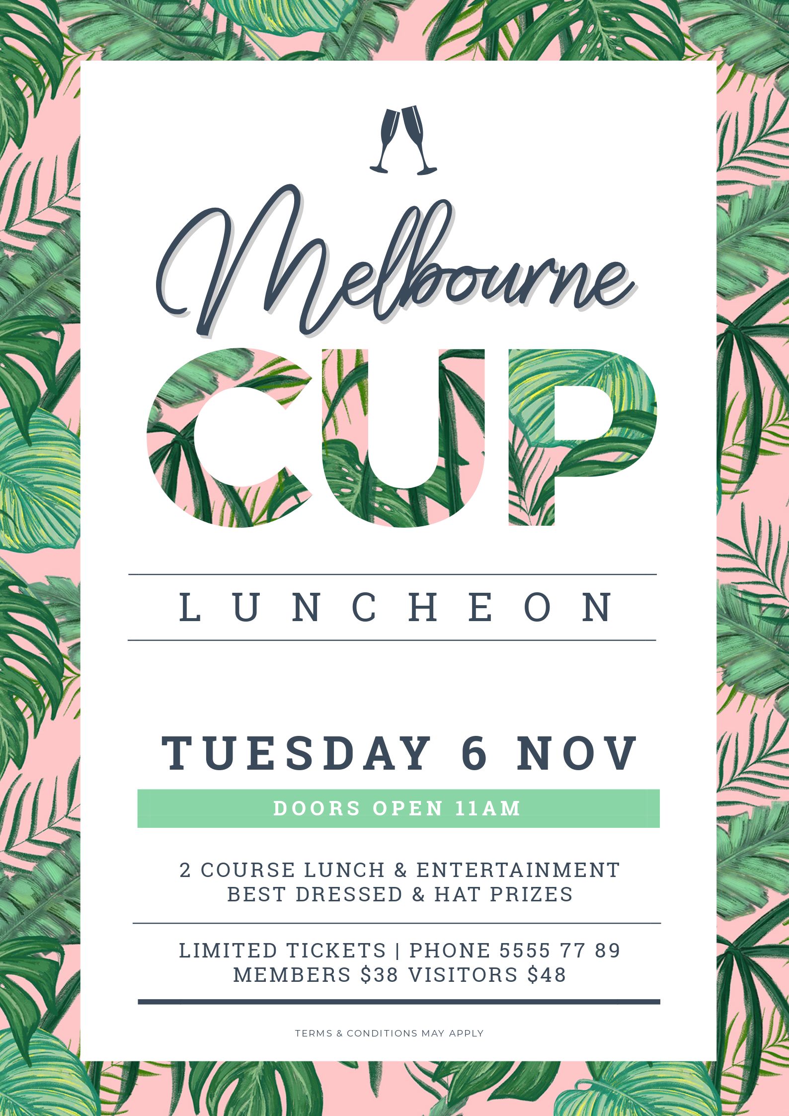
Here’s what we did to create this design:
- Switched up the heading and added a second font.
- Changed the background image to something quite detailed that will catch attention.
- Searched on graphic elements for some champagne glasses and added those as part of the heading
- Finally we used the same image from the background on the CUP text using the mask plus filter technique.
Hot Tip: If you’re not comfortable with choosing new fonts and layout for your heading, use the Design Merge feature to bring in the heading layout from another design. Then apply one of the fonts to the copy area of your current design to tie it together.
#8 Use Image in Text over a White Background
White space, white space, white space. This design has white space for days and it really makes the heading pop.
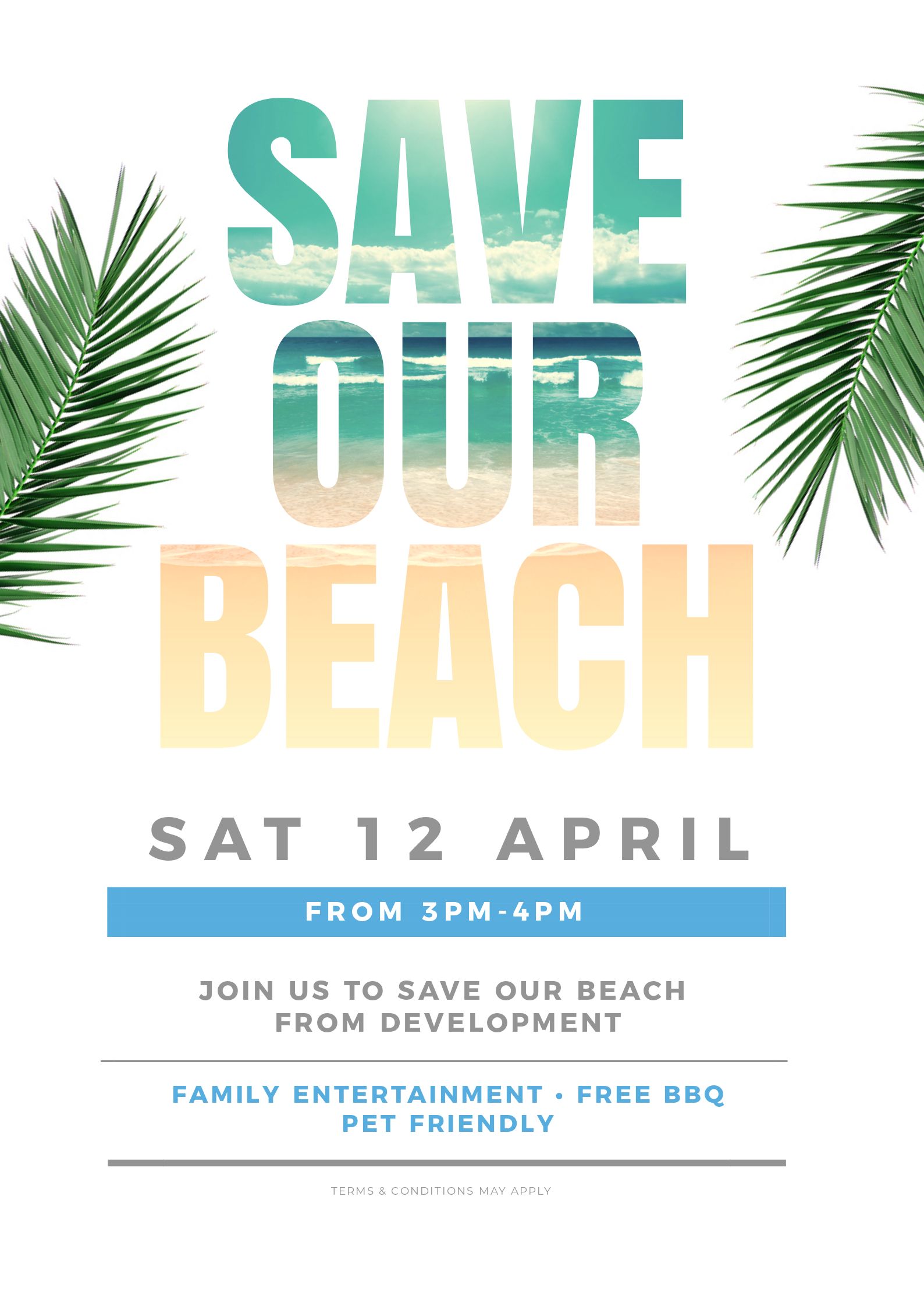
Here’s how we did it:
- Changed to a different font but kept it bold and large.
- Added an image of the beach (waves and sand in the shallows) to the title using the Text Mask Feature.
- Searched on some leafy greens to add to the design for impact.
- Kept the same body text but changed up the colors.
Hot Tip: Use an image that has a graduated effect or contrasting, changing colors or graphics. For this example the beach was perfect as it graduates down from the blue/green ocean to the shallows, then the sand.
#9 Use a reversed or blocked out Font to place your image into
The reverse effect is powerful using our Text Effect tool in Easil. Here’s what you can do with it:
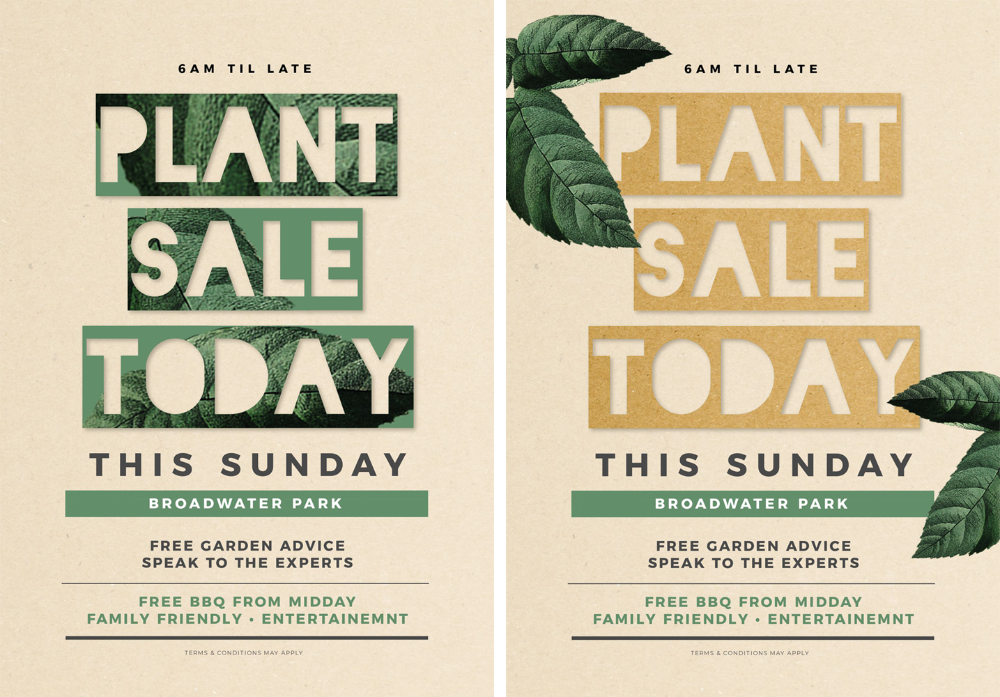
For this design duo, we:
- Swapped the headline font to a reversed block font (Blackout 2am). This turned the block area into the frame to give a very different effect with the text mask tool.
- Added an image into the heading with the text masking tool.
- Played around with 2 options – one making the header without any extra graphics, and then a second where we added some leaf elements to the border of the design.
Hot Tip: You can also use transparent PNG images in your poster designs. For example, in the version on the left above, the transparent areas show the font color!
#10 Take Your image across multiple elements of your design
You can work across more than one word or element of your poster, with the text mask tool:
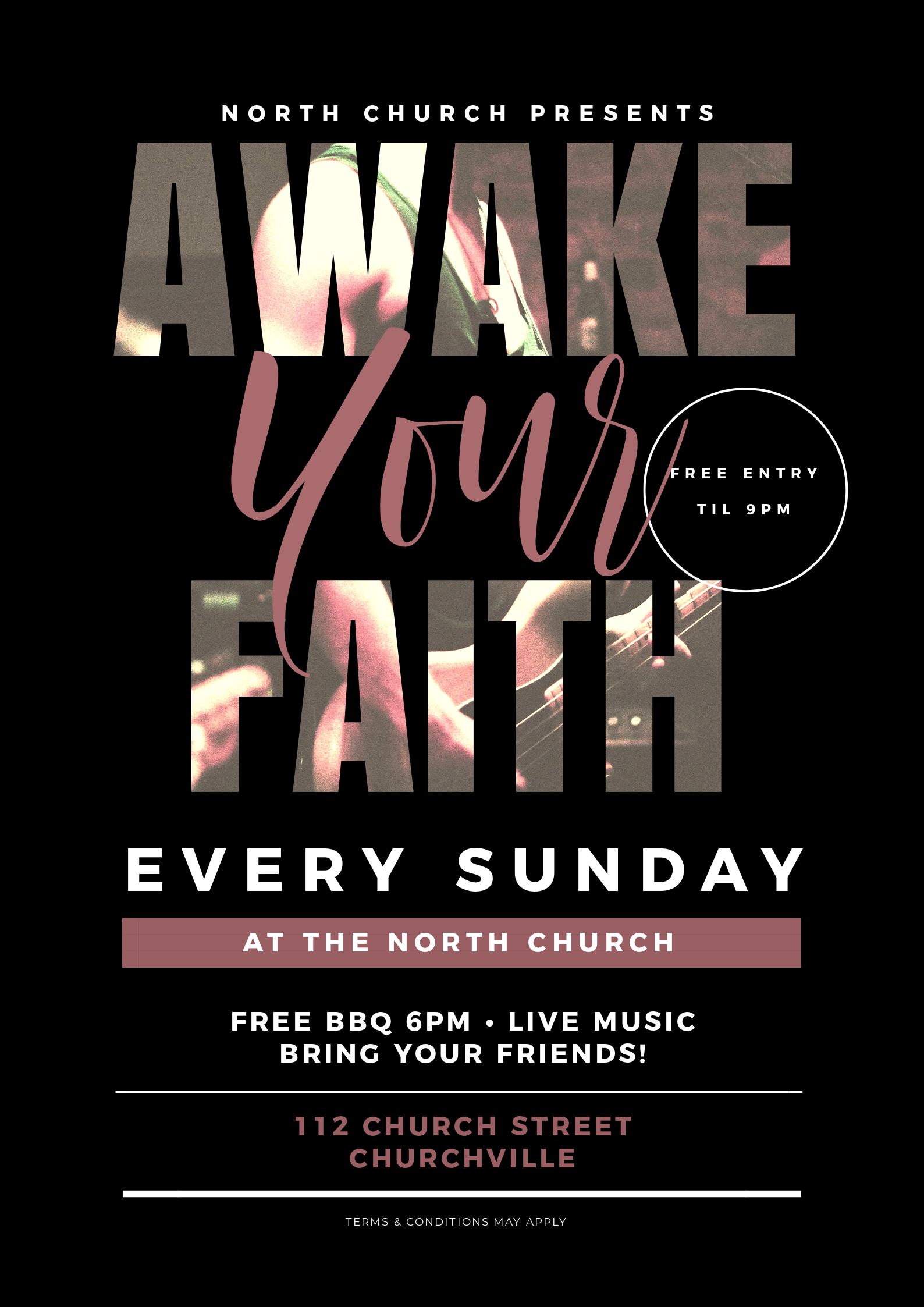
Here’s what we did to make this eye-catching poster:
- Added a line space between the words ‘Awake’ and ‘Faith’ to allow them to be treated with one image across both rows with the masking tool.
- Snapped the image into the design, so it would then appear across the entire heading. Then we used a different font for “Your” to break up the title and the two sections using image in text.
- Note that we re-used the circle effect from the original base design and the rest of the body text is similar to previous designs. We’ve just matched the colors to the new title image to bring it all together.
Hot Tip: Make us curious about the image in your heading text. In this design, you are drawn in to make sense of what the image actually is and it is only after a slightly longer look that you see it is a guitar and live music. Keep it relevant but tease us with the image!
Cool, Hey?
Are you pumped about the potential for using our text mask tool? Now you can go and use it to make stunning posters too!
Before you run off to play with Easil, I wanted to leave you with a couple of tips for avoiding common mistakes when designing “custom” designs from a single template. It just takes a few clicks (but you really want to avoid these mistakes in your poster designs).
COMMON MISTAKES TO AVOID WHEN EDITING DESIGN TEMPLATES
Remember, as we have said in this series of posts before… keep it simple and don’t mess too much with the template itself. Try not to make these mistakes:
Do this with your Poster Designs:
Keep the Design Elements! When it comes to the template itself, the following elements are usually there for a reason. So don’t mess with them TOO much:
Text
Keep the text in roughly the same position, size and length as it is already. For example, if you are changing a heading, don’t make it a lot longer or shorter. Keep it similar in length (ie if it’s a 5 word sentence, keep it close to 5 words of similar length).
If you change the heading to another font, change it to one that is a similar size and shape. Then it is more likely to suit that particular design. Put simply, keep the “shape” and “essence” of the design.
Fonts
Keep it simple. Stick to 2 or 3 fonts maximum. If you are not sure, use the same number of fonts as is on the template already. Don’t fix what ain’t broken!
Use your brand fonts if you want, but keep it to 2 or 3 maximum. A good rule of thumb is to not use anymore fonts than is already in the template design).
Images
Match any new images to the images that are already there. If it’s a busy image, choose a busy replacement image. If it’s an image with white space in the middle and detail around the edges… choose something similar.
Don’t be tempted to add loads of graphic elements, unless you are replacing those that are already in the design with another graphic element of similar size and shape.
Colors
Stick to the same number of colors as is already in the Image in Text Poster (if you intend to change them at all).
Use Easil’s color picker tool to match colors from the image to the header and body text. This way you are more likely to choose colors that complement each other. Check it out:
Ready to go and Hack Your Visual Design to create a fun “Image in Text Poster”?
Easil’s text mask tool is a game changer when it come to creating stunning poster designs that don’t look like anyone else’s.
One of the most common complaints we hear from users who are creating their own DIY Designs is that they don’t want to look like the next person who is using similar templates. If you follow the rules above you’ll never create a boring cookie cutter design again.
Don’t forget our other Hack Your Visual Design Posts!
You can check them out here:
- Pinterest Templates, 10 Ways
- Quote Graphic Templates, 10 Ways
- Animated GIFs 10 Ways
- Menu Templates, 10 Ways
- Instagram Stories Templates, 10 Ways
Your Turn
Are you loving the “Image in Text Poster Style”? Have you tried it in Easil yet to create poster designs?
Use our visual design tips above and you’ll be making stunning posters in minutes!


