
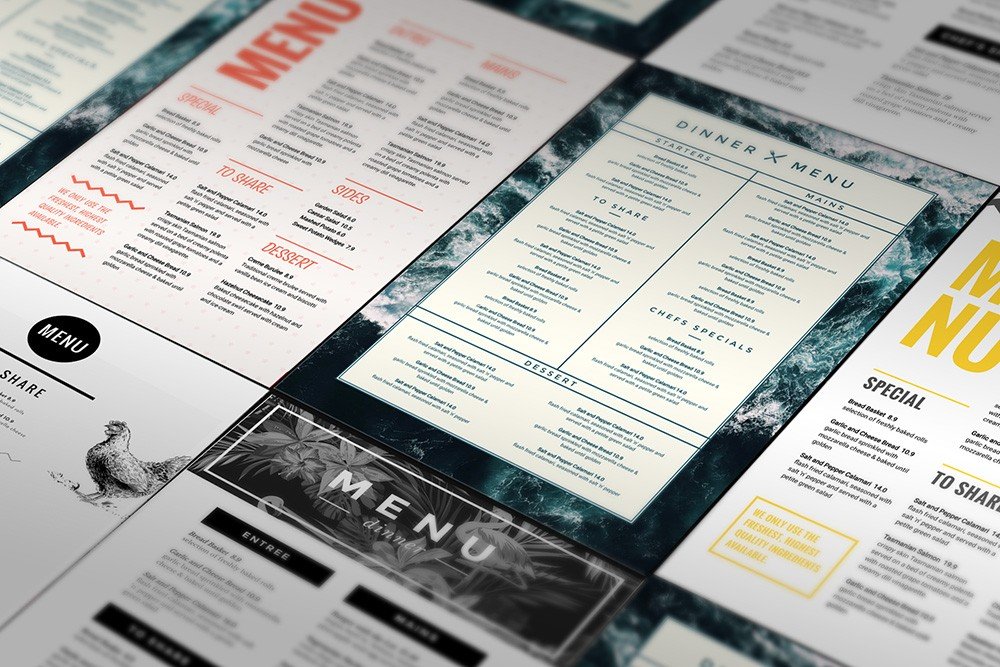
Keep your menus fresh, up-to-date and looking delicious with our menu template selection and menu maker. With a menu template from Easil, you’ll cook up a professional menu in-house.. in less time than it would take to get your Head Chef to liaise with a Graphic Designer!
In this blog series, we show you how to take 1 x DIY Menu Template and change it in 10 unique ways… quickly and easily. One you learn how to do this you’ll create a custom menu every time in just a few clicks!
One of the biggest challenges for restaurants and venues is ever-changing menus and the cost required to constantly liaise back and forth with designers to update them. It’s frustrating when one small change can result in back-and-forth, lost time, extra cost and delays.
What you really want is to be able to change your menu quickly and easily, right?
Easil’s menu maker and menu templates makes it easy to design beautiful cafe, restaurant or venue menus in a snap. It doesn’t matter whether it’s a light breakfast, a feast of degustation proportions or a cheeky cocktail menu – your guests will love them! Ready to print or ready to upload to your website… in minutes.
ONE MENU TEMPLATE, TEN WAYS
So let’s take a look at just how easy it is to edit our menu templates by taking one single menu template and changing it up, in 10 ways. Your chef won’t be able to contain his excitement. Ready to drag-and-drop your way to a stunning menu template? Let’s start with our base menu template design.
Note: Don’t forget to check out the tips at the end of this post for editing your menu templates in a snap.
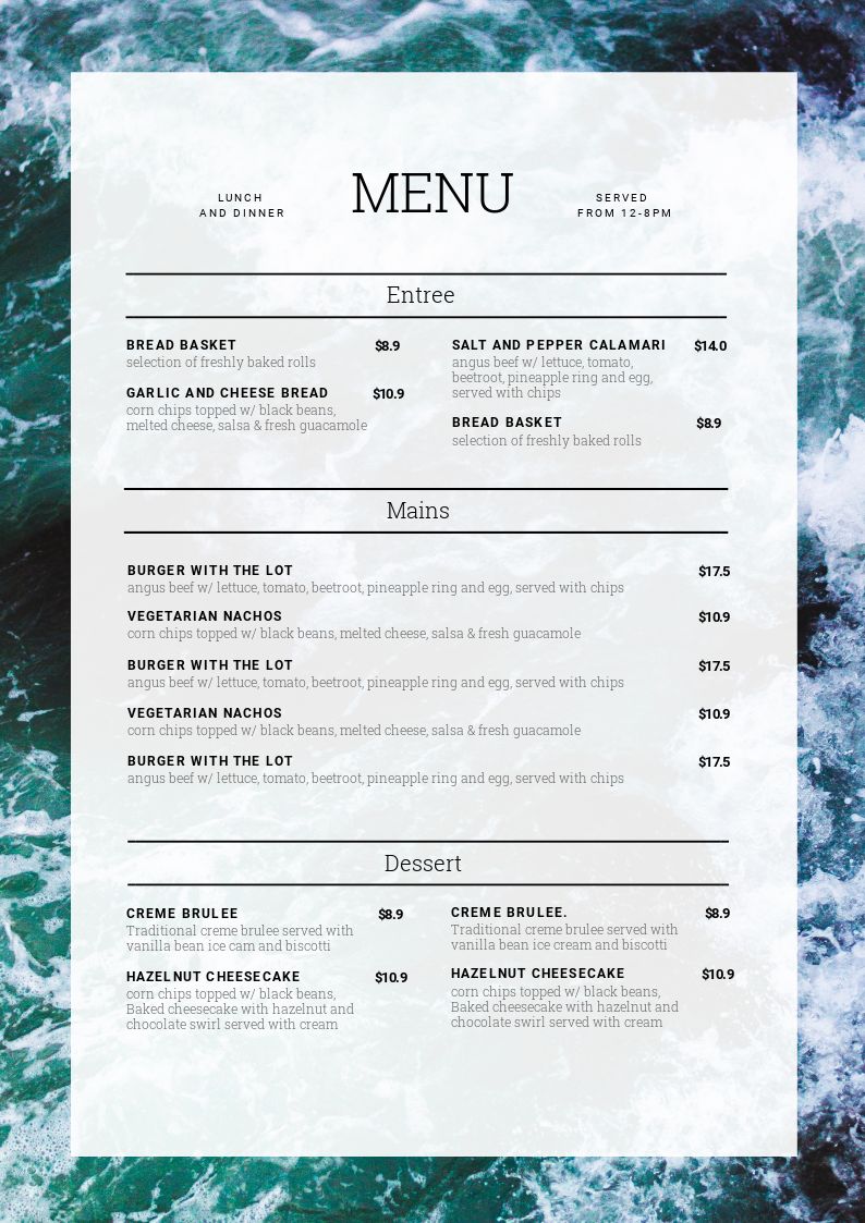
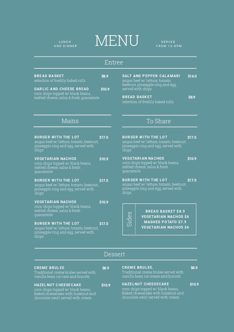
#1 The Base Menu Design.
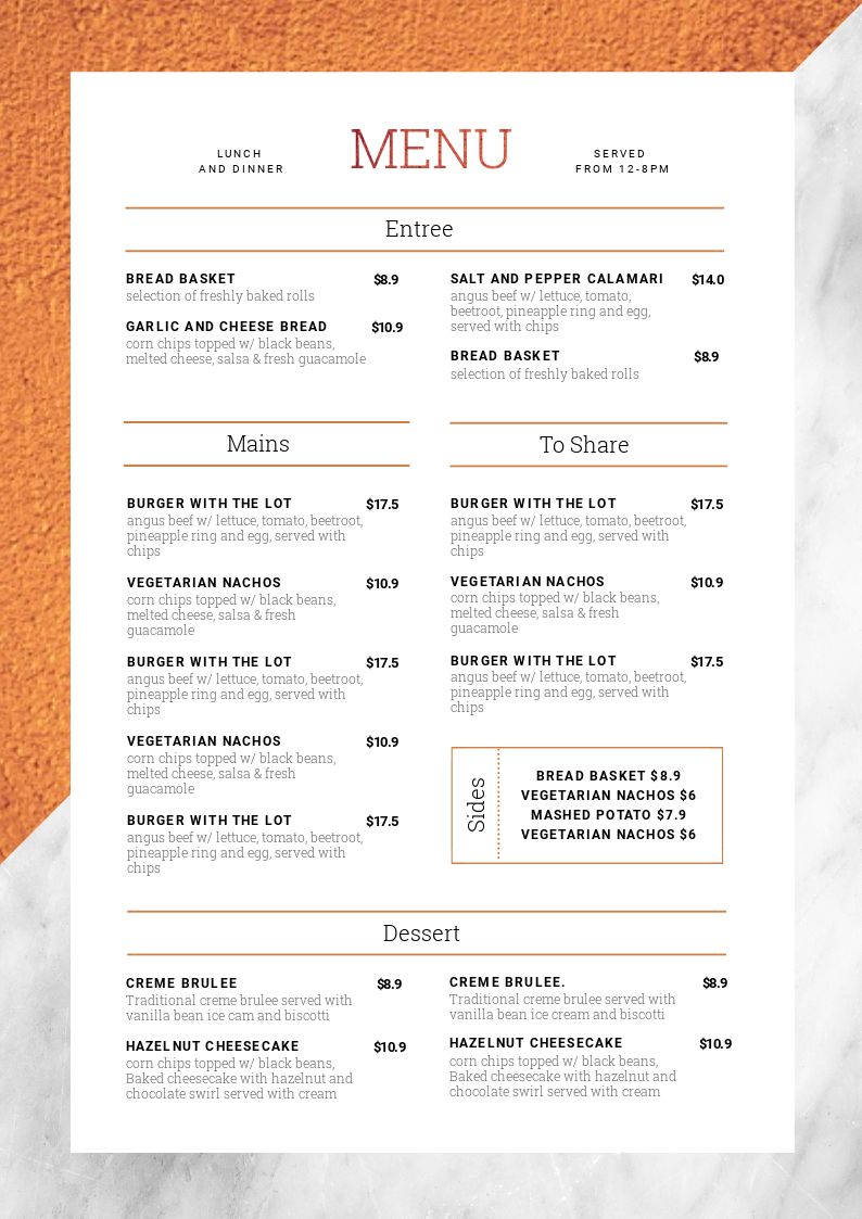
We’re using this stunning ‘Copper & Marble’ menu template as our starter. The text is laid out in a classic format, with the title for each item in a slightly bolder font than the description. Note also that the price column position is aligned to the right of each item; also bolded.
If you look closely at the designs to follow, you will notice that we have kept the text-to-image ratio the same for each design. By keeping the text spaced similarly to the original menu template, your final design will work each time. You don’t have to guess because you are using elements of what the designer originally presented. You’re in good hands with templates!
Here is the template before we make any changes to it:
Let’s get to it! If you’ve got your new menu copy ready to go, it’ll make life easier for spacing it all out. So our hot tip is to have it all ready (and decided upon) so you can simply add it into the template sections and you’re all set!
#2 Change the background image & Text Colors
Keeping the same menu template layout, we’re going to start with just a couple of subtle changes. The beauty of Easil’s templates is that sometimes one or two simple changes is all you need to change up your menu template to a completely new look!
In this first edit, we changed the menu into a leafy green menu suitable for outdoor Bistros, cafes, garden lunches and more!
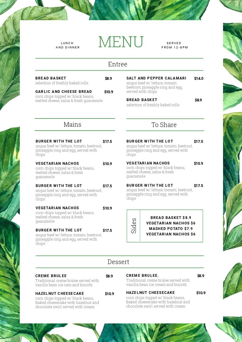
To achieve this fresh leafy green menu, we:
- Selected the background “leaf” image from Easil’s range of stock images.
- Used Easil’s Color-picker tool to select a color from the background image. Like this:
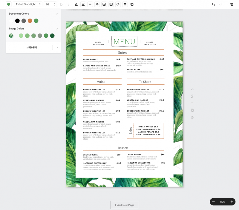
Then we applied that green color to the text and line elements so that they matched the border image (in the same format as the color scheme of the original template). In just two changes, we have a completely fresh (and original) menu design!
#3 Adjust the Column width
Now, let’s switch it up to a water effect but with one key change: Column width! By changing the column width, our Main Course section becomes the hero of the menu and stands out just that little bit more. And we’ve increased the other columns slightly as well.
This menu has a lot more space in the design, and with less menu choices we can play around with the number and style of the columns:
If your menu is compact, you may want to reduce the amount of columns. In this example, we:
- Updated the background image;
- Removed one of the ‘Mains’ columns, and increased the width of the remaining column to ‘full’ width by stretching out the table.
- Changed the font color on the headings and line elements to black.
- Adjusted the opacity of the white box overlay (that sits over the background) to 92%. This allowed the background to slightly show though, whilst leaving the text legible.
- Repositioned the remaining menu text to be horizontally centred.
Shall we head to a beach cafe for a burger? … anyone?
#4 Shift the Content Position off-centre
Now that we’re a little bit more confident with editing our menu template, let’s switch it up a bit and go off-centre!
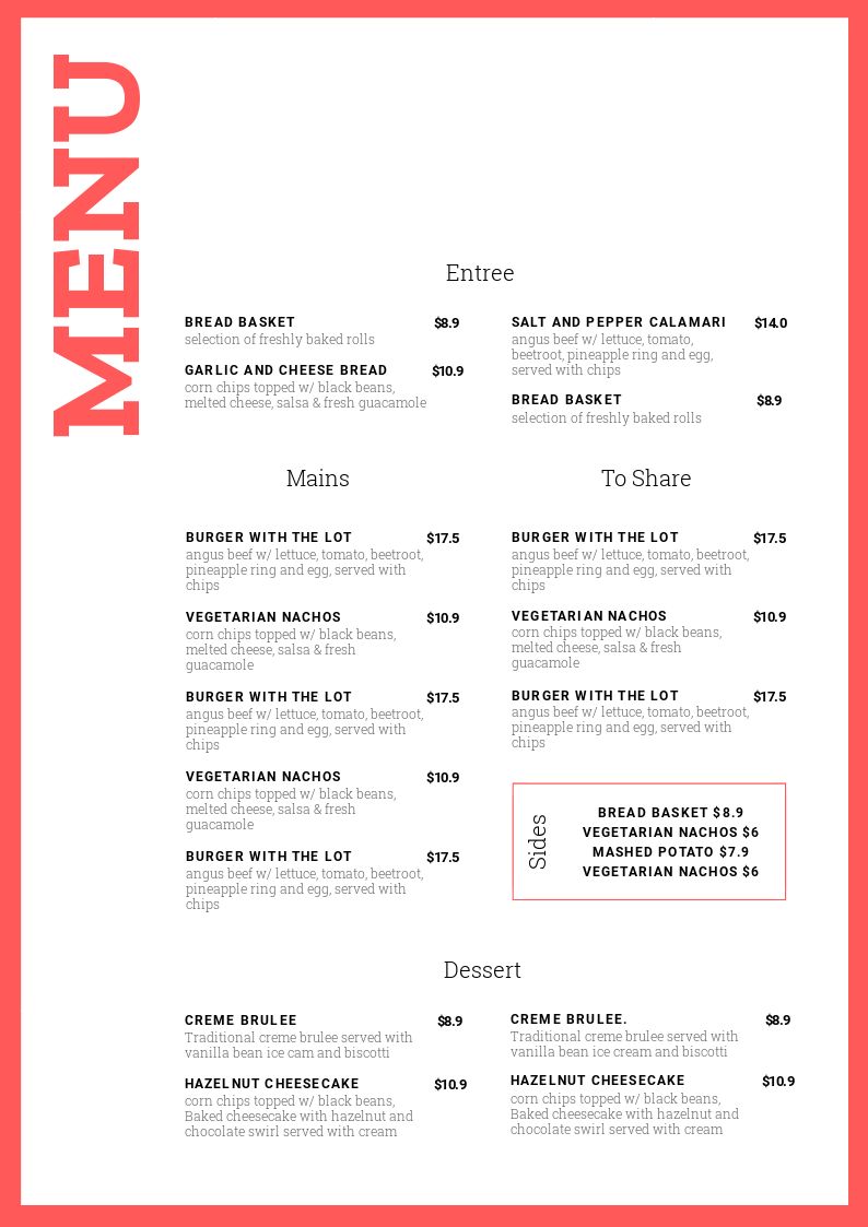
This modern, minimalist menu is perfectly suited for taking your text off-centre and trying something different. To achieve this look with the menu template, we:
- Enlarged the white overlay area, leaving a thin border.
- Changed the background color to a fresh raspberry color.
- We wanted a stand out heading, so we enlarged the text, and rotated it to 270 degrees, positioning it at the top left of the page.
- Using the layers panel, we selected all of the groups with menu content in them, and then dragged them to the lower right of the menu layout.
Hot Tip: If you want to move elements around, move them in groups. It saves you time and prevents you having to line them all up again manually! It’s easy in Easil as the Layers panel allows you to quickly identify a group of elements and move them all at once.
#5 Switch up the fonts
With Easil’s Table Feature, you can update the attributes of all matching cells within a table, in just a couple of clicks! Let’s show you how to use this to easily switch up the fonts for multiple sections of text. Start by watching this sort video:
Let’s walk through the steps above to show you how we used the table feature in our menu design:
- Select the section of text where you want to change the font. The Action Bar will pop up, showing just the elements you need to be able to edit text.
- Choose the font you want to change to from the font drop down menu in the Action Bar.
- The font for the selected text will automatically change – not just for the heading you chose, but for all the headings within that table.
- With the heading text still selected, choose a new font in the Action Bar to change it.
- Choose the color picker and change the color (in this case we changed all the headings to Grey).
- Click on some body text to highlight it. Then choose the color picker again and change it to your desired color. Expand the color picker if you need to see a bigger range of colors.
Hot Tip: Let the Action Bar guide you. If you’re unsure how to edit a particular section of your design, click on it. If you click on the text or image, different elements of the Action Bar will pop up to help show you just the features you need for that particular part of your design…not the entire suite. Easil is clever!
#6 Add stand out section headers
Don’t be shy with your heading sizes! Help your customers know exactly where to look on the menu with stand out section headers, like these:
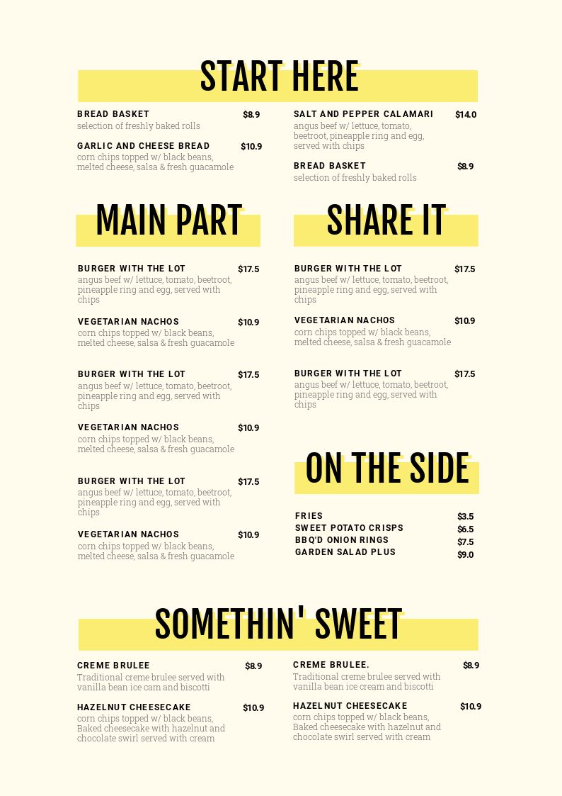
In this example, we decided the headers would speak for themselves, so there was no need to keep the ‘Menu’ heading and we removed it. For this menu template edit, we:
- Removed all the background images from the original template
- Pumped up the size of all of the section headers, and changed the font to a nice bold option.
- Added a solid block header behind each section title. See the Hot Tip below.
- Changed the background color to a softer shade of the same yellow that you see in the block headers.
- Finally, we added a solid drop shadow to the text headers in a matching yellow to give it an edge (using the Text Effects tool).
Hot Tip: Save time when updating your header titles. Get one title just right, then select the group of items by pressing ‘shift’ and clicking on the text and block. Then press the duplicate button to create identical copies to move to the other sections.
#7 Add block colored sections
Using block colors in menus is great for separating content out. Think Breakfast vs Lunch menus, or Food vs Drinks. Or purely just use it for a different graphic look, as we have in this example:
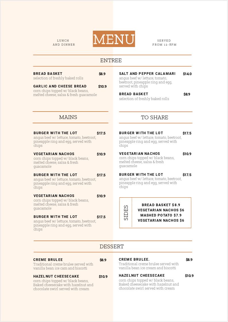
To achieve the block colored sections in this menu, we made the following changes from the base menu template:
- Removed the background images
- Added in a block graphic element covering half of the menu background, and matched it with the menu color scheme.
- Reduced the opacity of the block color right down to a light shade.
- Replaced the heading fonts with a new one. Here we chose the ‘Zilla Slab’ family.
Hot Tip: When adding blocks of color like this, the opacity tool is your friend. You can create great effects (without overpowering the design) by reducing the opacity right back, and keeping it subtle!
#8 Strip Your Menu Back to the “Bare Bones”
Ever heard that term KISS? Keep it Simple Sweetheart (yes, there are other “variations” but let’s run with Sweetheart). This is about KISS. Sometimes it’s better not to add anything to the menu template, but instead to remove all images so that all that remains is a simple background color and contrasting text.
In this menu design example we’ve stripped things right back to a single color print. It would work just as well with a white background, paired with a deep, dark blue font, or even never-fail black text. Sometimes less is more. As the Restaurant Coach, Donald Burns says:
“Sometimes what you do NOT put on your menu is more important than what you do – Donald Burns.”
If you’ve got a well designed menu, sometimes keeping it simple without graphics is best!
Hot Tip: If you’re stripping your menu back to text, ensure you use language effectively, to describe your menu. Your words need to conjure up pictures of dishes in the diner’s mind that has them salivating on the spot!
#9 TURN IT ON IT’S SIDE
Menus come in all shapes and sizes. Just because the original template is portrait orientation, doesn’t mean we can’t make it landscape! You can resize your menu design to landscape in minutes. Let’s show you how, with this video:
Let’s recap what you just saw in the video. To resize the portrait menu to landscape, you need to:
- Select the ‘Resize’ button from the ‘File’ Button (it’s the top icon on the right hand side panel).
- Choose the ‘Custom Size’ tab, and enter the size of your landscape menu. Using the Unit dropdown to ensure it’s in ‘mm’ or ‘in’ for a print format. We used A3 landscape for our example, which is 420mm Width x 297mm Height.
- Re-arrange the content to fit on the menu in the new orientation. Use groups, or multi-select layers or groups in the Layers Panel in the Easil sidebar. Watch the video again to see how we did it!
- Increase or decrease the size of content by selecting groups of content at once, and then pulling out from the corner to scale up.
Hot Tip: Watch the video a couple of times to catch the different tools we used in Easil and practice one yourself! Try moving groups or sections by multi-selecting items in the Layers Panel, expanding table sizes and re-sizing elements. We find that “doing” the actual task (instead of just watching) is the quickest way to learn how to leverage the features in Easil. And you’ll love the tools more when you do!
#10 MAKE IT MULTI-PAGE
Once you’ve got a single page mastered in Easil’s menu maker, it’s super quick and easy to turn it into multiple pages for use on a clipboard, in a book format menu holder, or even just a second (back) side to your menu.
To add a reverse side to our menu (or multiple pages), you will need to:
- Make sure your first page is perfect in terms of design before duplicating. This will save going back to make corrections to more than one page! Trust us, this is frustrating, so don’t do it.
- Hit the Duplicate Page icon, which is located right next to the page design on the canvas.
- Choose to follow the same format on the other page, or swap out colors like we have here!
- For a drink list, insert a new table with 2 price columns so you can add glass & bottle pricing. You can find tables under the ‘Add Graphic Elements’ tab.
Hot Tip: We repeat: Ensure the first page of your design is completely finished, checked and perfect. Then (and only then) duplicate the page. This way you avoid having to correct two pages of mistakes if you spot an error!
READY TO CREATE STUNNING MENUS?
Are you excited about the potential for using our menu templates? Show Easil’s Menu Maker to your Chef and prepare for squeals of delight!
But before you dive into creating delicious menus, we want to leave you with some extra tips (and mistakes to avoid) for designing menus with our menu template tools:
Extra Tips for Designing Menus
1. Resize for TVs
If you have a big-screen TV in your venue then don’t forget that you can easily resize your menu to display on the TV. It’s easy with Easil, as we have HDTV as a standard size format for designs. Choose Digital Screens => Landscape TV or Landscape TV (Full HD) and then use the instructions from #9 above to resize to landscape if you need to.
2. Create Matching Drink Lists
Get creative with matching your menus – you can pair all sorts of drink menus like Wine & Cocktail or Kids & Seniors.. even Hot and Cold.
AVOID THESE COMMON MENU TEMPLATE MISTAKES
Rule number one, two, and three – don’t… repeat DON’T, mess with the menu template too much.
As you can see above, by editing just the colors or elements behind the main text layout, you can change your design from the base template, to something totally new in just a few quick steps – and still keep it designer quality.
FONTS
Keep your menu content legible. Ensure it’s large enough for your patrons to be able to read, in any lighting. If you’ve have an existing brand style guide, it’s a good idea to utilise those fonts in your menu design too.
IMAGES
Stick to a single background image when you’re starting out with DIY menu design. Don’t over-complicate your menu design.
COLORS
Ensure there is enough contrast in the colors you choose for menus. Readability is your main goal, so choose a font color that is easy to read! You should also take advantage of Easil’s color picker tool to match heading colors to any background or feature image.
START DESIGNING STUNNING MENUS NOW!
Get started now with Easil’s Menu Maker and choose the Menu Template that’s perfect for your venue.
Still want to read more? You can find out more about our Menu Maker here.
Don’t forget our other Hack Your Visual Design Posts!
You can check them out here:
- Pinterest Templates, 10 Ways
- Quote Graphic Templates, 10 Ways
- Image in Text Posters, 10 Ways
- Animated GIFs 10 Ways
- Instagram Stories Templates, 10 Ways
OVER TO YOU
Are you ready to take control of your venue’s menus?


