If you love Instagram Stories as much as us, then watch as we take Instagram Story Template Designs and turn 1 template into 10 Unique Instagram Story images. This is the latest post in our Hack your Visual Design Series.
In this post you’ll discover how to create Instagram Story Template Designs quickly and easily with Story Templates – when you know a few design tricks first for working with templates (it’s easier than you think)!
If you want your marketing content to be unique and custom, you’re in the right place. Watch as we completely transform a single Instagram Story template into 10 unique designs – with just a few changes.
The best part is that you can use these to create Facebook Stories too – or share your Instagram Story to Facebook Stories.
And no, you do not need to be a designer. In fact the less you know about design, the quicker this process might actually be!
Why Instagram Story Templates?
We wrote about the importance of Instagram Stories in this post and this post. With so many of us holding our phones vertically to consume content, it’s no wonder that this format has become so popular.
Even Evan Spiegel, the founder of Snapchat agrees, saying that “people just don’t rotate their phones”.
As business owners we don’t always have time to be “on” social media all day to create Instagram Story content. Sometimes it’s necessary to batch create a few stories based around Instagram Story Templates.. That’s where Instagram Story Template Designs make it easier – you have some content prepped and ready to go.
Let’s take a look at how to do that quickly and easily! Are you ready to hack your visual design with our Instagram Story Template Designs?
Instagram Story Template Designs – 1 Template, 10 Ways to Hack Your Visual Design
Let’s start with the base template, then we’ll move into all the stunning designs you can make with it. We’ve also included hot tips at the end of some of these examples, to help you with your own template edits.
#1 The Base Template
We’re using the following ‘5 Page Travel Themed Instagram Story Template’ in this example. Here it is before we start to make any changes:
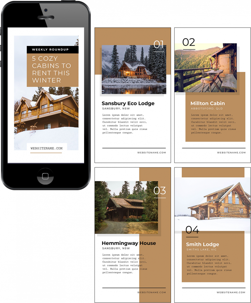
As you can see, it’s made up of 5 unique layouts including a cover design and 4 additional layout pages that can be re-ordered, duplicated, or deleted from your Story format.
As you can see it’s also easy to switch out images and text, so it’s a great base for our re-designs in this post.
Now, let’s take the first of our Instagram Story Templates and change this base template into a series of more unique designs… in just a few clicks.
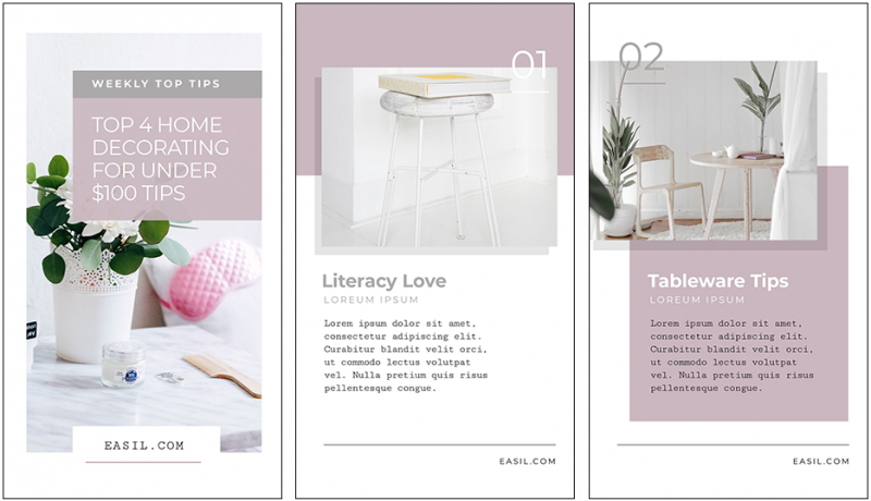
#2 Change the Colors
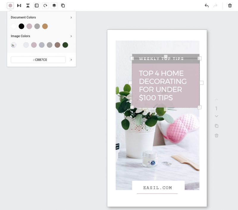
Updating the
After replacing our image, we used the ‘Image Colors’ functionality to choose colors to change our
Hot Tip: Use
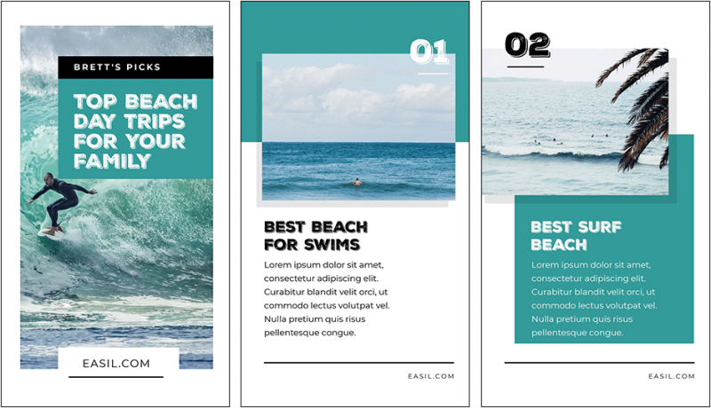
#3 Update the text styling
For our next story example, a casual style of font would suit the subject more than the original Instagram Story template.
To achieve this new look, we simply:
- Chose a custom “gritty” rough font that suited the beach topic and uploaded it to
Easil . - Applied the new font to the headings and numbers on the template.
- Swapped out the
colors to the new ocean/turquoise basecolor . - Switched the imagery to surfing images.
Hot Tip: Check out our popular free fonts blog post that you can use to find new fonts to customise your Instagram Story templates!
#4 Add Graphic Elements
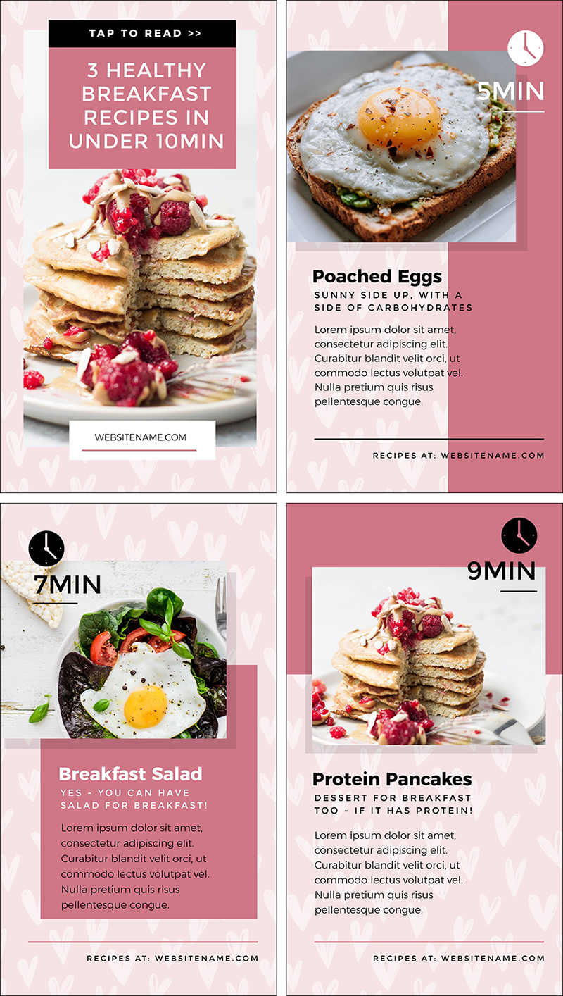
An easy way to change up your Instagram Story template design is to use graphic elements. In this design we used a clock icon to highlight the fact that this Story is all about creating healthy recipes.. quickly!
To achieve this new look, we:
- Uploaded our custom images, and replaced the placeholders.
- Changed the template
colors to the brand’s colors. - Swapped out the previous numbers for “clock” icons to showcase the recipe content and give
quick reference to the cooking times. - Added a background graphic pattern to each page, and tied it in with a shade of the brand colors.
Hot Tip: Keep your colors on brand (and on point) by using only tints and shades from your approved brand color palette.
#5 Merge content from another story layout
Sometimes the original template just won’t cut it for all the layouts you’ll want to include in your Instagram Story. Using
Think of it like the Pick ‘n’ Mix of design. Here’s a video showing DesignMerge in action for this template transformation:
To achieve this new look with DesignMerge, we:
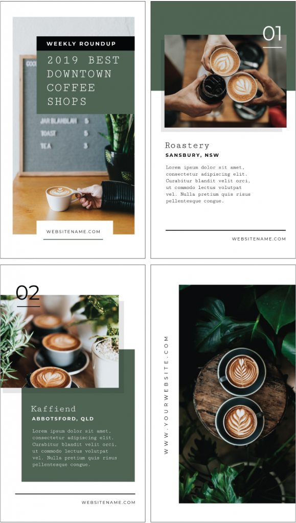
- Edited the template to the coffee shop design you see below, changing the fonts, design
colors and images. - Used “DesignMerge” to bring in an additional 4th page to the design. This involved clicking on the Layouts Tab on the
right hand side (watch the video above to see this in action) and choosing the Templates option. Note that you can choose fromEasil - Adding the new page to the bottom of our design layout, clicking “Add as a new page”.
- Editing this new fourth “page” of our design by clicking the Images Icon, choosing a new coffee-themed image and selecting it to replace the image of the girl.
- Then all we need to do is finish off the design by changing any fonts or text
color to match the rest of the templates!
Here’s the finished design below:
Hot Tip: Expand your story by clicking on the Duplicate button next to any page you want to copy, and then use the arrows to push the page up or down in order, according to your preferences.
#6 Design frames to Showcase a Countdown
If you are counting down to a product release, close-of-cart on
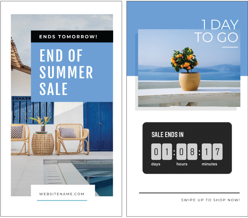
Here’s how to create a branded look to frame your timer. To achieve this look re:
- Swapped out the
colors and fonts with a new fresh, blue summer theme. - Left some white space on the second page to allow for the addition of the Instagram Countdown Sticker when posting the Instagram Story. You can find the Countdown Sticker in the Sticker Selection in the Instagram Story Menu.
- Saved the template to our camera roll, then uploaded into our I
nstagram Story. - Added the Sticker ready to post! Now our Story viewers will see that the End of Summer Sale ends in 1 day, 8 hours and 17 minutes!
Hot Tip: Instagram Stories expire after 24 hours so this is a great opportunity to roll out a series of stories based around your launch, event or offer using the Countdown Timer Sticker. Use the same templates, while changing out the messaging or headings. For example, you can create one countdown template for the opening of a new Sale (3 days to go) and a different one for the close of the sale (Closes in 24 hours!). Get creative with Countdown Stickers, as they add scarcity and move people to action!
#7 Create a Poll
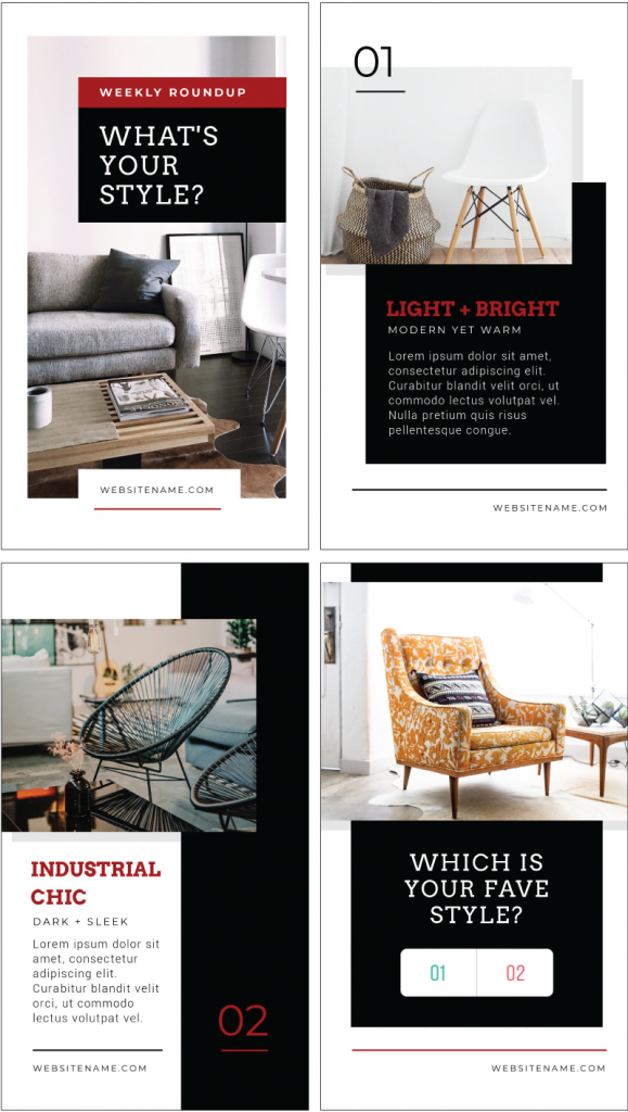
Adding a Poll Sticker can be a great way to encourage engagement on Instagram Stories. One way to conduct a poll is to show a series of products, and then poll your audience at the end:
To achieve this new look, we:
- Updated the color scheme of the template.
- Changed the fonts to suit the brand represented in the story.
- Uploaded our own imagery into the image placeholders.
- Removed some content from the 4th page to allow space for the Poll Sticker to be applied when in Instagram, and adjusted the design slightly.
Hot Tip: Polls also work on Facebook Stories! Increase your responses by sharing this story across both channels!
#8 Add a Question Sticker
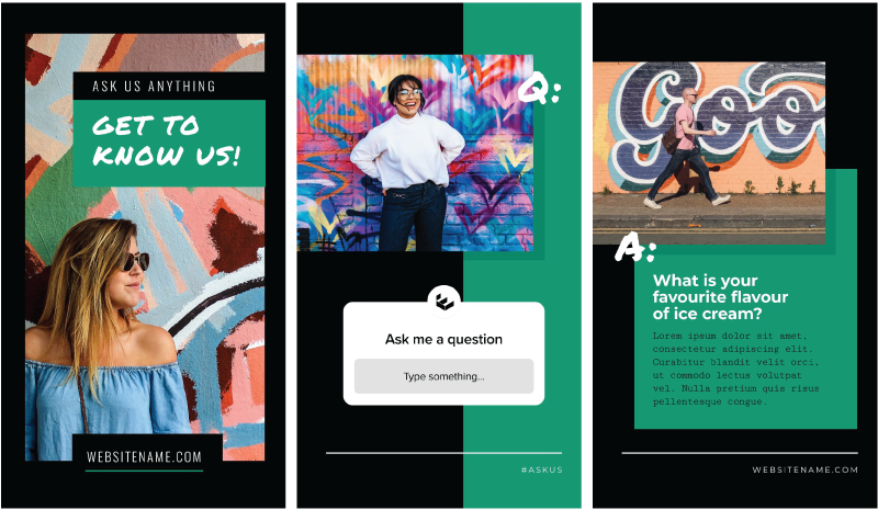
Another engaging way to connect with your audience is to use the Questions Sticker to ask feedback from your audience. In this example we have branded our Instagram Story to catch attention and encourage our audience to reply with the Questions Sticker:
To achieve this new look, we:
- Updated the
color scheme of the template with green and black. - Changed the header font to a new fresh, eye-catching style.
- Uploaded bright imagery to our image placeholders.
- Made sure we allowed space on Page 2 for adding the Question Sticker. This is what the viewers will use to add their responses.
- Designed a custom final slide that can be edited to feature the responses added by the viewers. You can manually add their responses in a custom design like this one below, or simply copy and share the actual question sticker responses straight from the app back on to your story – which Instagram allows you to do.
Either way, having a custom template on which to place them, makes your brand stand out and gives flow to your story:
Hot Tip: Don’t get to feature all the responses? Keep them in a list of audience FAQs that you can feature another time when you are not sure what to post!
#9 Create an Animated GIF Heading
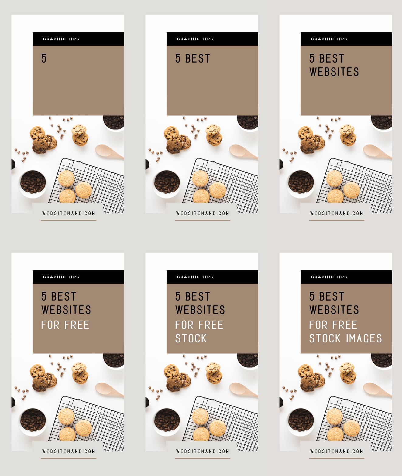
Draw in your audience by adding some motion to the first section of your Instagram story – very few people do this, so your story will stand out. In this example, we animate in the text word by word with our multi-page GIF tool.
To achieve this GIF design, we:
- Just used the first page of the template design and removed the subsequent pages.
- Changed up the
color scheme and fonts. - Inserted the full title on the design – 5 Best Websites for Free Stock Images – in both white and black text.
- Copied the master image 6 times (resulting in 7 images or “pages” in total)
- Systematically removed one word from each of the images so that the title is stepped out from “5 Best Websites for Free Stock Images” just “5” as you move down the pages in your Workspace.
- Click Download and Choose GIF format.
- Choose the Speed – in this
case we chose a Fast Speed. - Publish as a GIF!
Hot Tip: Instagram doesn’t currently support playing GIFs in stories by default, so you’ll need to convert to
#10 Create a custom sticker for Video Content
This option really has us excited! If you have access to the Sticker option that allows you to access content from your camera roll – we’re calling it the Camera Roll Sticker – you’ll love this feature. You’ll be able to download various elements and ‘stickers’ that you make in
Here’s a sneak peek of the feature. From what we can understand, it is being either testing or rolled out slowly at the time of writing this post, so not everybody has it on all accounts:
To achieve this new design, we:
- Created a custom sticker in Easil, with a transparent PNG background.
- Downloaded it and saved it to our Camera Roll on a Smartphone via Dropbox.
- Opened up our Instagram Story and added our chosen Video.
- Clicked on the Sticker Icon and chose the Camera Roll Sticker Icon, which then opens up our Camera Roll.
- Chose the sticker/image we had created.
- Clicked to add it to our story as an overlay over the video background.
Alternative “Hack” if you don’t have this Sticker yet:
Alternatively, here’s a hack you can try if you don’t have the feature above just yet:
- Prepare your Instagram Story as usual.
- Just like above, find the image you want to add in your camera roll. Choose the Download icon at the top of the screen in the corner.
- On the next screen that opens, choose “Copy”.
- Go back to your Instagram Story and you’ll see a pop-up saying “Add Sticker”. Tap it and your chosen image will be placed on to your Story!
Hot Tip: If you have a regular series such as ‘What I wore’, you can create your own branded footer set with the day of the week, your brand.. or both..! Keep them stored on your camera roll and then add them to your Instagram story after shooting your new photo or video content.
Are you excited about the potential of these Instagram Story Template Designs?
It’s all about creating something unique and custom for your brand with a little drag-and-drop action. Easil’s templates make this whole process easy. Before long you’ll be switching out content and dragging and dropping like a boss.
And remember, you can share your Instagram Stories to Facebook Stories too!
Before we finish, here are a few key tips for editing DIY Instagram Story Templates so that they look professionally design. The key is to do less, not more. Let’s take a look:
AVOID THESE KEY MISTAKES WHEN EDITING INSTAGRAM STORY TEMPLATES
Remember this key rule:
The key to editing DIY Design templates effectively is this: don’t mess with the basic design elements too much.
Try working with these elements only when you edit your Instagram Story Templates:
Text
Don’t move the text around too much on the template. Stick to the positioning the designer has given you. Why? Because it works!
If you need to replace the text, then
- keep your text to a similar length
- use the same – or similar – font size
- maintain the same location of the text (or in the same general area on the page.
- be guided by any text boxes in the design – stick to a similar shape and size.
Change the text content, but if you stick to the guidelines above, it will still look professionally designed.
Fonts
It’s always best to stick to just 2 or 3 fonts in your design. If you need to change the fonts from the base design, then:
- try to match the number of fonts you use to the number of fonts on the original template. If they use three, only use three. If they use two, stick to just two.
- If your brand fonts work with the design then use those.
- Try to pick similar font styles. If it’s a bold heavy font, replace it with a similar font. If it’s a delicate classic font, use a similar style.
Don’t guess when it comes to fonts that work together. Check out our Free Font Guide to choose fonts and our Font Pairing Guide here.
Images
Choose images that are similar to those you see in the template, ie
- If it’s photographs, stick to photographs, or icons stick to icons. If it’s illustrations, replace them with illustrations.
- If the image you are replacing is detailed, choose a similarly detailed image.
- If it’s an emoji, icon or illustration you are replacing, choose one that is a similar shape or style to replace it.
- Consider darkness and tones in photos too – if the photos are all bright and airy, they will contrast against the text week so choose similar contrast in your new images.
If your Instagram Story Templates have photographs that snap into place (many of Easil’s template designs do just that!) this process becomes much easier. Many of our templates use frames to allow you to snap photographs in by simply dragging and dropping. Easil will size it to fit and then you can make small changes.
Color
Color is a huge part of design and you need to consider it for your Instagram Story Templates. Get it right and your design pops. Get it wrong and …. gah! It can make your story hard to watch. A few tips:
- Stick to the same number of key colors to the original template
- Use colors that are complementary to each other.
- Don’t go adding too many extra colors (compared to the original template design) unless you really need them. Stick to small highlight colors if you really must.
- Consider using the orignal colors – if you have changed the fonts, text and images, maybe you can leave the colors as they are?
Hot Tip: use Easil’s Color Palette Generator! It’s MADE for decisions about what colors to keep and add.
Easil’s Color Palette Generator
Watch the video to see it in action. Simple click on any background photo or image in Easil and the Color Palette Generator will pop up. You can choose from a range of colors that are pulled directly from your image. They are primed to be used for headings so you get the right color match every time.
Are you ready to “Hack Your Visual Design” with Easil’s Instagram Story Templates?
When you use Instagram’s stunning Instagram Story Templates, it’s easy to get started.
With our Instagram Story Templates, there’s no such thing as cookie-cutter designs. As long as you stick to our suggested rules for editing them! Now that you know just how simple it is to create designs like a pro… you can get started.
And remember… focus on adding less, not more!
Don’t forget our other Hack Your Visual Design Posts!
You can check them out here:
- Pinterest Templates, 10 Ways
- Quote Graphic Templates, 10 Ways
- Image in Text Posters, 10 Ways
- Animated GIFs 10 Ways
- Menu Templates, 10 Ways
Over to You
Are you ready to dive in and use our Instagram Story Templates to hack your visual design?
Follow our rules outlined in this post and the tips we’ve shared and you’ll be creating engaging Instagram Stories that stand out… in minutes.
