
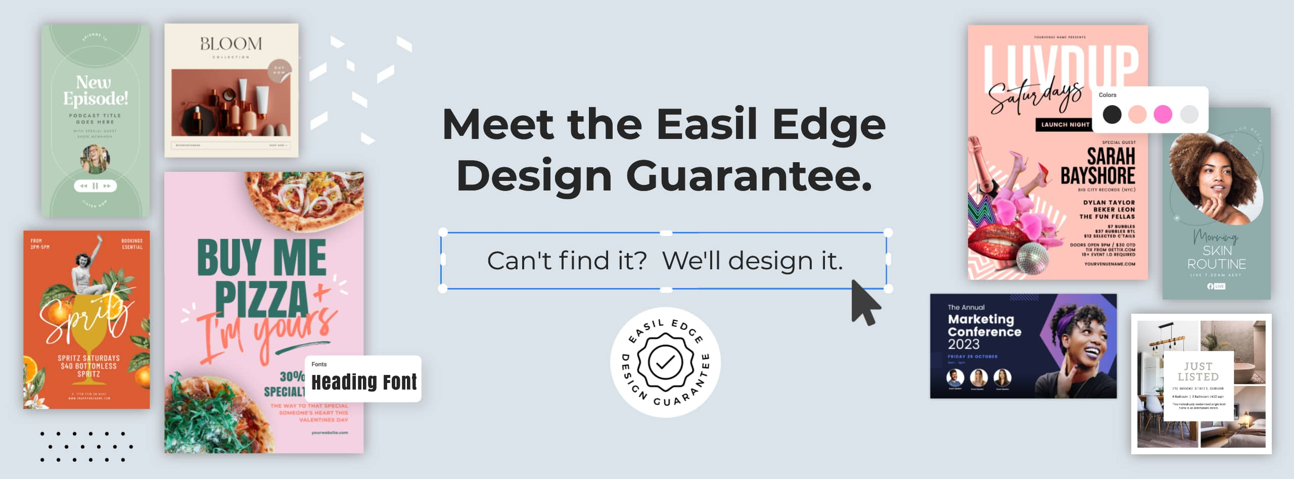
Getting to know anything new is both exciting, and daunting with the time commitments and brainpower required to master it. Even with a design tool like ours, it can take some time to find all the gems within the product. That’s why we decided to put together this quick reference list, and include all 21 of our must-try features for DIY graphic design, so you can scan through and see the best-of-the-best, and dive straight into discovery.
We know you’ll be as delighted discovering and using each of these features as we have been putting them together and building them! Make sure you bookmark this post so you can come back to it again, and again!
To jump straight to any of the features, click on them from this list:
- Add an image to your font, with Text Masking
- Create an Animated GIF Sticker [With Transparent Background]
- Use the Design Resize Tool to quickly repurpose designs
- Create and/or Edit a Design Collection
- Remove the Background from an Image
- Create a Brand Kit
- Set up Multiple Workspaces
- Turn on Rulers, Guides and Snap Alignment
- Add an Outline or a Glow Effect to an Image or Graphic
- Set up your Design with Editing Restrictions
- Turn your Design Draft into a Re-usable Template
- Drag your Images onto your Design to Upload
- Explore the Design Approval Workflow
- Replace all Instances of a Color in your Design in one click
- Format your Text with multiple styling options
- Use Shape Masks and Grids to create a Professional Layout
- Organise your Design Workspace with Folders and Tags
- Copy & Paste your Design Elements from one Design to another
- Create Curved text to enhance your Designs
- Re-arrange and Organize your Design with Layers
- Merge Entire Documents with Layouts Merge
Some of these awesome features are included on Easil’s free plan, and all excluding background removal are available on the 30 Day Free Plus trial. If you’re currently on Easil’s free plan, we’re happy to extend you another 14-day trial so you can test out these features! Send us a message in-app by clicking the (?) and we’ll get it sorted!
1. Add an Image to your font, with Text Masking
We’ll start out with one of our most popular DIY graphic design tools… Text Masking. With this magic tool, you can transform any font uploaded into Easil, or use any of ours, to create a gold, metallic, gradient, or textured text. Or simply add any image that you want to display through the text!
How to use this DIY Graphic Design feature like a pro:
- Create your design draft, and typeset a word or phrase in any font.
- With the text box selected, click on the Text mask Icon in the top toolbar.
- Click on the images tab on the right sidebar, and then click on the image you’d like to add!
Your text with the image placed remains editable! Double click on it if you need to make changes to the content, or single click to select it to move around your design.
Read more about the text masking feature here, or watch a detailed how-to video here.
2. Create an animated GIF Sticker [with transparent background]
If you’re tired of using generic animated GIFs from GIPHY on your Instagram Stories and want your own branded versions, this output tool and tip are for you!
With Easil’s transparent background option set, you can create a multiple-page design in any social media size, add some movement to it by altering the positioning, color, or formatting of elements on each page, and then export as your very own animated GIF – without a background.
Creating GIFs without backgrounds means that you can either start your own branded GIPHY channel or just save to your own devices to paste into Instagram Stories using your iPhone! Read more about creating animated GIF stickers in this dedicated article.


3. Use the Design Resize Tool to quickly repurpose designs
Every savvy digital marketer knows that repurposing graphics across various platforms is the key to success, and also sanity! But no one design size fits all, and often you’ll want to make small tweaks to your graphic to suit the next platform. This is why you’ll want to make friends with Easil’s design resizing tool.
How to use the Design resizing feature like a pro:
The Resize tool is located within the ‘Sizes’ tab on the right sidebar within the Easil editor, which means that you can access this option once you have completed your first design size. Clicking on the Sizes tab reveals the ‘Copy and Resize’ option, which is followed by design resize categories, and pre-designed design size options.
Upon going through these couple of steps, your current design will be loaded into another copy, in the newly chosen size, with the elements on the design able to be tweaked and adapted to fit within the new size.
We’ve been asked in the past: Why can’t I select multiple sizes and add them to resize at once? The answer to this is that it’s more efficient to do the design tweaks size by size. Meaning, if you’re starting with a portrait image, like an Instagram Story size, and then need to create 3 x landscape variations, it is much more efficient to create just one of the landscape versions first, make your adjustment, then resize again to your next landscape size. This saves you from repeating those same adjustments several times over.
Learn more about resizing your designs here.
4. Create and/or Edit a Design Collection
If using the Design resize tool is not your favorite thing to do over and over, it’s worth checking out our professionally pre-designed Template Collections, and also learning how to create them for yourself.
Design Collections are related families of designs. For example, a campaign consisting of several print sizes, alongside a variety of digital graphics. They generally contain the same headlines, imagery, body copy, and graphic elements, but in different sizing and orientations for use on different platforms.
When Easil’s design team is creating new templates to add to the library, they work on building out these Collections with as many pre-done ‘resize’ options as possible, so that you don’t have to! When you click on a design to edit, the preview modal shows you both a list of available sizes, as well as the ability to preview each design:
With this option, you can choose to click on the size that suits your project, and only edit that option by selecting Edit Design, or if you choose Edit Collection, all of the listed design sizes will open up in the Easil editor, appearing in the right sidebar in ‘Sizes’.
How to use the Collections feature like a pro:
The magic of collections really starts to shine with the release of our beta version of the ‘Update Collection’ feature, which allows you to make a text adjustment on one size, then right-click, and update across all your linked design sizes in the Collection! In addition, you can also use the feature to replace an image on one size, and repeat the process to quickly populate all the matching collection items.
Want to see another super-power of Collections at work? Click here to learn how to create 15 different Pinterest Pin designs, from one design!
5. Remove the Background from an Image
Not too long ago, removing the background from an image was one of the most commonly required graphic design skills. Known as deep-etching, it’s a tedious skill that most graphic design students are taught to do with a digital pen tool used to mark out a path to separate the subject being isolated, and can take hours working across just a few images.
Thankfully, this process is now just a couple of clicks and produces a spectacular result from a huge range of images – even those with extremely complex detail like curly hair on a person, or leaves on a tree.
You can find the Remove Background tool in your Workspace, under My Images:
- Upload your image (with the upload button, or drag from your desktop).
- Once it appears in the list, click on the ellipsis (3 dots menu on the right side) and then Remove Background.
- A copy of your new image is saved without the Background.
- When in the editor, this new image will be available in your ‘My Images’ dropdown in the Images right sidebar.
How to use the Remove Background feature like a pro:
Using the background removal feature is a cinch. But the key to looking like a pro is in how you place your cut-out images into your design. Here are some pro-level tips:
- If you have an image of a person cut out, don’t have them ‘floating’ in your design. Anchor them to the bottom of your design, or try placing them into a Shape Mask.
- After removing the background from your subject, try bringing in the original image back in, and placing behind your cut-out version. Using filters, apply a blur to the background version. Just like that, you can put the focus on your subject without photo editing software!
Note, the Background Remove tool is not available on the 30 day Plus free trial.
6. Create a Brand Kit
Streamlining the application of your Brand Colors, Fonts, Logos, and imagery comes down to getting your Brand Kit organized. Using your own assets is key to taking a template, and making it your own, so no one will suspect that you started with a Graphic Design Template in the first place.
Set up of the Brand Kit can be conducted by any team member with ‘Brand Manager’ permissions assigned to them. With this role available, you can see the ‘Brand’ navigation at the top, and within that, individual tabs for Brand Colors, Brand Fonts, Brand Images, Brand Logos, and finally Brand Settings.
Work through adding your assets to each section of the Brand Kit:
Brand Colors: Add your colors in palettes, meaning groupings of colors that should be used (interchangeably), together. Type in the Hex Codes of each of the colors, and assign a Palette name to it, which will then also display within the editor when you pop open the color editing tool.
Brand Fonts: Upload TTF or OTF fonts that can then be shared with your entire team in all their Easil Designs. Ensure you have the correct licenses before uploading.
Brand Logos: Upload JPG, PNG, or SVG files for each of your logo variations. If you have it available, SVG is the preferred file type as you can scale these to any size, without losing quality.
Brand Images: Upload JPEG or PNG images to share with your entire team. PNGs can contain transparent backgrounds.
Brand Settings: This section contains the option to ‘hide’ the Easil designed templates section from your team, leaving them with only your ‘Team’ designed templates. More settings and options to come here soon!
How to use the Brand Kit feature like a pro:
- Access your Brand Colors by clicking on any text or graphic element within your design, and then click on the color chip located at the top left of the editor. Select a color from the Brand Kit options, and click to apply.
- Ensure you click on the ‘Update All’ option that appears at the bottom of the pop-out selector. (See Item 14 in this list for more detail).
- Access your Brand Images from the ‘Image’ tab on the right sidebar, followed by the dropdown selector to Brand Images.
- Access Brand Fonts in any design at the top of the font dropdown menu.
- Place your Brand Logos on your design by clicking on the Images tab, and through to the dropdown selector > Brand Logos. Click on the logo to add to your design (or drag and drop into position).
7. Set up multiple Workspaces
Easil provides you with the ability to separate work for departments, clients, or any other scenario where having a separate brand kit, design workspace, and even team members may be required.
How to Set up Multiple Workspaces or Teams like a pro:
- Plan out your Workspace or Team Hierarchy. Keep in mind that designs can be shared ‘down’ only between teams, so if you’ll need to create templates that go into multiple teams/brands/workspaces, this needs to be considered. If you’re an agency, the ‘Top level’ team should be your agency, and then you can create a sub-team for each client.
- Set up your Sub-Teams, with each working as a separate workspace. If these are clients, or different divisions within your company, you will be able to have separate tempaltes, assets & brand kits, as well as users in each team.
- Note that team members in higher levels can access all teams and content below.
Learn more about teams and how they are structured in Easil, in this article & video. Or feel free to reach out to our team to help you plan out your structure so it’s optimized for your workflows.
8. Turn on Rulers, Guides, and Snap Alignment
Does your OCD require you to have things perfectly positioned and aligned in every design? We get it, and that’s why we’ve provided you with several tools to keep things in line on every design you create, easily.
To get started, click on the Rulers & Guides icon located just to the right of your design page. You’ll notice a ruler appears across the top, as well as one running down the left side of the design area. Then to place your own guides within your design, just click and drag the existing ones into a new position, or create new ones by clicking and holding down from the x & y-axis and draggin the new guides out:
You can also swap between millimeter, inch, and pixel rulers by clicking on the settings cog icon sitting between the top & left side rulers:
Toggle visibility of the Guides on and off your design with a single click to the Rulers & Guides icon. They’ll be turned off by default when you open your design, but rest assured that any guides that you add or update within your design are automatically saved into your design!
Note: Guides do not appear in your downloaded file, so there is no need to clear them, or even toggle them off, before hitting the download or Purchase buttons in the Easil editor interface.
Hot tip: Need to left, center or right align groups of elements in a snap (click)? Simply multi-select each of the items to align, and then hit the align tool to perfectly align them to each other. Then, whilst they are all still selected, move them to the new position on your design, using guides to assist!
9. Add an Outline or Glow effect to an image or Graphic
Neon glows, soft shadows and outline effects of any color can be achieved through the Outline tool, which is located in the effects tab when you have an image or graphic element selected on your design.
These look best when applied to an image that has had its background removed so that the outline highlights the unique shape of the hero image.
- Place your image on your design, and ensure it’s selected.
- Click on the Effects tab in the top Actionbar.
- Then click on the sub-tab – Outline.
- A default color will be applied as a solid outline to your image or graphic. You can then use the various sliders and pop-outs to customize colors, fade/softness, distance, smoothness, and many more effects!
How to use this DIY Graphic Design feature like a pro:
Hot tip: When adding an outline to a human image, click on the ‘View more’ options once you’re in the outline tool. Select the Smoothness slider, and push it out to the right, keeping an eye on how it takes the edges off the outline and produces a more rounded cut-out sticker effect.
10. Set up your Design with Editing Restrictions
Gone are the days of reading brand guidelines with font usage stipulations [and more], and then trying to apply them to your graphics – as a non-designer! With template editing restrictions, the Designer/s in your team can create templates, and lock down any aspect of the template to ensure the correct usage of fonts, colors, images, and even placement of all of these – without any coding!
This is the perfect way to ensure brand consistency and adherence across teams of all sizes and freeing up the bottlenecks that traditionally come with creative and marketing departments trying to execute creative requests and changes at large volumes. If you like it, put a lock on it!
Get hands on with learning how restrictions work with this article and in-app demonstration or get in-depth detail here!
11. Turn your Design Draft into a reusable Template
Regularly used designs should be converted into ‘Templates’ for easy access, for just your own use, or for your teammates to also be able to access.
Creating a master copy of your frequently edited designs can also prevent accidentally saving over a design, as each time you click on the master, you’ll be creating a new copy to work on.
How to use this DIY Graphic Design feature like a pro:
Templates can be used on your own, or with a team. They can also be created as indivudal documents, or as Collections. If you regularly use a template in many resizes, it’s worth following this process:
- Create your first design.
- Use the resize tool to create your new design sizes, by re-arranging elements on the new sizes, but utilizing the original text, images and graphic elements.
- Converting the Design to a Team Template (Collection) – you’ll be prompted when converting.
- Once the Collection is a Team Template, each time you or your team members click on that master, you’ll be able to open the entire set together for fast editing.
12. Drag your images onto your Design to Upload
Did you know that you can upload images to use in your designs in many ways?
Our favorite way is within the Easil editor, and simply dragging and dropping an image from your desktop, into the design area! This works for PNG, JPEG, and SVG files, and places them right in your design, ready to go, as well as adding a copy into your ‘My Images’ tab for future use, or for further organization.
How to use the Drag to Upload Images Feature like a pro:
Drag multiple images into your design at once (via one drag!) onto the ‘Drag your Images here’ icon. Drag and drop to upload is also available for adding images to the Brand Kit, and also within the My Images area in your Workspace area.
13. Explore the Team Design Approval Workflow
For the ultimate adherence to brand compliance, you can opt to have any of your Team Design Templates go through an Approval Workflow, prior to allowing your teammates to download their files. This option is perfect for when you don’t want to lock down a design too heavily, and instead, want to encourage some creative freedom.
As a design-by-design opt-in option, the Approval Workflow can be applied to any Team Template, by clicking the black chevron located at the bottom right:
Once the option is selected and applied (by a Brand Manager), all team members will be able to identify that the template requires to go through the flow by the blue checkmark that appears on the template design card within the Team masters. This way users can choose between templates that do not have the approval requirement (meaning instant download capabilities), or edit a design with the requirement but have the understanding that they will need to wait for the Approval prior to being able to download their graphics.
Read more detailed steps on the Approval workflow feature here.
14. Replace all instances of a Color in your Design with a click
Whether you’re starting with one of Easil’s amazing pre-designed templates and wanting to change the colors, or you’ve created your own and need to change all instances of a color to another – this is the way to do it quickly.
- Click on any graphic element, text box or the background that has the original color applied.
- Whilst it’s selected, open the color picker at the top left of the design editor.
- Choose your new color.
- Before closing the color picker, click on the ‘Update all [old color] to [new color]’ message that appears at the bottom of the pop-out:
15. Format your Text with multiple styling options
Easil has recently upgraded the text editor to feature multiple styling options within a single text box. Previously, only a single color, size, and styling were available within the text box in its entirety. Now, single-clicking on a text box will add your selected styling to the entire box, but highlighting sections within the text box will allow you to apply the options that appear in the top Action bar (the top toolbar).
These can be limited by team restrictions, and the Action bar will always reflect the options that are available to a text box within a design, whilst the unavailable styles will be greyed out.
How to use this DIY Graphic Design feature like a pro:
Remember to keep in mind: Single-clicking the text box will apply any formatting to the entire text box.
Highlighting text within the text box will apply the formatting you choose from the Action bar, just to the selected text.
16. Use Shape Masks and Grids to create a professional Layout
Adding an image to your design in its original proportions and shape (eg square or landscape) is fine and acceptable for many design cases. But if you want to step up your creativity, opting to place your image into a shape (such as a circle) is an easy way to do that!
You can find both Shape Masks and Image Grids within the Graphics tab on the right sidebar.
Shape Masks: These are uniquely shaped elements like circles, ovals, arches, stars and more – essentially any shape that is not square or rectangular!
Image Grids: These are single and multiple grid areas made up of square and rectangular boxes, that can be stretched out of their orginal aspect ratios. Add them to your design by clicking and then use the corner handles to resize into your new chosen orientation.
To use Shape Masks or Image Grids:
- Click to add or drag one onto your design page.
- Resize to your desired size by clicking on one of the corner handles to increase or decrease the size.
- Then, whilst it’s still selected, head back to the right sidebar and click on the images tab. Locate the image you’d like to place into the shape, and simply click to fill the shape with that image.
- To refine the positioning, double click on the shape mask to activate the control handles for the image. These allow you to expand the image to show less within the mask. You can also click and hold down your mouse to adjust which portion of the image is showing through the mask.
Discover our favorite shape masks and more tips in this article!

17. Organize your Design Workspace with Folders and Tags
Keeping your Easil digital workspaces tidy and organized is easy with the help of design tags and folders for both your own personal workspace and also for team templates.
My Workspace: Your workspace is always your own private space. No other users will be able to change your tags, folder structure, or file names unless you share your designs with them. In your workspace, you can add tags to each individual design by clicking on the black chevron (arrow icon), and also create Folders that your personal designs can be stored in.
Team Templates: The filing system for Teams templates is visible to all members of the team, but can only be managed by those with Designer role assigned. Tags and folders can also be created in this space and will provide the whole team with organization and easy access to documents.
18. Copy & Paste your design elements from one design to another
Elements, images, and text, including multiple selections can easily be copied from one design to another, no matter what the design size!
- Select the element/s you wish to copy from your current design. Use shift+ to multiple select, or if you’re familiar with using groups you can even copy entire groups of elements and even keep them named, by copying from the Layers tab!
- With the layer/s selected, right click on the design canvas and select ‘Copy’.
- Then click on the Easil logo ‘E’ in the top left and locate the new design you’d like to paste to.
- Open the design, right click and select Paste!
How to use this DIY Graphic Design feature like a pro:
This is brilliant for quickly reusing combinations of your brand elements, or re-using graphic sets like footers from one size to another. Alternatively, if you see a group of elements (perhaps the way some text is set together) on an Easil template, you can use this method to copy that from the template, and into your own!
19. Create Curved Text to enhance your Designs
One of the easiest ways to add a professional touch to a graphic is to add some curved text. With our tool, you can type in your text and use the slider to position it to any range of curve in seconds – and it’s pretty fun to use!

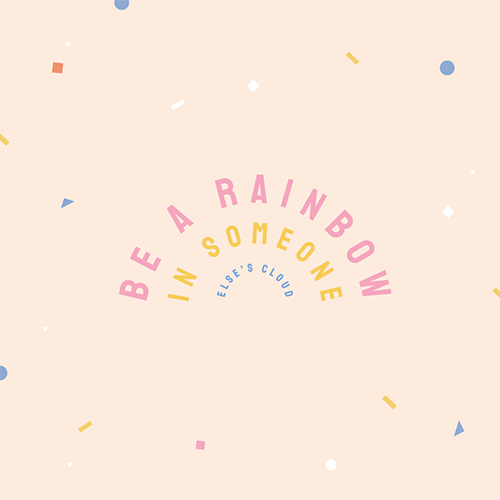
Our top tip, however, is to use it sparingly within a single design. Choose one line of text and apply the curved to that, and use a non-scripted font. Of course, if you’re creating a rainbow graphic like our example above, then this is an exception to the one-line suggestion 🙂
- Add your text to your design and ensure it’s selected.
- Click on the Curve Text icon in the top Action bar and then use the slider to adjust. Move it to the right to have the text facing around the ‘outside’ of the circle or to the left to curve ‘inwards’.
- Use the corner handles of the text box to enlarge or reduce the size of the text in proportion and click to drag into a new position on your design if required.
Want more inspiration and ideas for using curved text? We’ve got you covered. Read this article to get 23 awesome ideas & free templates too.
20. Re-arrange and organize your Design with Layers
The Layers panel, located in the right sidebar, is your hub for organizing each individual design. This is where you can create groups, re-arrange the order of layers, and more.
Some handy tips on how to manage layers and create groups:
- Open the Layers tab on the right side bar, in the design editor.
- Observe how Easil created templates are organized into folders.
- Note that each element in your design, is it’s own ‘Layer’ in this panel.
- Clicking and dragging layers (or layer groups) in the Layers tab allows you to re-order them without fiddling on the design canvas. Simply click the layer or folder and drag up or down within the panel until it clicks into your desired location.
- The non-destructive way to explore changes to your design is to hide layers rather than to delete them. If you’re unsure about removing something from your design, head to the Layers panel and click the ‘eye’ icon located on the left side of the Layer name to toggle its visibility off.
- If you create a Group in your Design (by Clicking the New Group icon, and dragging layers into the group folder), you can then select this group via the layers tab to manipulate it in various ways. For example, you can increase or decrease the size of a whole group of elements at once time by clicking on the corner of the group and dragging in. You can also copy & paste entire groups (See item 18).
Hot tip: Content within any regular text box can also be updated on your design by typing in the new text over the layer name! This is handy for when a layer might be partially hidden by other items in your design.
21. Merge documents with Layouts Merge
Should you start a new design with an Easil template or one of your existing designs? Do you ever feel like you’ll need a bit of both in the new design you’re planning?
With the ‘Layouts’ tab in the right sidebar, not only can you add new pages into your document from other Easil templates, but you can use the dropdown menu to select Team Templates and My Designs to merge entire documents into your current working document.
Note that only designs within the same size template will be displayed and able to be merged together.
OVER TO YOU
Phew! That’s a lot of features to explore.. and that’s just our current top 21! Make sure you keep in touch with our social channels, jump into our Facebook Group, and watch our YouTube videos to ensure you’re getting all the latest released tooltips, as well as information on how to use Easil to its full potential!