Want to hack visual design with our Quote Graphic Templates? It takes just ONE design template plus a few clicks?
In this blog series, we show you how to take a single Quote Graphic Template and change it in 10 easy ways… in no time at all. You’ll see how to transform your original design from a single template to a unique, custom design.
You can take Quote Graphic Templates (just one) and create not one, but 10 Quote Graphic images that will:
- Stand out on Instagram and “stop the scroll”.
- Get noticed on the Facebook Newsfeed by taking up more real estate.
- Grab attention because of their unique, custom designs.
We want your designs to be so eye-catching that your followers notice them and stop scrolling when they see them – and then engage with them.
But first, let’s talk about the elephant in the room. Have you noticed that quote graphic images are everywhere but they don’t always look well designed?
It’s not the fault of the user, it’s just that the tools for DIY Design are not always being used correctly. So you could say that we are on a mission to bring back stunning design to social media.
This is all about how to hack visual design by taking a single template and editing it – without ruining the design elements that made it great to start with. Read more about how to use DIY Graphic Templates like a Pro here.
So, let’s show you how it works. Ready to hack your visual design?
Quote Graphic Templates… 10 Ways to Hack Your Visual Design
Here is the base template, plus all the stunning designs you can make with it. We’ve also included some hot tips at the end of this post, to help you with your use of templates.
#1 The Base Template.
We’re using the following ‘Only those who dare to fail greatly’ Motivational Quote Graphic template in this example. Here it is before we make any changes:
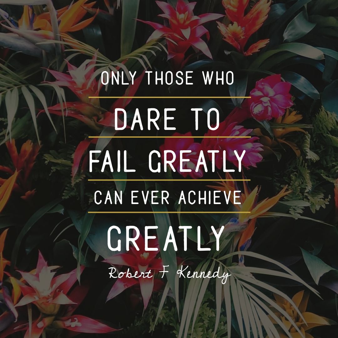
As you can see, it’s a simple design with two fonts (keep it simple!) and some line graphics to break up the image. This works well over a muted background image (filter magic at work!).
Now we’ll take this same quote and text and show you how to mix it up 10 ways… in a few simple clicks each time!
#2 Create a Quote Mockup
Keeping the quote in the same layout, all we have to do in this design is make the following changes for a whole new look:
- Swap out the background image to one that contains a flat piece of paper.
- Update the text from white to black. You can choose any color that contrasts with the paper, then reduce it to fit.
- Adjust the angle of the background image to suit the page in the mockup image.
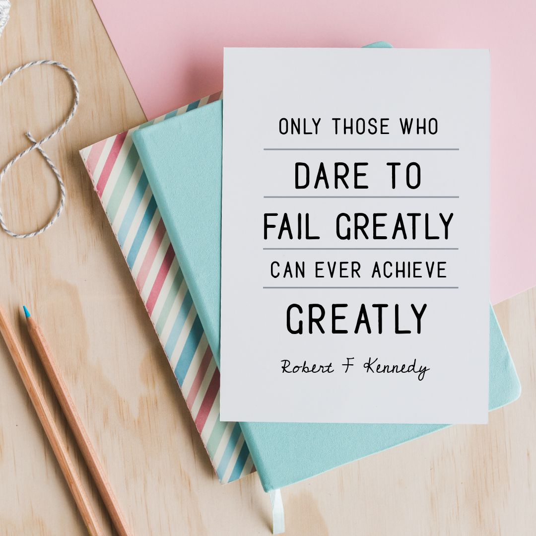
Hot Tip: Search the image library for ‘EasilStock’ – our exclusive stock image range of 1500+ images that are included for Plus users & above!
#3 Use a Text Mask to make your quote shine
Now we’re going to catch attention with Easil’s stunning Text Mask tool. This is our favourite way of editing Quote Graphic templates right now. Here’s how to use it to create image-in-text effects to die for:
- Remove the background image, and change the background to a solid color. We chose a deep navy blue.
- Choose a block/solid font that allows the text mask (image in text) to show up well when you add it.
- Select a text box, and using the text mask feature, add a glittery image (as in the example below).
- Within the text mask options, choose the filters and adjust to your choice of metallic shade. Repeat on other text within the design.
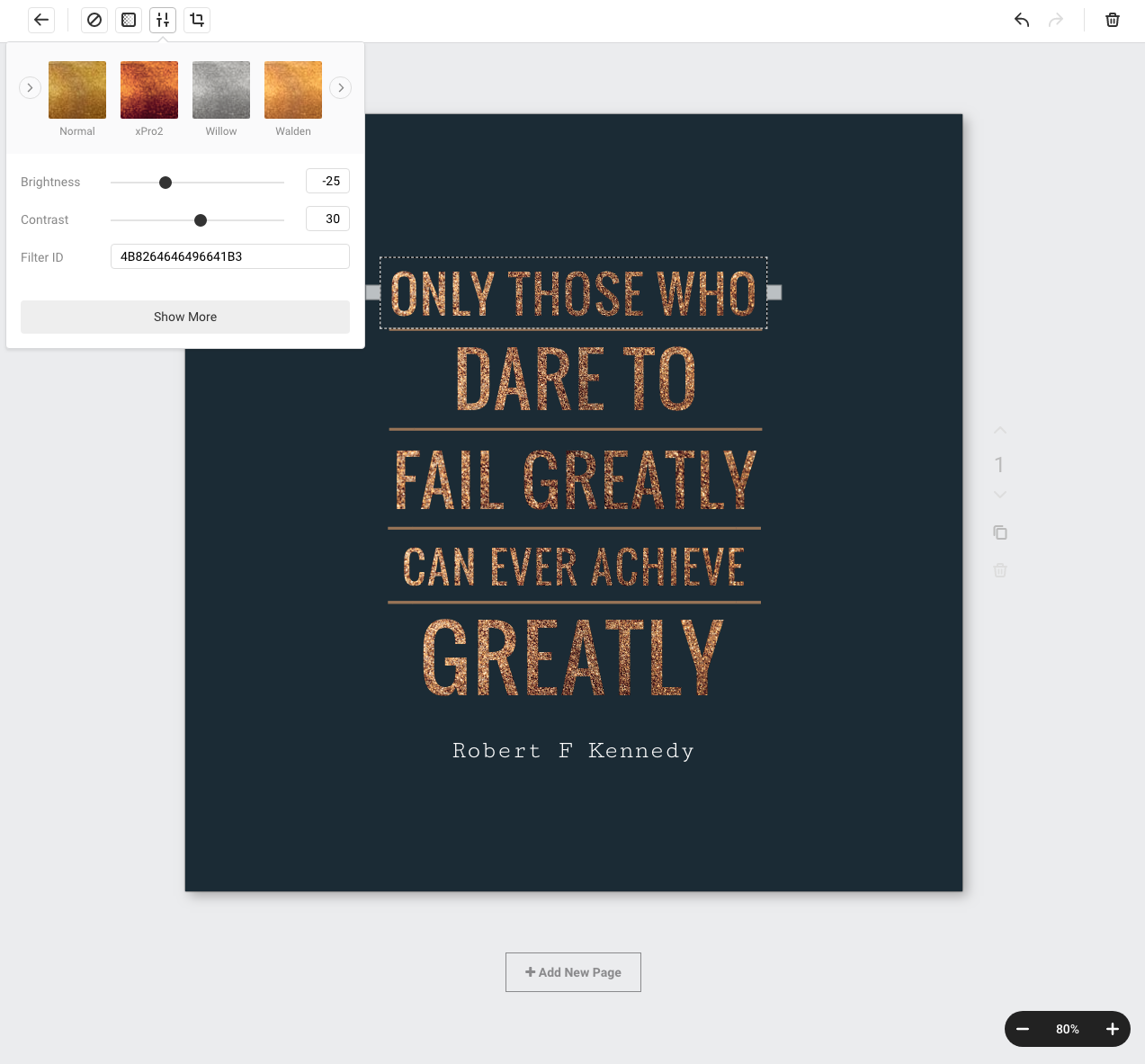
Hot Tip: Search for ‘Glitter’ in the Stock Image Library to find images similar to the one we used in this example.
#4 Add a Graphic Element to create a unique Frame for your Quote Graphic Templates
Easil is packed with unique graphic elements that provide a world of possibilities for quote graphics:
- Add a graphic element to your quote graphic. In this case we chose to keep the font and text as it was originally.
- Search in Graphic Elements under “Corners” for a unique shape to add to your design.
- Match the text to the graphic element if it suits your design. You can use Easil’s Color picker tool to get the perfect match.
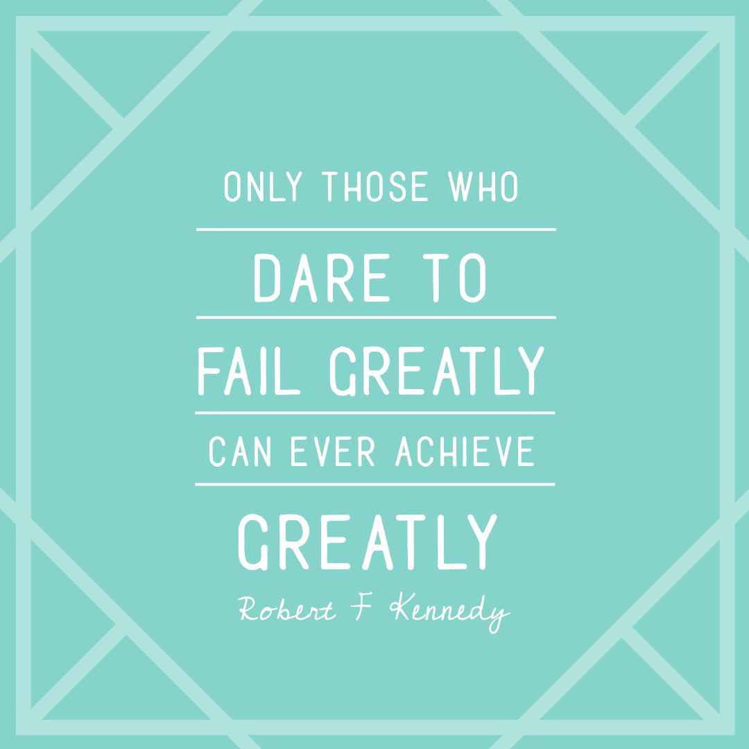
Hot Tip: Sometimes keeping it simple works best. In this case we didn’t change the text and fonts and only added a single graphic element. And we kept the image to two main colours… green and white (or shades of). Simple!
#5 Change the mood with a new Background Image
Nothing changes up a design as quickly as a new image – especially a photo. To create this striking effect we:
- Added a new night-time photo.
- Changed the main font (keeping the second font).
- Chose a color that would contrast well over the dark background – white was just the right fit!

Hot Tip: Use contrasting colors of dark and light for your background and title. Got a dark background image? Go for light text. Need text to match a light background? Choose light text.
#6 Use a shape behind your Motivational Quote
Sometimes adding a shape is just the thing you need to make your text pop! In this design, we:
- Added a new background image,
- Added a shape behind the text, and adjusted the opacity to let the background slightly show through – eg 75% – which gave us this gorgeous light effect.
- Selected the lines in the graphic and matched the color of the lines to one from the background image. To do this we chose used our Color Picker > Image Colors, then choose the color that was the best fit to add to our lines. In this case it was a light green color that contrasted with the shape behind.
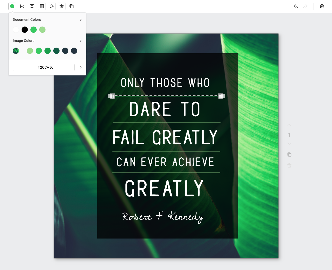
Hot Tip: Use Easil’s Color Picker (or Color Palette Generator) – it does all the hard work for you, matching colors that work best with your image or image overlays.
#7 Focus on the text by adding a Drop Shadow
Sometimes adding a simple Drop Shadow effect can really lift an image (as long as you use text effects the right way!). In this example, we have:
- Removed the background image, and aded back a solid color.
- Searched in the graphics panel for a graphic. Search on: rough/hand drawn/scribble to find a casual graphic to use to place behind your text.
- Replaced the current font with a more casual one, and added a contrasting drop shadow to the text. You can use Easil’s Text Effects tool to get your drop shadow to look great every time.
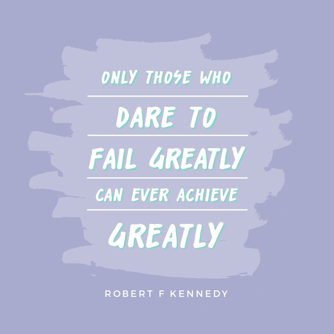
Hot Tip: Don’t over-do your text effects. Subtle is best.
#8 Use Icons and Elements to Lift your Design
Sometimes you can add a little “extra” something to your background and text to give it some “design lift”. In this case we:
- Added a background image with lots of white space to allow for text. This is one of our Easil Stock Images that are available for free for Plus users and above.
- Searched in Graphic Elements under Quotes/Icons and added the icons to the image, with some transparency so they are subtle.
- Changed up the quote slightly, modifying the body text and keeping the subtext as it was and layering it over the quotes.
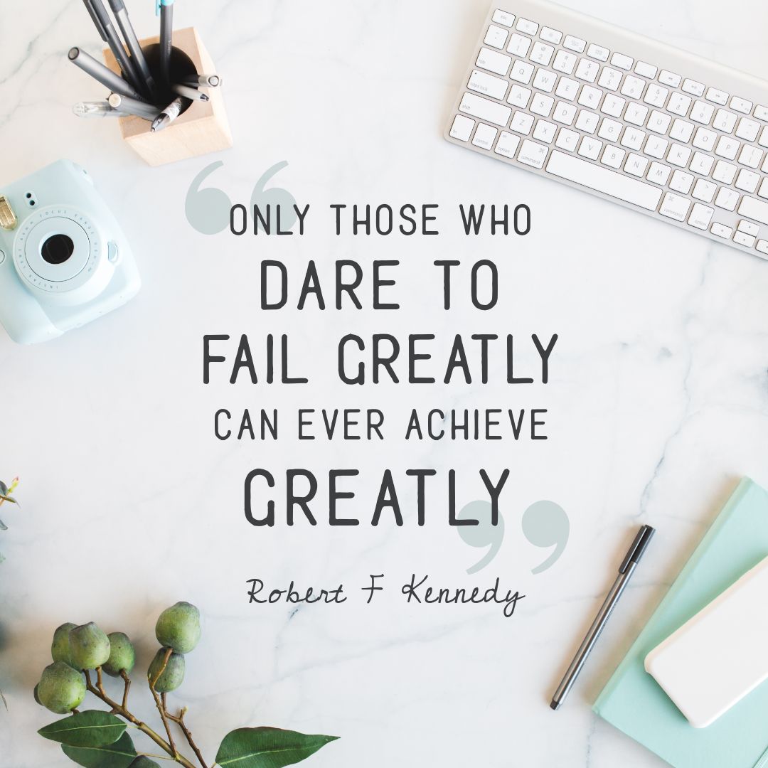
Hot Tip: If you are adding different elements like text and graphic icons, use the layer tool in the Action Bar to move items forward or back. Using transparency also makes text stand out against background images.
#9 Add some texture to make your text stand out!
The right kind of background can be as important as the text you lay over it. We’ve changed up a few simple things here:
- Added a textured background that makes the text pop!
- Switched out both fonts but keeping it simple – only two fonts for the entire image.
- Choosing a bright color for one of the fonts that stands out well against the background.
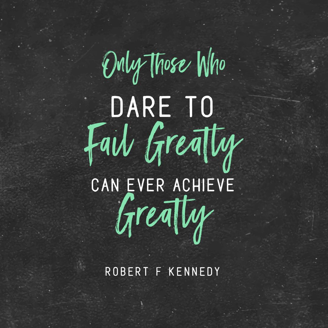
Hot Tip: Not sure what colors and fonts work together? Check out existing font combinations in some templates – if you see one you like you can copy that combination in your own design. Even better, pull it into your design with Easil’s Design Merge!
#10 Celebrate the Author
In the examples above, we’ve changed up the body text. What about changing up the author or person being quoted? Here’s how to make their name pop:
- Swap out the background image, and update the font on the quote, keeping it simple with just one font.
- Emphasise the author by adding a banner element behind their name.
- Update the graphic elements – as you can see the lines and the banner both match the orange in the flowers which ties the image together.
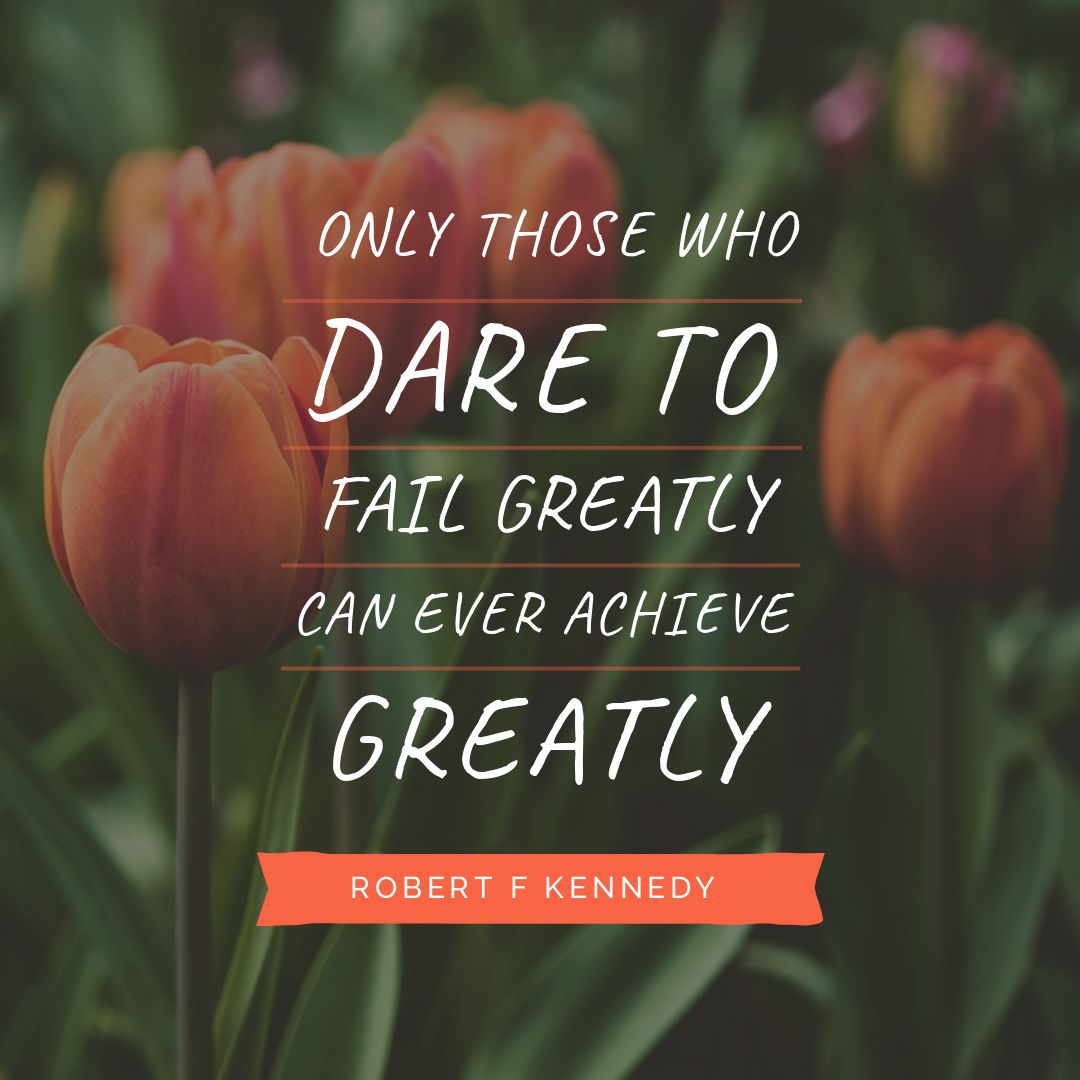
Hot Tip: Use Easil’s color picker to match the banner to one of your background colors (in this case, the orange in the flowers).
Cool, Hey?
Are you excited? It’s all about creating great designs from a little dragging-and-dropping. Easil’s templates make it easy, now that you can drag and drop like a boss!
Before you go, here are a few tips for editing DIY Design Graphic Templates so they still look professionally designed. There are a few key “rules” to consider.
AVOID THESE MISTAKES WHEN EDITING DESIGN TEMPLATES
Remember this rule first and foremost: The key to editing templates effectively is this: don’t mess with the basic design elements too much.
Try working with the following elements as you hack your visual design to create a whole series of quote image templates:
Text
Keep text positioning as it is on the template. If you are going to replace text, then keep it of a similar length, font size and location. Change the font and content by all means, but don’t move it around too much and keep it in the same (approximate) position on the page.
If there is a text box included in the design, then be guided by it. Don’t move it around or change it to much, and make your new text work with the text box.
Hint: If you need to make modifications to the text box, text size or location, do it with minimal changes so the differences are not too noticeable if you were to lay the two designs (your template and your new design) side by side.
Fonts
Stick with just 2 or 3 fonts maximum and match the number of fonts you use to the number of fonts on the original template. If your brand fonts work with the design then use those.
Otherwise consider using the existing template fonts or find some fonts that work together. Easil has plenty of these in our templates, or you can check out our Free Font Guide to choose a perfectly matched font pair.
Images
Choose images that are similar to the images you see in the template – either in terms of photographs or icons or illustrations. If the image you are replacing has a lot of detail in it, choose a replacement image that is similarly detailed. Likewise, if it’s an emoji, icon or illustration, choose one of similar shape or style.
It helps if your quote graphic templates have frames that snap photographs into place (many of Easil’s template designs do just that!). This way, when you snap your new photograph into the frame, it snaps right into place, positioned correctly.
Color
Color can have a huge impact on design for your quote graphic templates. Get it right and your design pops. Get it wrong and …. technicolor yawn (or worse!). Change out the colors on your design but try to stick to (a) the same number of colors and (b) colors that complement each other. This means that you shouldn’t go adding too many extra colors.
And if the colors on the template are a good fit for your new design, then why not use them? There is no rule to say you have to change everything to make a custom image. Sometimes keeping the color or fonts or images on the template can allow you to create something unique while keeping the pro-quality design of the original template.
Oh and of course, use Easil’s Color Palette Generator! It’s MADE for decisions about what colors to keep and add.
Easil’s Color Palette Generator
As outlined in the video below, simply click on the background photo or image in Easil and the Color Palette Generator will pop up. You’ll see a range of colors pop up to choose from (they’re pulled directly from your image so they are primed to be used for headings so you get the right color “fit” every time).
Here it is in action:
Ready to “Hack Your Visual Design” with Easil’s Quote Graphic Templates?
Using Easil’s stunning Quote Graphic templates (yes, we’re not afraid to say it… they are simply stunning) is an easy way to get started.
With our Quote Graphic templates, there’s no such thing as a cookie-cutter design. As long as you stick to the rules for editing them! Now you can see just how simple it is to create designs like a pro… you just have to follow a few rules and focus on adding less not more!
Don’t forget our other Hack Your Visual Design Posts!
You can check them out here:
Over to You
Are you excited about the possibilities of using Easil’s Quote Graphic Templates to hack your visual design? Just remember to follow the rules we’ve outlined and you’ll be creating engaging quote graphics that make us go WOW… in minutes!
